contents
Flat design is over — not dead, but decisively retreating. After roughly a decade of safe minimalism, 2026 branding is swinging toward texture, depth, and what design press now calls tactile maximalism. The shift is real and worth understanding. But copying the aesthetic without understanding what drove the old one is how you wreck whatever recognition you have spent years building.
flat is giving way to texture — what that actually looks like
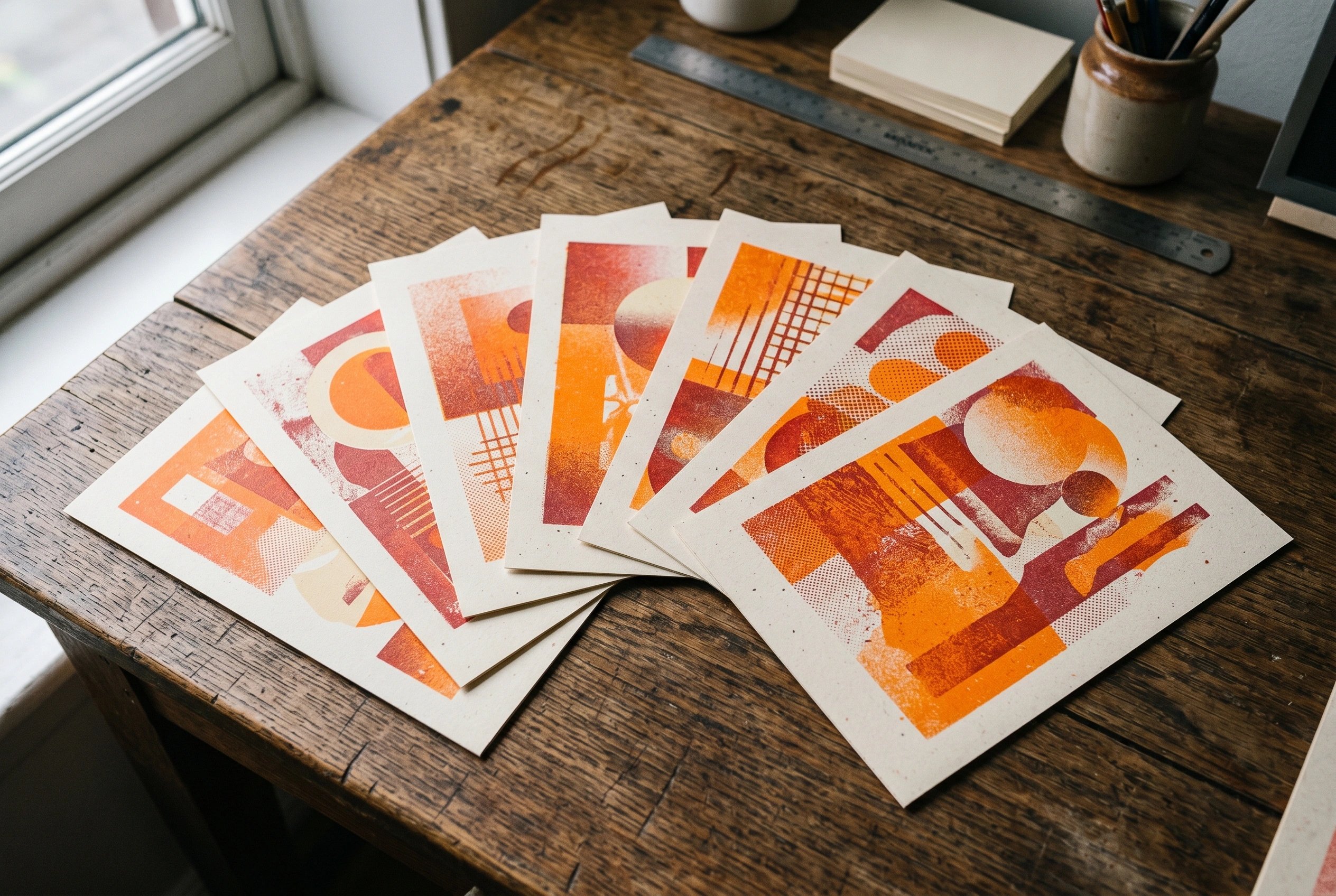
The signals are hard to miss if you are watching packaging shelves, brand launches, and motion identity this year. Metallic and chrome lettering. Embossed badges on packaging. Ornamental shapes that would have been dismissed as 'busy' in 2018. Grain, halftone, tactile surface treatments. Bold colour doing heavier lifting than any geometric sans-serif ever could.
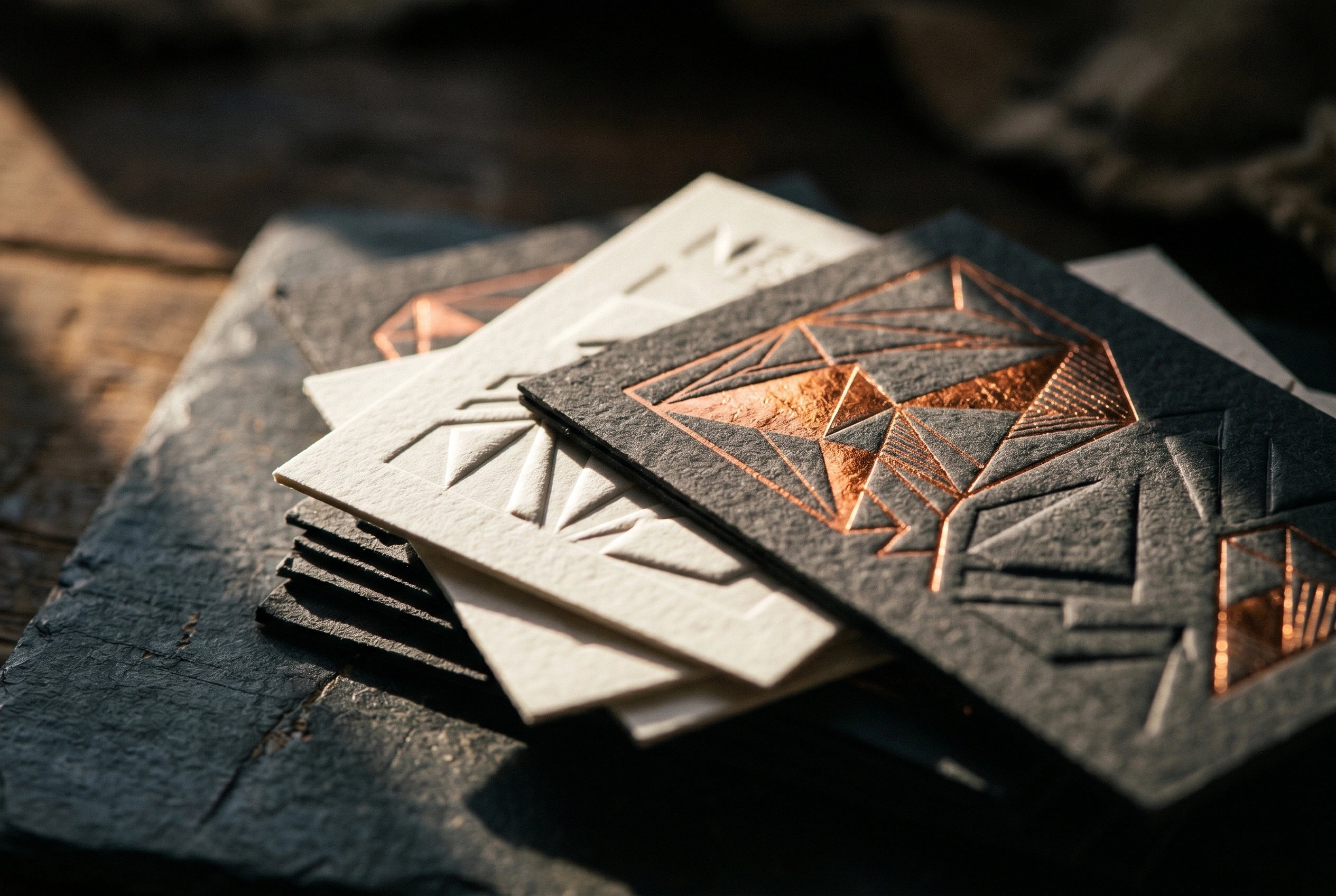
The term circulating in design coverage is tactile maximalism — hyper-textured, sensory-rich design that deliberately rejects the frictionless flatness of the last decade. It is not one unified movement; bold minimalism and loud maximalism now coexist on the same shelves, sometimes from the same studio. What is gone is the assumption that flat-and-clean is automatically the sophisticated choice.
For founders, this shows up most obviously in packaging: brands that spent 2019 to 2023 stripping everything back to white labels and a neutral sans are now watching newer entrants win shelf presence with retro-futurist texture and chromatic depth. The aesthetic ground has moved.
why now — a decade of flat, plus the ai sameness problem
The flat-minimalism wave made sense when it arrived. It was a corrective — against the skeuomorphic excess of the mid-2000s, against decorative noise that obscured rather than communicated. Clean, geometric, scalable across digital surfaces: the logic was sound and the execution often beautiful.
But a decade of that logic, applied by every studio to every brief, produced a graveyard of indistinguishable brands. What brand identity actually is is a system that makes you recognisable under pressure — and flat minimalism, adopted as a default rather than a choice, stopped doing that work. When every D2C startup, every fintech, and every food brand looked structurally identical, the aesthetic became camouflage, not distinction.
Then came AI. Generative tools are extraordinarily good at producing competent, averaged, on-trend visuals — which means they are extraordinarily good at producing the mean. AI in brand design is already accelerating the sameness problem: when the path of least resistance is a prompt that outputs something clean and plausible, the work of thousands of brand projects converges. Texture, idiosyncrasy, and crafted surface quality are things the mean resists. That is exactly why they are becoming differentiators.
“Trends are for brands with nothing to say — steal the texture, keep your system.”
steal the texture, don't wear the costume
Here is where most brands will get it wrong. They will see the direction — chrome type, embossed surfaces, maximalist colour — and treat it as a re-skin. Strip out the old identity, pour in the new aesthetic, brief a freelancer on 'making it feel 2026'. That is not a strategy. It is trading one borrowed look for another, and arriving at trend-chasing instead of brand-building.
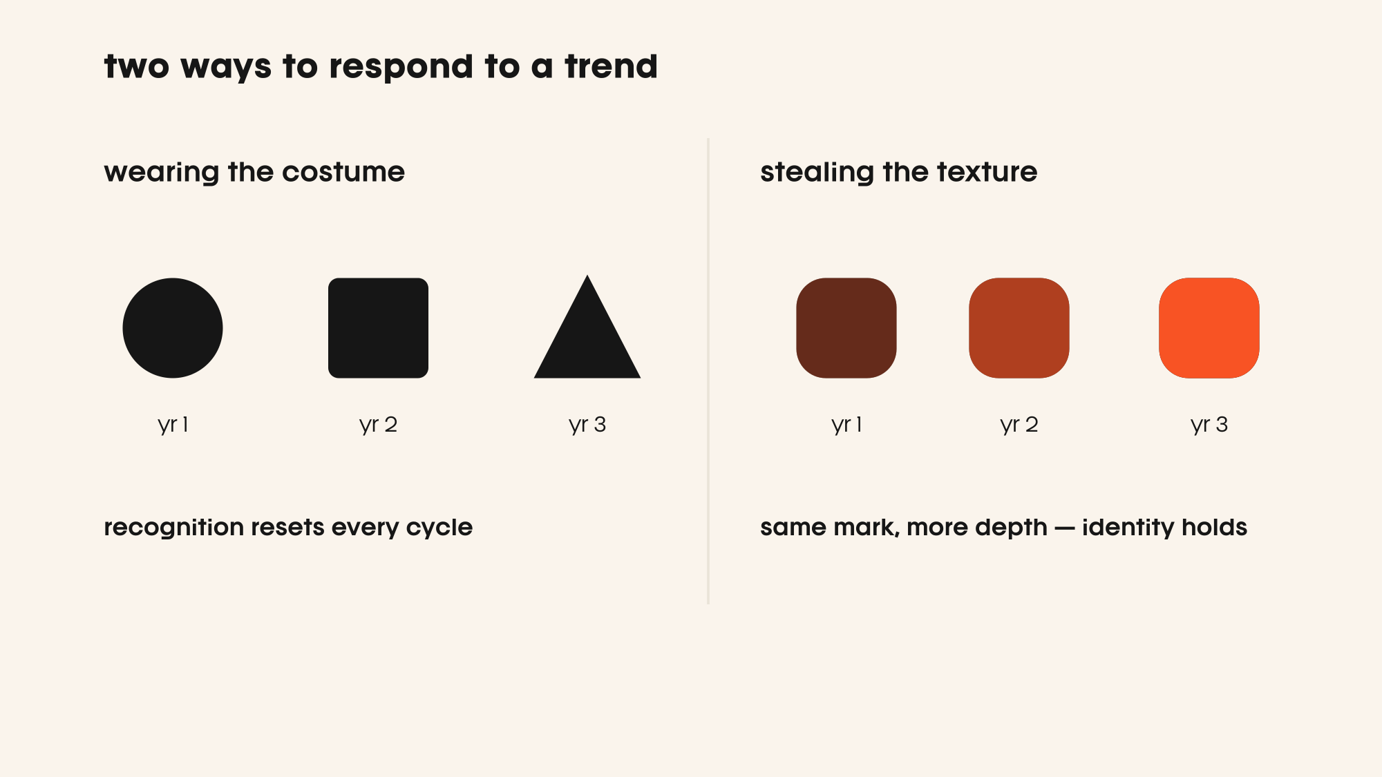
The distinction we draw with clients is between costume and craft. A costume replaces your identity with this season's. Craft adds depth to what already exists — roughness, weight, surface quality — in ways that feel inevitable rather than borrowed. A brand with real assets (a distinct mark, a considered colour system, a type position it owns) can absorb texture as enrichment. A brand that never built those assets will just look like it is chasing.
The question is not 'should we add texture?' It is: what do we already own? If you have a mark your audience recognises, texture can make it feel more real, more physical, more present. If you do not have that recognition yet, no amount of grain or chrome will substitute for the repetition required to build it. Markets need roughly ten times more repetition than founders have patience for.
how to add depth without breaking your system
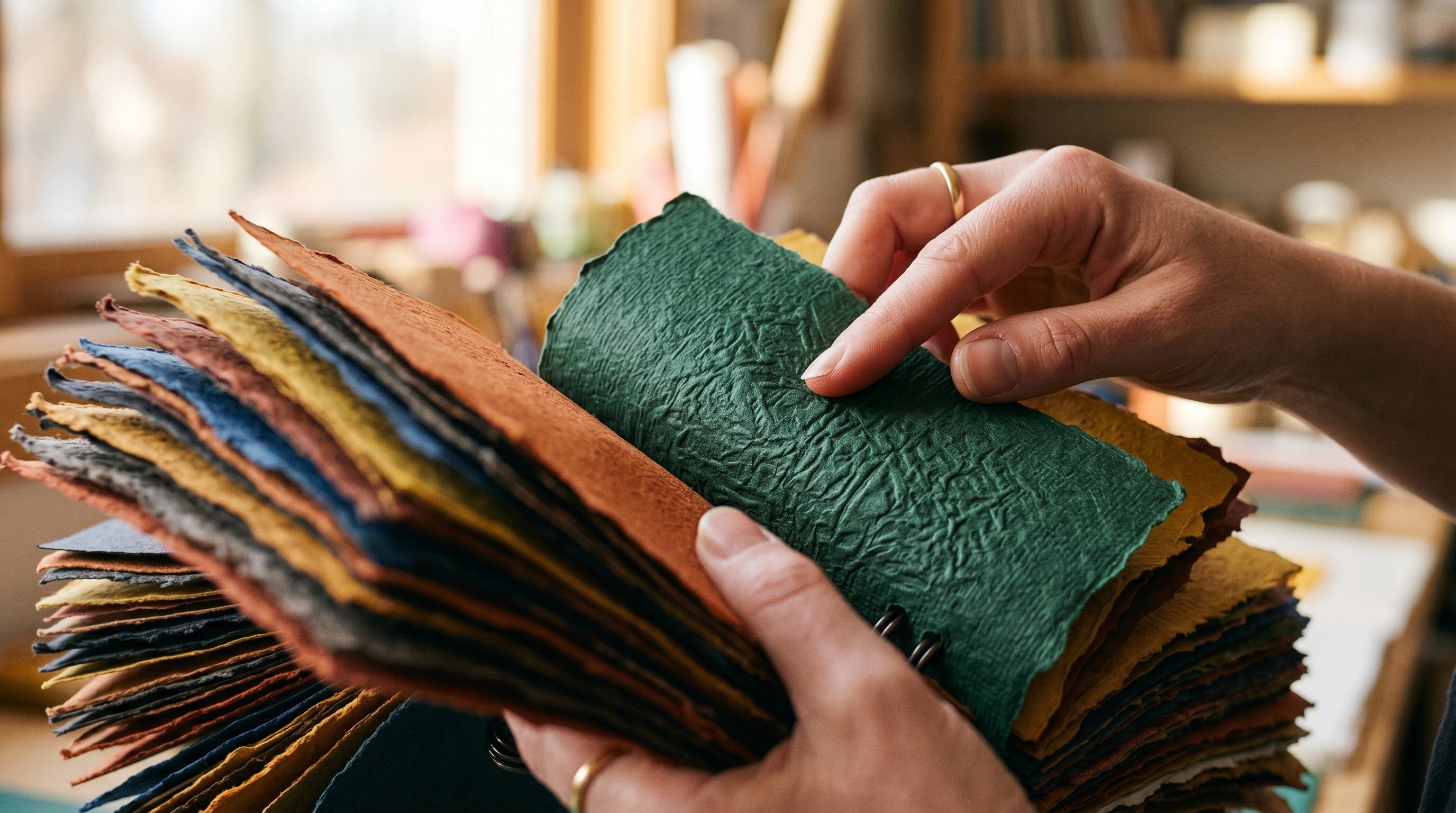
The practical approach is additive, not substitutive. Start with your highest-frequency touchpoint — usually packaging or a key digital surface — and introduce one textural layer: a grain treatment over your existing palette, a pressed or embossed treatment on your primary mark, a metallic ink run on a core SKU. Watch how it reads against your existing assets before extending it.
Colour is often the safest entry point. The anti-beige moment in 2026 is not just about bold choices — it is about colour doing more *structural* work: defining hierarchy, creating depth, replacing ornament. If your palette is strong, saturating it or adding a secondary accent with real chromatic presence is lower-risk than introducing new surface treatments across everything at once.
Typography is where the trend most easily becomes costume. Chrome lettering, variable-weight display type, ornamental serifs — these are recognisable signals of the moment. In editorial or hero applications they are powerful. Built into your workhorse type system they will date badly and fight everything else on the page. Our identity work almost always separates the brand's workhorse type from its expressive layer — the latter can absorb a trend; the former should resist it.
The goal is a system where the textural choices look like they could only belong to your brand — not like you read the same trend report everyone else did.
quick answers
is flat design dead?
Not dead — but no longer the automatic default it was for most of the last decade. Flat design as a considered choice still works. Flat design as a reflex, applied without asking whether it serves recognition, is what 2026 is correcting against.
what are the 2026 design trends worth paying attention to?
Tactile maximalism, grain and surface texture, metallic and embossed treatments, bold colour doing structural work, and retro-futurist depth. The consistent thread is *distinctiveness* — brands using visual craft to resist the sameness that flat defaults and AI-generated aesthetics both produce.
what is tactile maximalism?
Tactile maximalism is a design direction characterised by hyper-textured, sensory-rich aesthetics — 3D depth, embossed badges, grain, metallic surfaces, ornamental shapes — that deliberately contrast with the smooth flatness of the minimalist decade. It is the dominant signal in brand and packaging design as of 2026.
should we update our brand to follow 2026 branding trends?
Only if the update builds on what you already own. If you have recognisable assets — a mark, a colour position, a type system — you can add textural depth as enrichment. If you use a trend as an excuse to start from scratch, you reset the recognition clock and solve nothing. Steal the texture; keep your system.
“The brands that will look embarrassing by 2028 aren't the ones that ignored this trend. They're the ones who wore it wholesale, without asking what they were giving up.”
filed under

got a project in mind?
we turn thinking like this into brands that actually ship. tell us what you’re working on.