Captured by J. Moïse
an identity designed to feel safe enough to be invited in.
about the client
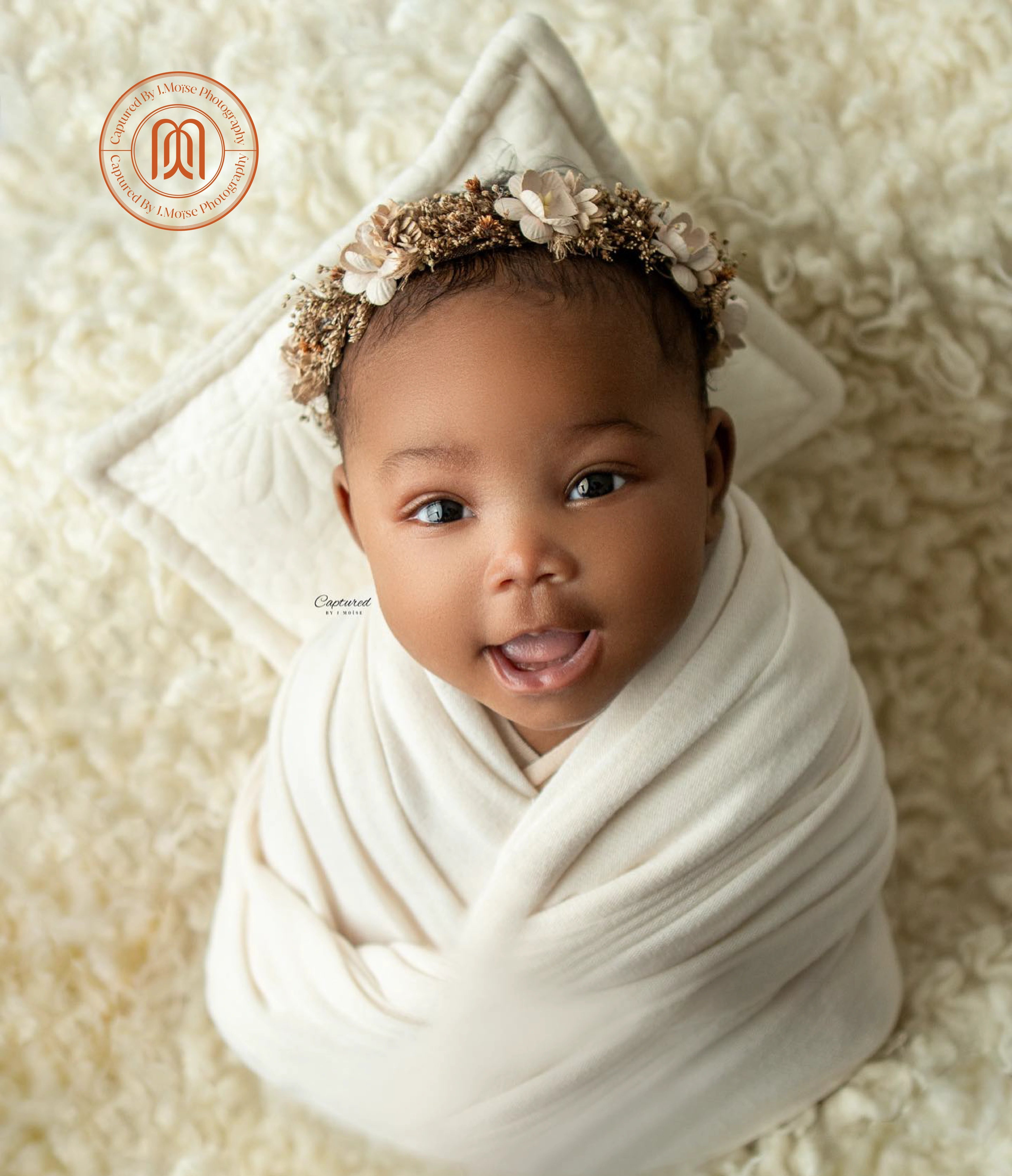
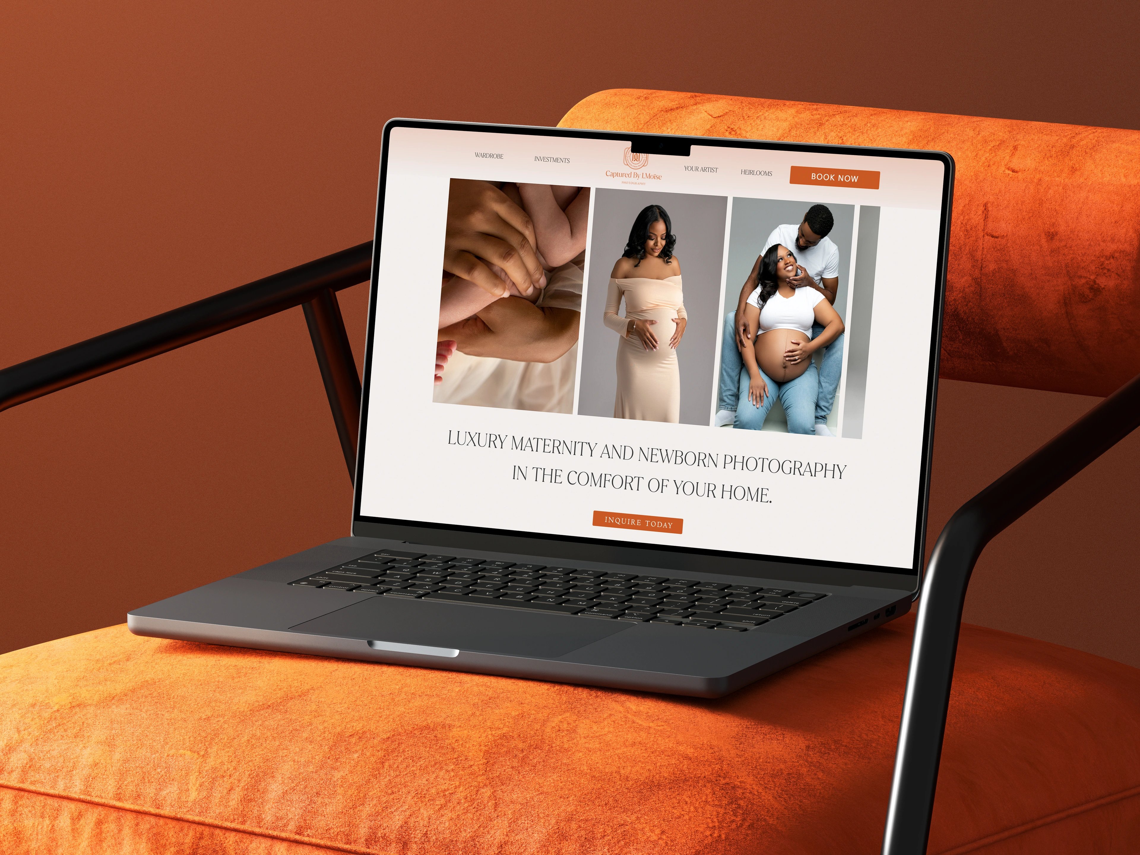
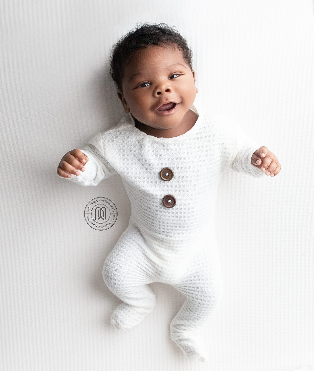
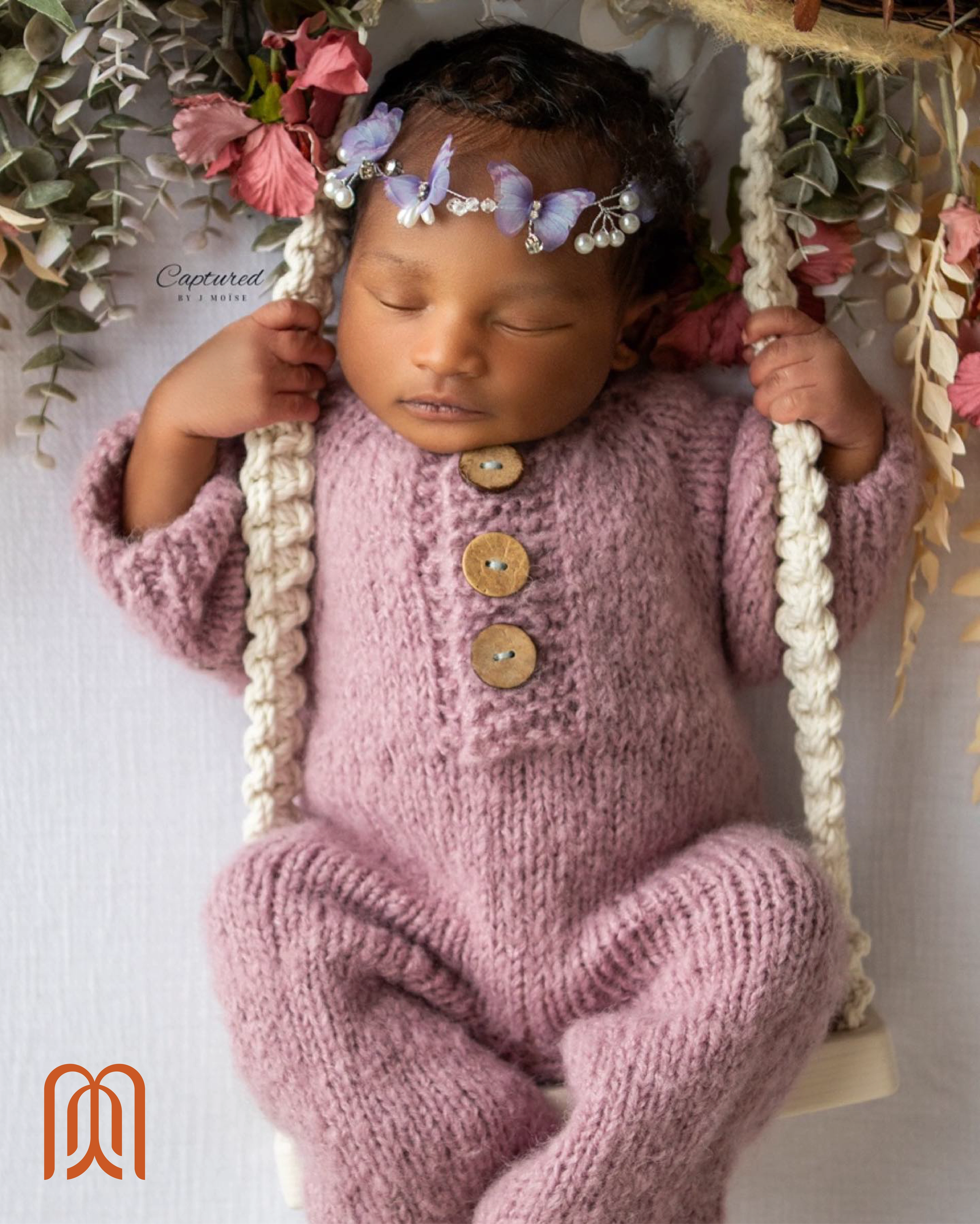
Captured by J. Moïse is a maternity, newborn and motherhood photography studio based in Atlanta, serving families across Gwinnett County and the surrounding area. The work is built around a fully guided in-home portrait experience — styling, posing, studio-quality light and heirloom keepsakes delivered to the client's door. The visual register is warm, earthy and bohemian, closer to a fall editorial than a typical newborn session.
the challenge
Maternity and newborn clients invite a photographer into some of the most private hours of family life, so the brand has to read as emotionally safe before it ever reads as luxury. The category is crowded with soft pastels, script fonts and predictable baby imagery — none of which carry the premium positioning a fully guided in-home experience commands. The work was a mature, soulful identity that could hold trust, warmth and editorial weight without the usual clichés.
our solution
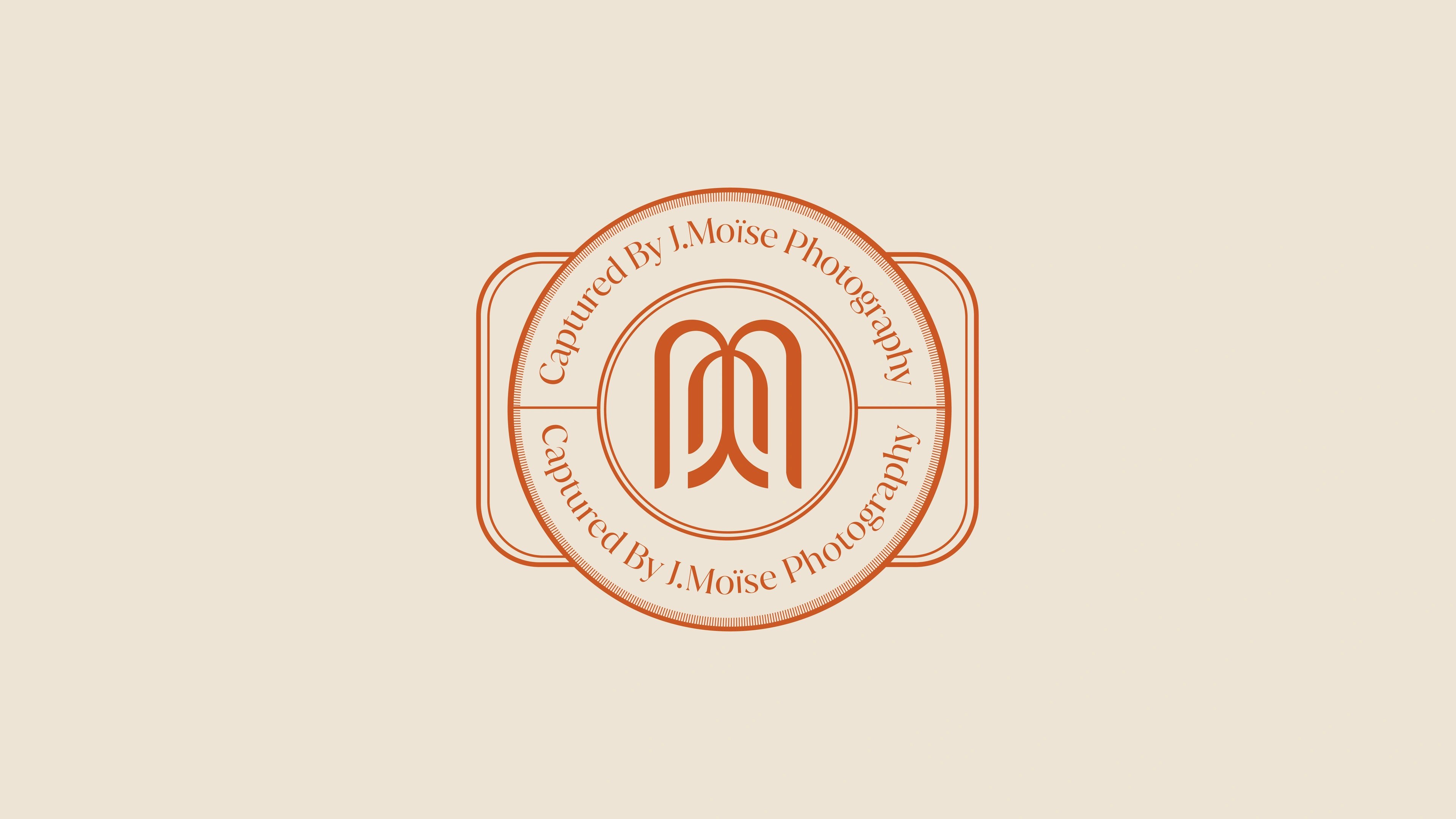
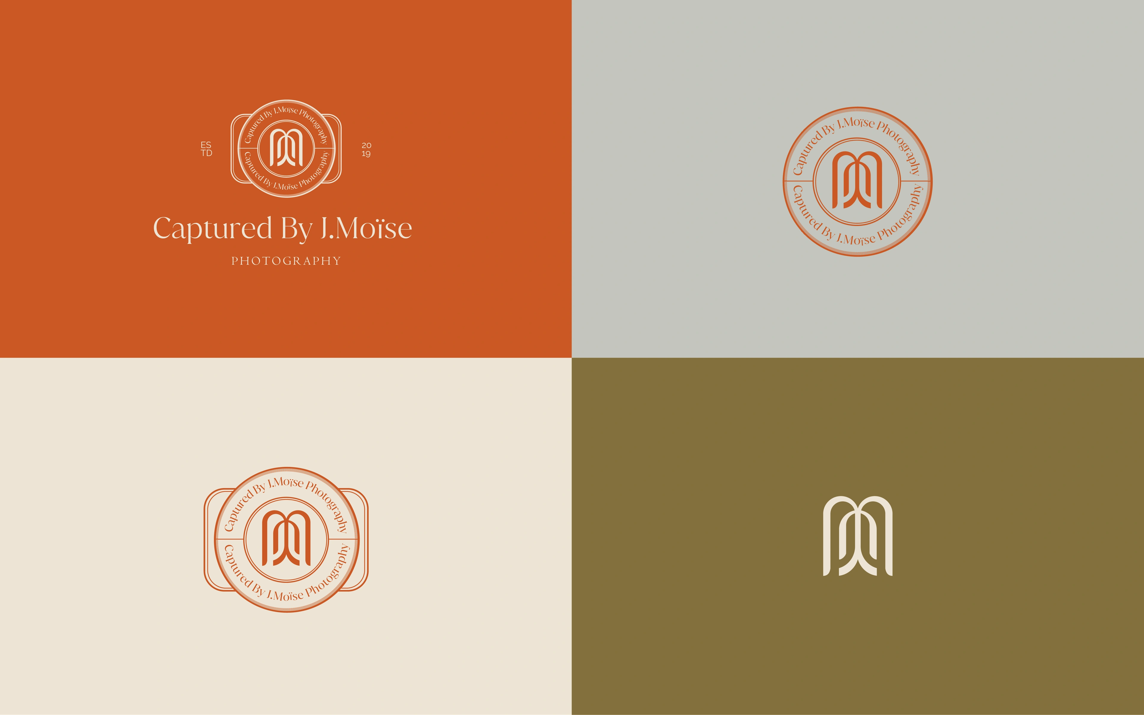
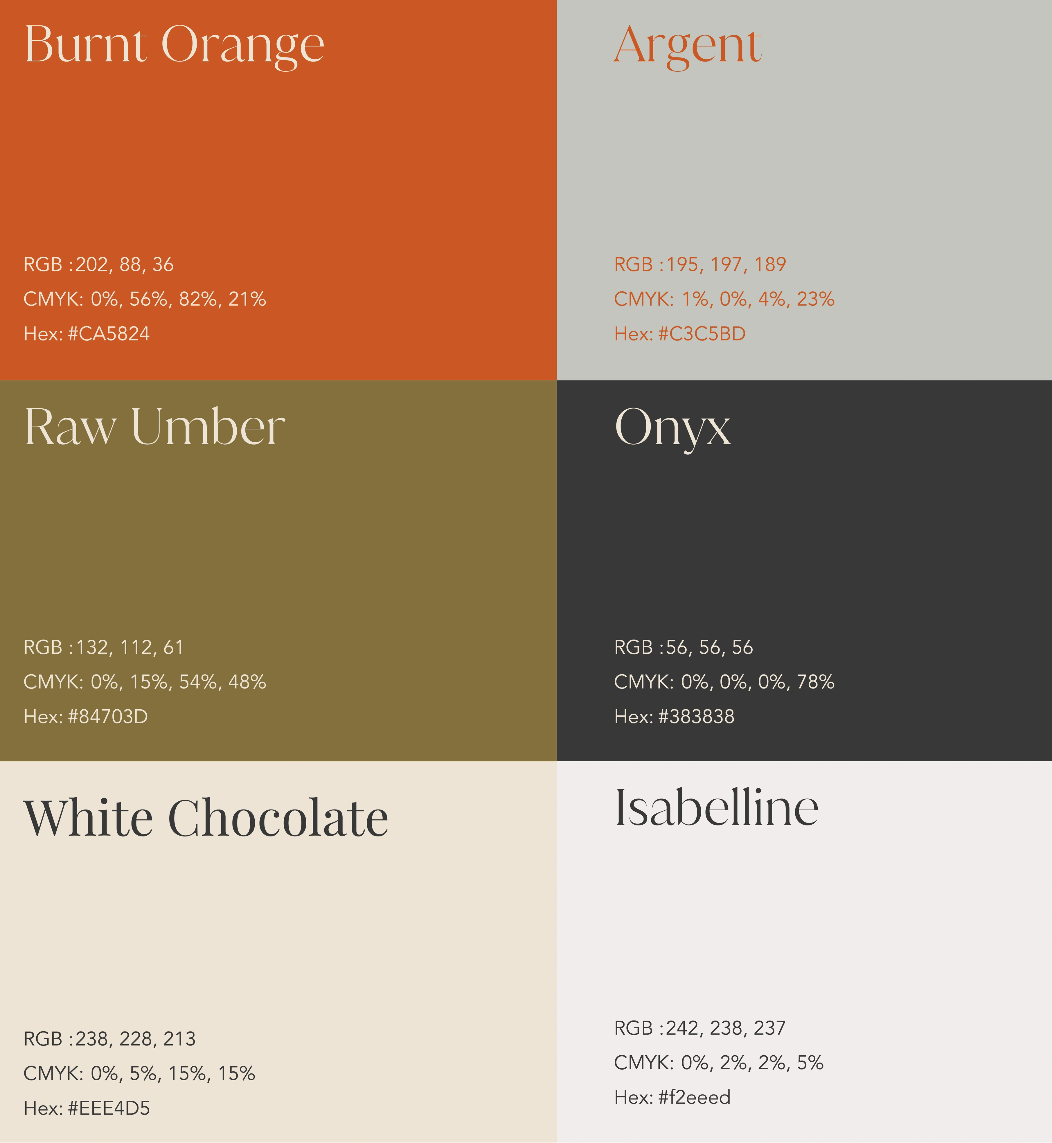
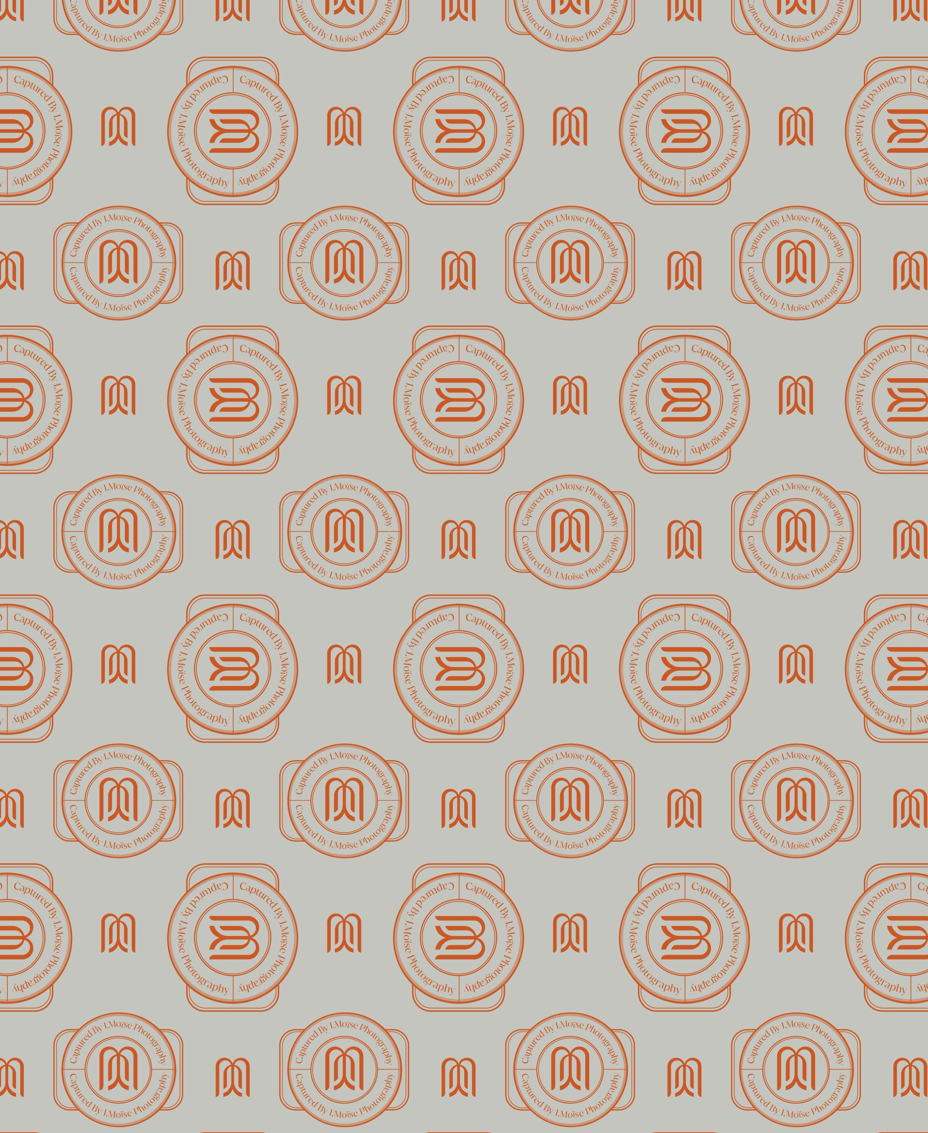
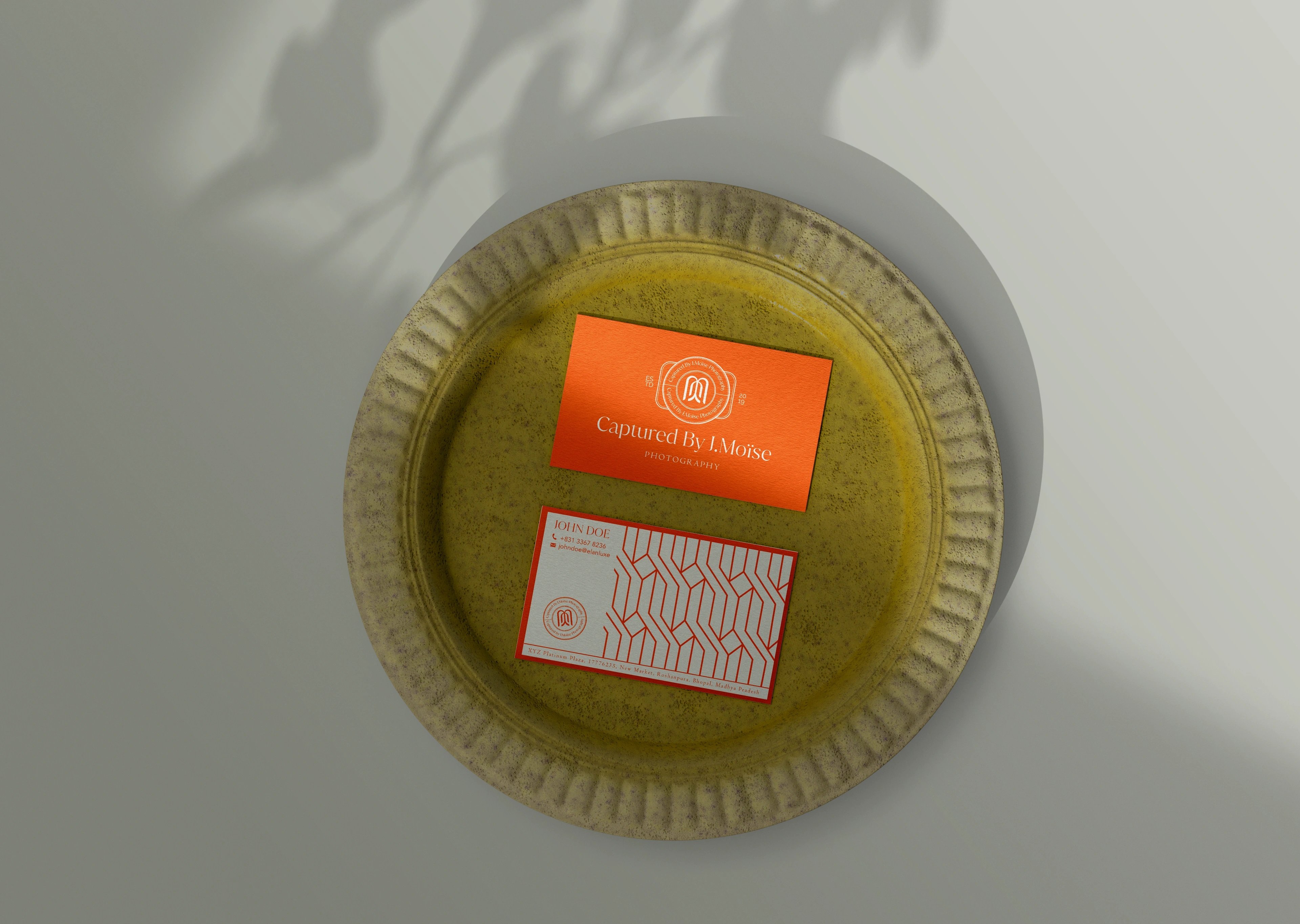
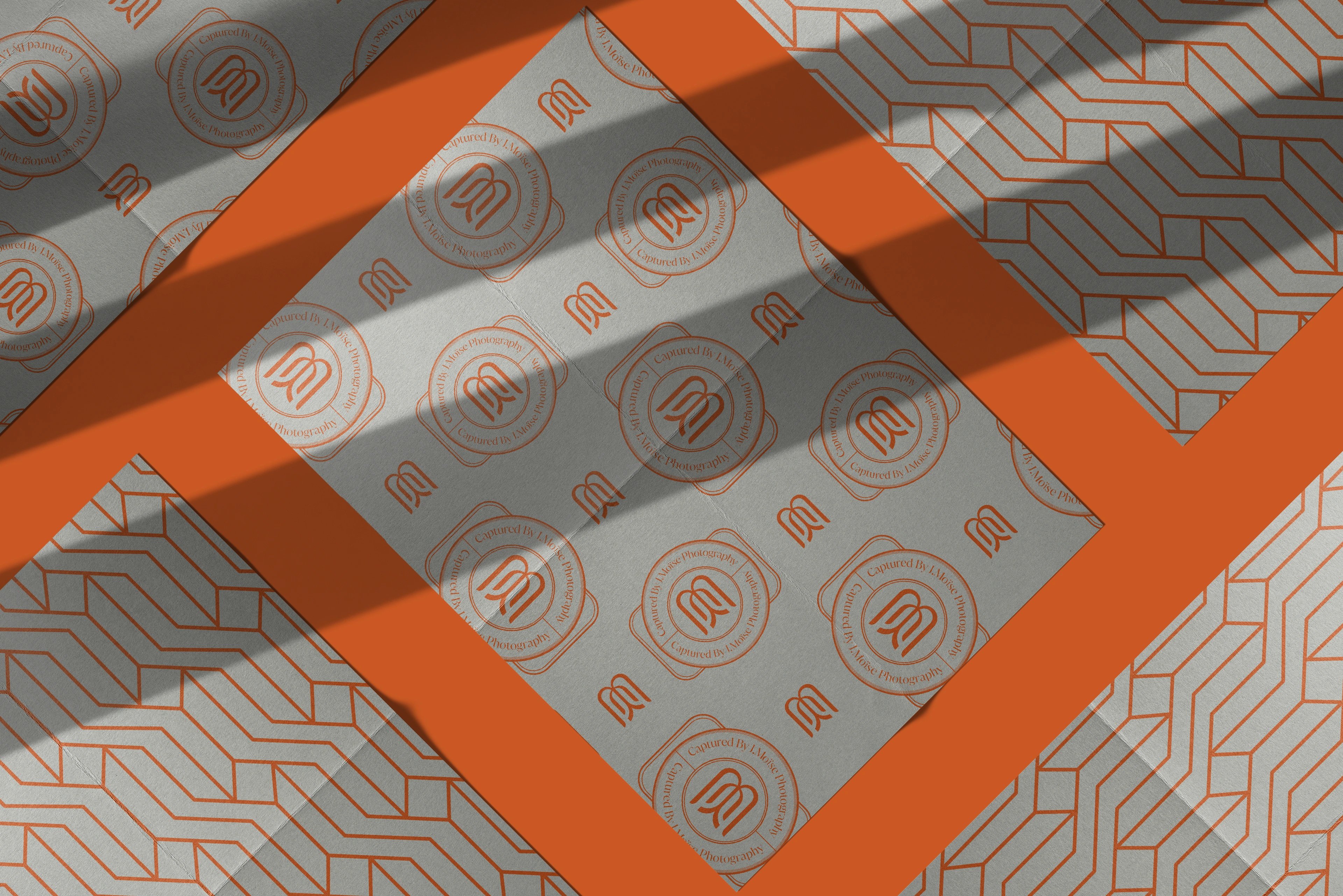
We built the identity around a custom monogram whose soft, arc-like forms read at once as initials, flowing fabric, a soft frame and — in the wider submark — a quiet camera reference. A circular seal system wraps the mark, giving the brand a recognizable device for watermarks, social avatars, packaging and the heirloom pieces that arrive at a client's door. The palette of burnt orange, raw umber, argent, onyx, white chocolate and isabelline was tuned to sit beside the creamy, autumnal finish of her photography rather than fight it. Typography stays editorial and timeless so the photography always remains the hero.
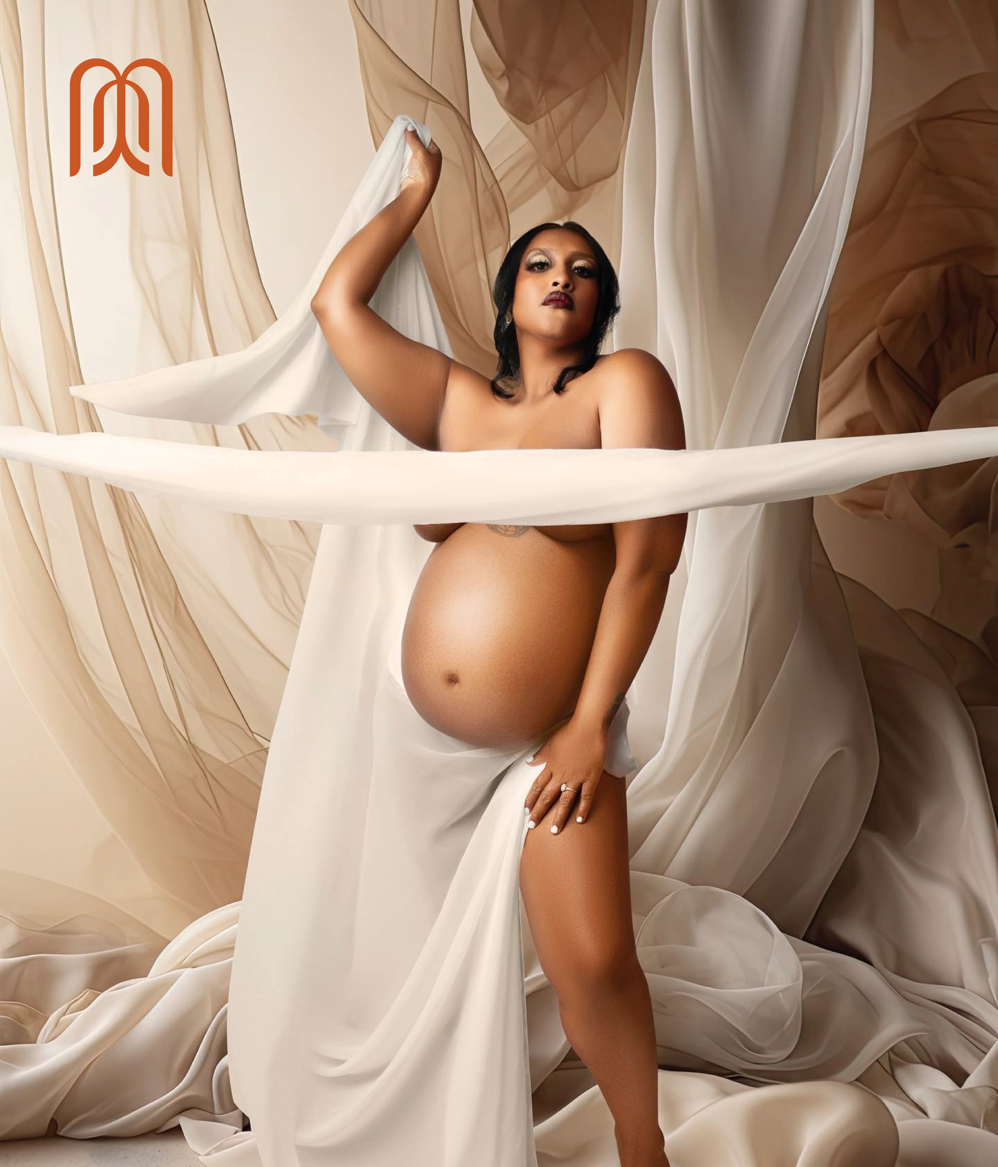
a warm, soulful identity for motherhood portraits
initials over icons
We started with the monogram, not the palette or the type, because the brand needed a mark that could survive as a watermark on a portrait, a stamp on a keepsake box and an avatar in a feed. From there the seal system extended the mark across packaging, client documents, social and the heirloom albums families keep for a generation. The warm, autumnal palette and editorial typography were tuned to sit beside the photography rather than announce the brand. What shipped was a single visual language — from website to Instagram to the framed portrait on a client's wall — that reads as personal before it reads as premium.
but wait, there’s more
Zion Health
earth-rooted identity system for a clay-based wellness brand

RooView
smart viewfinder accessory brand for solo content creators
Washify
trust-led identity for a doorstep car-wash subscription
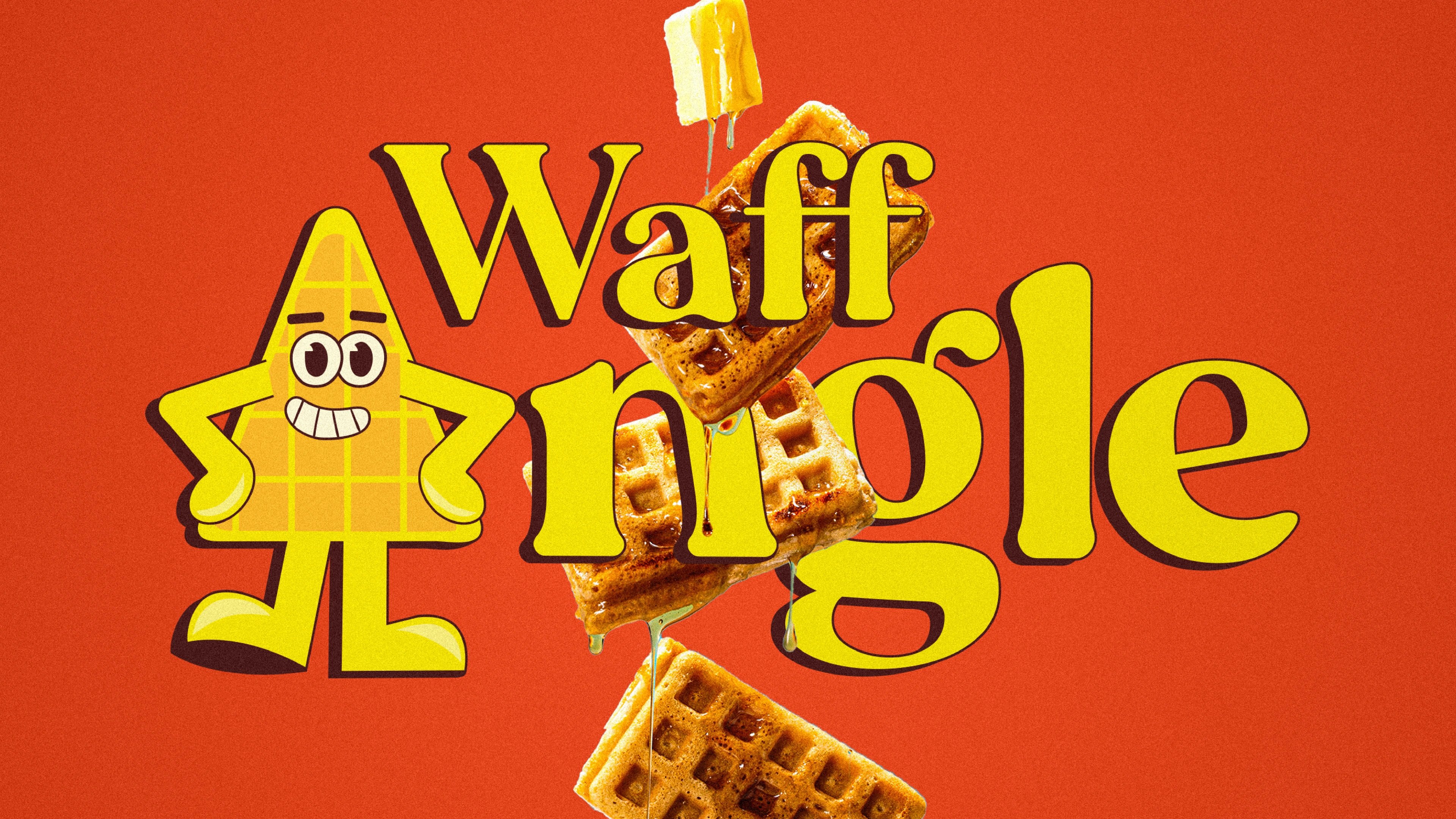
Waffangle
mascot-led identity and packaging for a bengaluru waffle brand
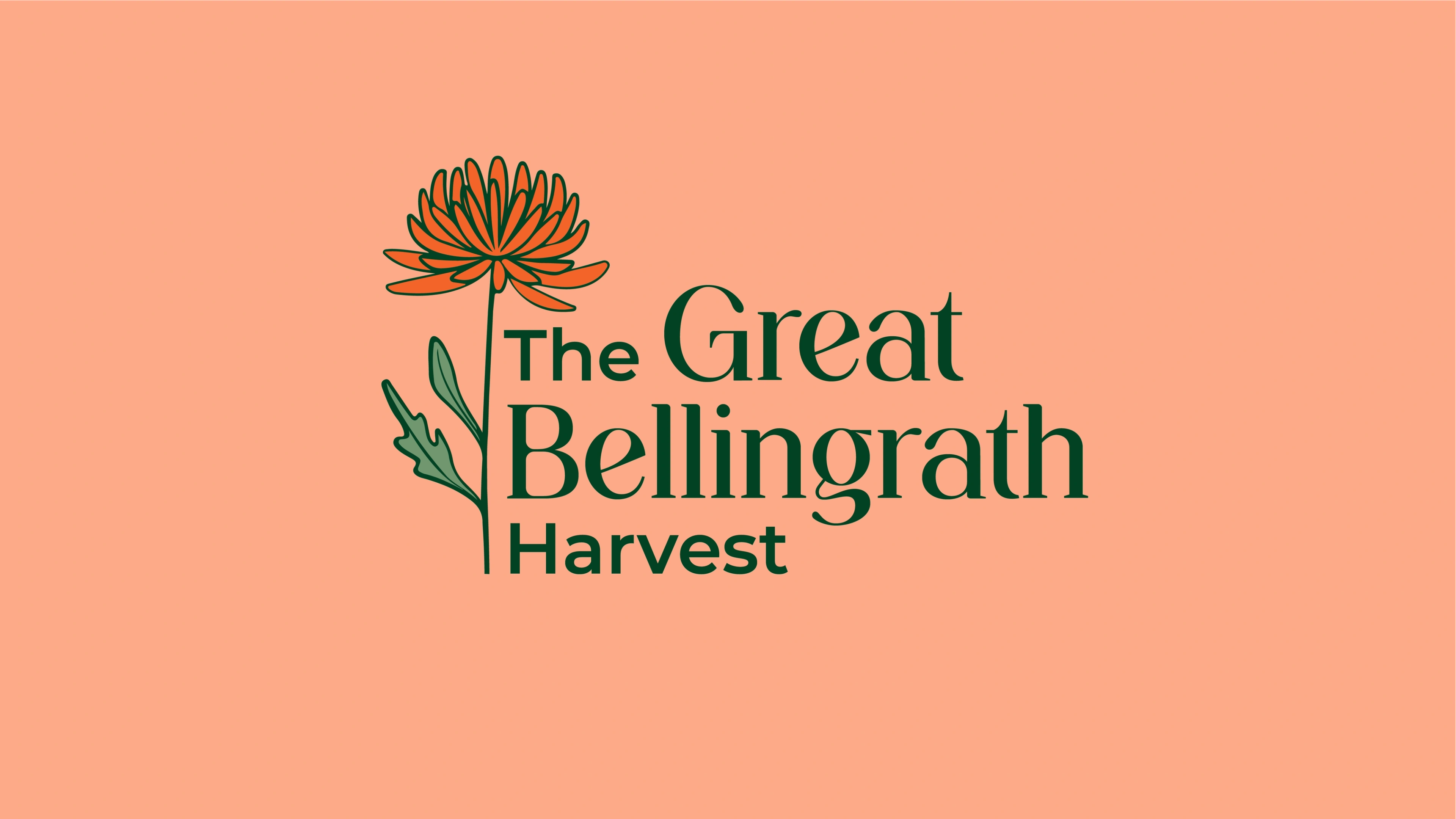
The Great Bellingrath Harvest
festival identity for a historic alabama garden estate
ready tobegin?
tell us what you’re building. we read every message, reply within two working days, and only take on projects we know we can ship well.