a kangaroo in a pocket explains the product faster than any spec sheet.
about the client
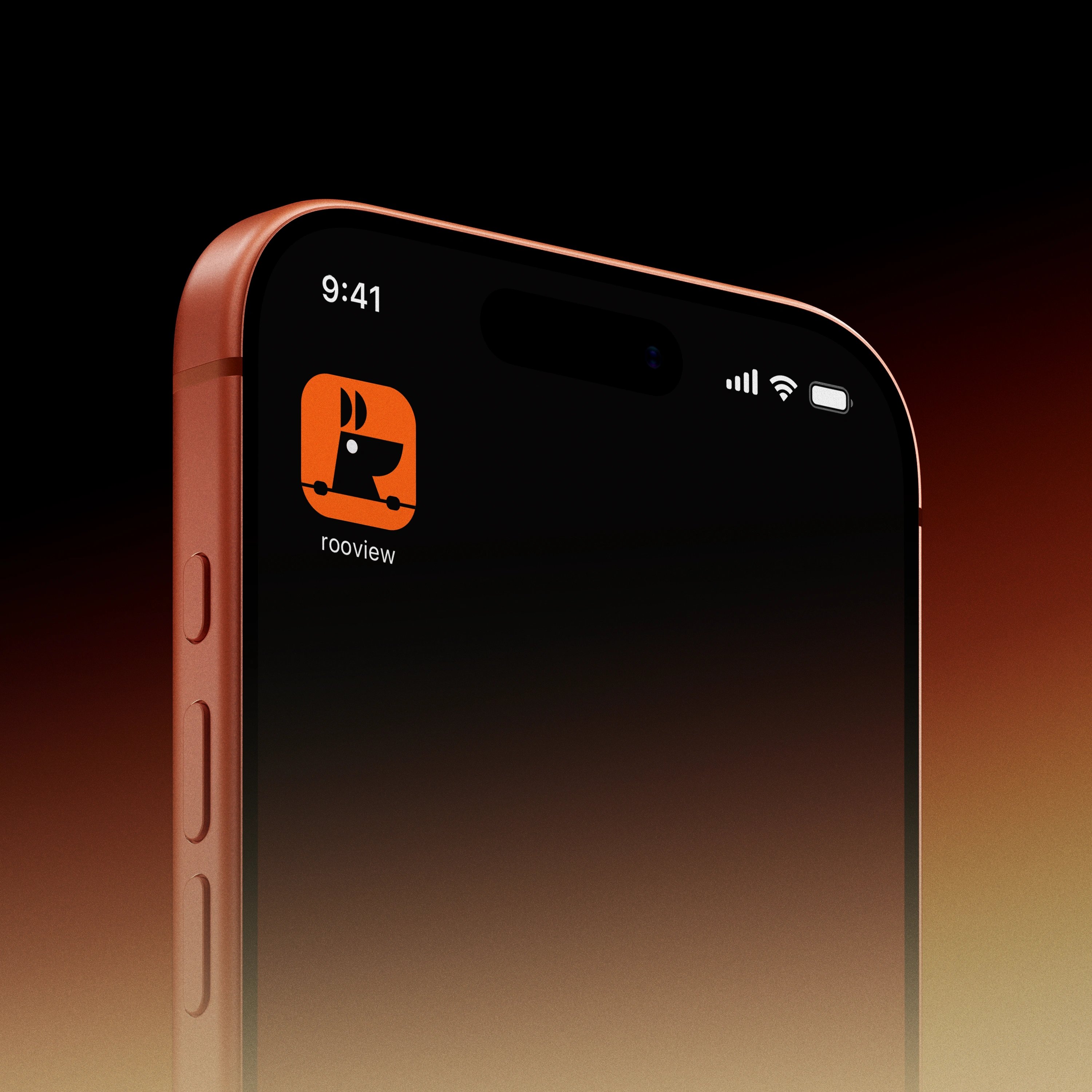
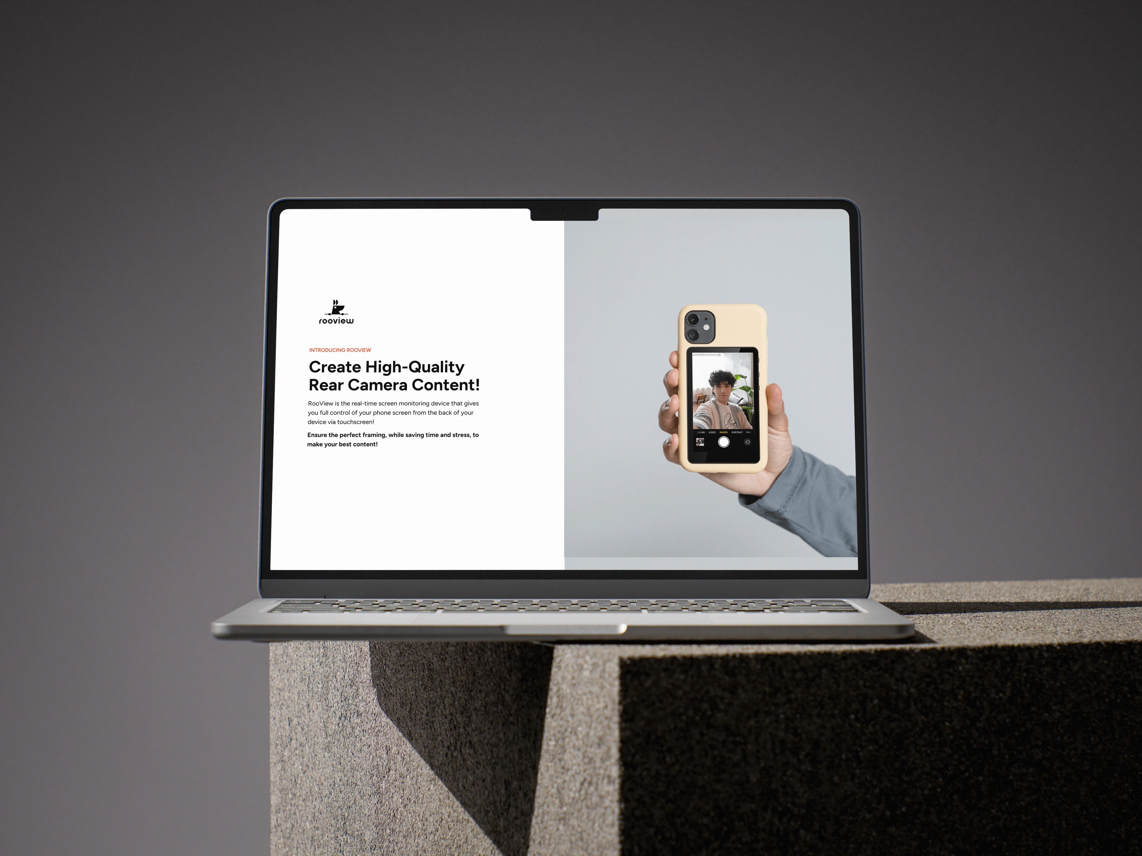
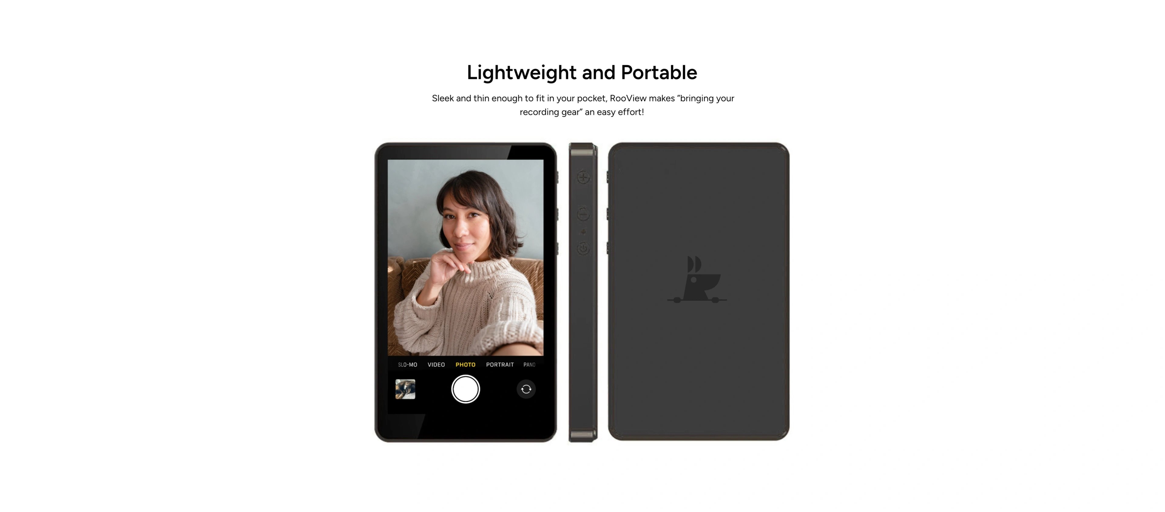
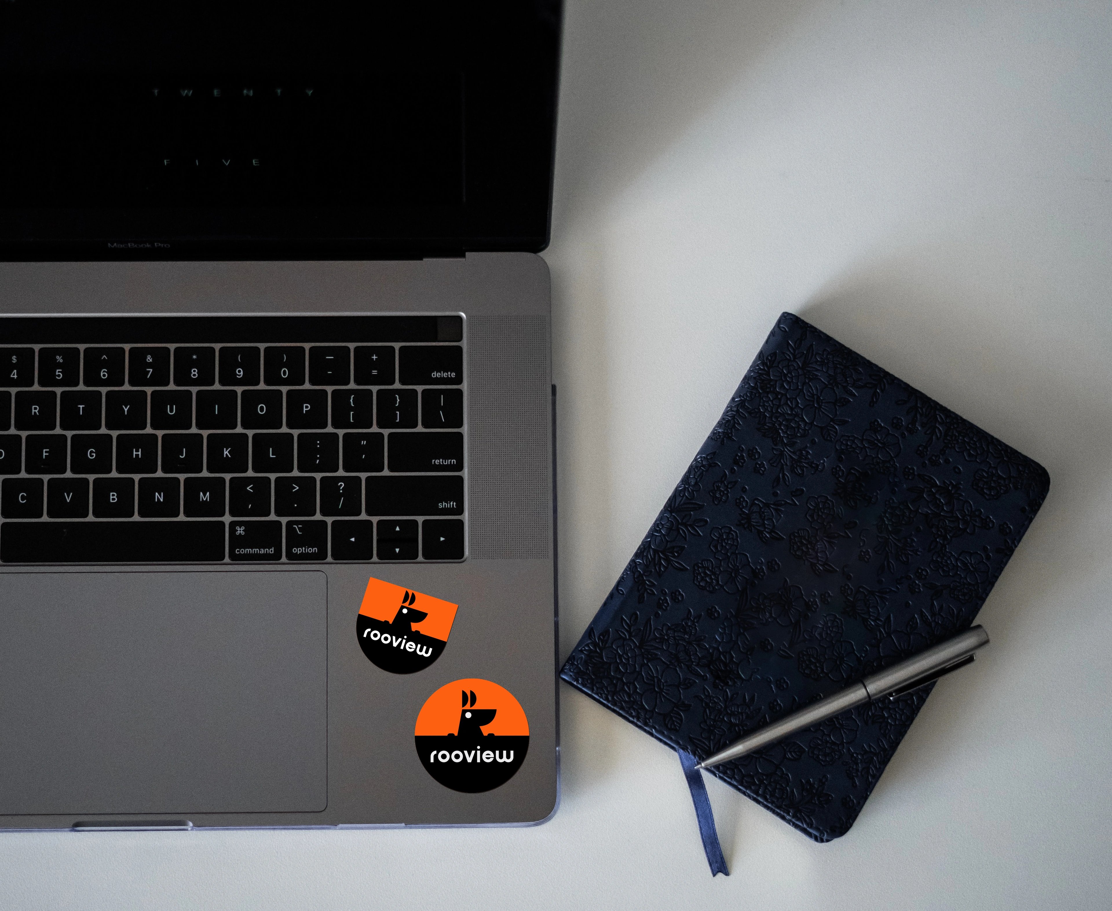
RooView makes a smart camera accessory that lets solo creators see their phone screen while filming with the rear camera. The name — "Roo" from kangaroo, "View" from the core function — points to both the product's form and its purpose. It's a creator-tech brand built for people who film alone and want real control over their frame, recording status and composition.
the challenge
RooView was introducing a new kind of accessory into a category split between cold, tech-spec brands and forgettable generic phone add-ons. It had to feel smart and reliable without losing the warmth that gets a creator to pick it up. The identity needed to explain the product in seconds and hold up across launch pages, reels, demos and creator content.
our solution
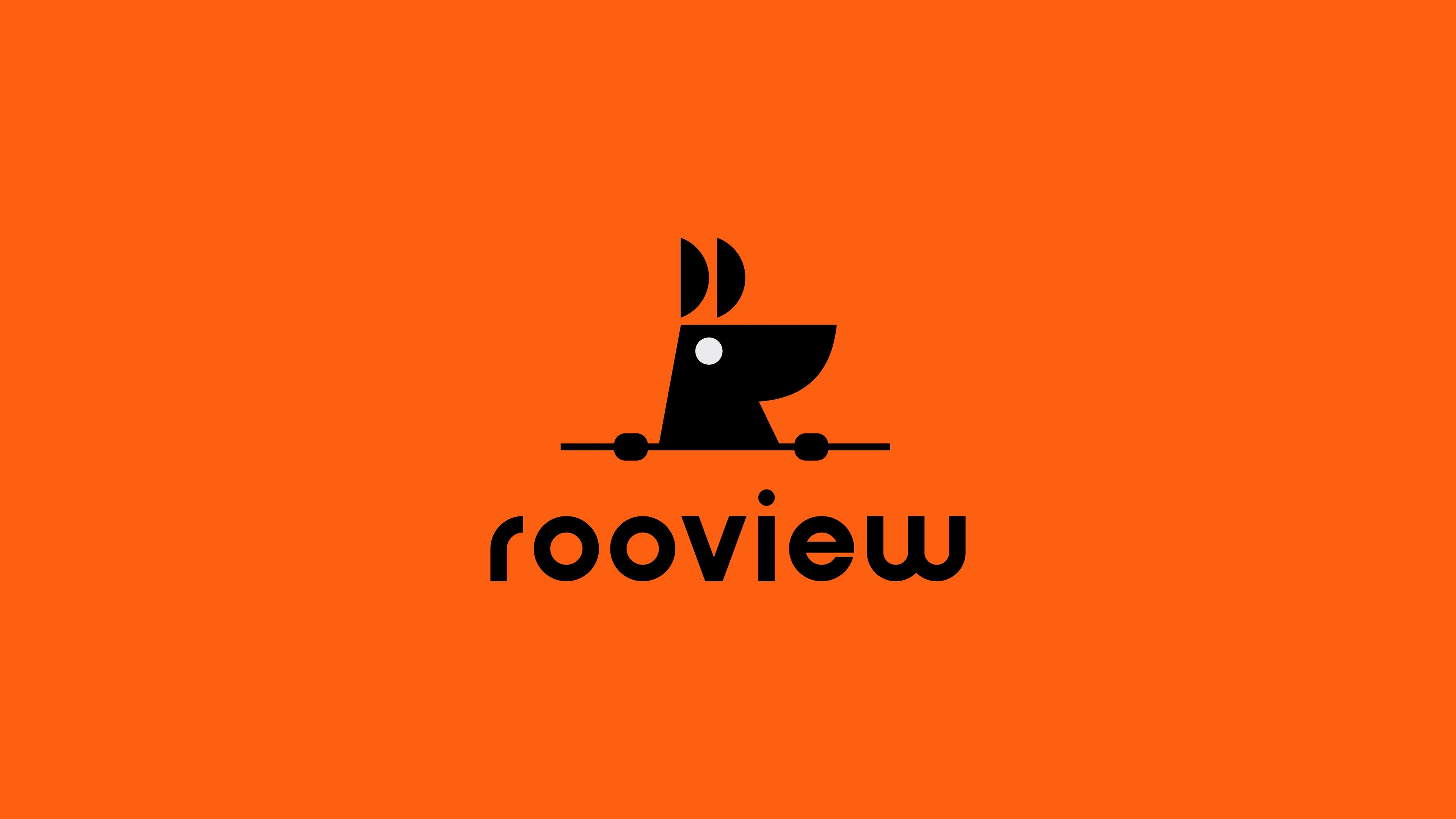
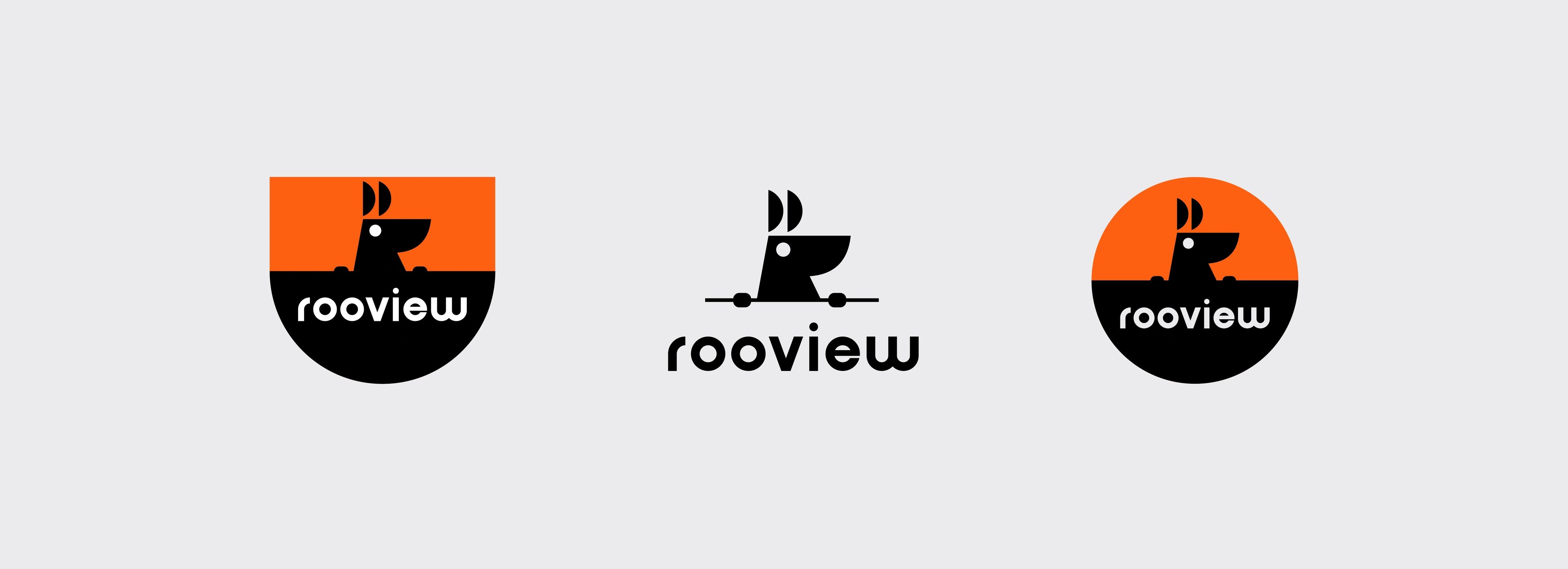
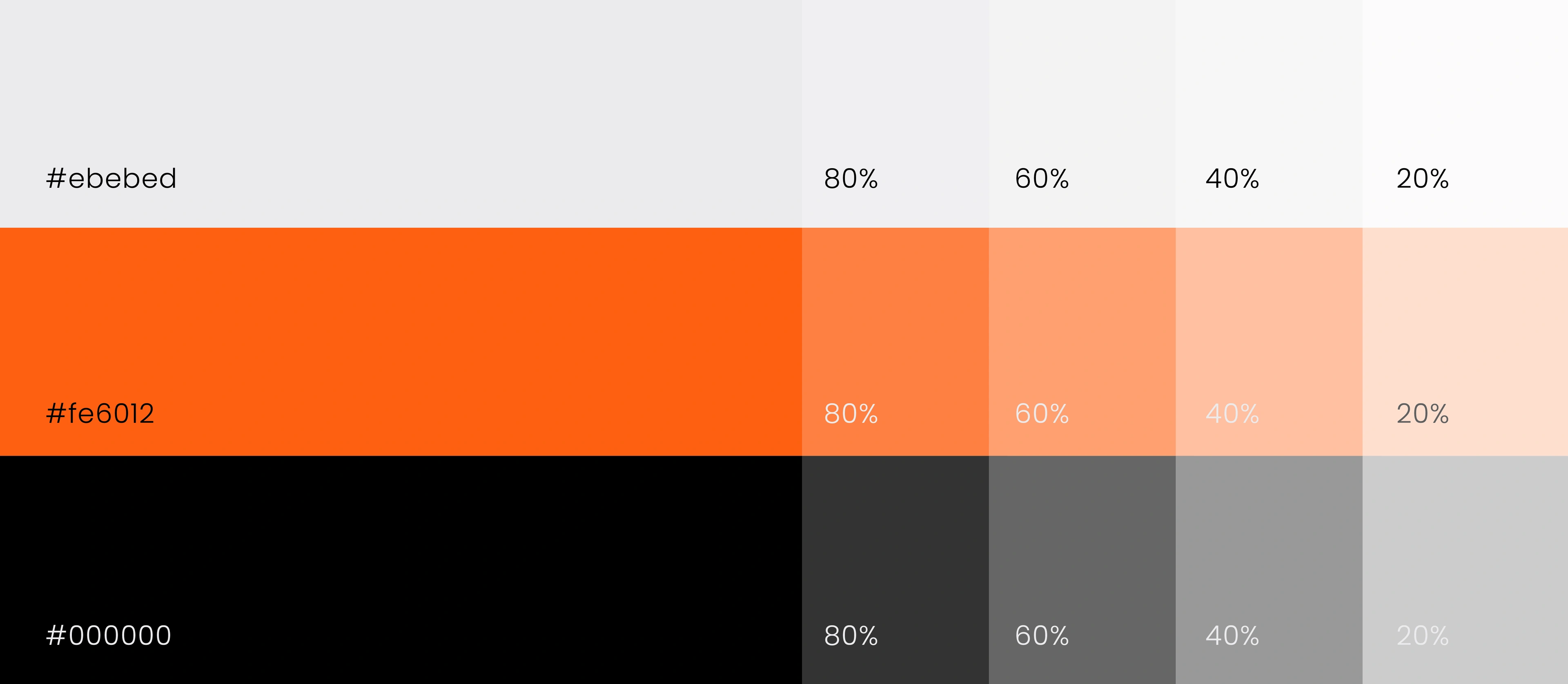
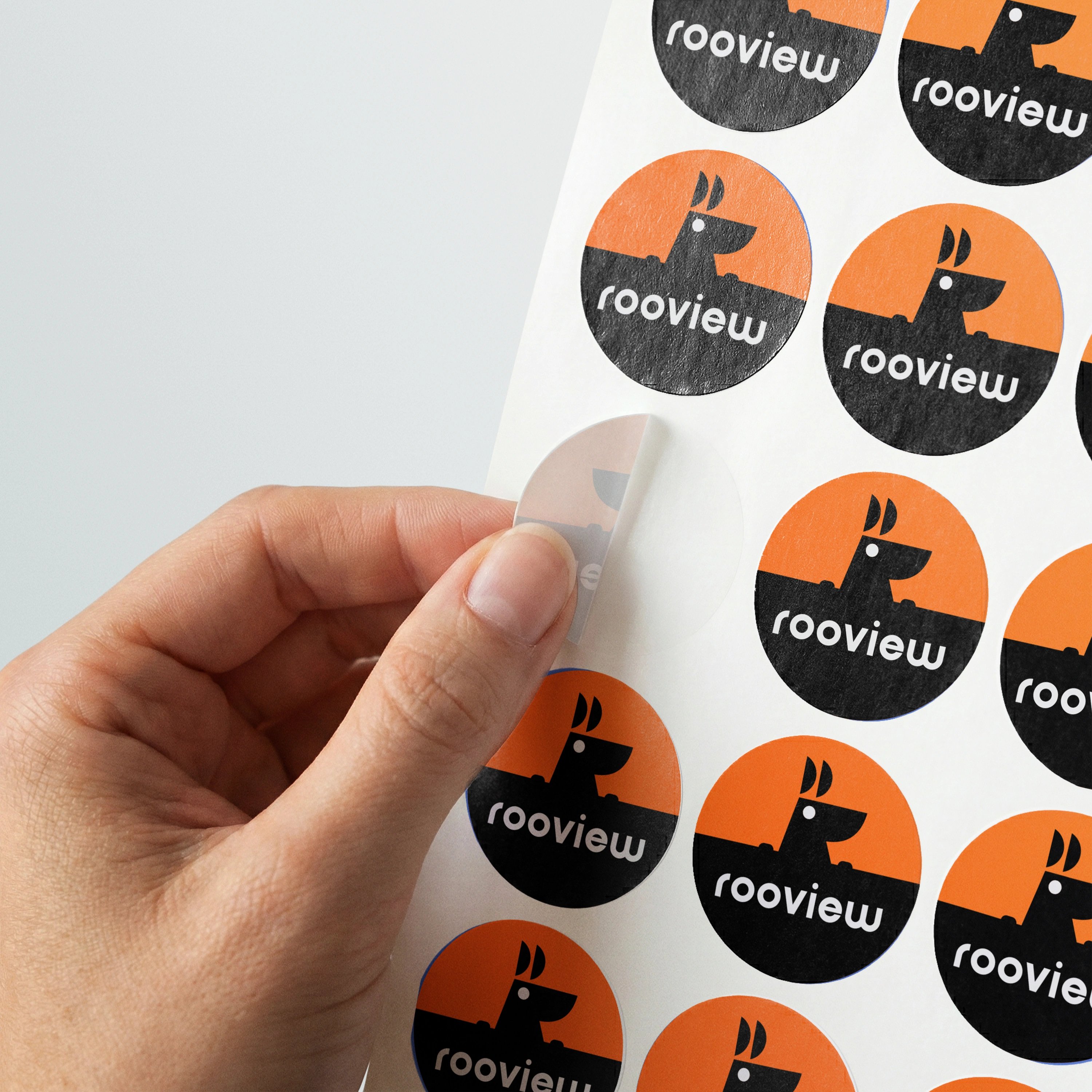
The accessory attaches to the phone in a way that reads as a small pouch — so the mark leans straight into that. A kangaroo character emerges from the pocket mid-view, turning the product's physical form into a single metaphor that names itself, explains the function and gives the brand a friendly mascot. Tech-accessory credibility comes from a clean silhouette, sharp contrast and a screen-like eye detail that reinforces the act of viewing. A rounded lowercase wordmark keeps the system approachable, while a bright orange, black and light grey palette gives it launch-day presence without sacrificing clarity.
a kangaroo-inspired identity for filming without the guesswork
the pocket became the pitch
The mark started with a simple read: the accessory sits on the phone like a small pouch. From there the kangaroo emerged — not as a literal illustration, but as a structural idea connecting name, form, function and mascot in one shape. The eye carries the "view" idea; the rounded silhouette keeps the brand creator-first; the orange-and-black palette gives it stopping power on social. The result is an identity that explains itself, holds memory, and gives RooView a clear lane on a crowded accessories shelf.
but wait, there’s more


ready tobegin?
tell us what you’re building. we read every message, reply within two working days, and only take on projects we know we can ship well.