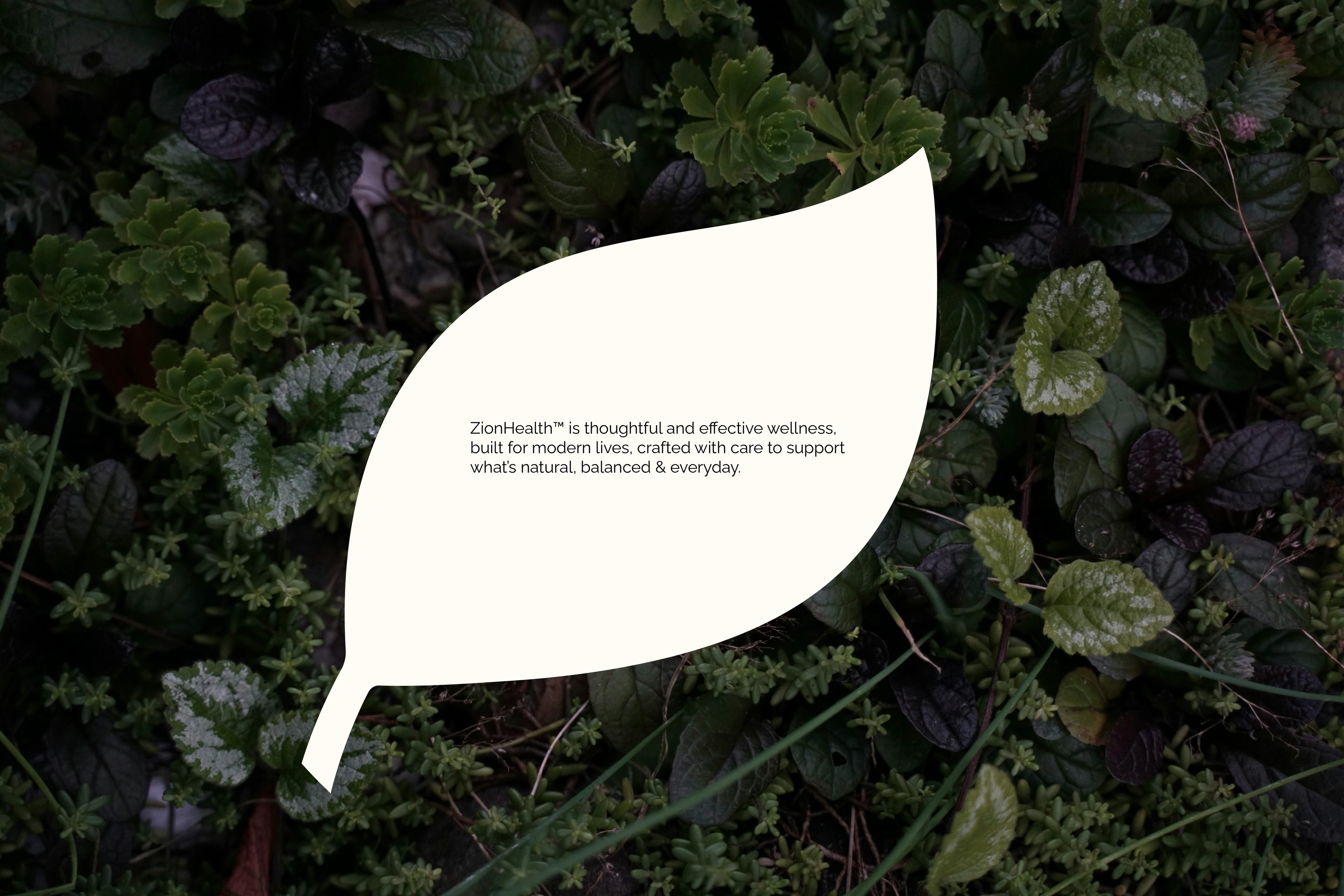
a wellness brand that finally feels as grounded as its ingredients
about the client
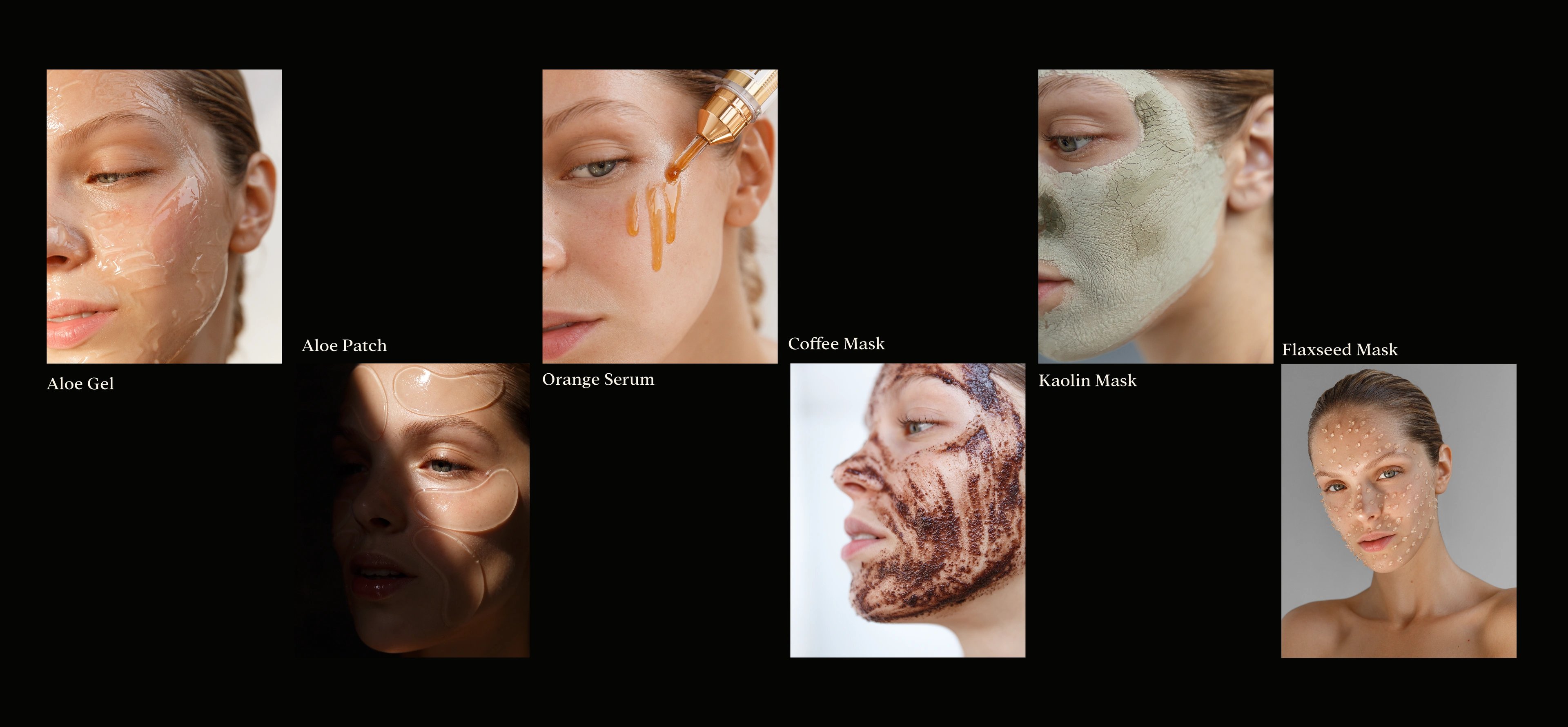
Zion Health is a clay-based wellness and personal-care brand built on a single promise: healing from the earth. Its range runs wide — deodorant, toothpaste, clay soaps, hair and body care, serums, treatments, and masks — yet every product traces back to one source: Kanwa Clay and calcium-montmorillonite minerals. The result is a brand where everyday care feels mineral-rich, gentle, and genuinely close to the ground it came from.
the challenge
Zion Health already had the hard part — a real ingredient story and products people trusted. What it lacked was structure. The old identity had drifted out of step with the modern wellness audience it was speaking to, and as the range grew, logo, colour, type, packaging, and imagery had no shared logic holding them together. The brief was the tricky kind: modernize the brand to feel cleaner, calmer, and more premium without spending the earth-rooted credibility it had already banked — and build a system flexible enough to carry every future launch.
our solution
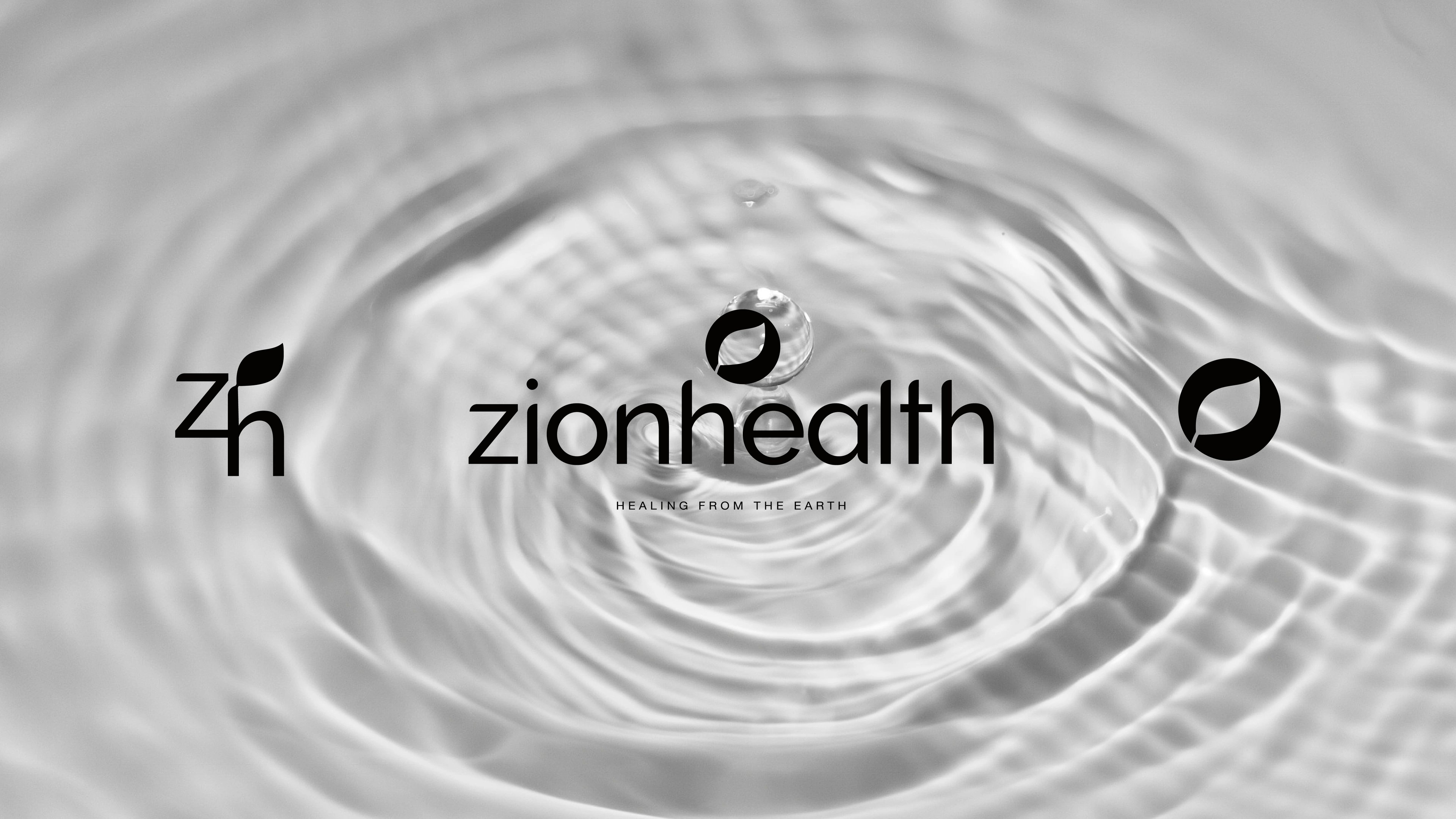
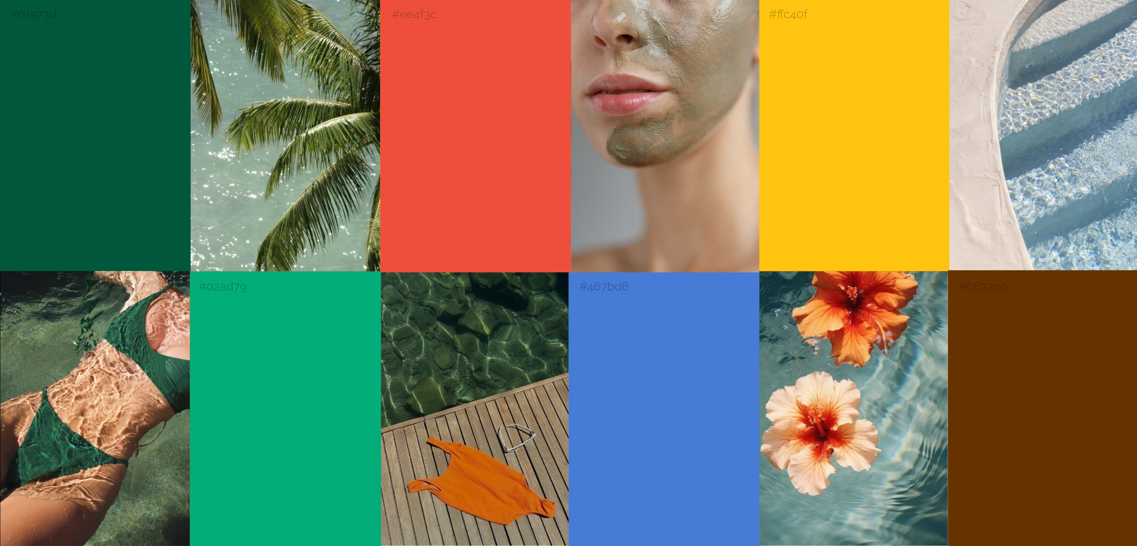
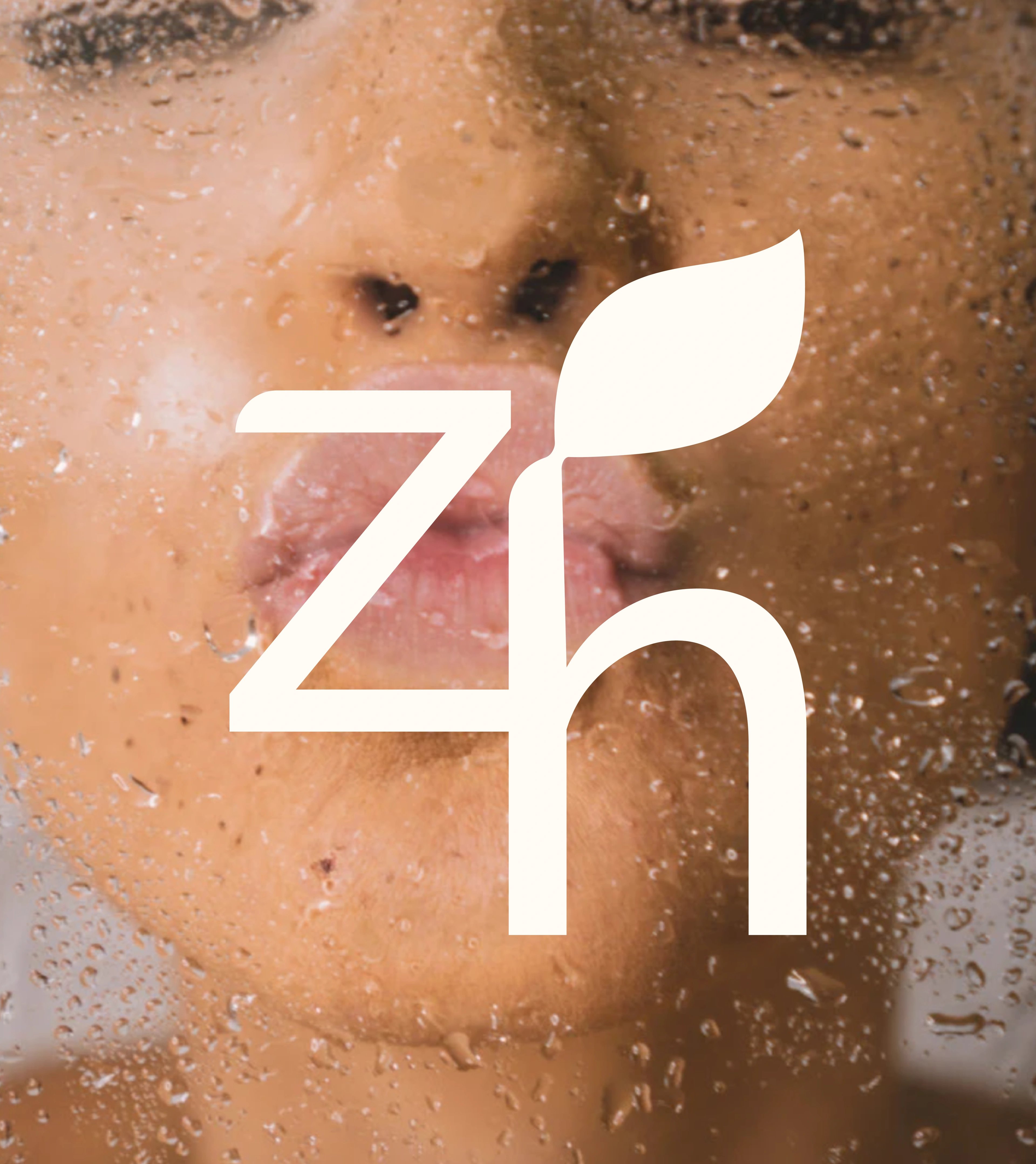
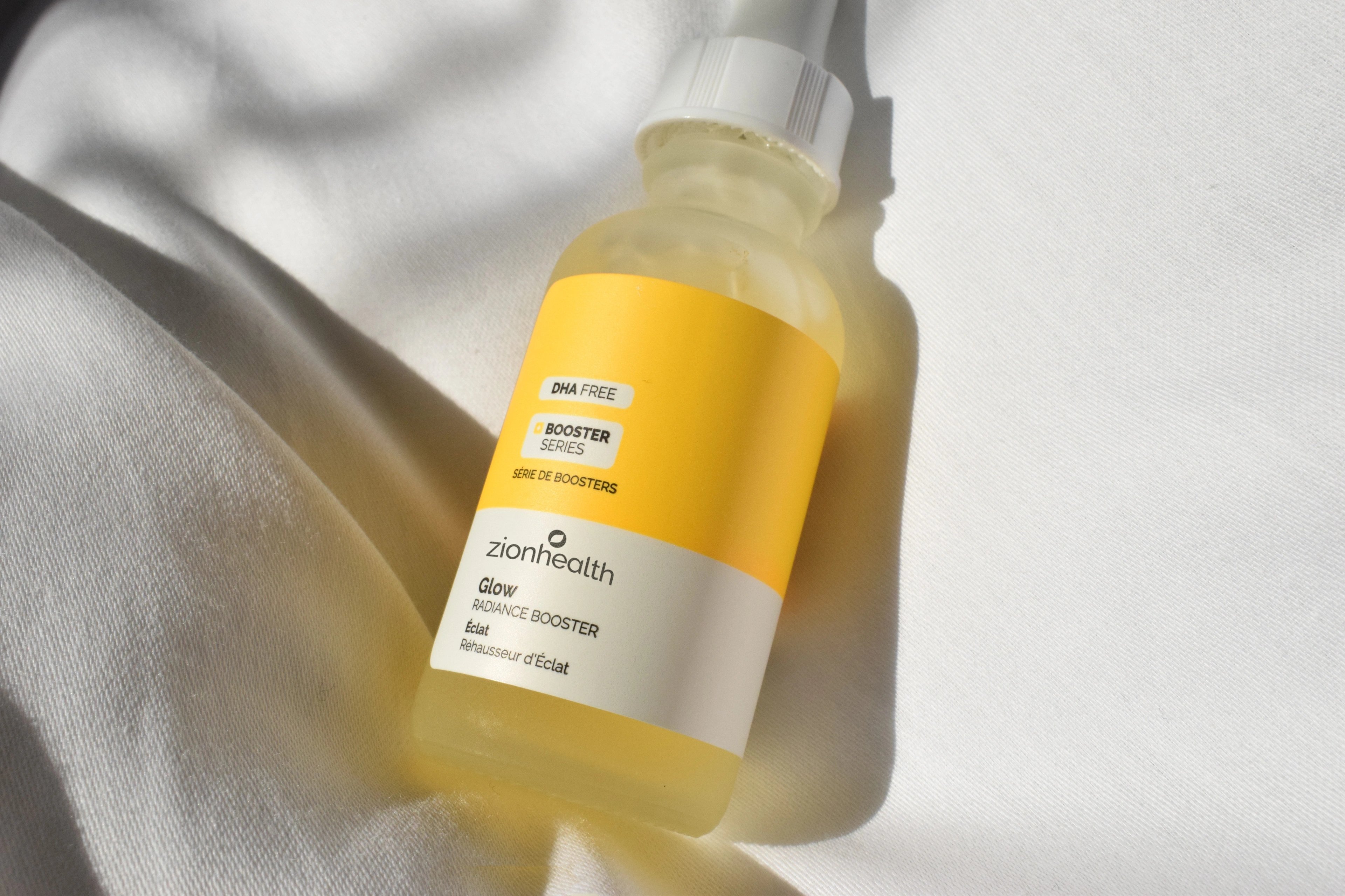
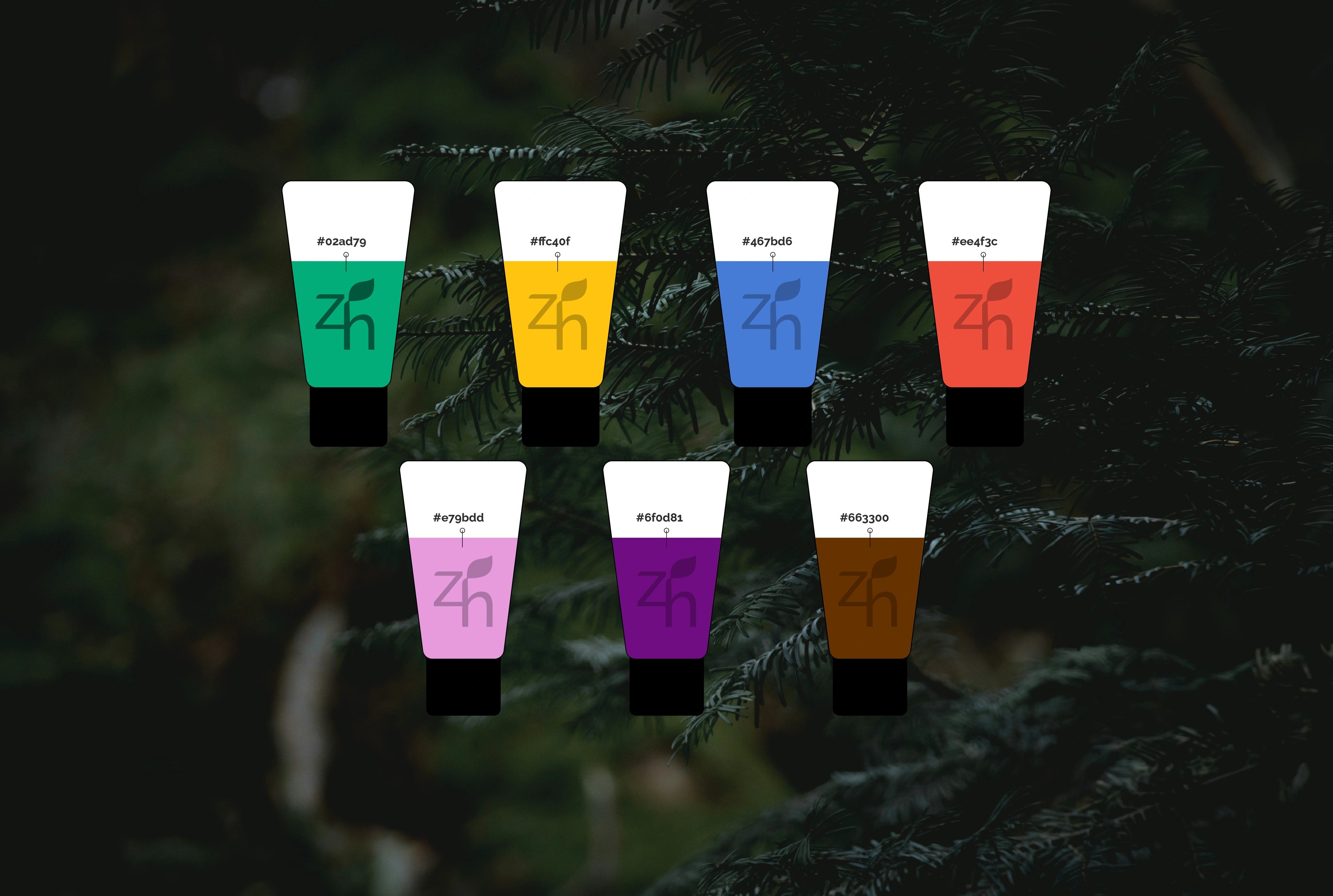
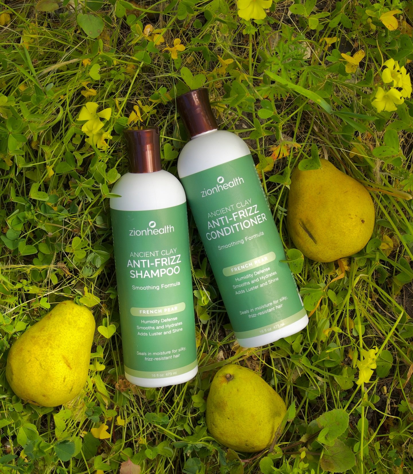
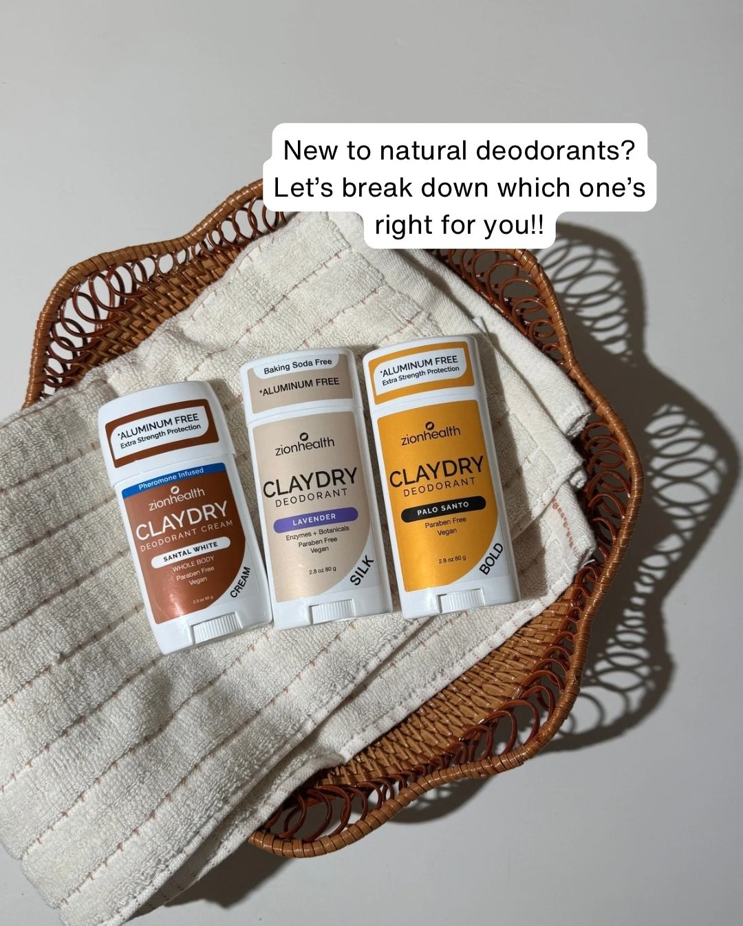
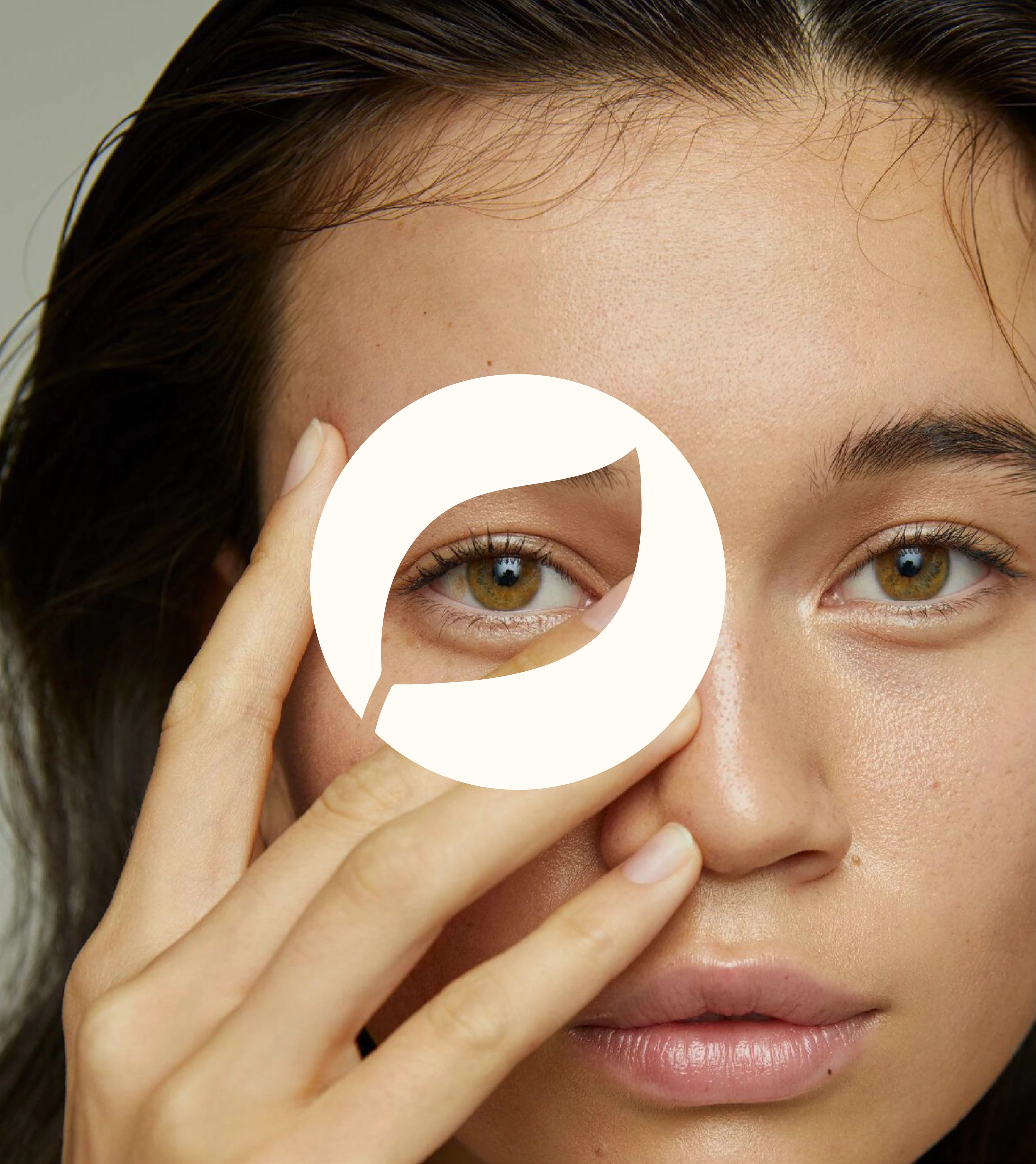
We rebuilt the identity around one organizing idea: a system calm enough to feel premium, flexible enough to stretch across a growing product universe. The wordmark dropped its old-school wellness look for a softer lowercase form, and the leaf became the central symbol — minimal, never decorative, an instant read on plant-based, earth-derived care. A 'zh' monogram handles the small touchpoints while a circular leaf mark works as a seal for icons, product graphics, and social. The palette pairs deep greens and earthy browns with brighter yellow, coral, blue, teal, and pink, so each product range reads distinct without breaking the family — and an imagery direction of close-up skin, clay textures, water, and botanicals builds a world that feels sensory and ingredient-led rather than clinical.
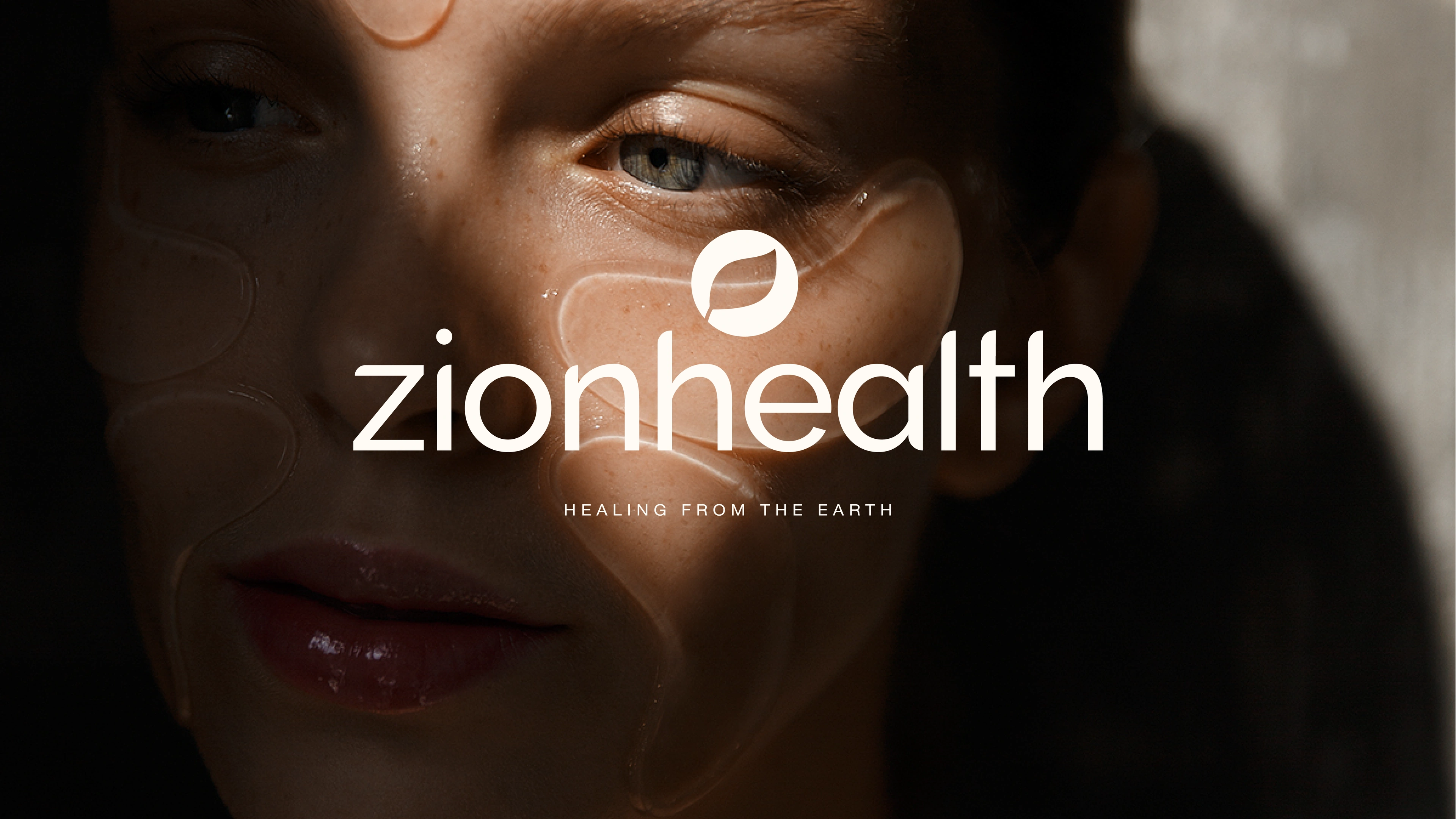
healing from the earth, refreshed
from scattered visuals to one wellness system
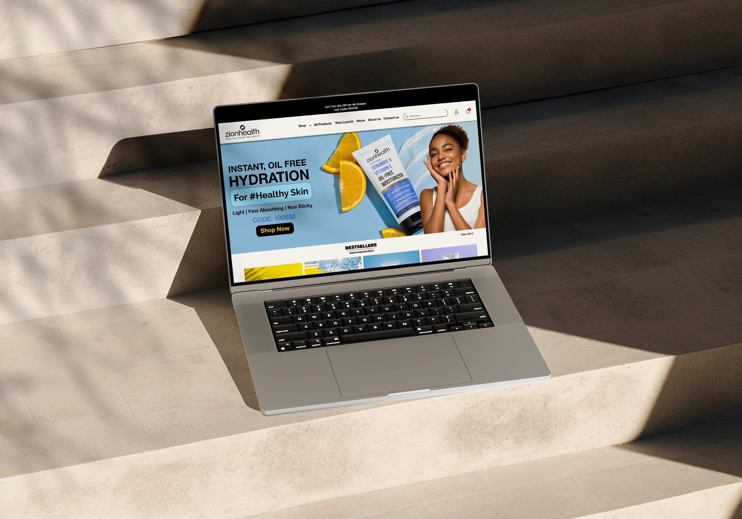
The real win wasn't a newer logo — it was clarity. Zion Health can now launch a product without treating it as a fresh design problem; the colour system, packaging hierarchy, and ecommerce visuals all draw from one language. That structure reads as trust on the shelf, polish on social, and confidence on the site. Earthy and fresh, natural and structured, established and current — the brand finally holds all of it at once.
the result
but wait, there’s more
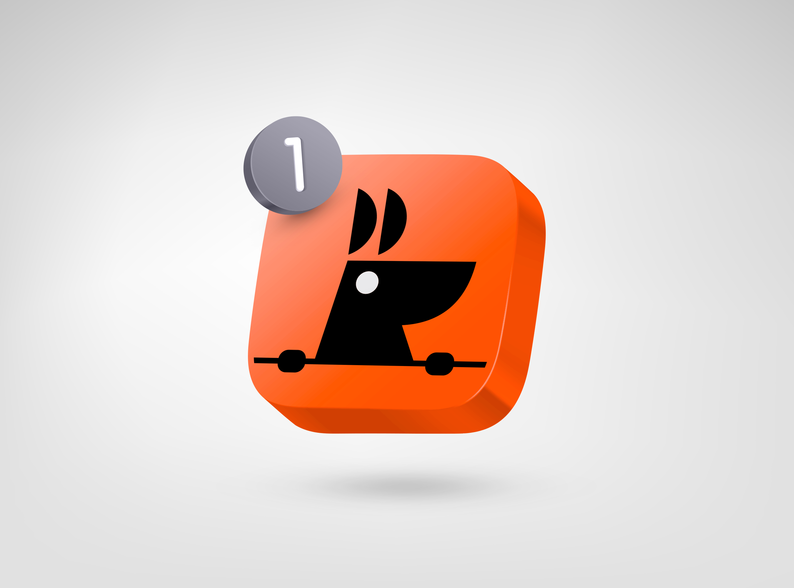
RooView
smart viewfinder accessory brand for solo content creators
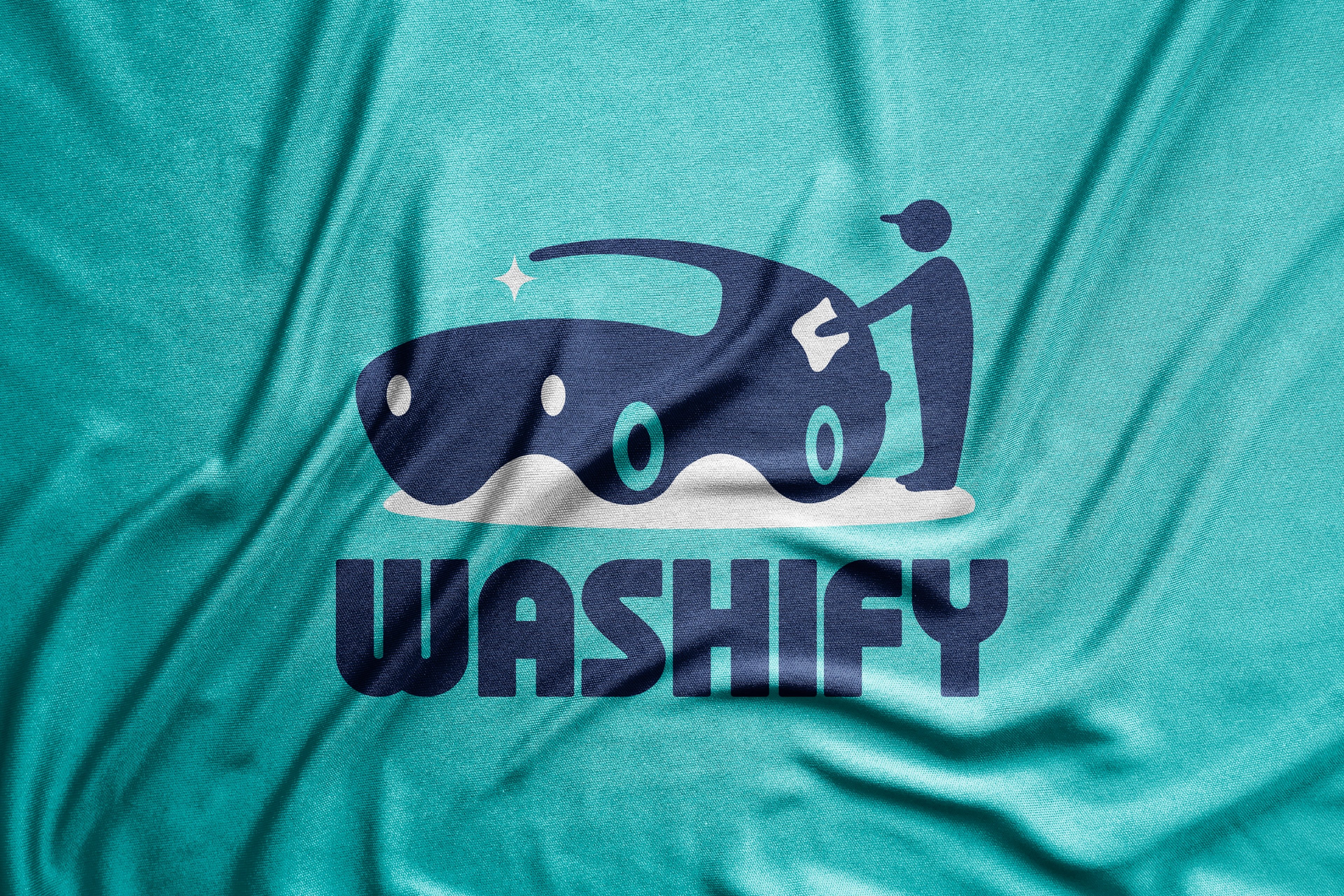
Washify
trust-led identity for a doorstep car-wash subscription
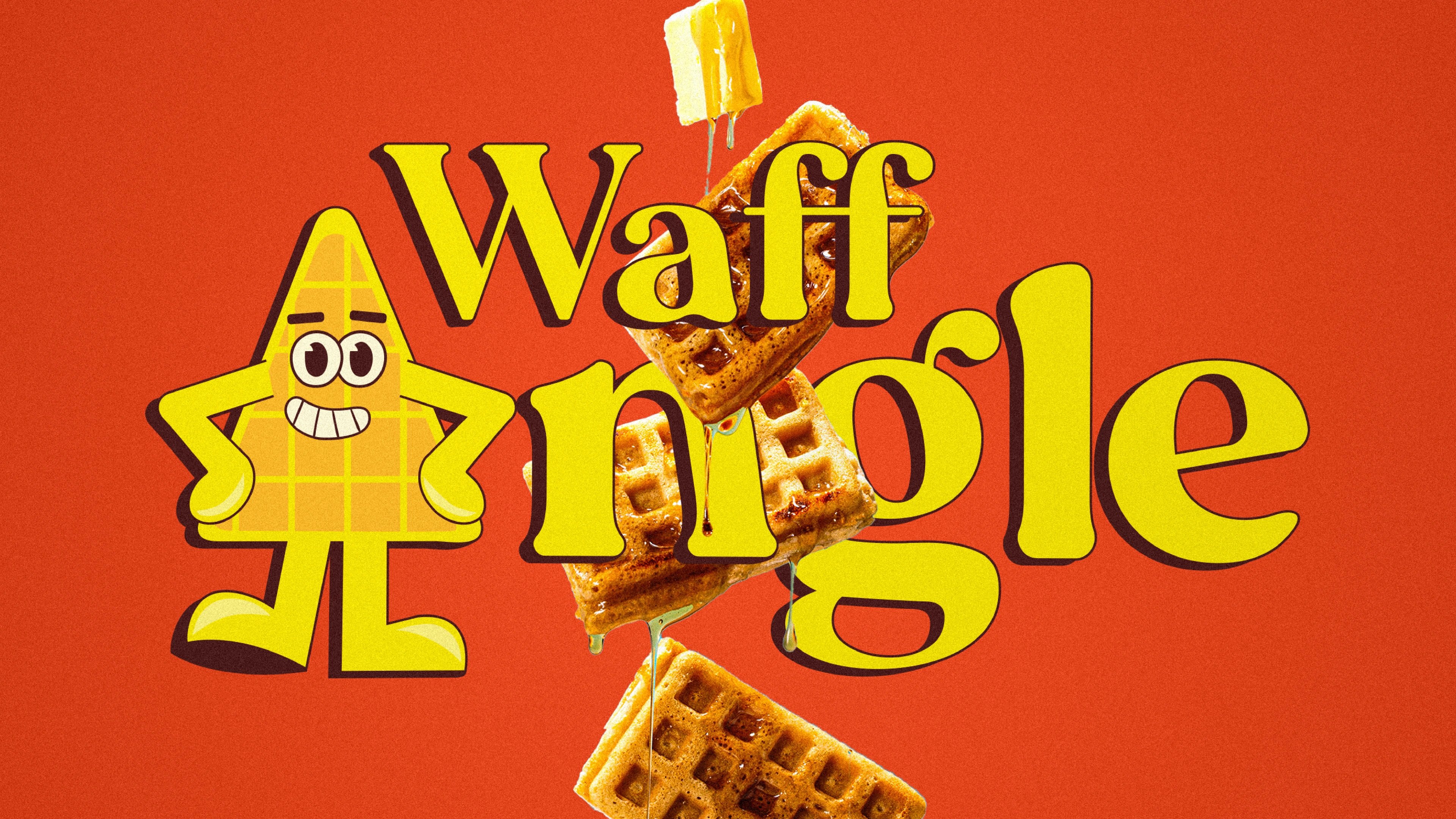
Waffangle
mascot-led identity and packaging for a bengaluru waffle brand
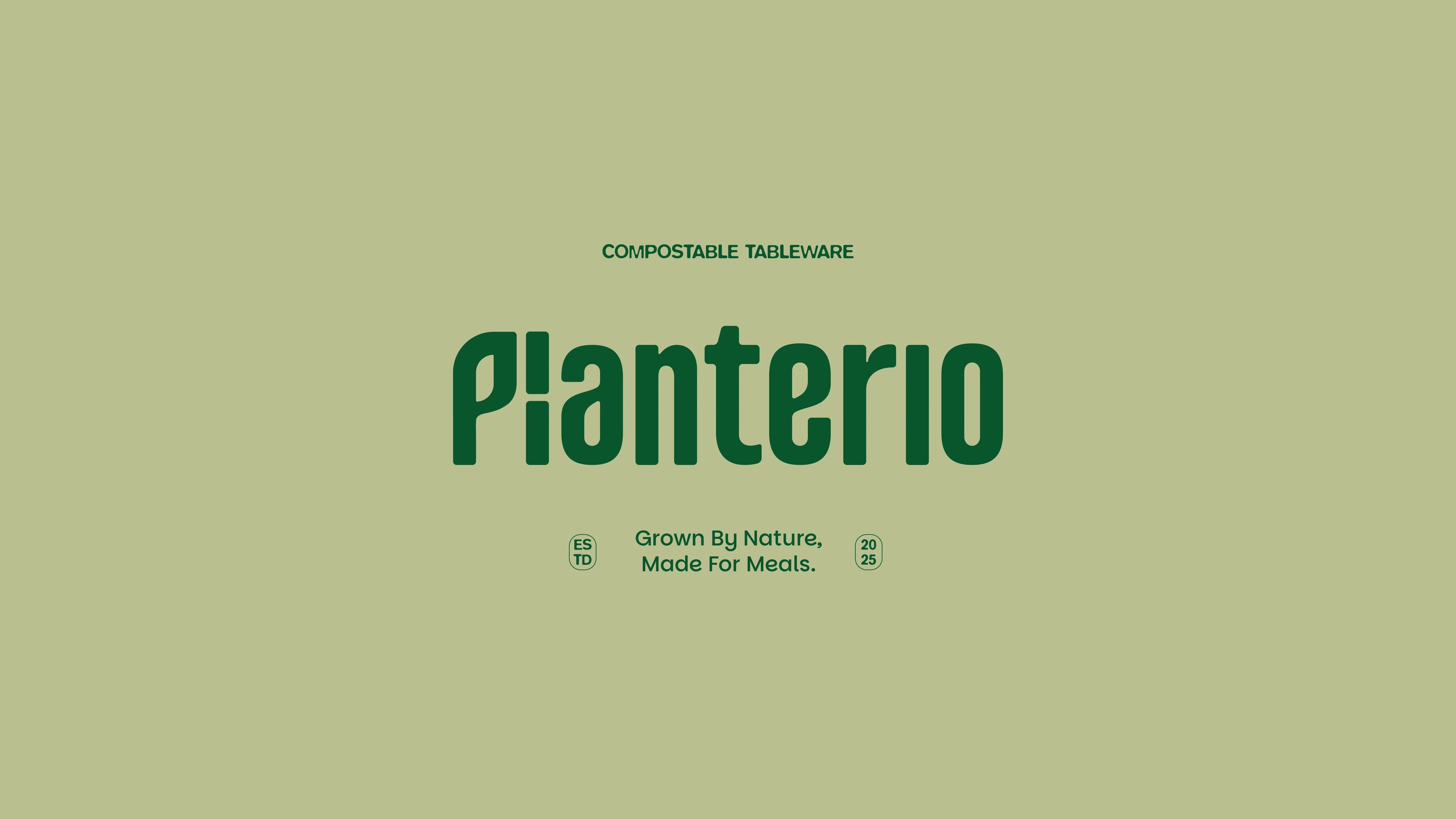
Planterio
identity for a plant-based tableware brand
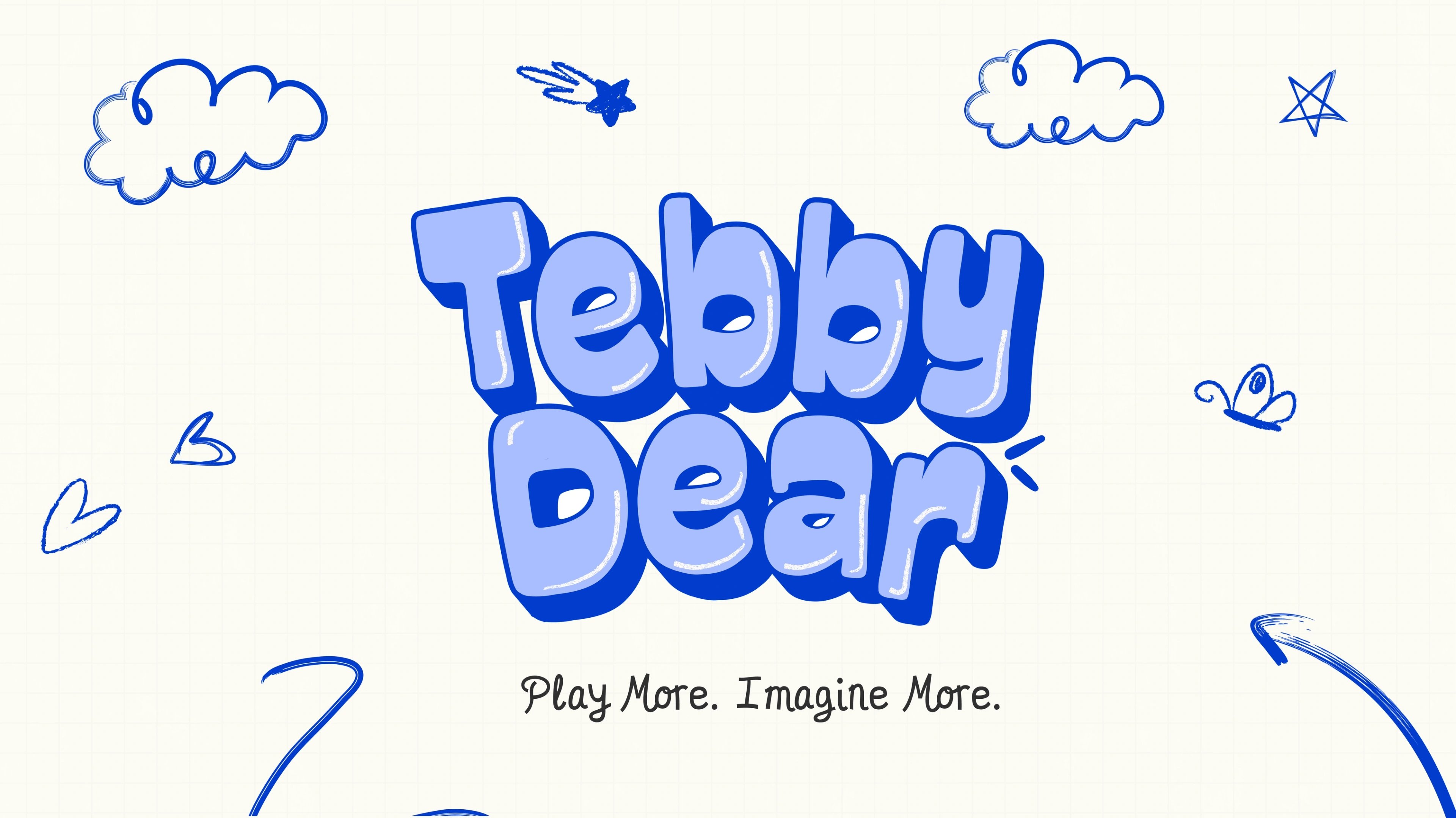
Tebby Dear
playful packaging for a US kids' toy brand
ready tobegin?
tell us what you’re building. we read every message, reply within two working days, and only take on projects we know we can ship well.