The Great Bellingrath Harvest
a harvest festival with a flower at its centre
about the client
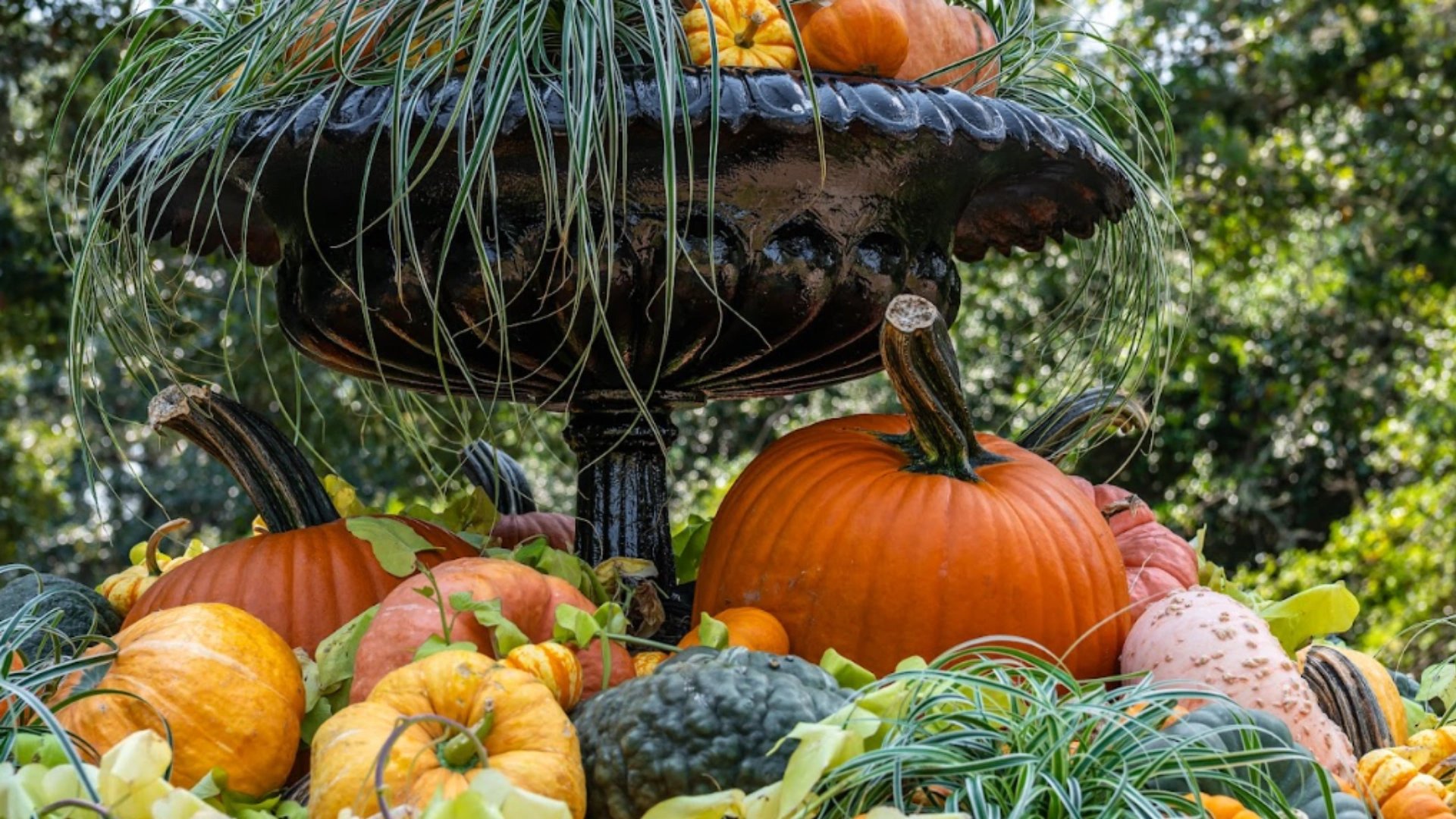
Bellingrath Gardens and Home is a historic garden estate in Alabama, known for its seasonal displays, events and floral spectacle. The Great Bellingrath Harvest is its fall festival — pumpkins, plant markets, garden walks and family activities staged across the grounds each autumn.
the challenge
The festival had to feel festive, seasonal and garden-led without tipping into childish or generic. It also spans many experiences at once — plants, pumpkins, flowers, gift-shop moments, photo displays — so the identity needed to flex across very different touchpoints while still reading as one festival world.
our solution
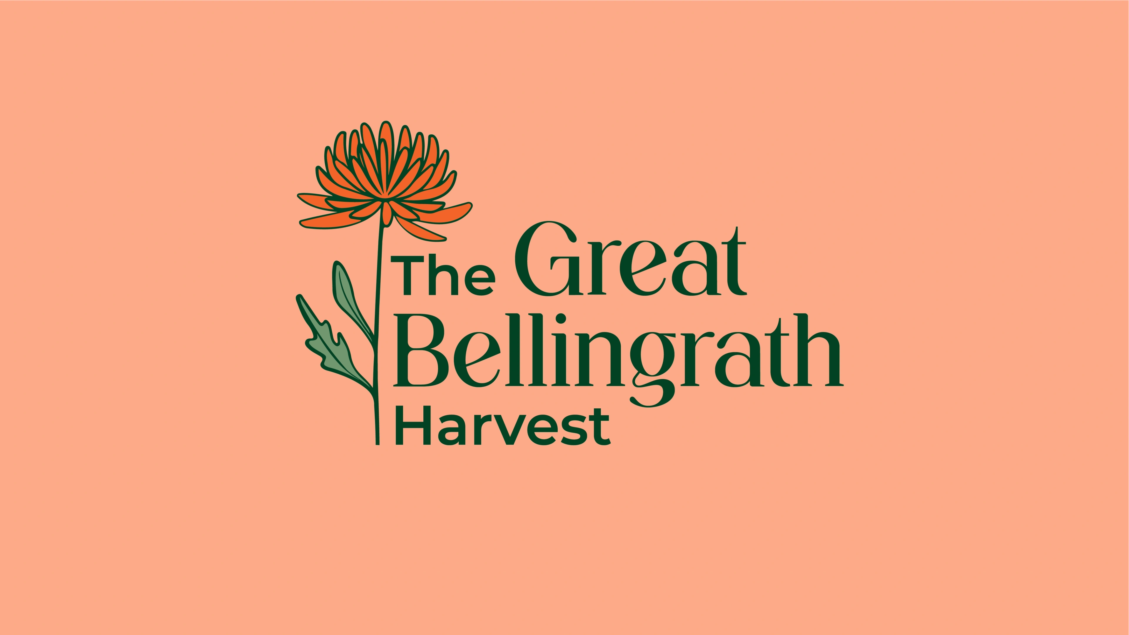
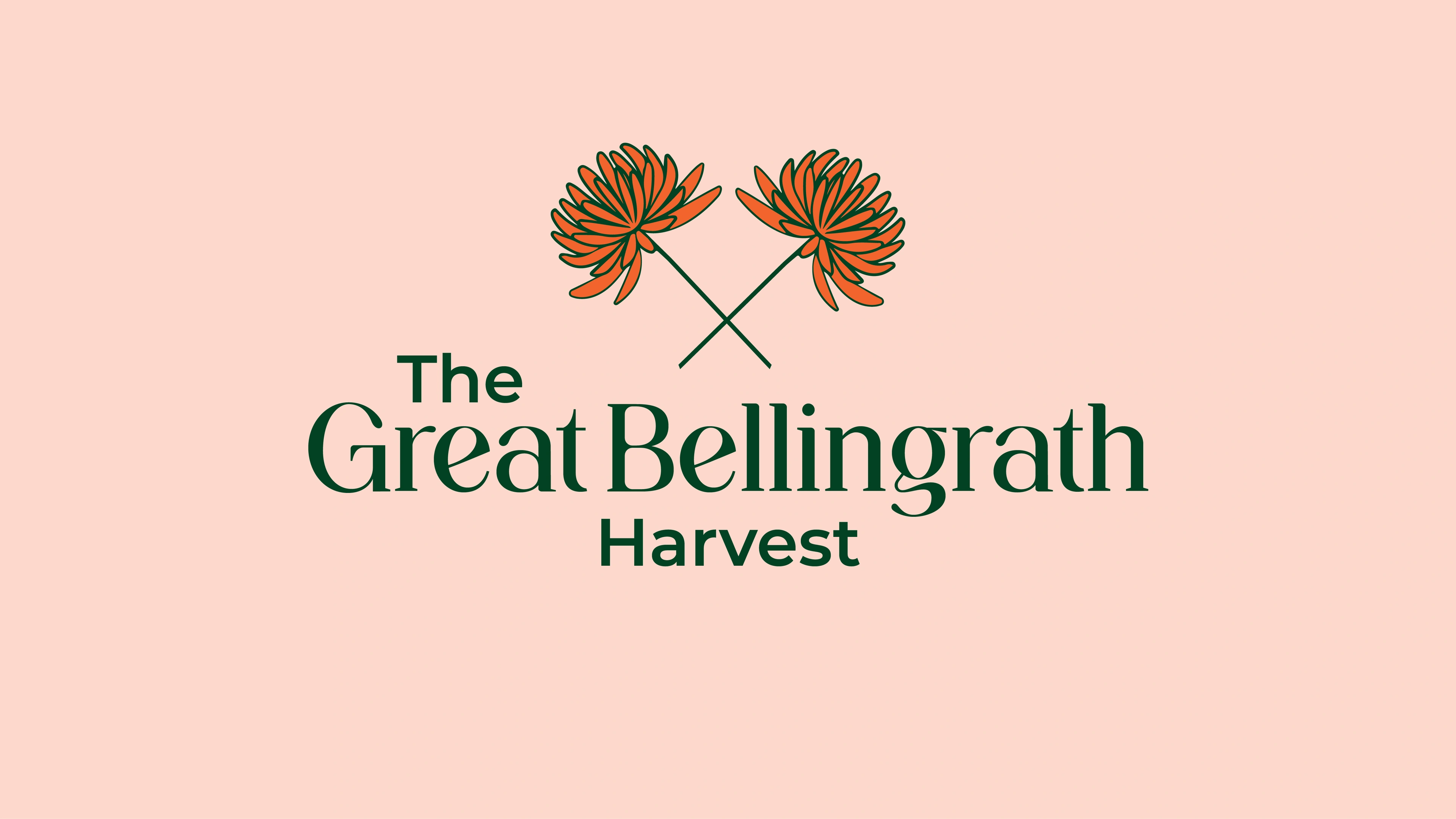
We built a complete festival identity around the warmth of fall. The palette leans on tangerine, garden green and deep reds drawn from pumpkins, foliage and harvest light. A serif-led wordmark gives the event a classic, estate feel, while the logo mark — an orange, many-petalled flower — ties the festival back to the gardens themselves. Together they make a tone that is joyful, warm and unmistakably ownable.
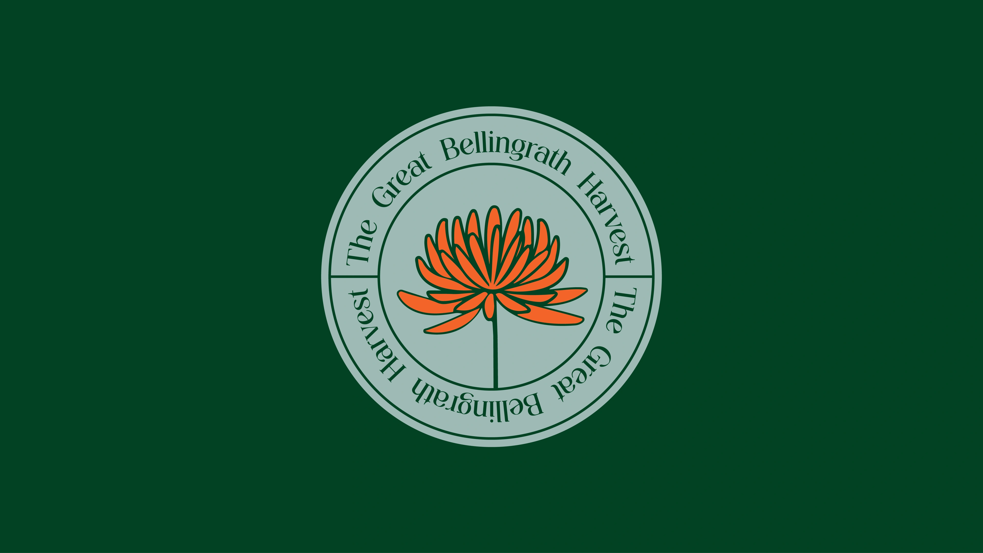


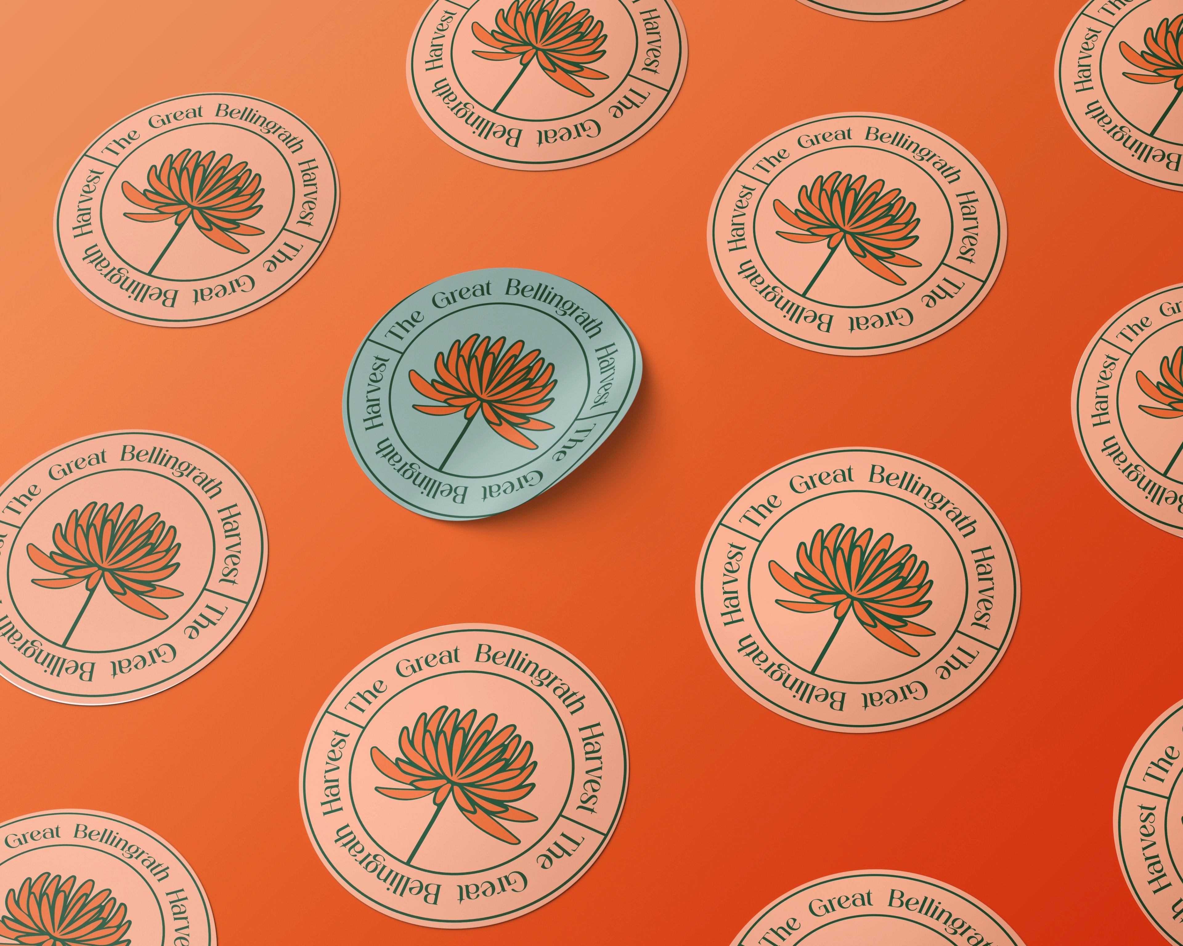
one flower to hold the season together
The flower mark does the heavy lifting. It scales from a tiny submark badge to a full tiled pattern, carrying the festival across digital promotion, event comms and on-ground collateral without losing its character. The serif wordmark keeps everything grounded in the garden's heritage. The result is a season that finally looks like one thing — branded, cohesive and easy to recognise — while staying true to the garden's floral, festive, family-friendly spirit.
but wait, there’s more


ready tobegin?
tell us what you’re building. we read every message, reply within two working days, and only take on projects we know we can ship well.