sustainability built into the letterforms, not bolted on beside them.
about the client
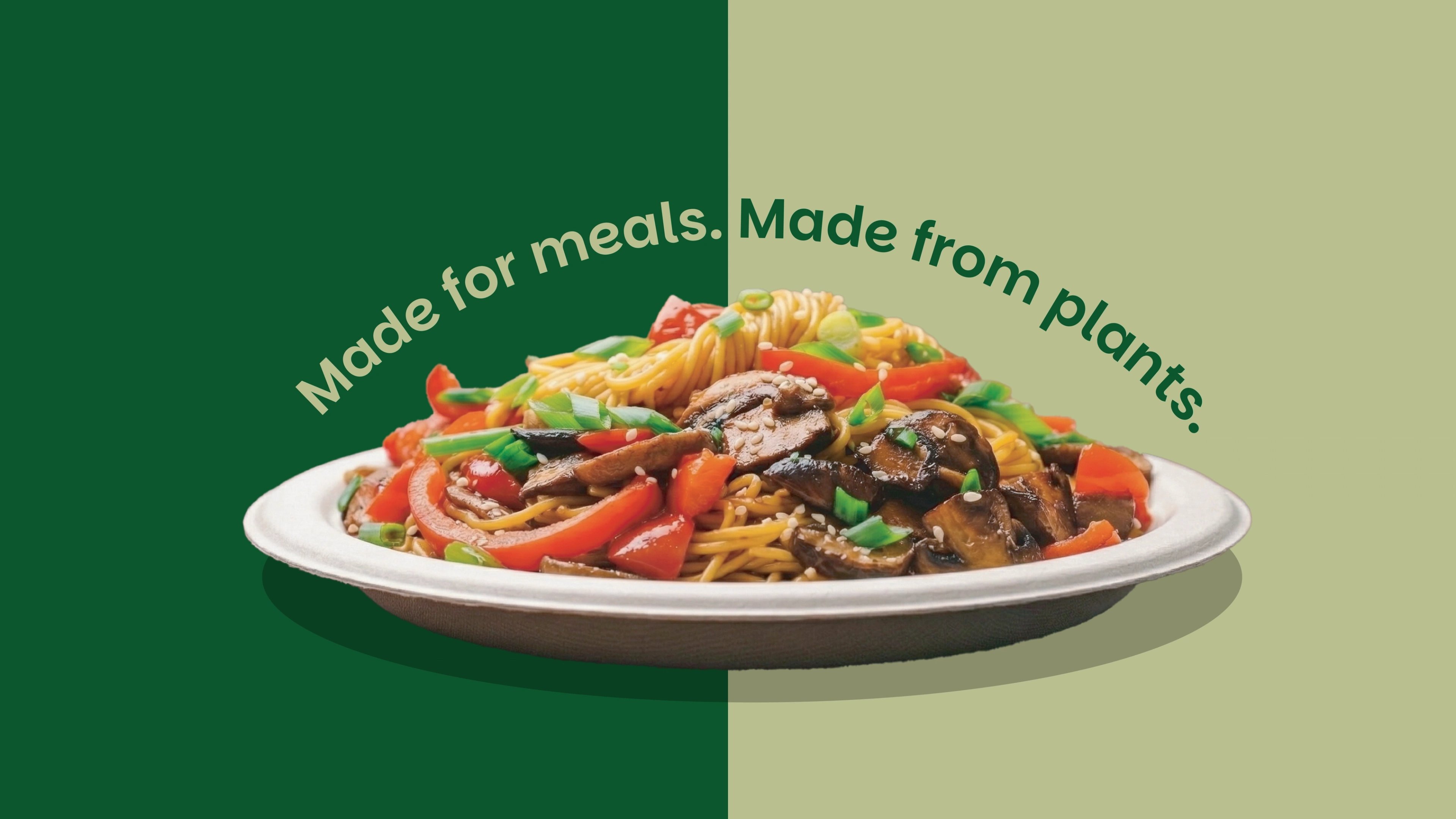
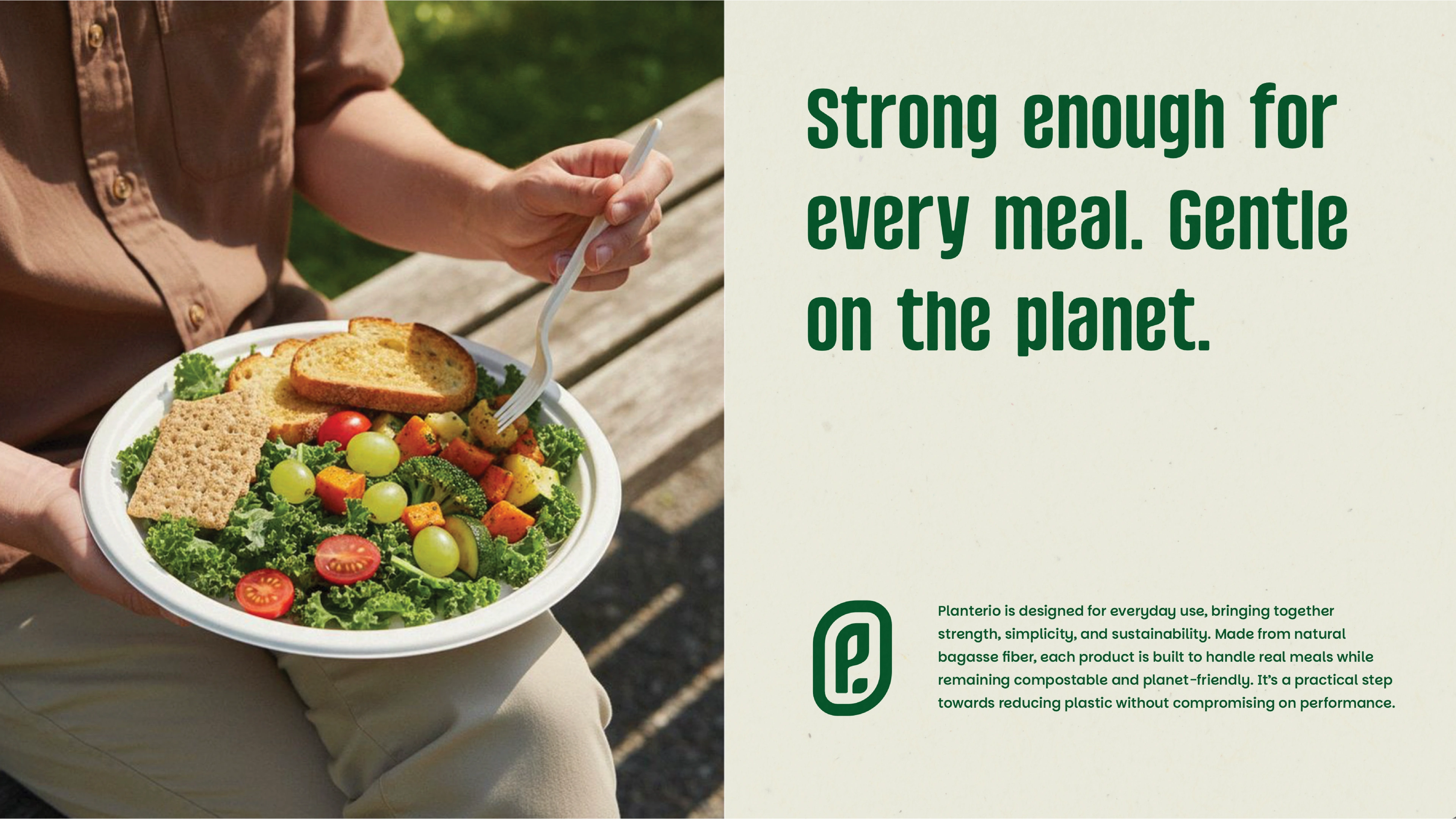
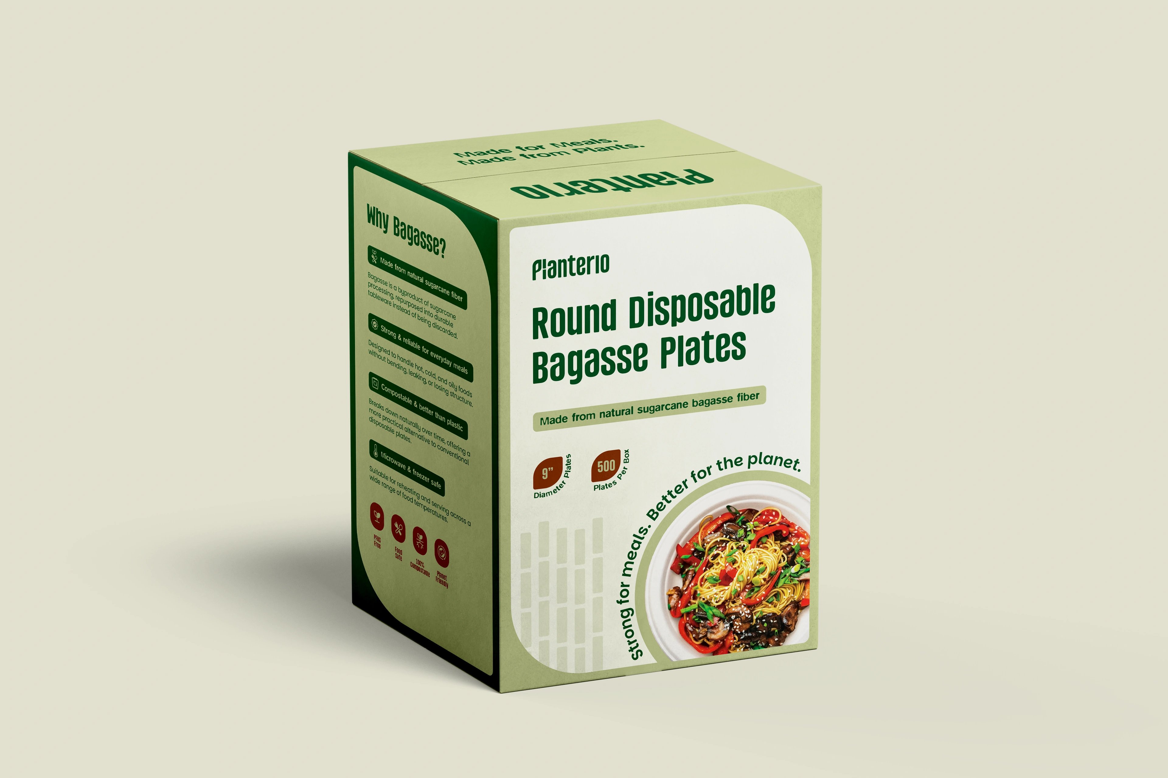
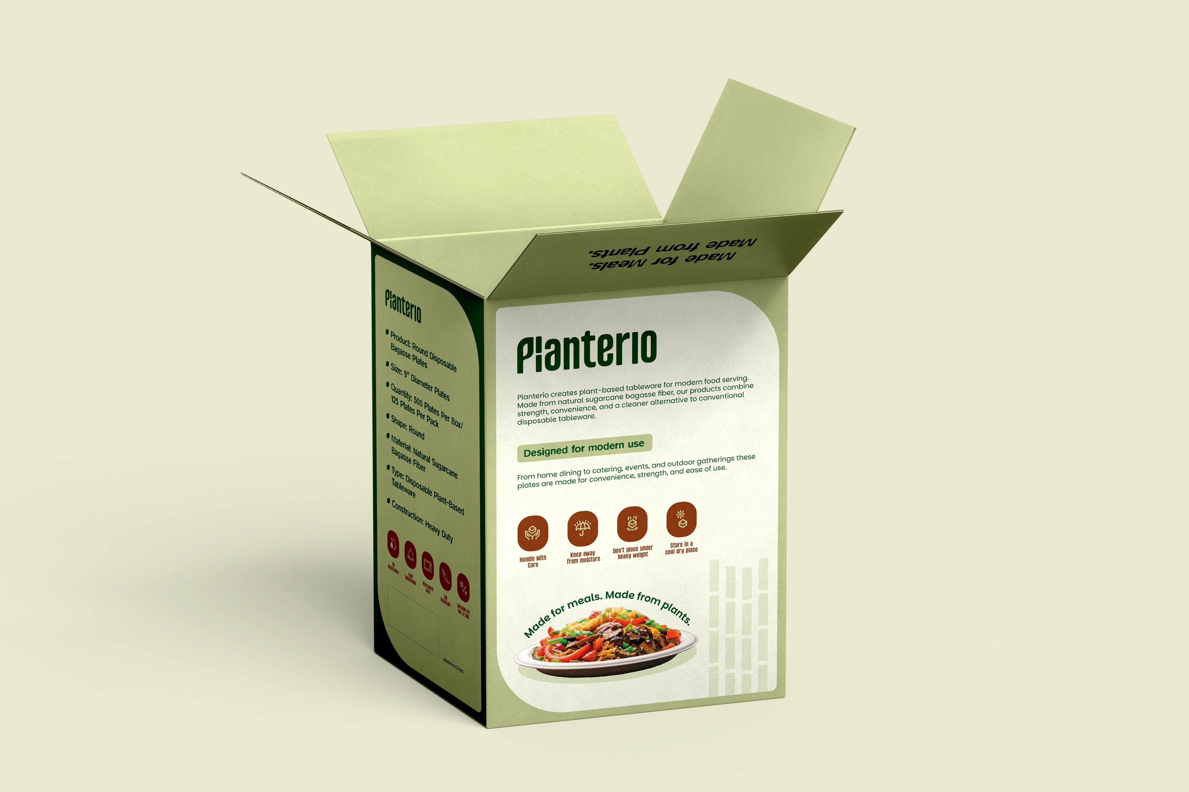
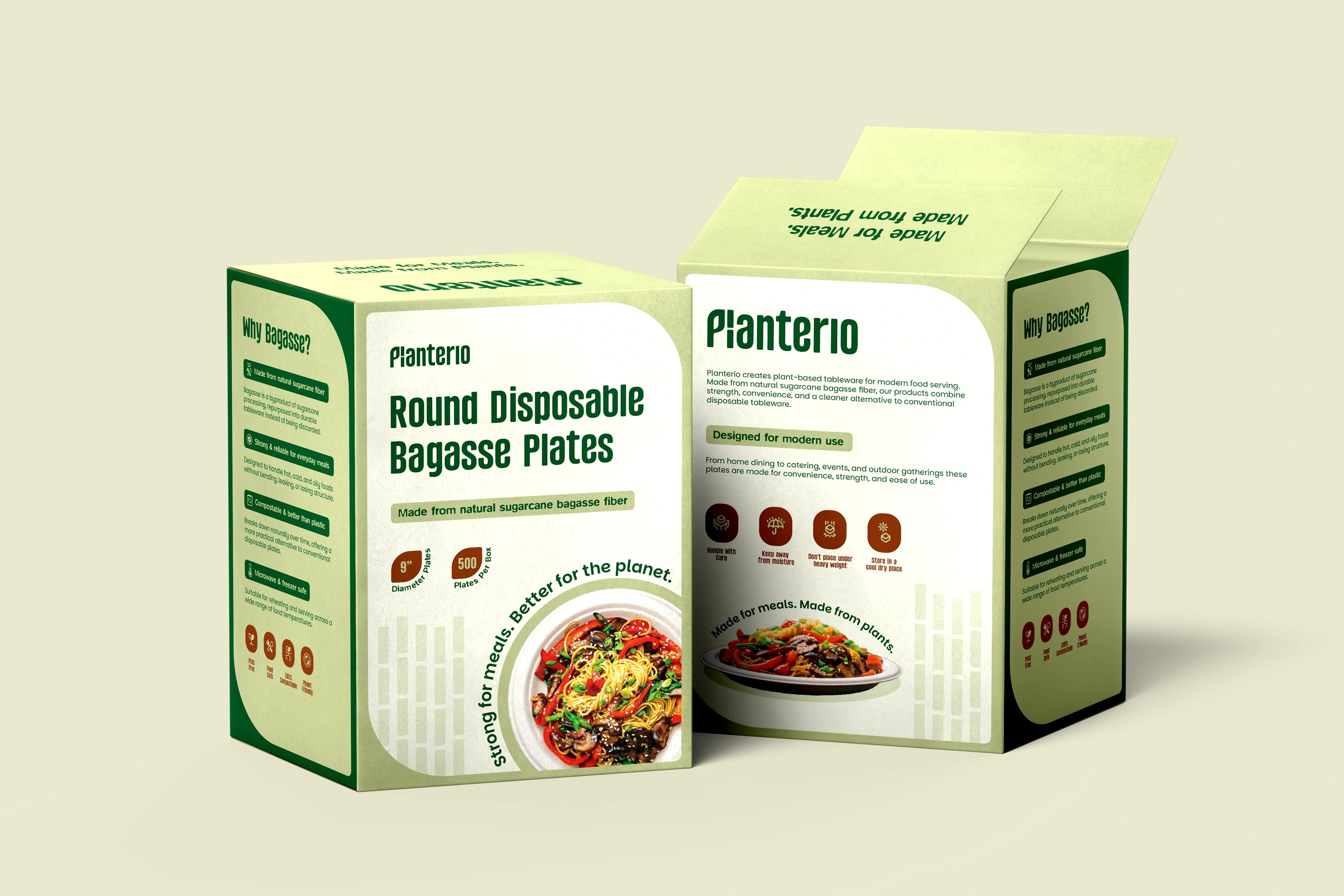
Planterio is a plant-based tableware brand built on a simple idea: everyday foodware that's better for people and the planet. Made from natural sugarcane bagasse, it offers a sustainable alternative to disposable tableware without giving up the strength and convenience food service needs. The goal was never just to sell eco-products — it was to build a lifestyle brand that makes the sustainable choice feel easy and trustworthy.
the challenge
The sustainable-tableware market mostly looks and sounds the same — generic green cues, leaf clip-art, interchangeable claims. Planterio had to read as sustainable instantly while staying commercially sharp and easy to understand, and the identity had to scale across packaging, collateral, future product lines and retail. The real problem was distinction: standing out in a category that all blurs together.
our solution
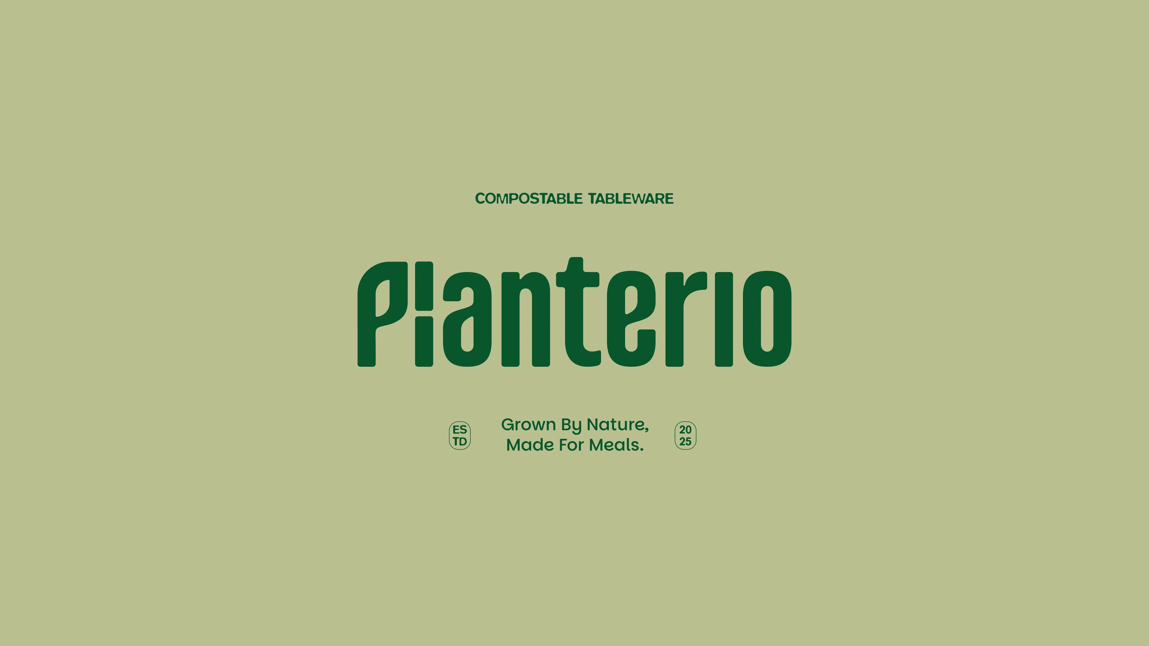
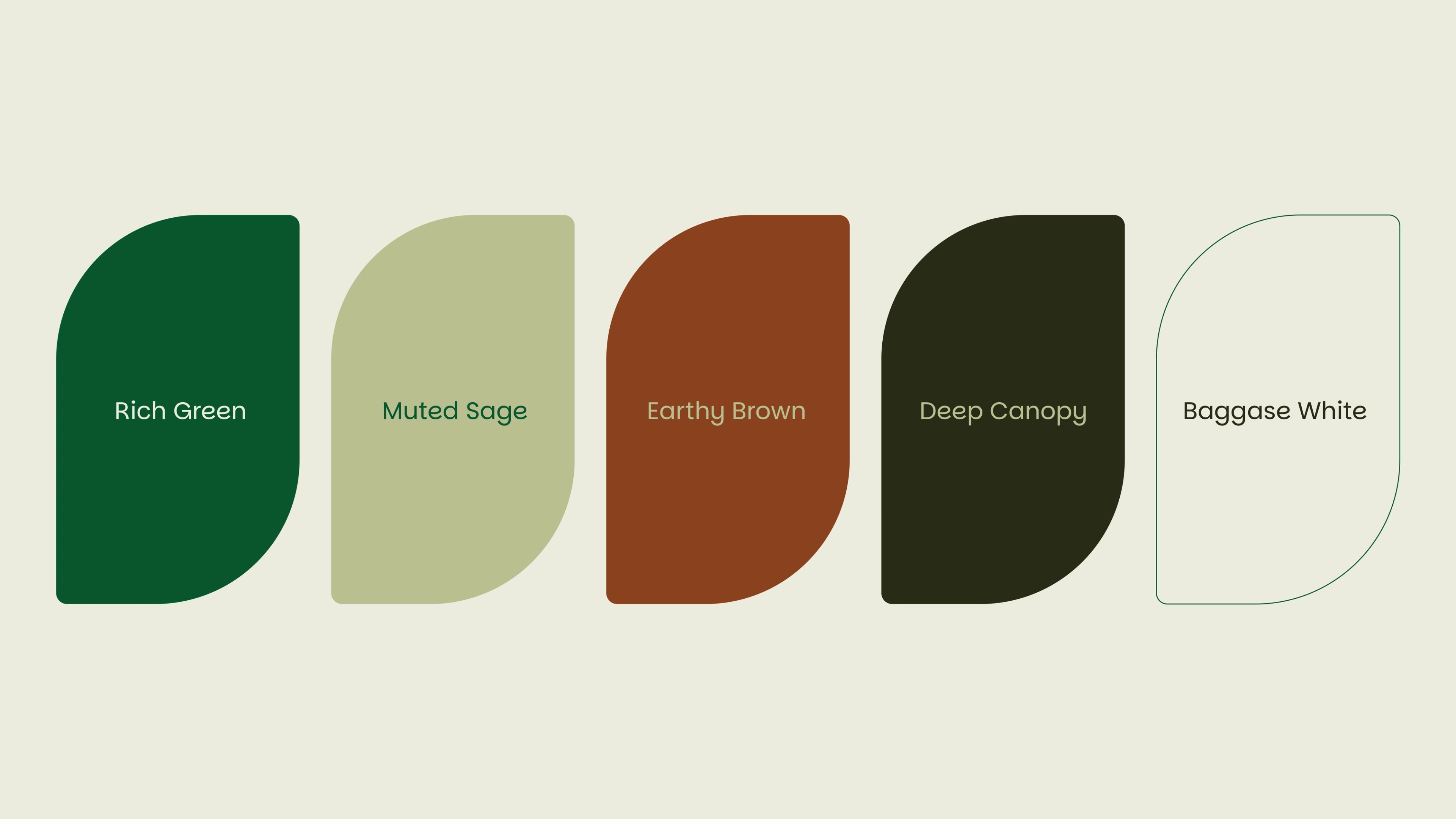
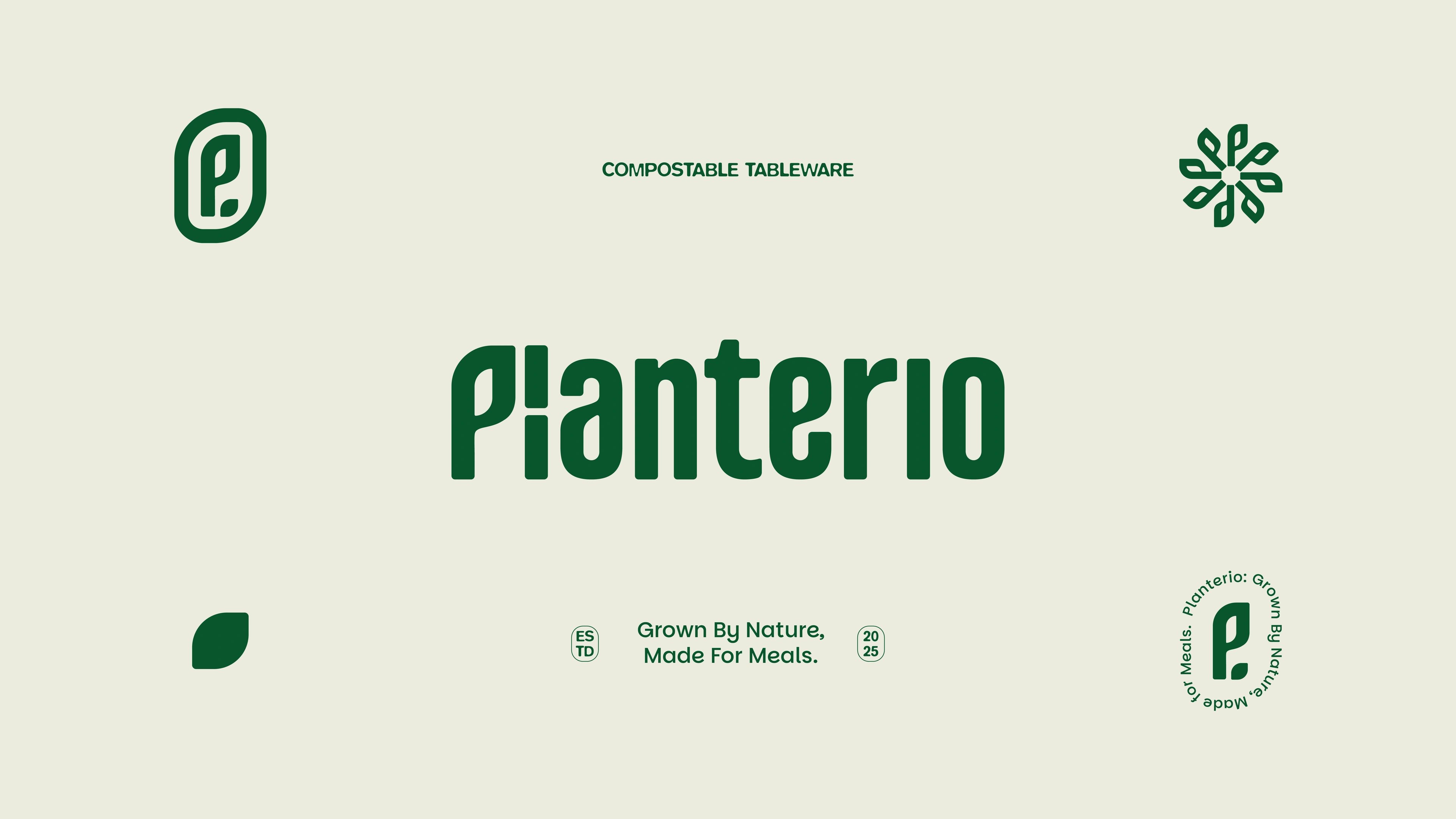
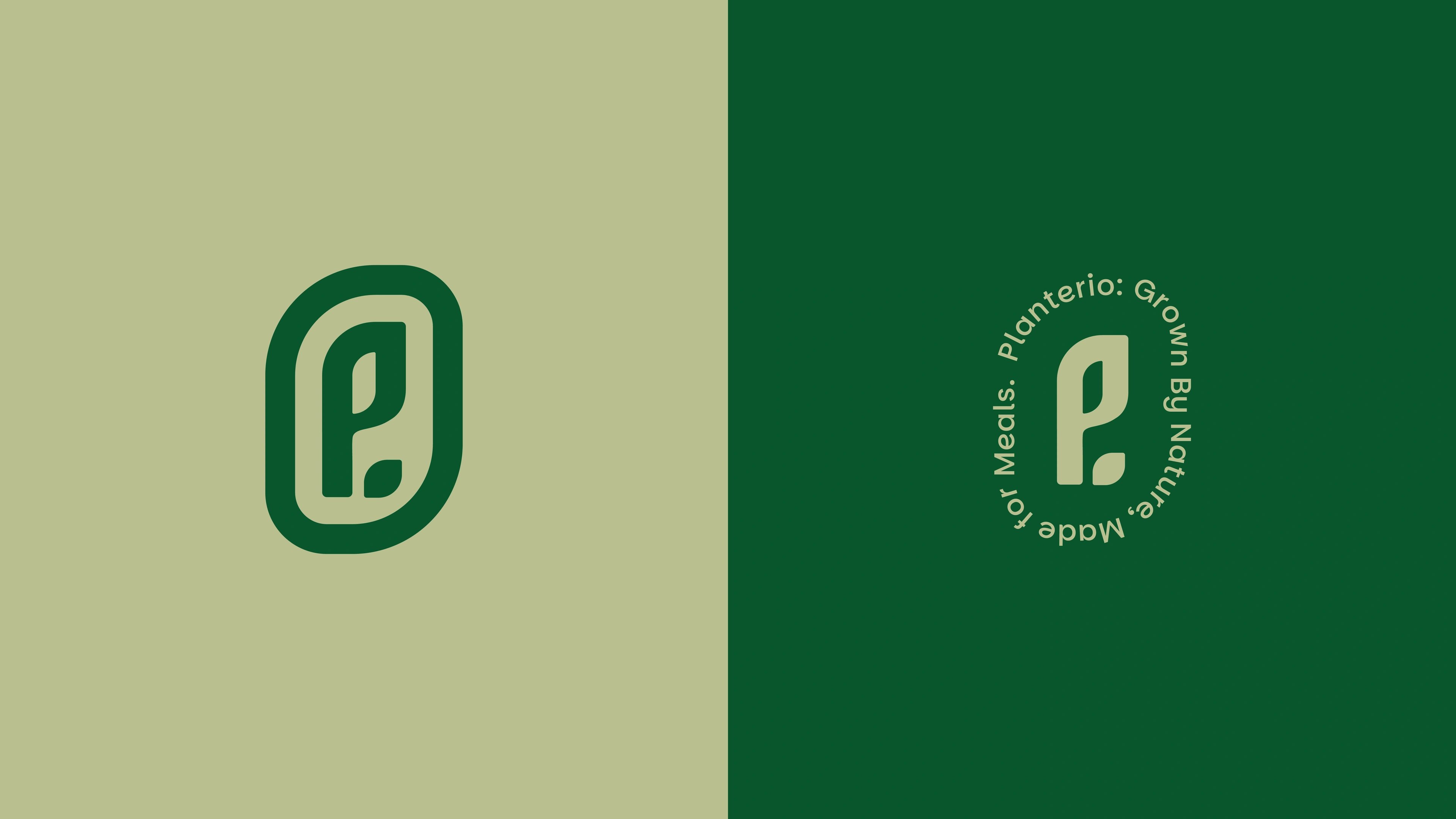
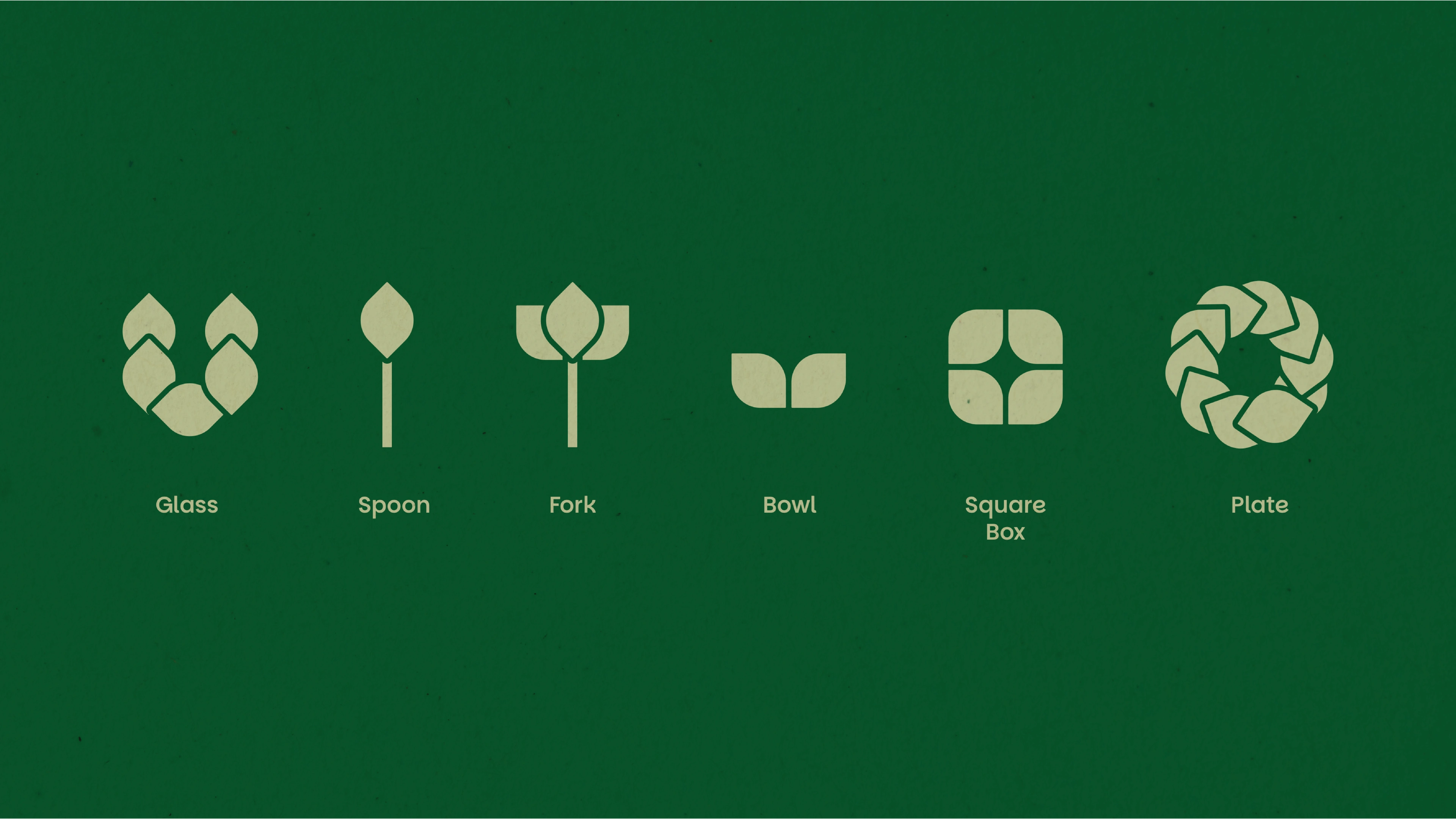
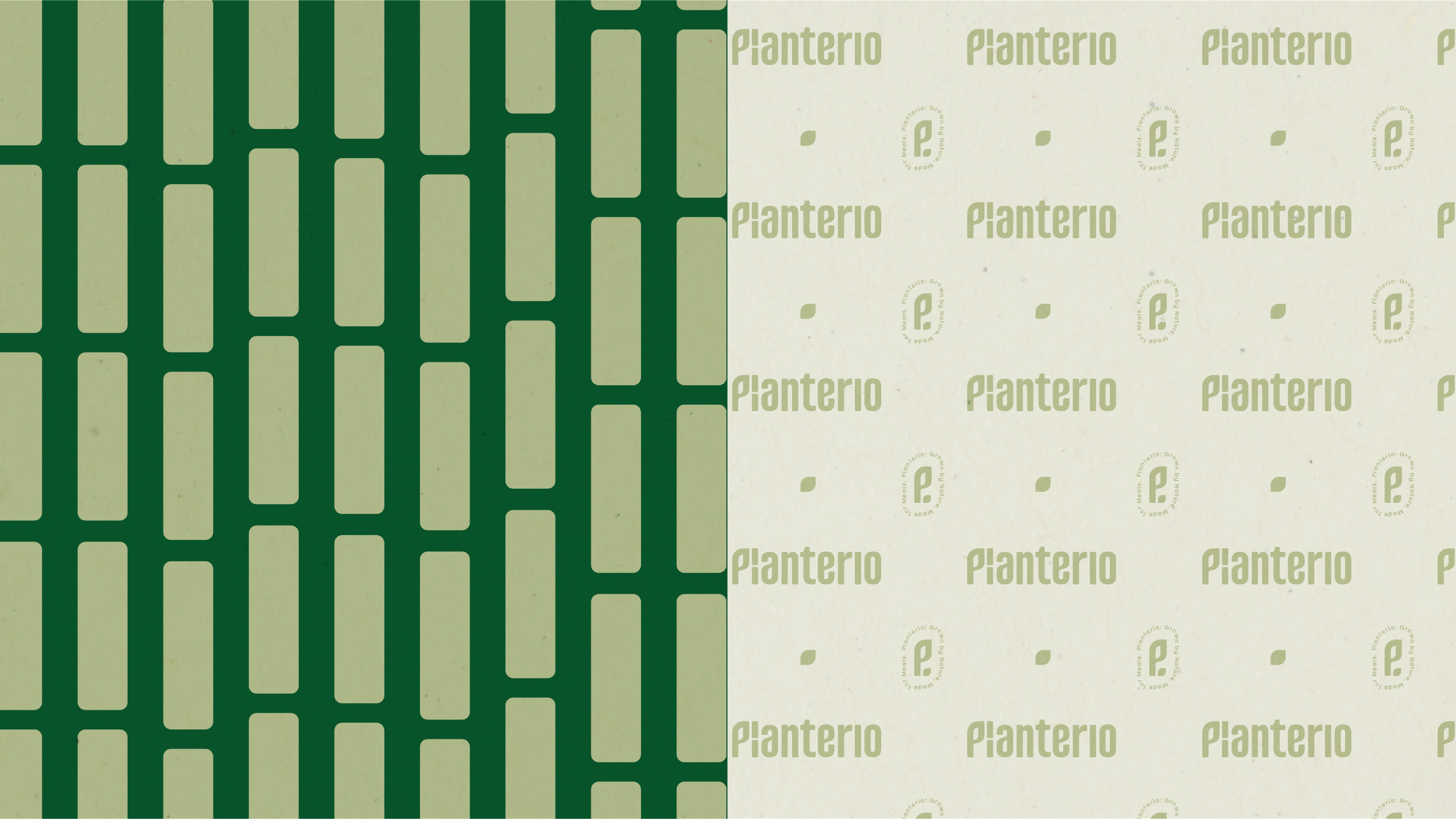
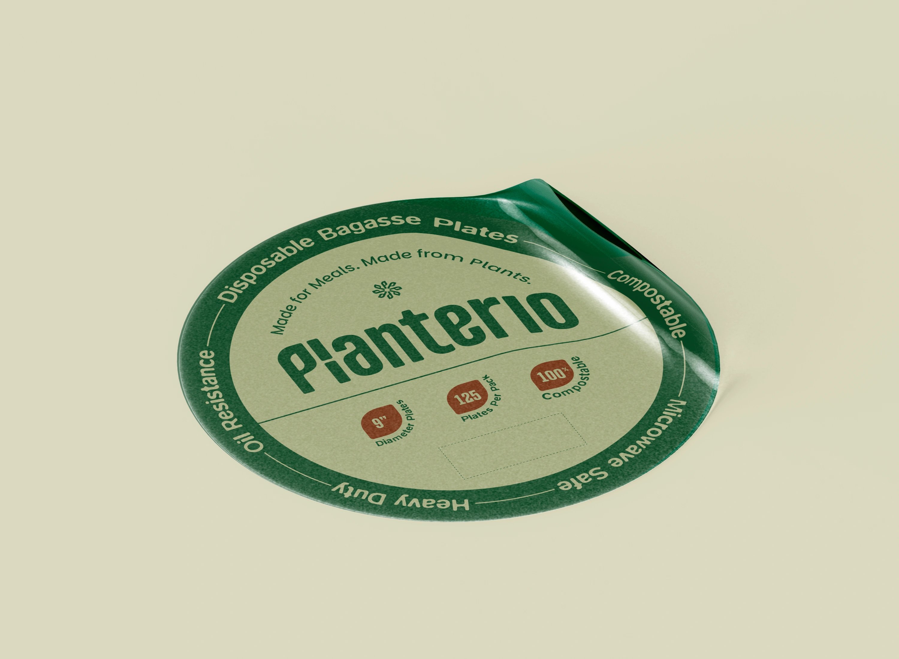
We built the sustainability story into the brand's own structure instead of pinning a symbol beside it. A bold, condensed custom wordmark gives Planterio confidence and shelf visibility; inside the letterforms, a leaf-inspired cut ties it straight back to its plant-based origins. A simplified leaf mark extends the system across stickers, digital and future products. The palette skips harsh eco-clichés for softer plant greens and warm earthy accents, drawn from sugarcane bagasse and the warmth of food service. From the leaf form we grew a full graphic language of patterns and icons, then carried it into packaging with clear hierarchy and into collateral like thank-you cards and product stickers, so every touchpoint feels like one brand.
from supplier to brand
The result is a cohesive ecosystem that moves Planterio from a product supplier to a recognizable consumer brand. A strong identity, a thoughtful packaging system and scalable assets give it a foundation ready for launch, retail and whatever it grows into next — communicating sustainability clearly while staying modern, approachable and distinctly its own.
but wait, there’s more
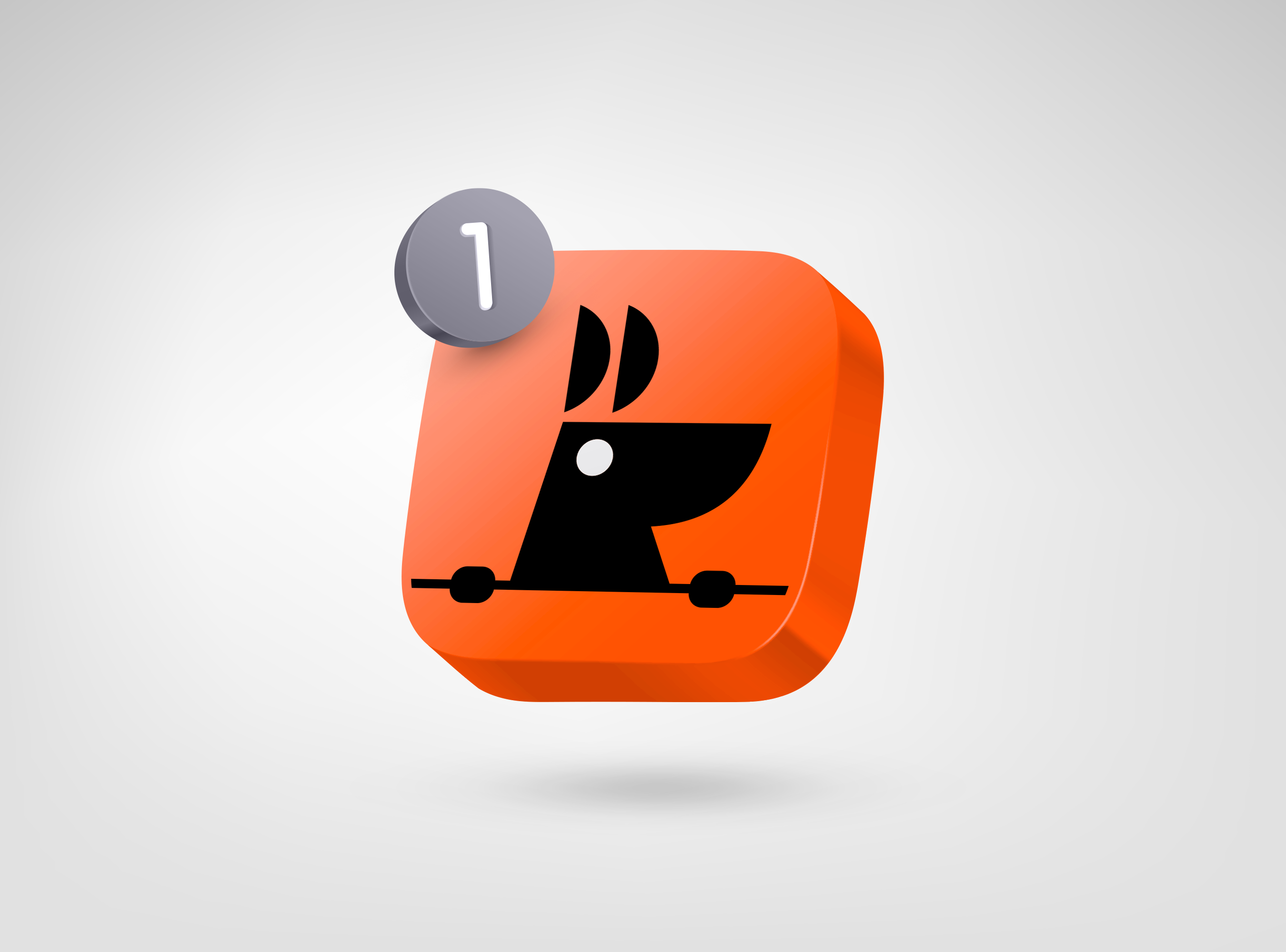
RooView
smart viewfinder accessory brand for solo content creators
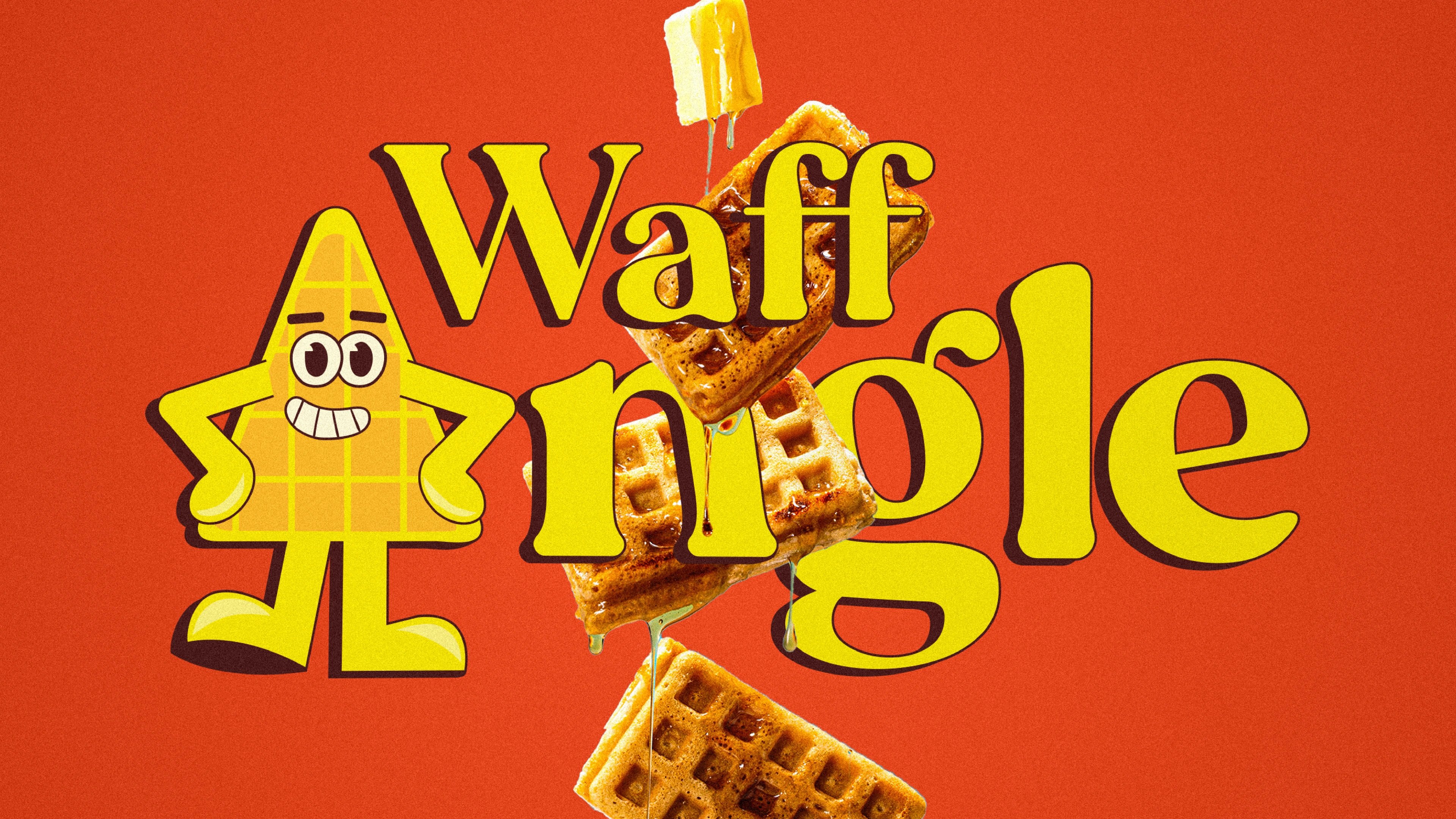
Waffangle
mascot-led identity and packaging for a bengaluru waffle brand
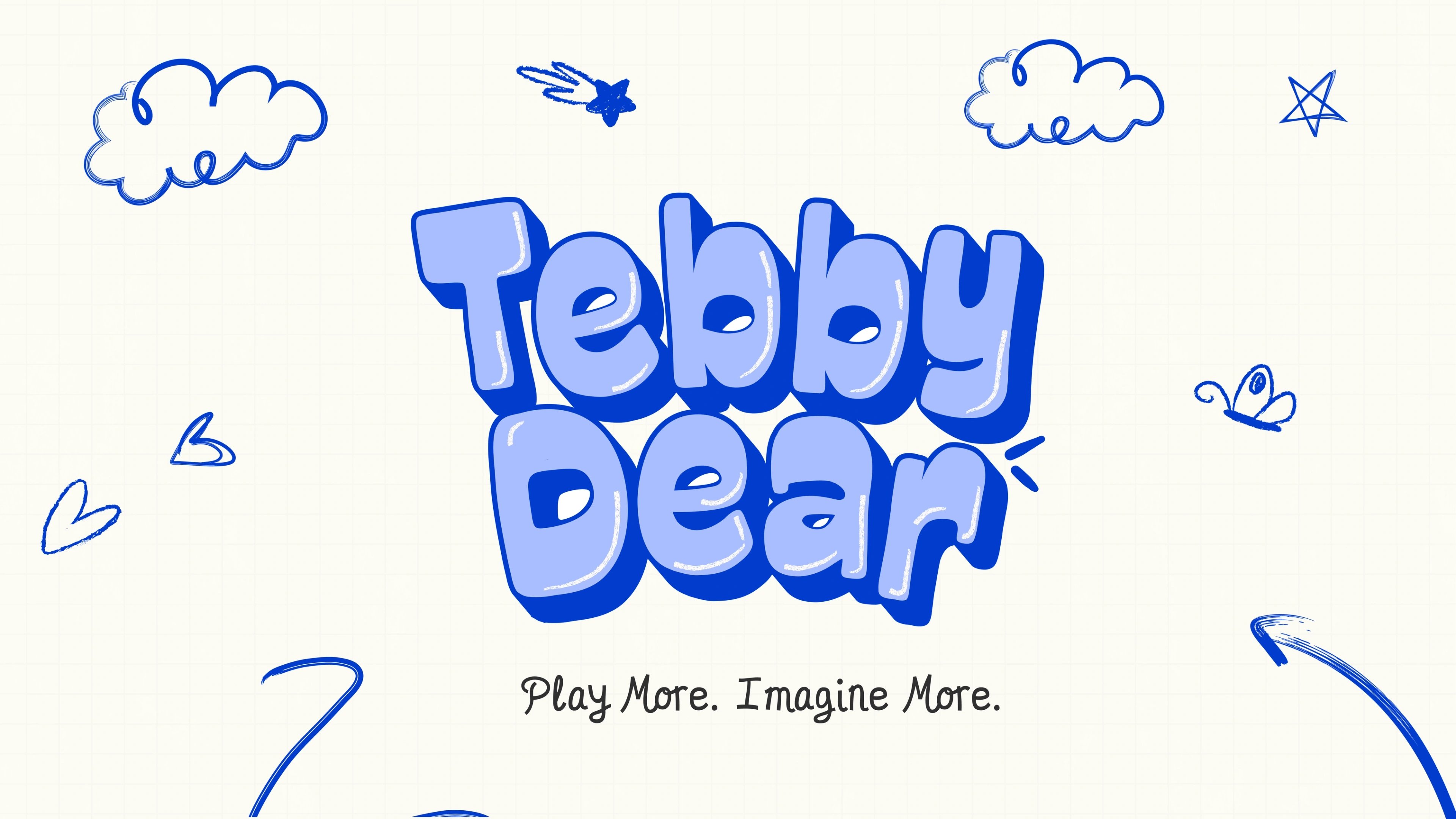
Tebby Dear
playful packaging for a US kids' toy brand
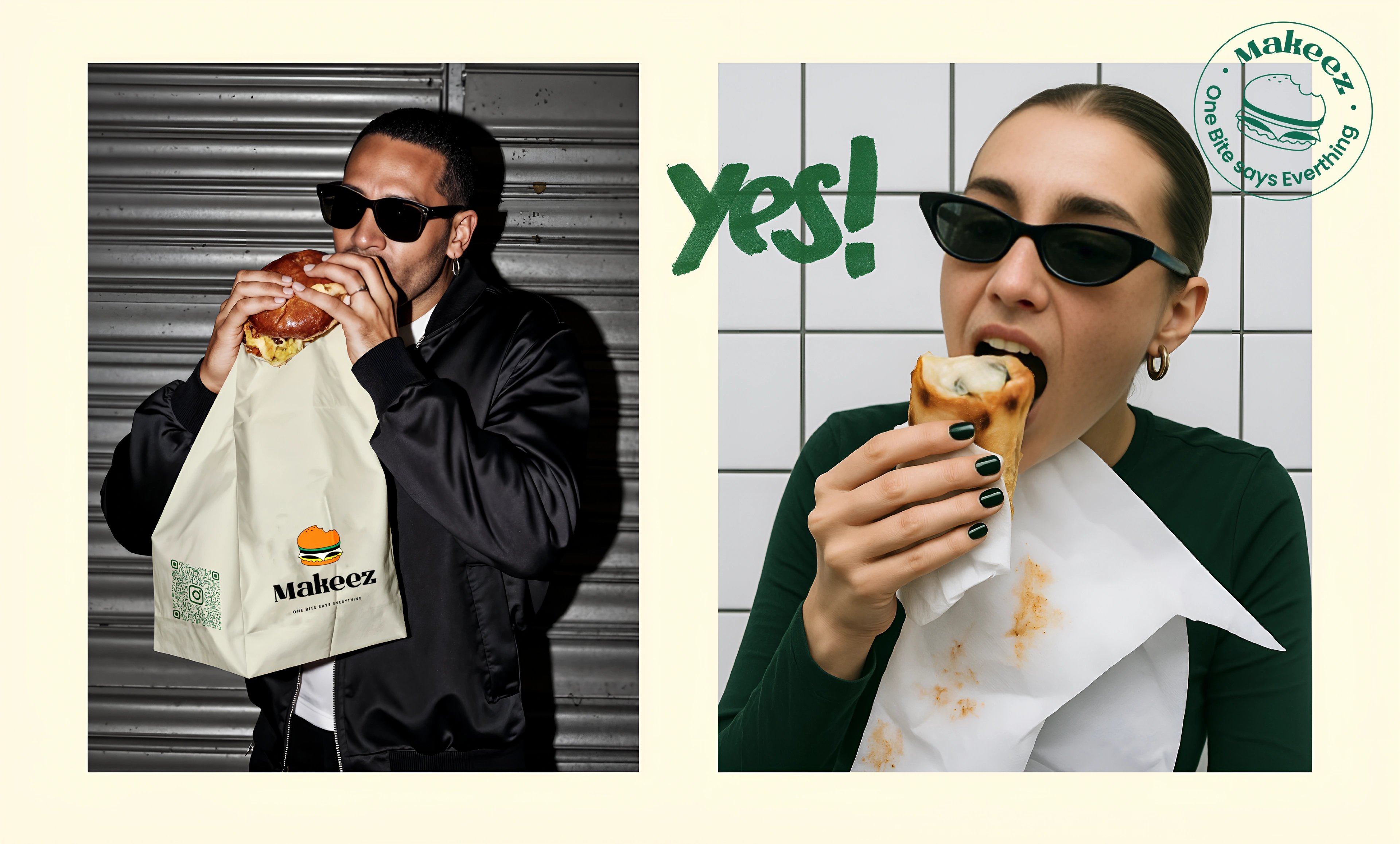
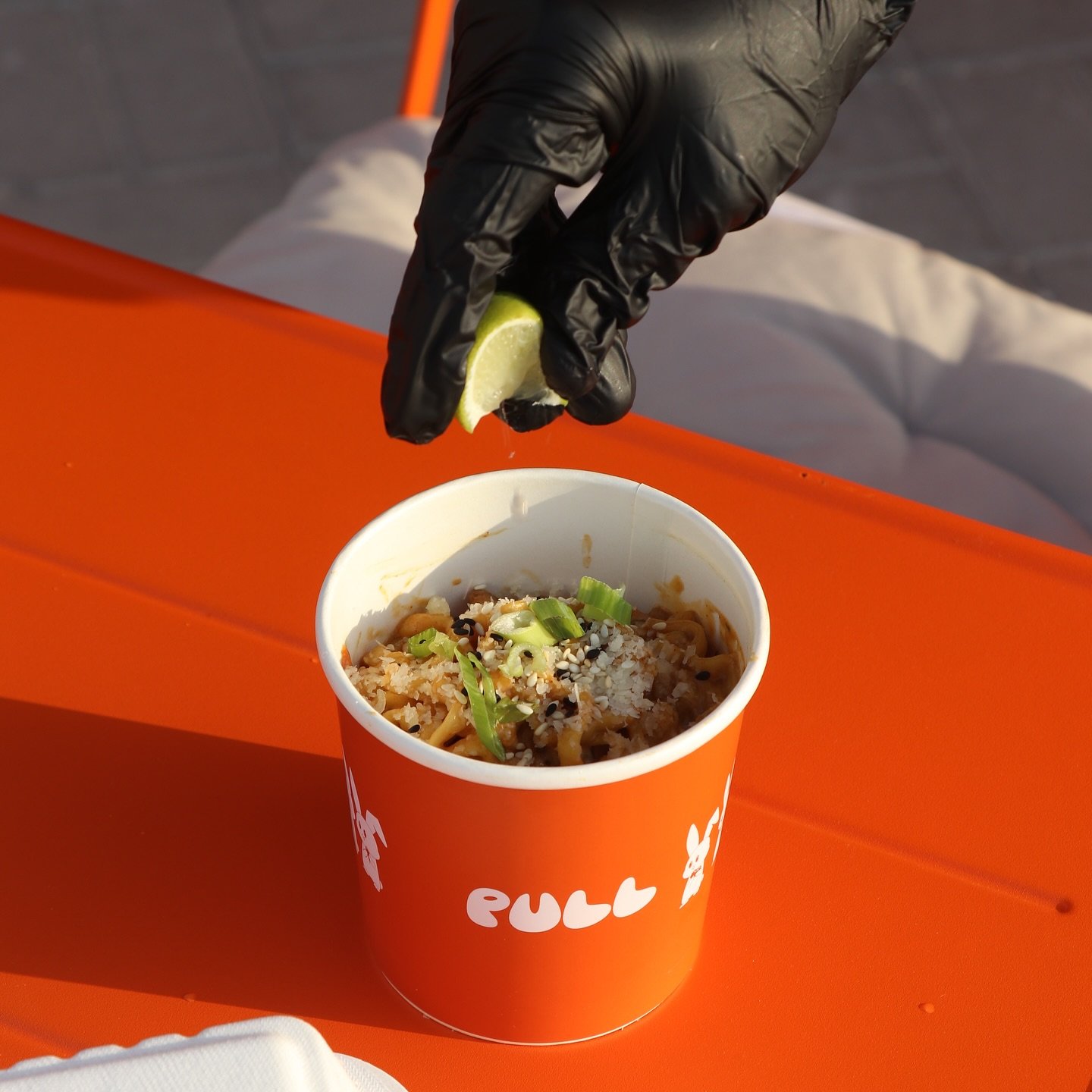
Pull & Unfolded
dual identity for two sister food brands

Solvio
wellness branding for an Amazon home-essentials launch

ready tobegin?
tell us what you’re building. we read every message, reply within two working days, and only take on projects we know we can ship well.