a toy that earns a parent's trust and a kid's excitement from the same box.
about the client
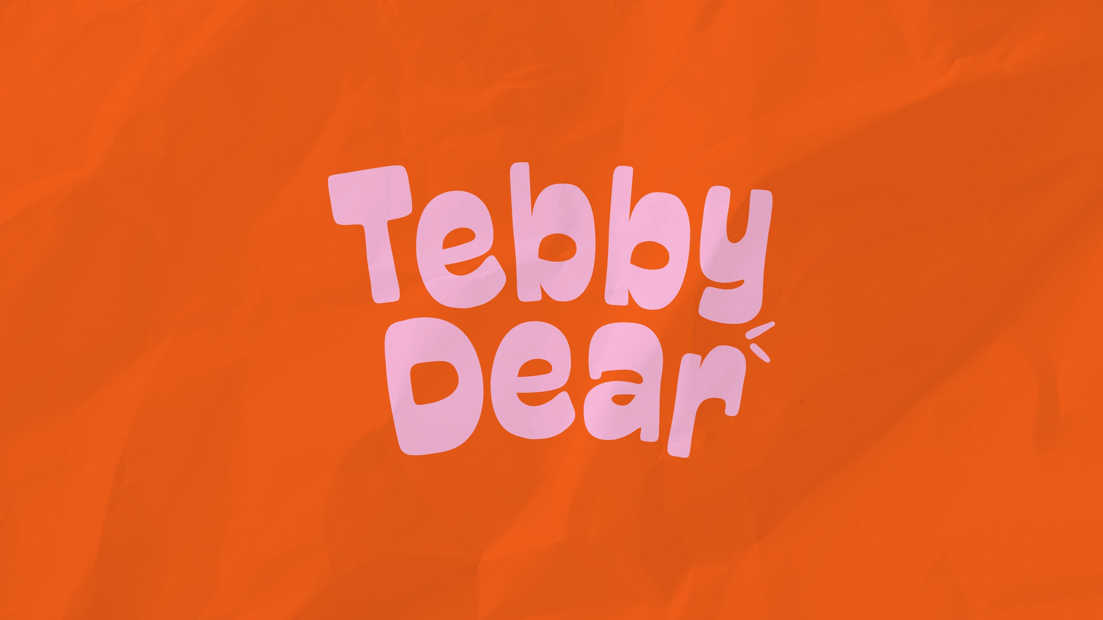
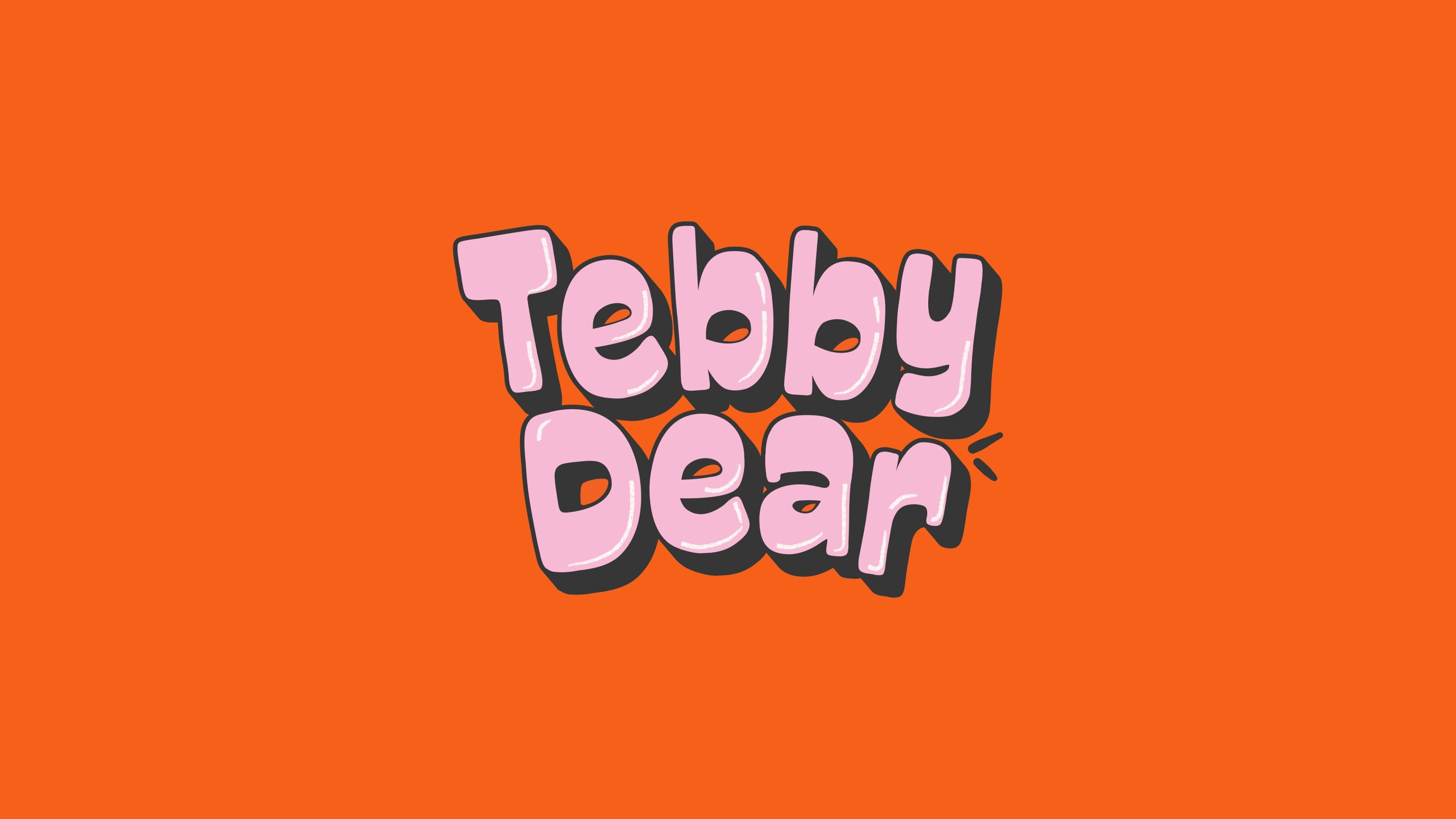
Tebby Dear is a children's toy brand built around joyful, screen-free play. It launches in the US with its first product — a mini arcade claw machine for kids aged 3+, bought mostly by parents and relatives looking for a gift that feels exciting and interactive. The bigger idea is a D2C toy brand with a bright, ownable world that can grow well past one product.
the challenge
Tebby Dear had to enter the US toy and gifting aisle with the confidence of a real brand, not the look of another generic product. The category is loud but forgettable — crowded boxes, white-label packaging, scattered claims, products that blur together on the shelf. The brand needed to win a parent's trust and a child's excitement at the same time: fun and safe, clear and premium enough to gift, and scalable enough to carry more toys later, not just decorate one launch.
our solution
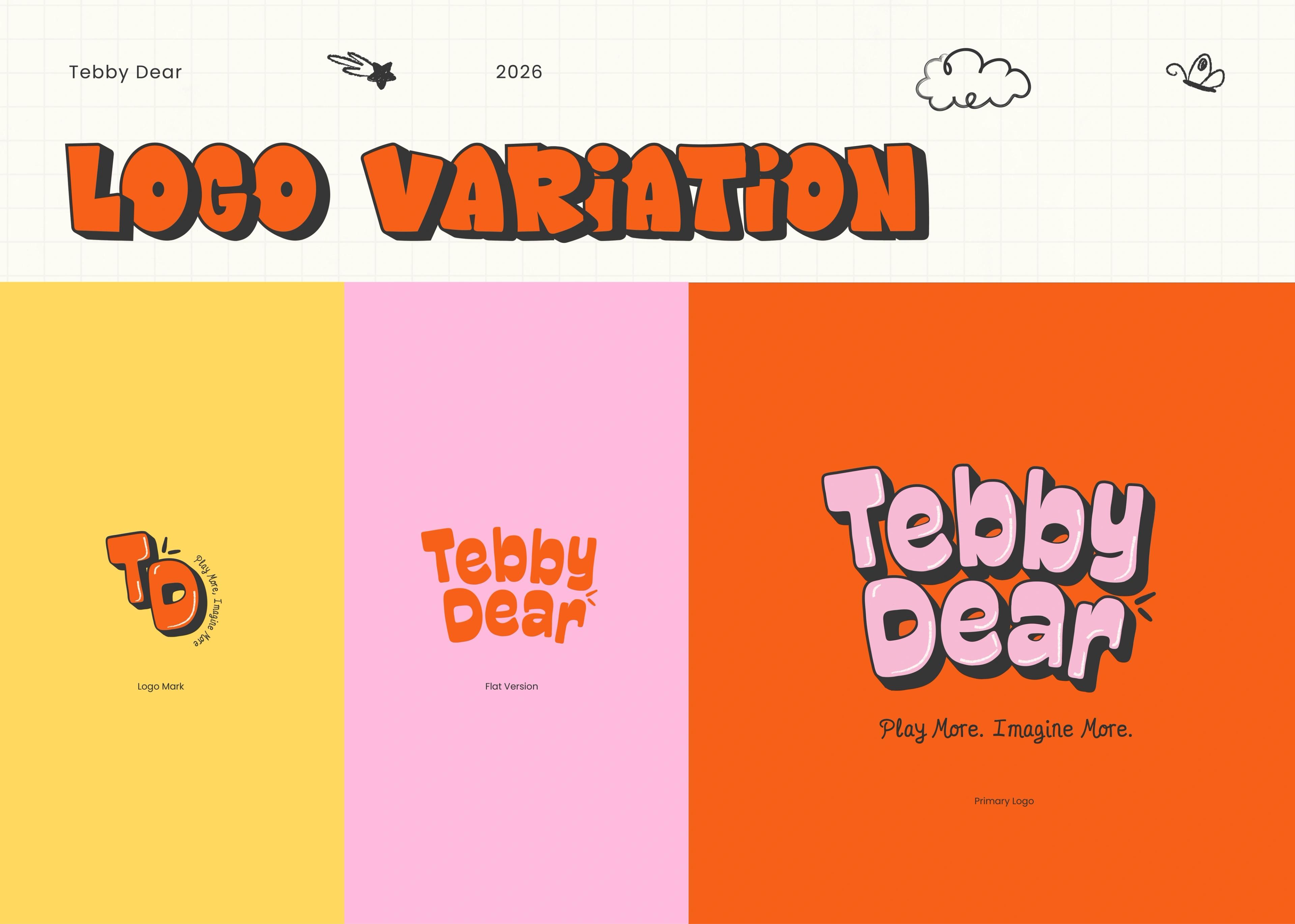
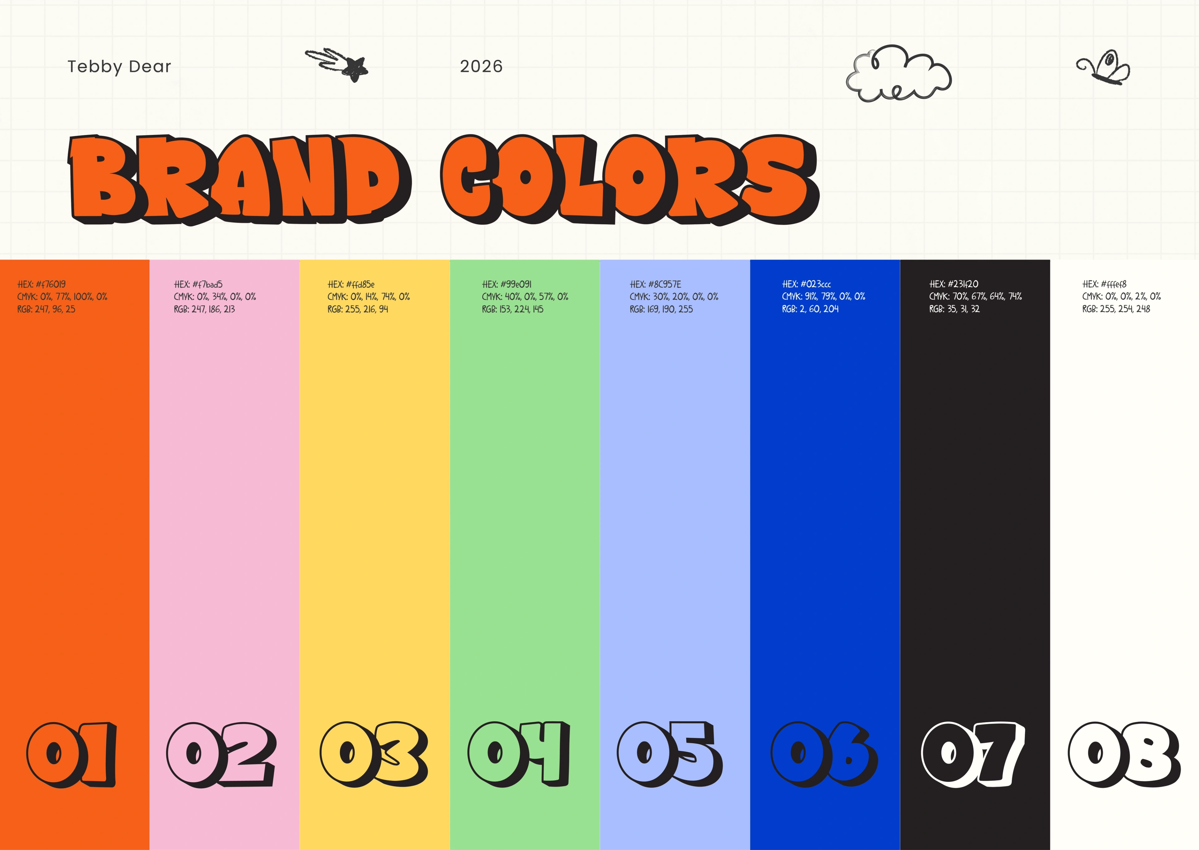
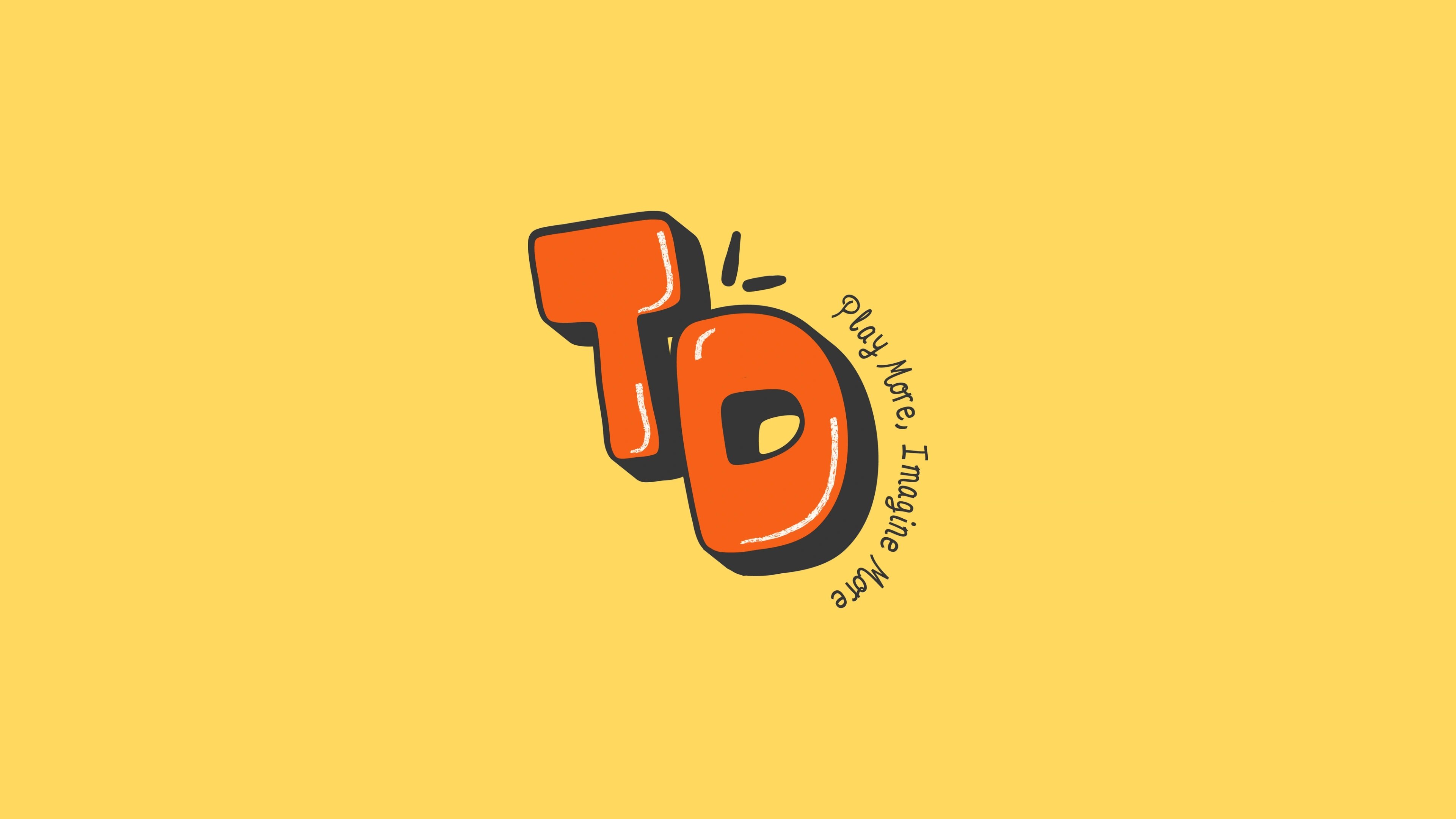
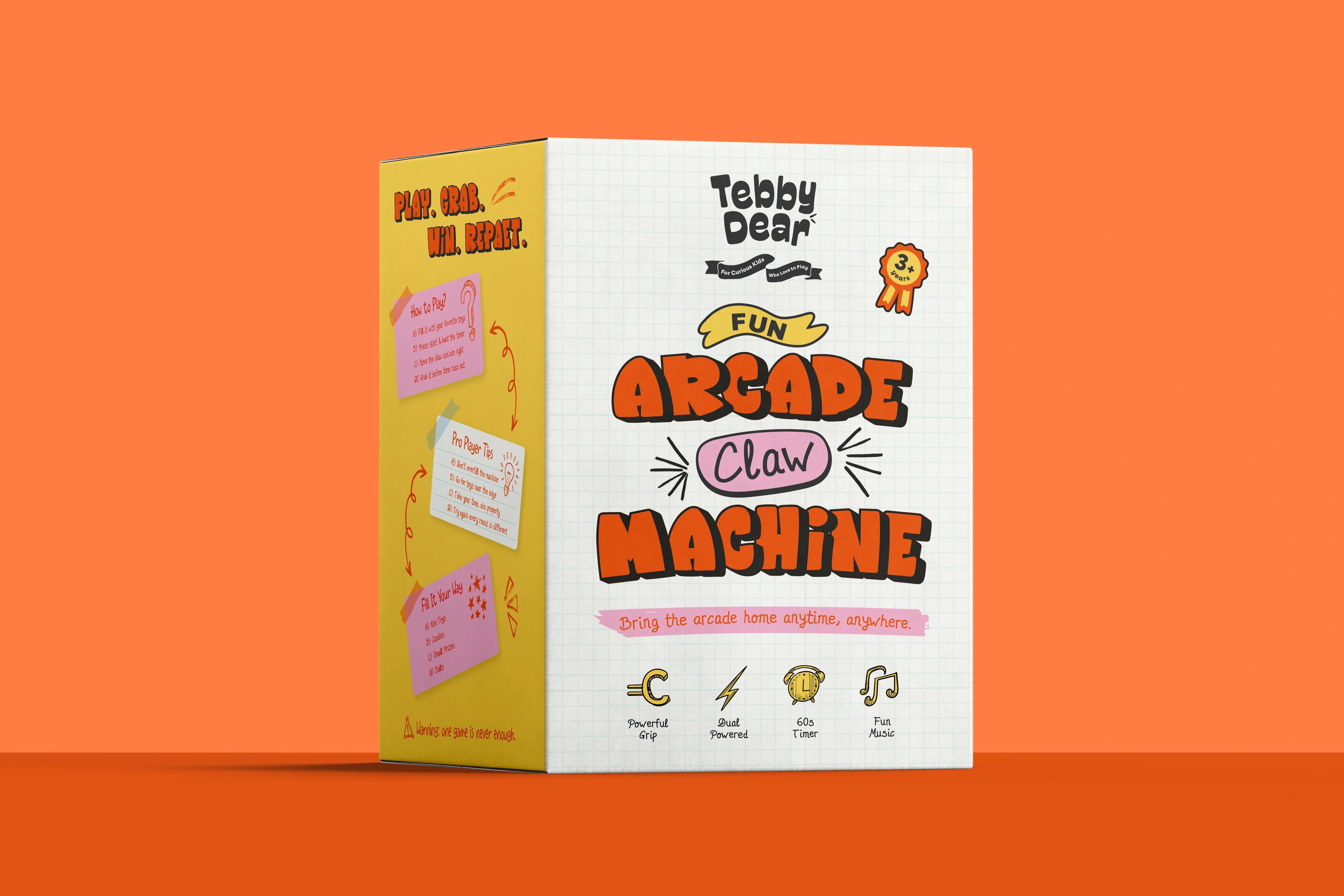
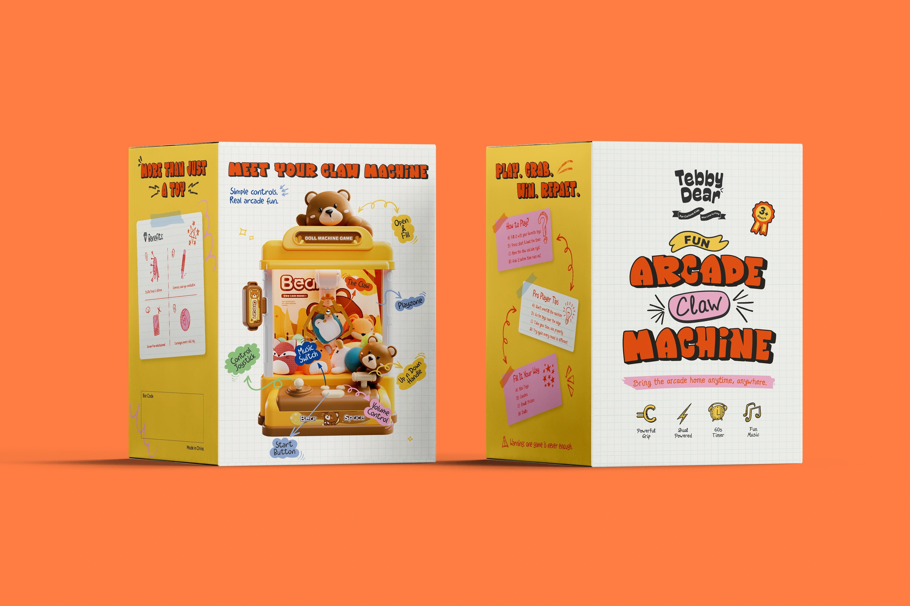
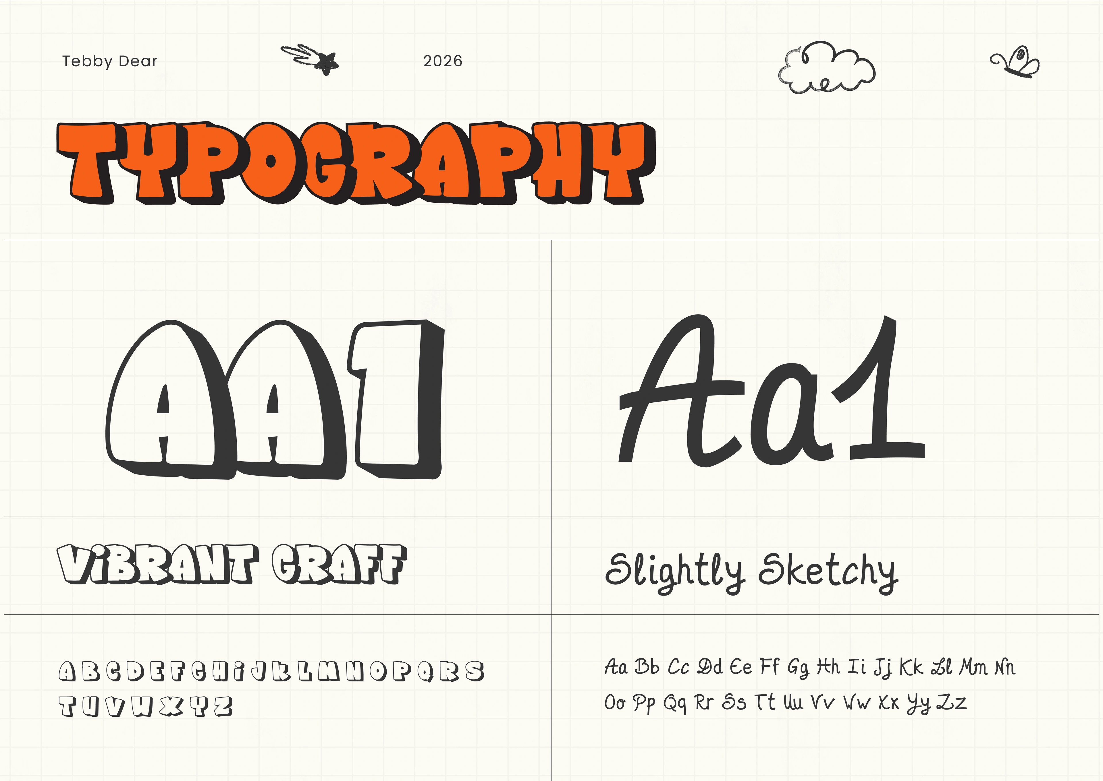
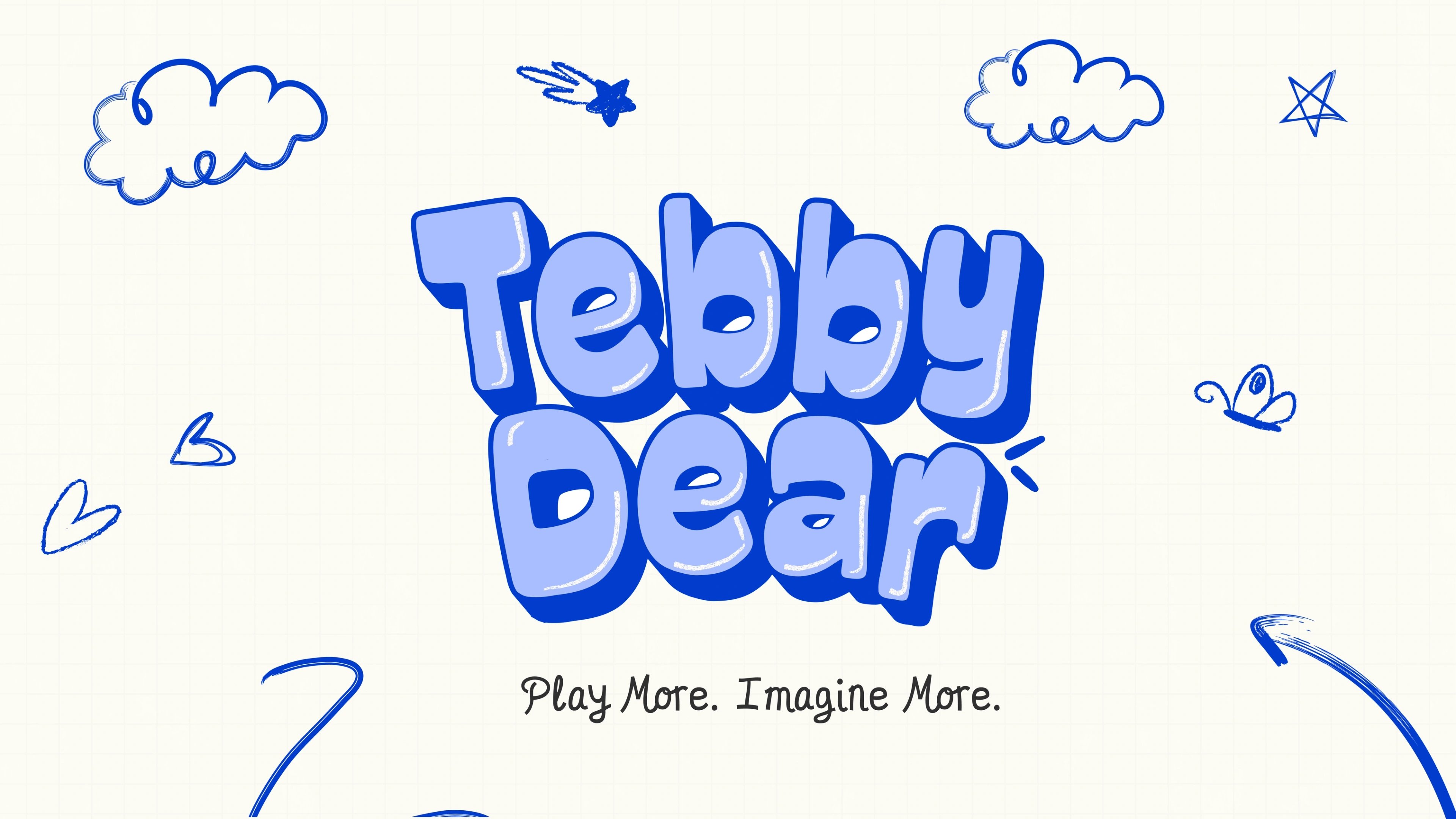
We built a high-energy identity and packaging system inspired by arcade lights, reward moments and childlike scribbles. Instead of leaning on a mascot, we drew a custom wordmark that gives the brand personality while staying flexible for future toys. The packaging works as a full communication system: the front face sells the "Fun Arcade Claw Machine" on sight, then hands parents quick proof points — powerful grip, dual power, a 60-second timer, music. Other faces turn the box into a game, with "How to Play," "Pro Player Tips" and parent-facing benefits like hand-eye coordination and screen-free focus. Bold orange and yellow, scribble arrows, sticky-note blocks and chunky type keep it exciting for kids and trustworthy for parents.
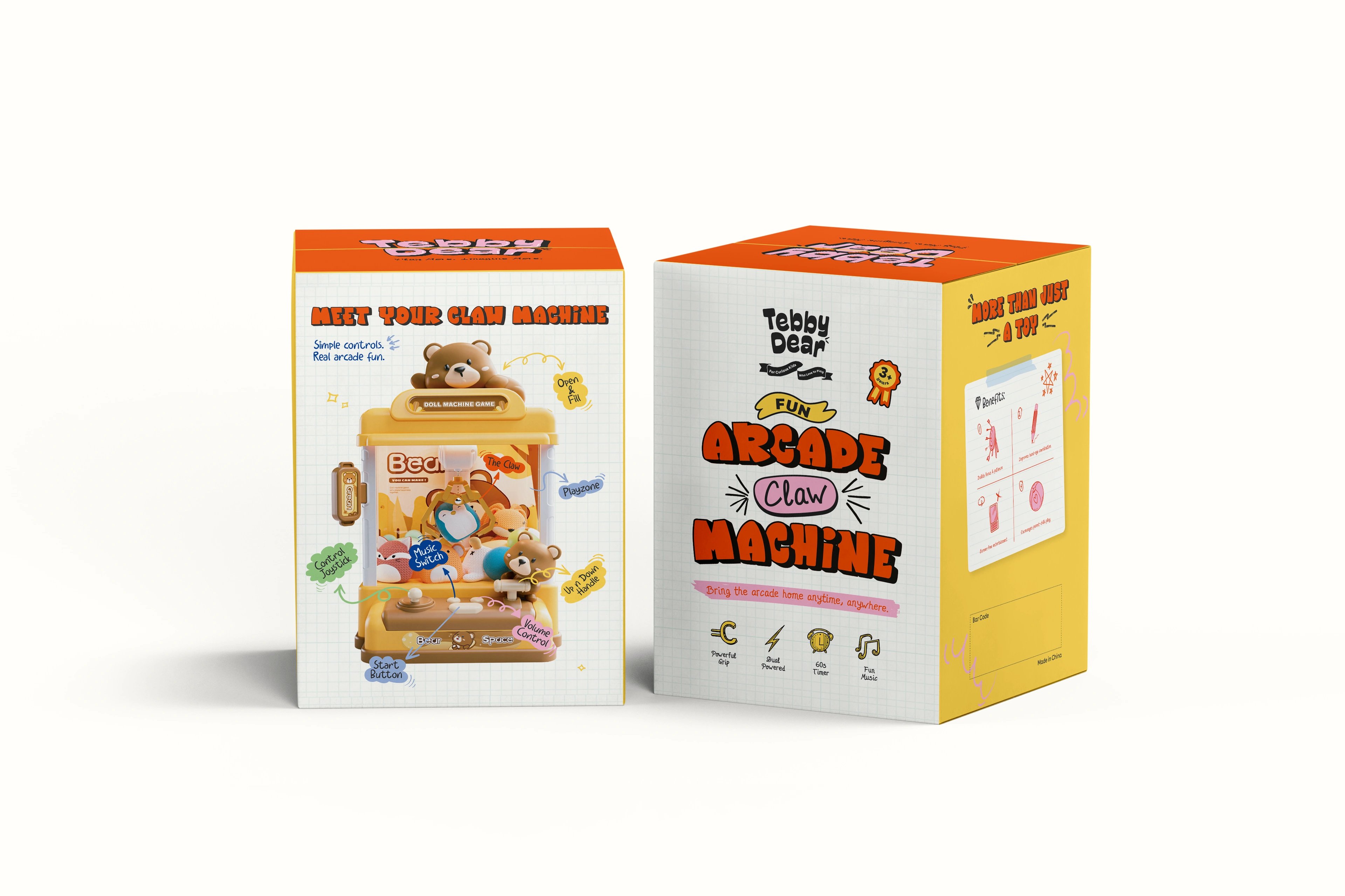
play brought home
The result is the foundation of a toy brand, not just a launch SKU. The packaging attracts, explains, guides play and proves value from every side — easier to understand, easier to trust, easier to choose as a gift. And because the system isn't tied to one mascot or one product, Tebby Dear can grow into future toys while keeping the same joyful, screen-free, arcade-inspired spirit.
but wait, there’s more
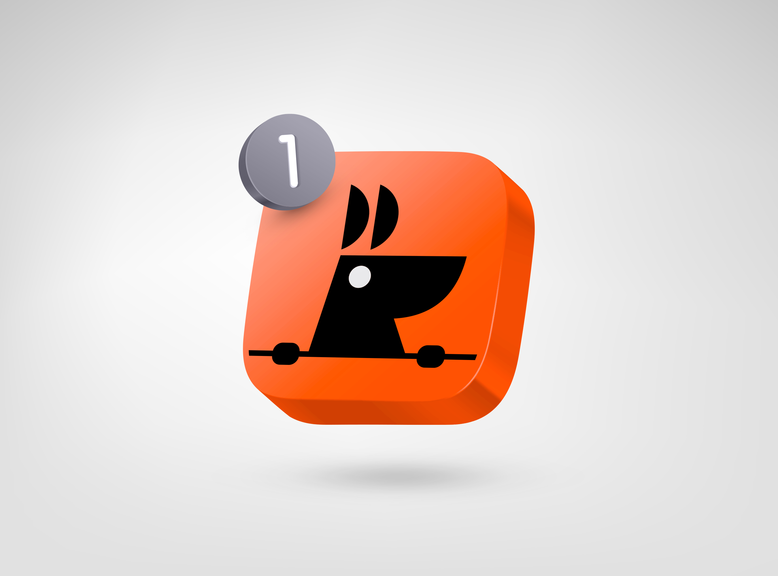
RooView
smart viewfinder accessory brand for solo content creators
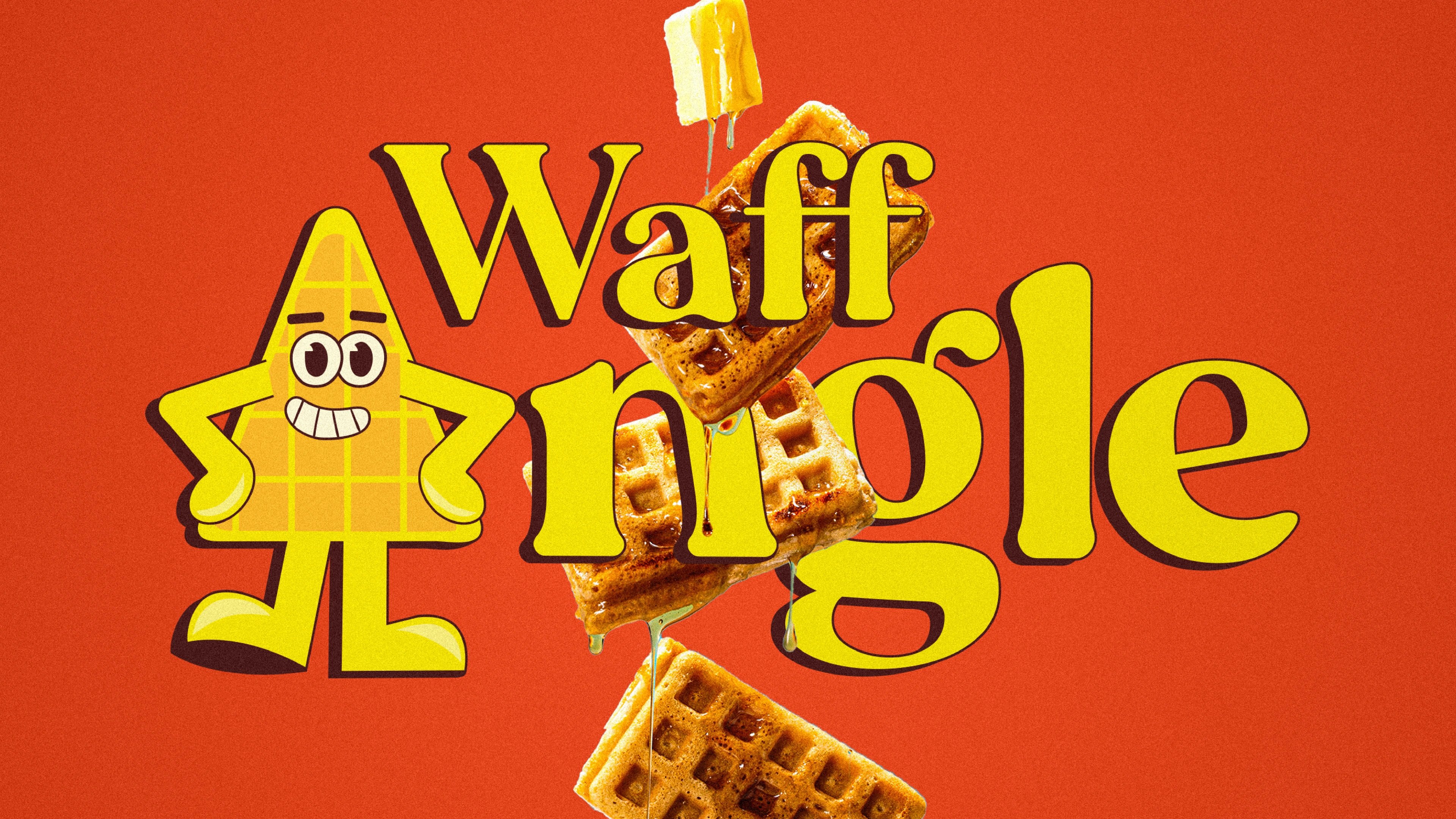
Waffangle
mascot-led identity and packaging for a bengaluru waffle brand
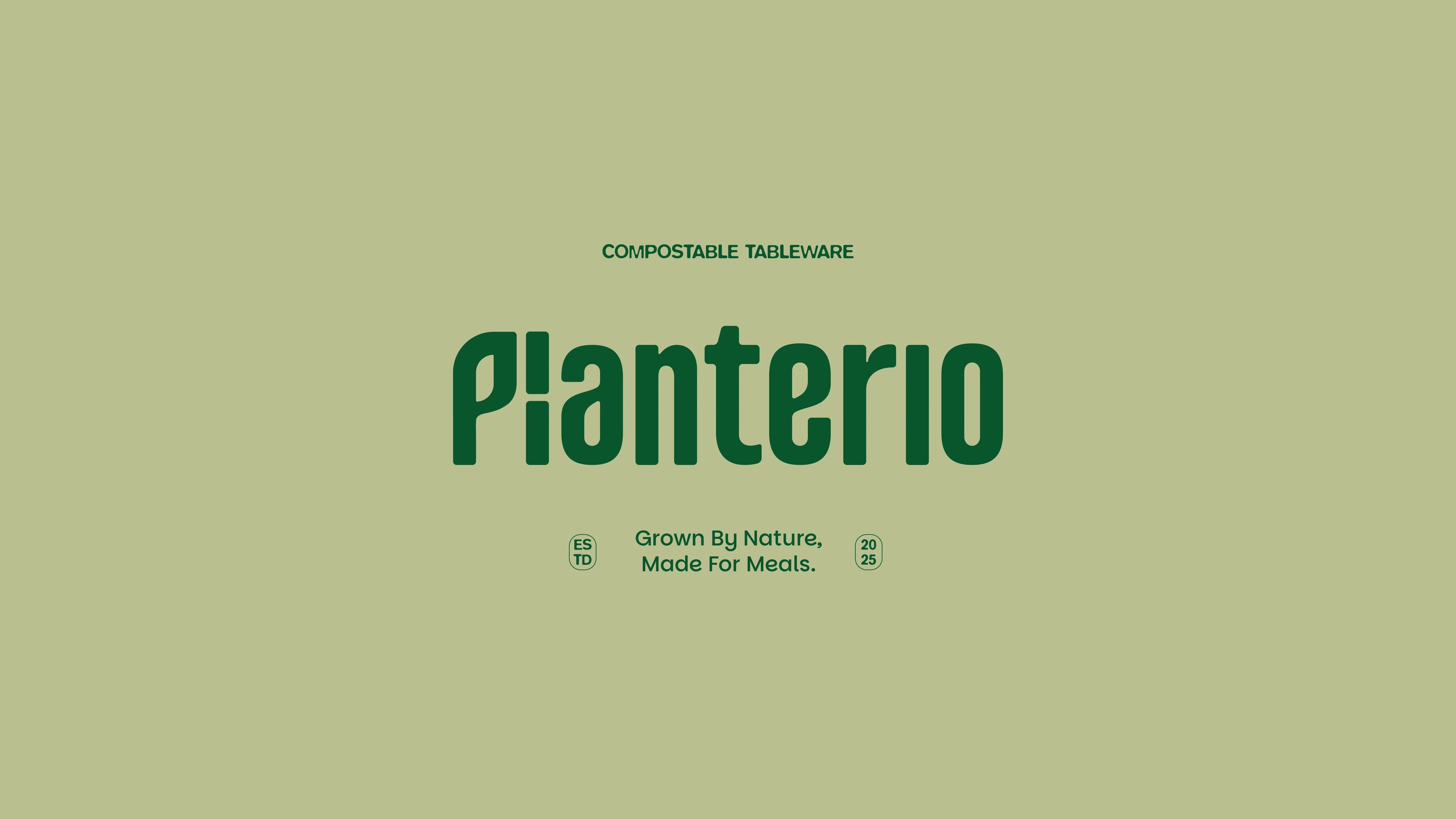
Planterio
identity for a plant-based tableware brand
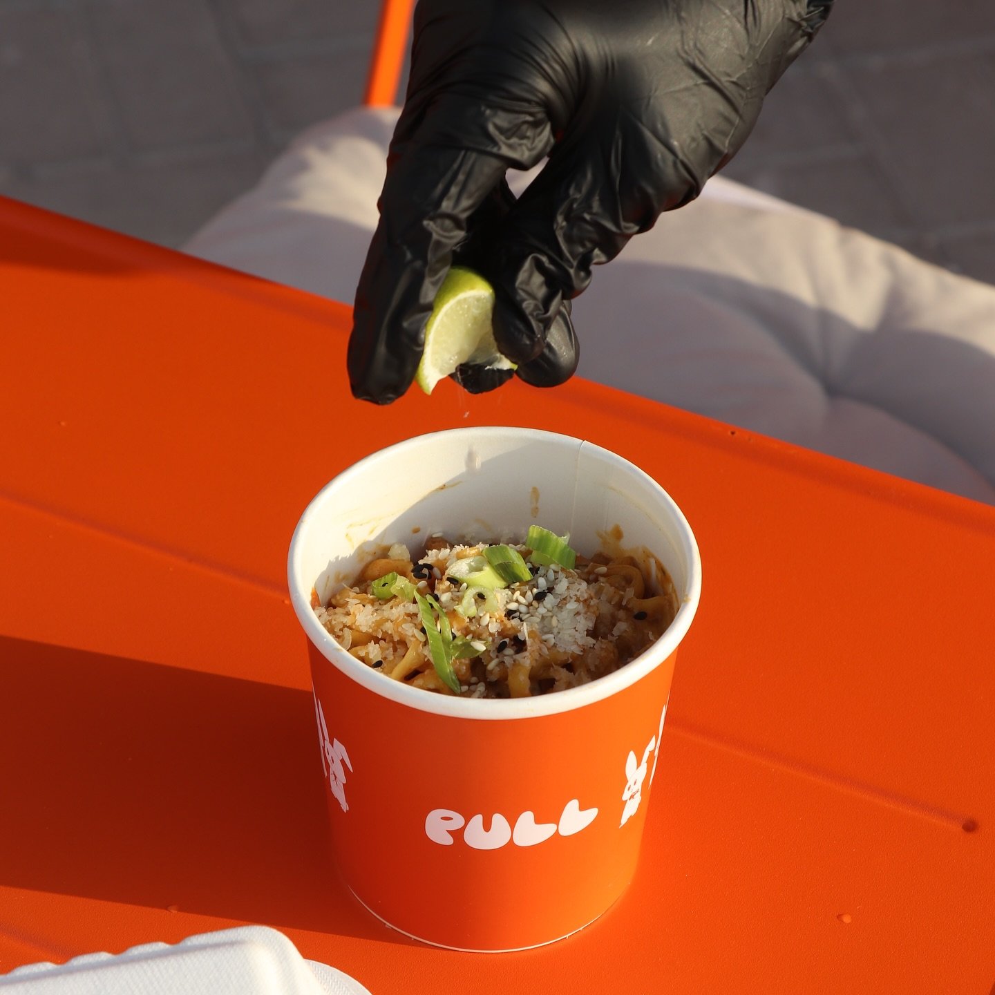
Pull & Unfolded
dual identity for two sister food brands

Solvio
wellness branding for an Amazon home-essentials launch

ready tobegin?
tell us what you’re building. we read every message, reply within two working days, and only take on projects we know we can ship well.