Pull & Unfolded
one playful world, two food brands — and a bunny that makes both unforgettable.
about the client
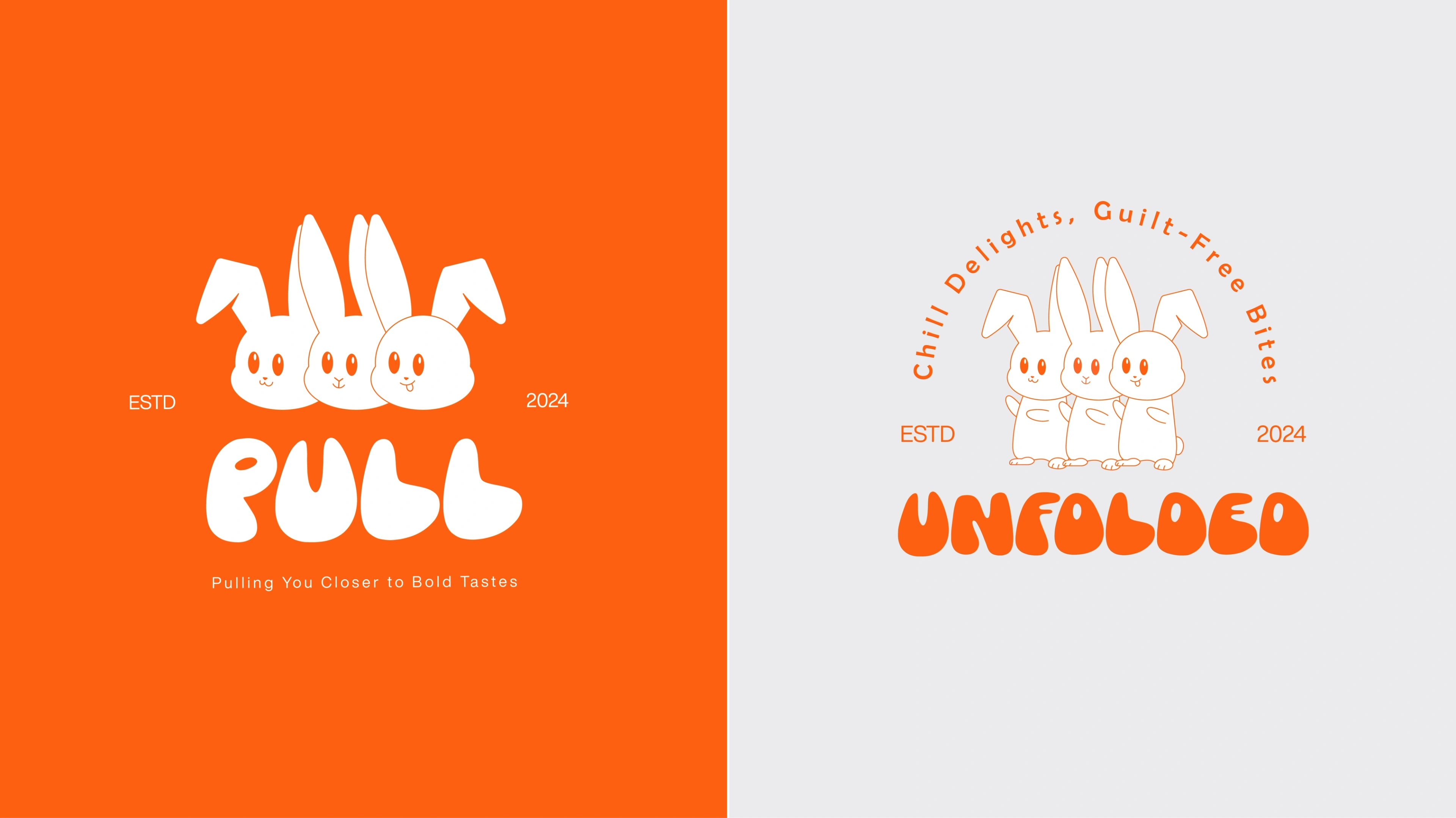
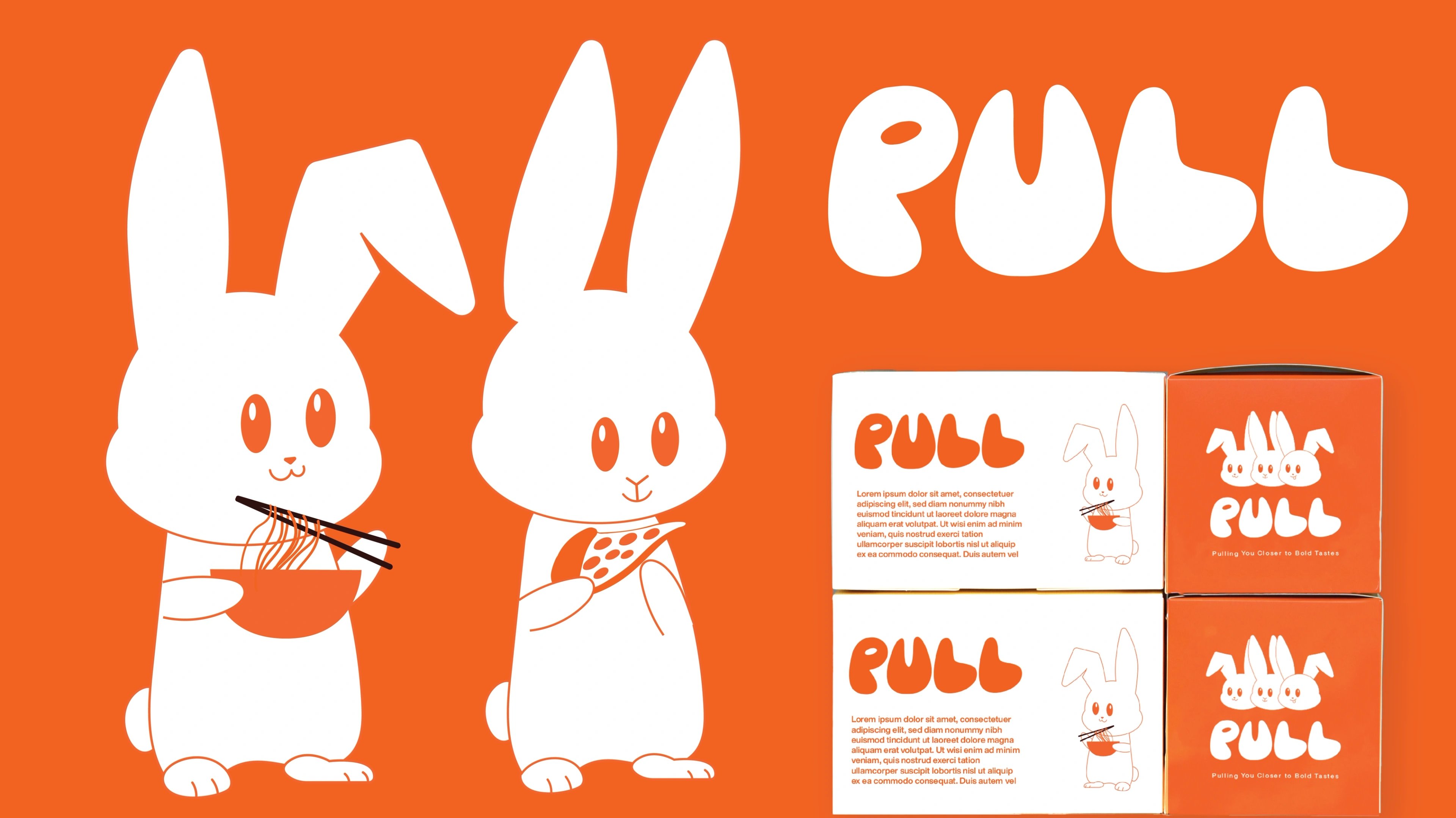
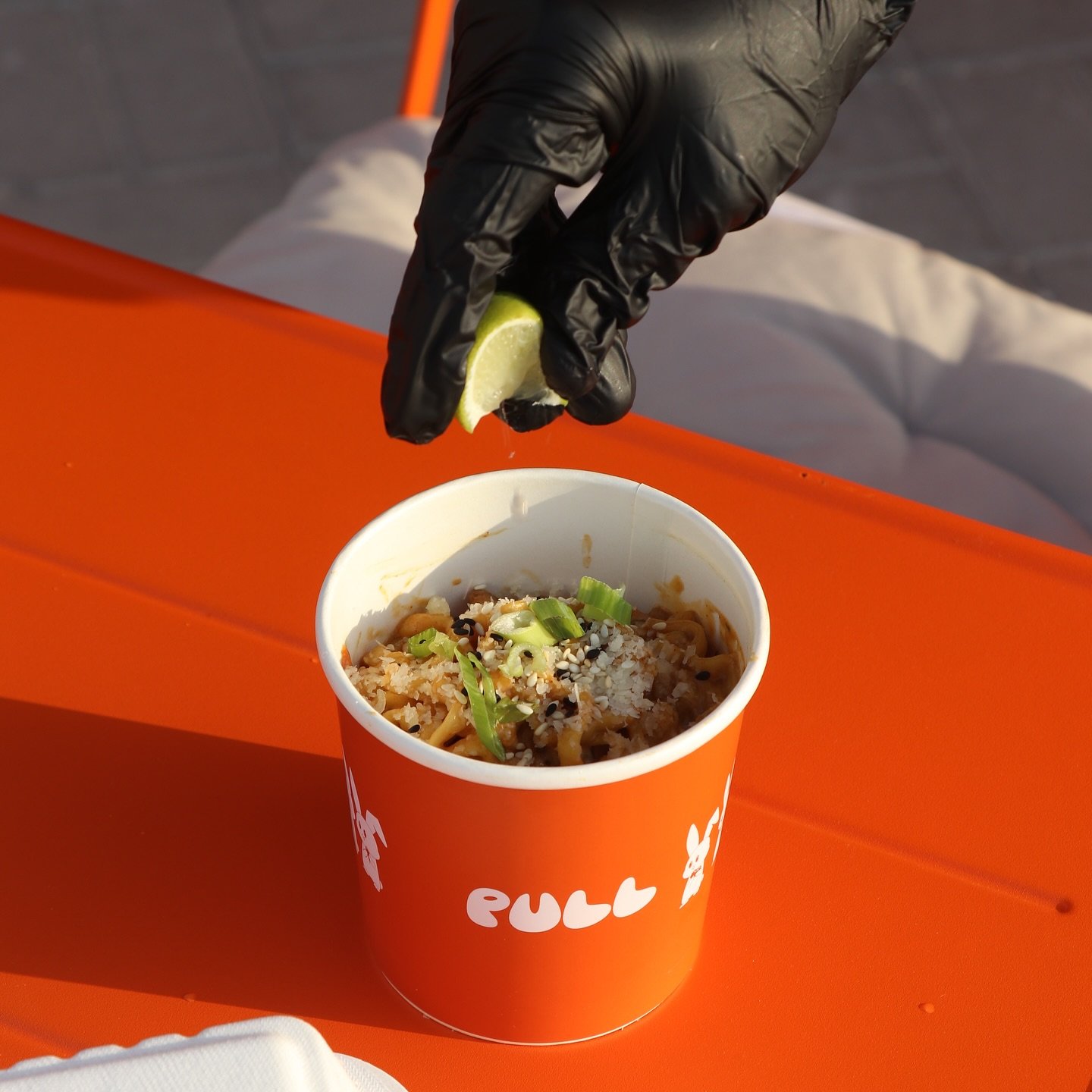
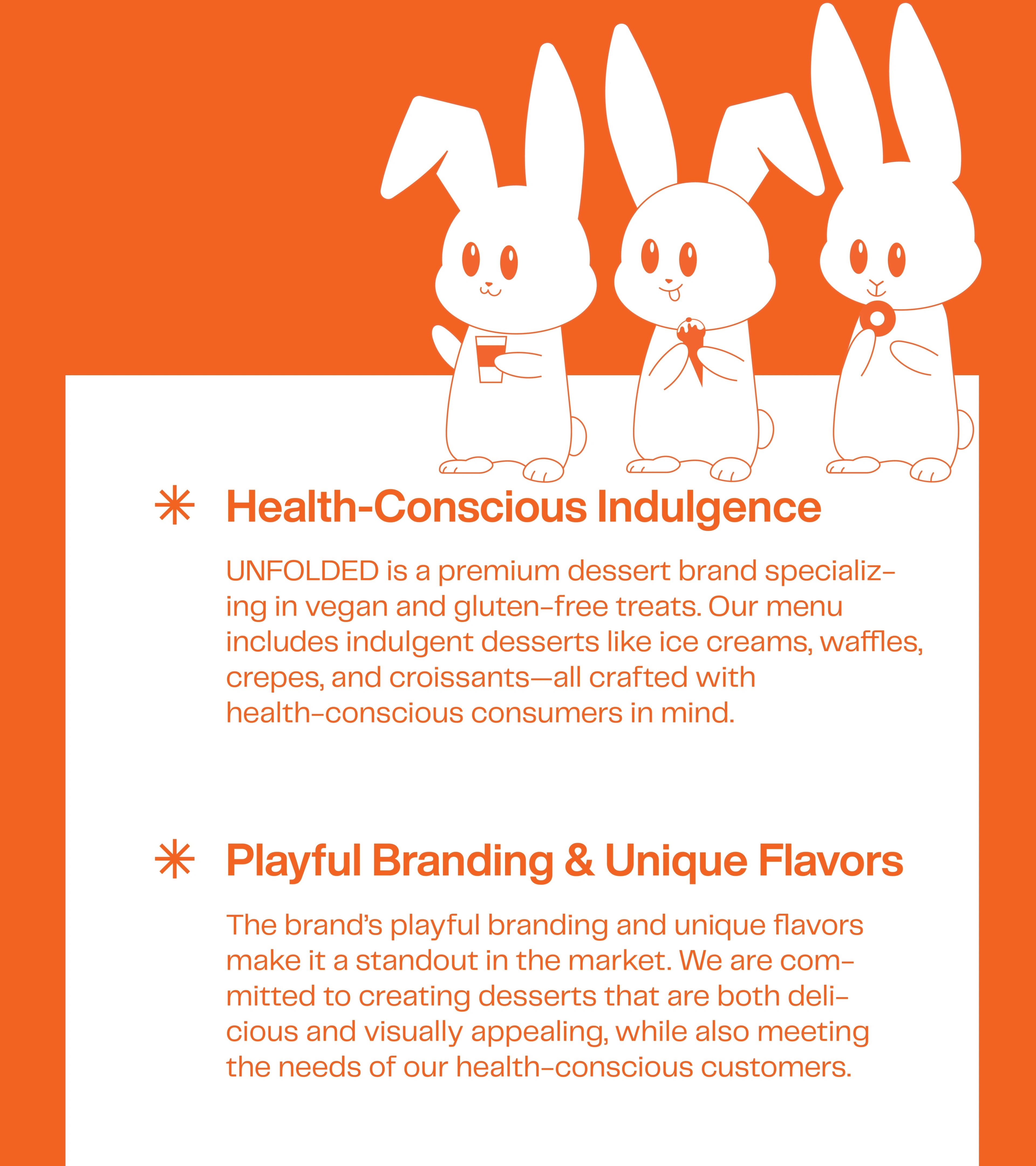
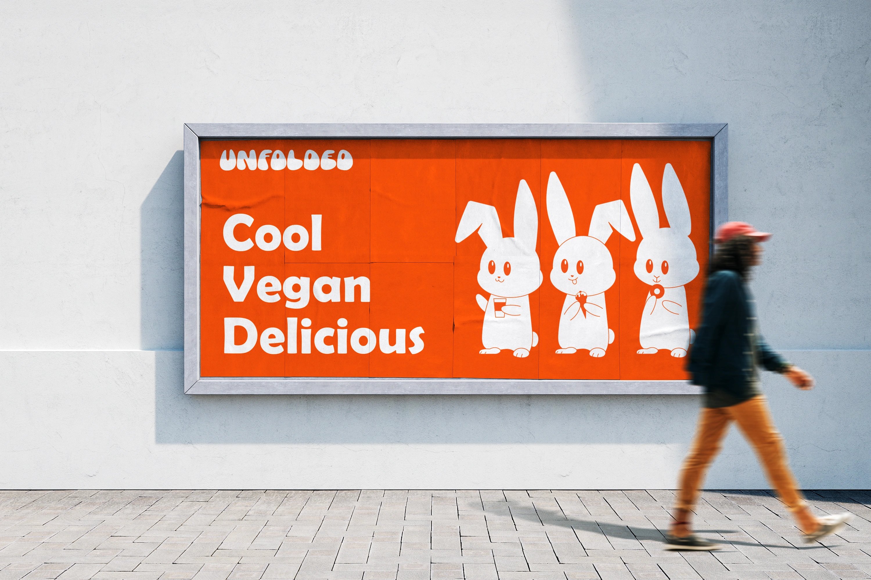
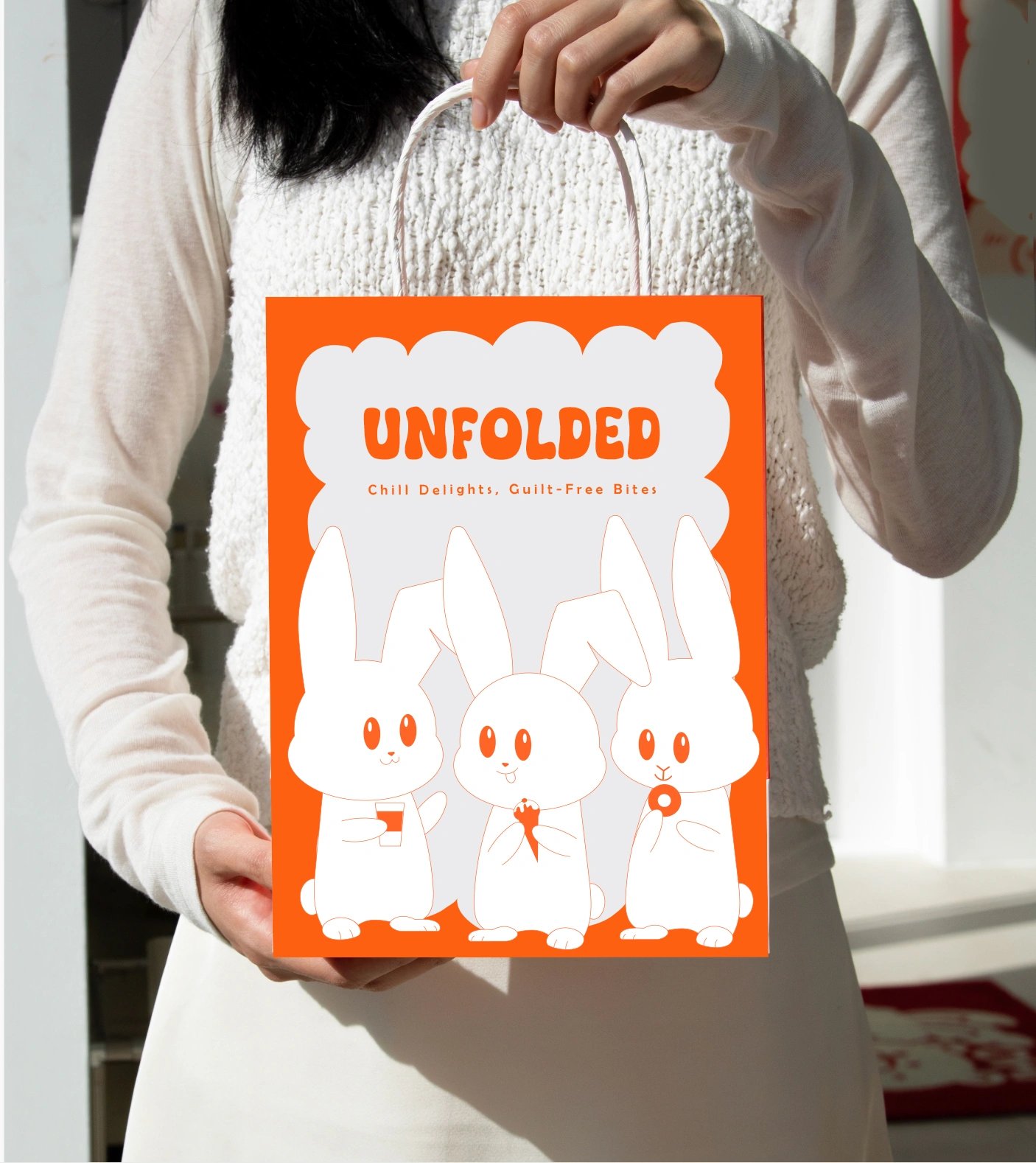
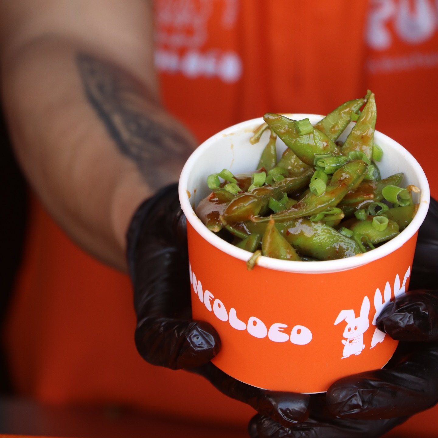
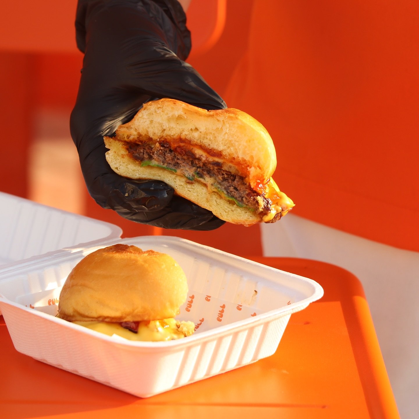
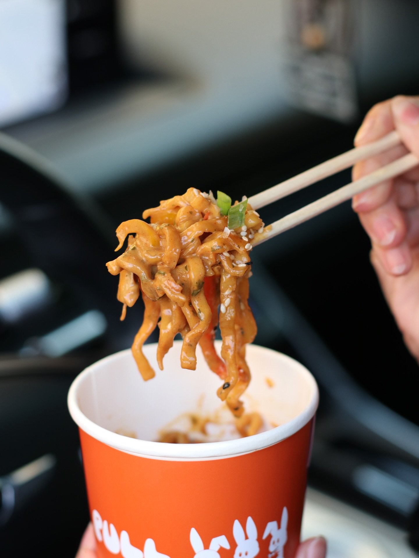
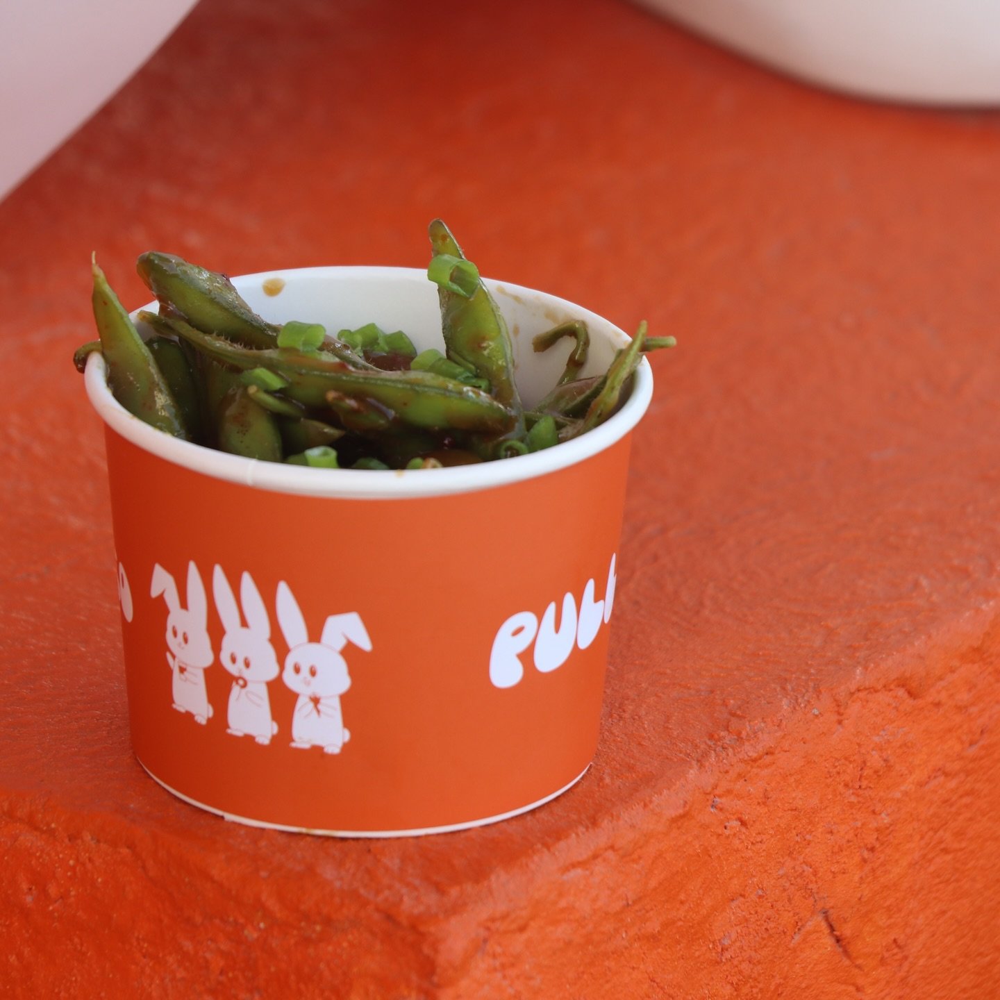
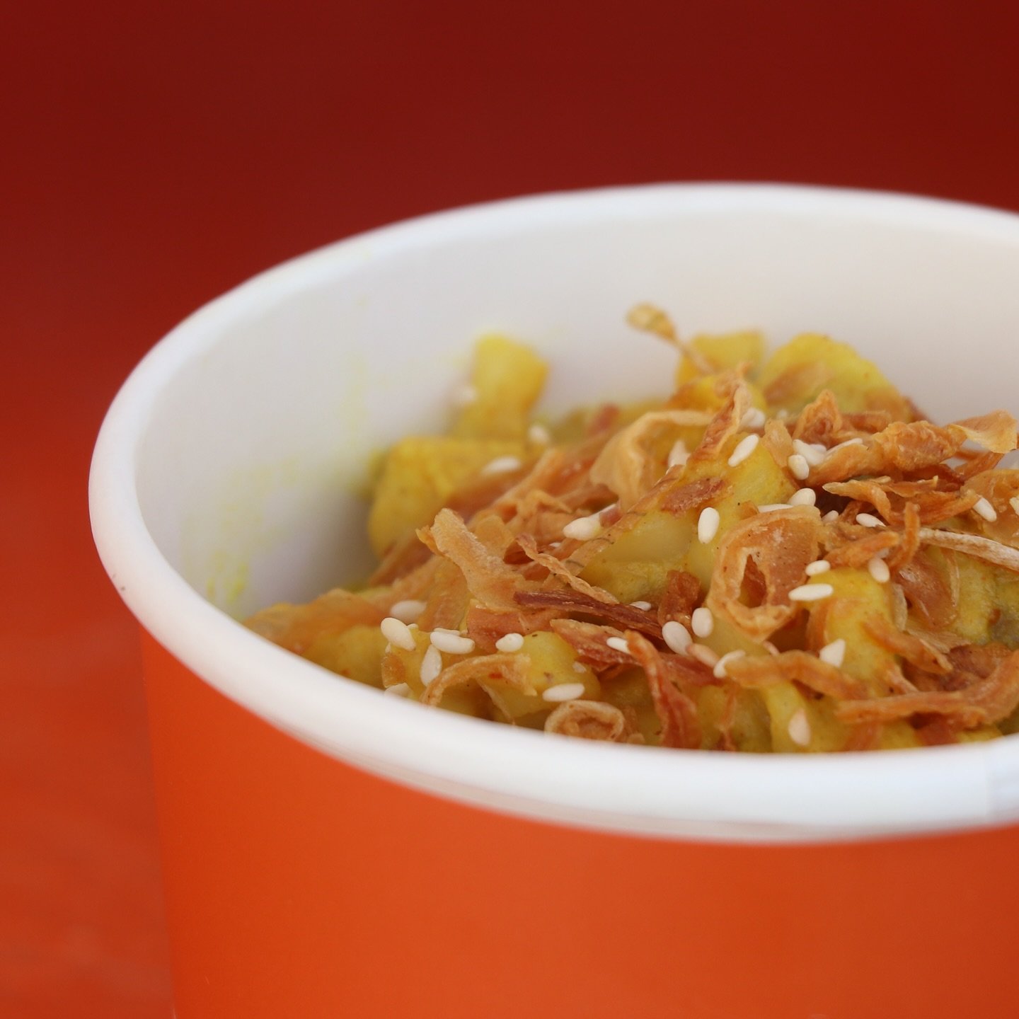
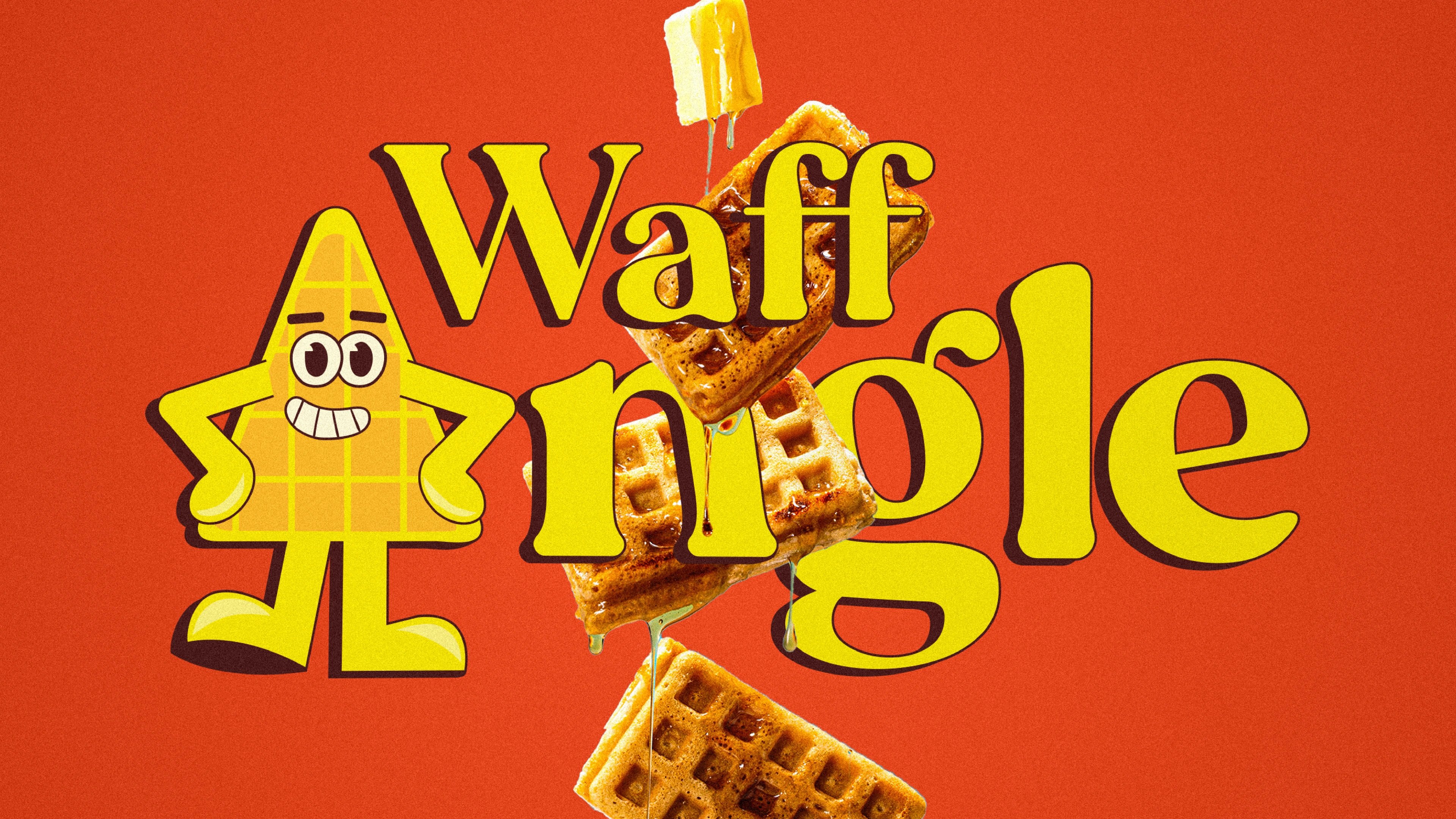
PULL and UNFOLDED are sister food brands launched under the Taraf ecosystem. PULL is an Asian-fusion street-food concept that blends Indian, Thai and Japanese flavours into bold, photogenic dishes. UNFOLDED is its premium counterpart — a vegan and gluten-free dessert brand built around conscious indulgence: ice creams, waffles, crepes and croissants made for health-minded customers who still want the joy.
the challenge
Two brands, one problem — they had to feel like a connected pair while keeping clearly separate personalities. PULL needed energy: flavour-forward, street-inspired, loud. UNFOLDED needed to feel indulgent and premium without tipping into the boring kind of "healthy." The system had to carry food appeal, category clarity and a social-first presence across both at once.
our solution
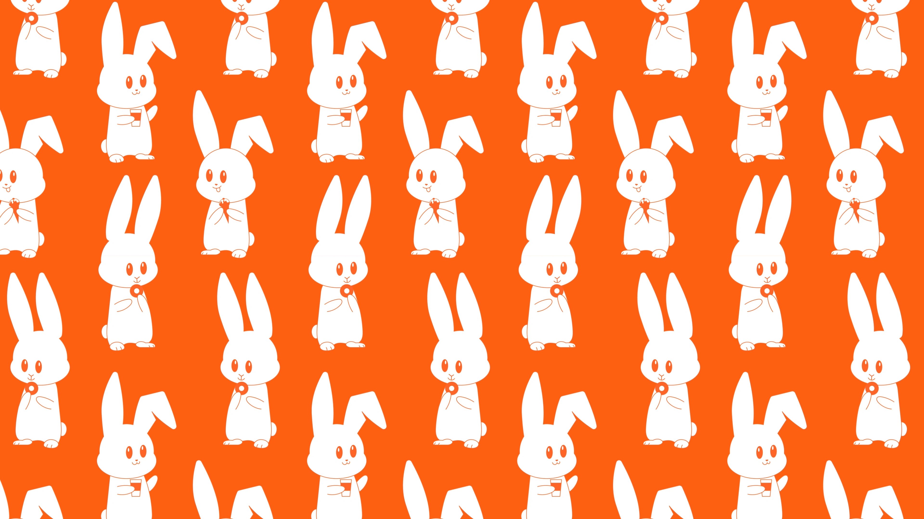
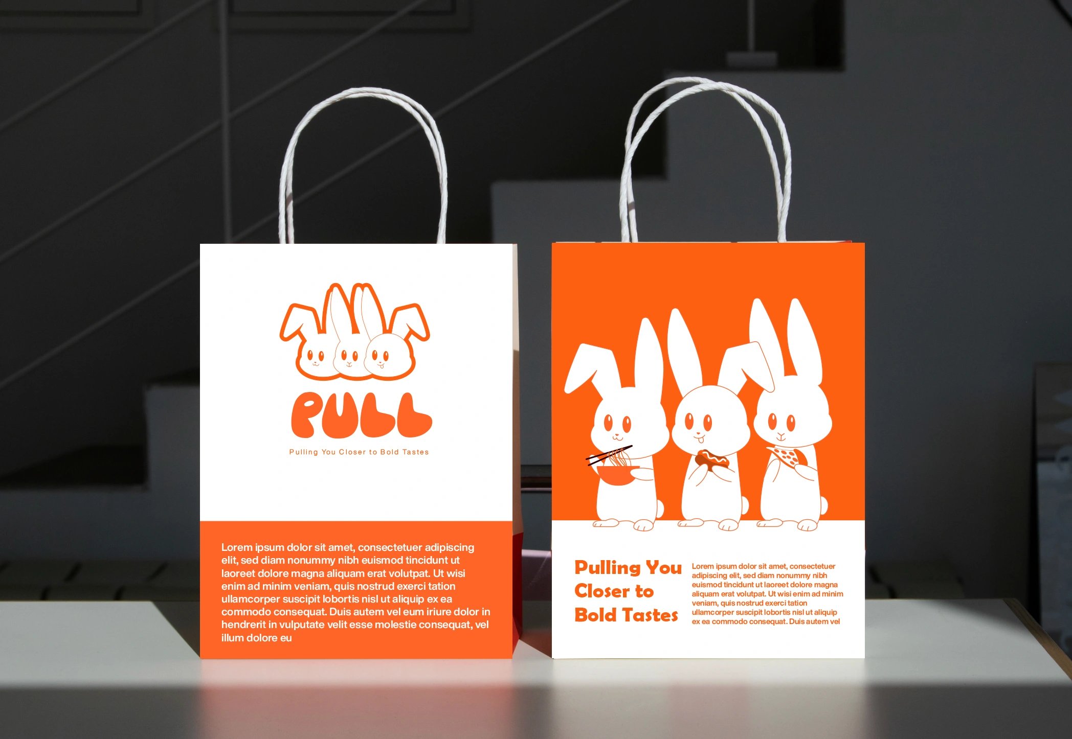
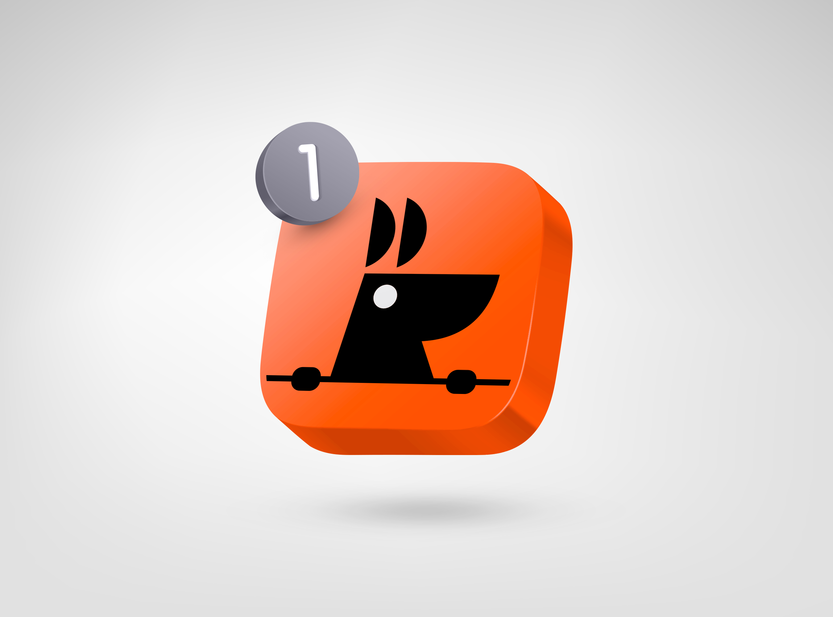
We built one flexible identity system and split it two ways. A recurring bunny motif gives both brands a memorable character and a world that stretches across packaging, menus, social and launch comms. The palette — orange, black and metallic — reads energetic for PULL and indulgent for UNFOLDED. PULL leans warmer and sharper for its street-food roots; UNFOLDED softens into a dessert-led expression for its vegan, gluten-free promise. Connected, playful and commercially ready — but each still speaks to a different craving.
two playful food worlds, one bold launch system
two appetites, one launch
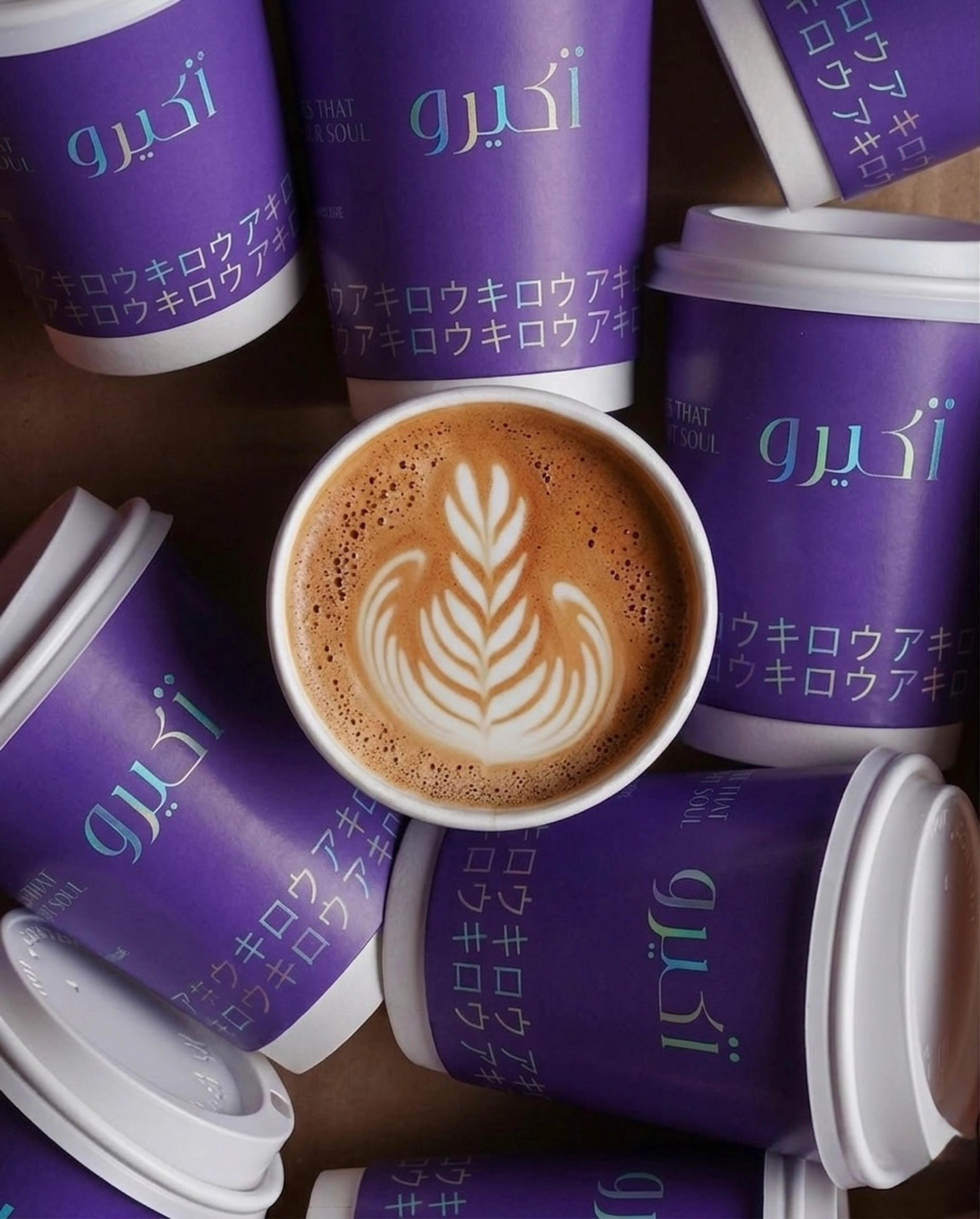
The system gave PULL and UNFOLDED a distinct, social-friendly presence from day one — PULL as a bold Asian-fusion brand, UNFOLDED as a playful premium dessert label. It also deepened our partnership with Taraf, adding two more brands to an ecosystem we've built together alongside Akiro and Berry Roasters. One identity language, stretched two ways, ready to launch.
but wait, there’s more


ready tobegin?
tell us what you’re building. we read every message, reply within two working days, and only take on projects we know we can ship well.