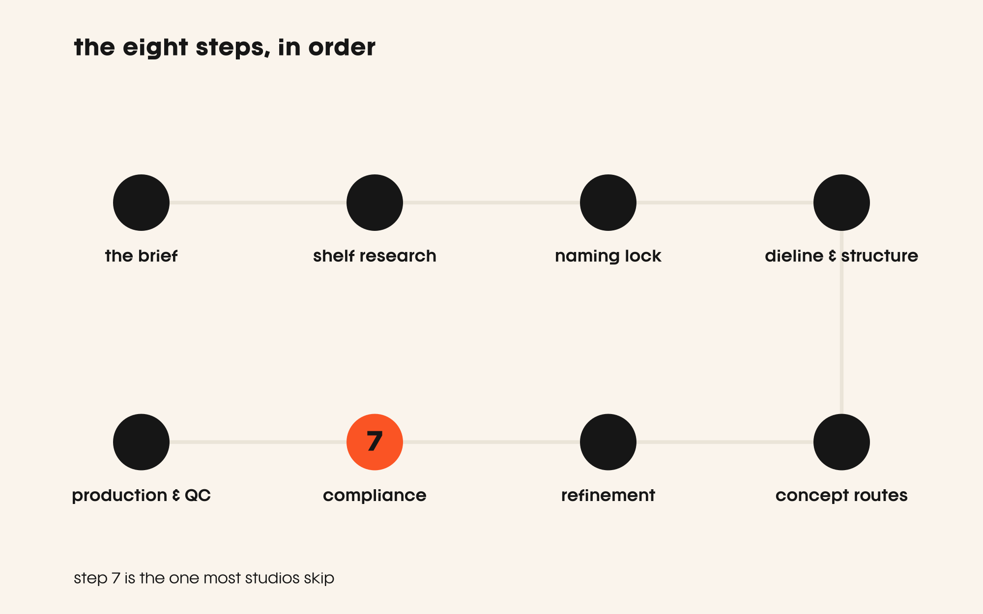
contents
- step 1: the brief, and the questions most briefs skip
- step 2: audience and shelf research
- step 3: naming and brand architecture lock
- step 4: dieline and structure first
- step 5: concept routes, not 20 variations
- step 6: refinement, and killing your darlings
- step 7: compliance and pre-press
- step 8: production and QC
- quick answers
The packaging design process, done properly, runs across eight stages — from the brief most brands underwrite, to a press check most studios never attend. Skip any one of them and you pay for it: in reprints, in regulatory holds, or in a pack that looks fine in a PDF and fails completely on shelf.
Most founders come to us after one of those failures. They have already spent ₹4–8 lakh on a design that could not be printed as specified, or that sailed through concepts and collapsed at FSSAI review. The eight steps below are our attempt to make the sequence legible before you hire anyone — including us.
step 1: the brief, and the questions most briefs skip
A brief is not a mood board and it is not a sentence about 'premium feel'. A usable packaging brief answers: who is buying this, where are they buying it, what does the pack need to do beyond contain the product, and what does success look like in measurable terms.
The questions most clients skip: what is the primary retail environment — modern trade, kirana, a quick-commerce thumbnail, a D2C unboxing? What shelf adjacencies will this sit against? Is there a variant range coming in twelve months that this system has to accommodate? These are not nice-to-haves. Answering them at brief stage costs an hour. Answering them after the dieline is built costs a redesign.
We spend one or two sessions on the brief before a single visual is produced. If a client cannot answer the retail-environment question, that is itself information — it tells us we need shelf research before we begin.
step 2: audience and shelf research
Packaging does not compete with other packaging in a deck. It competes on a shelf, in a search result, in a tiny app thumbnail. That context has to be documented before any visual direction is set.
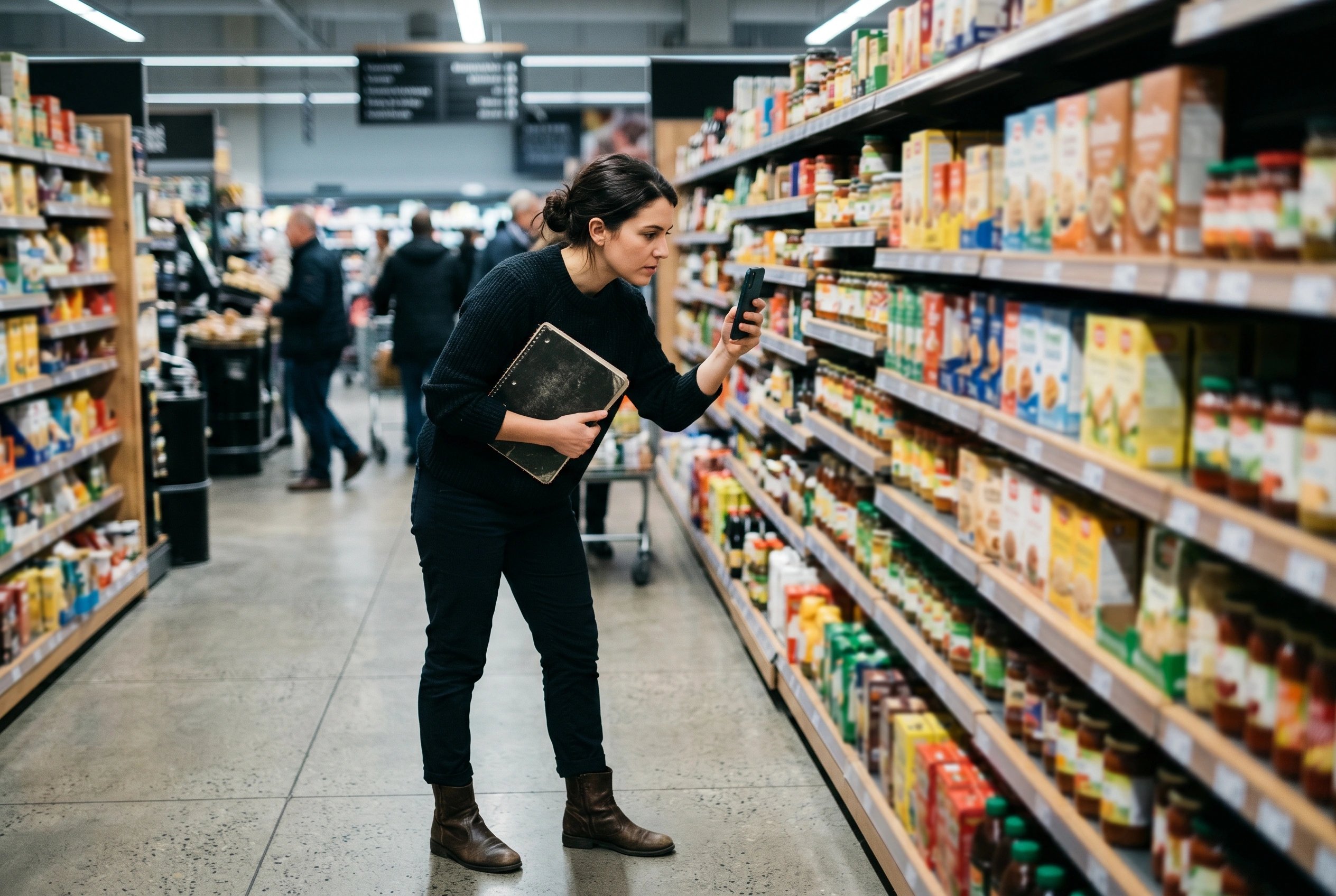
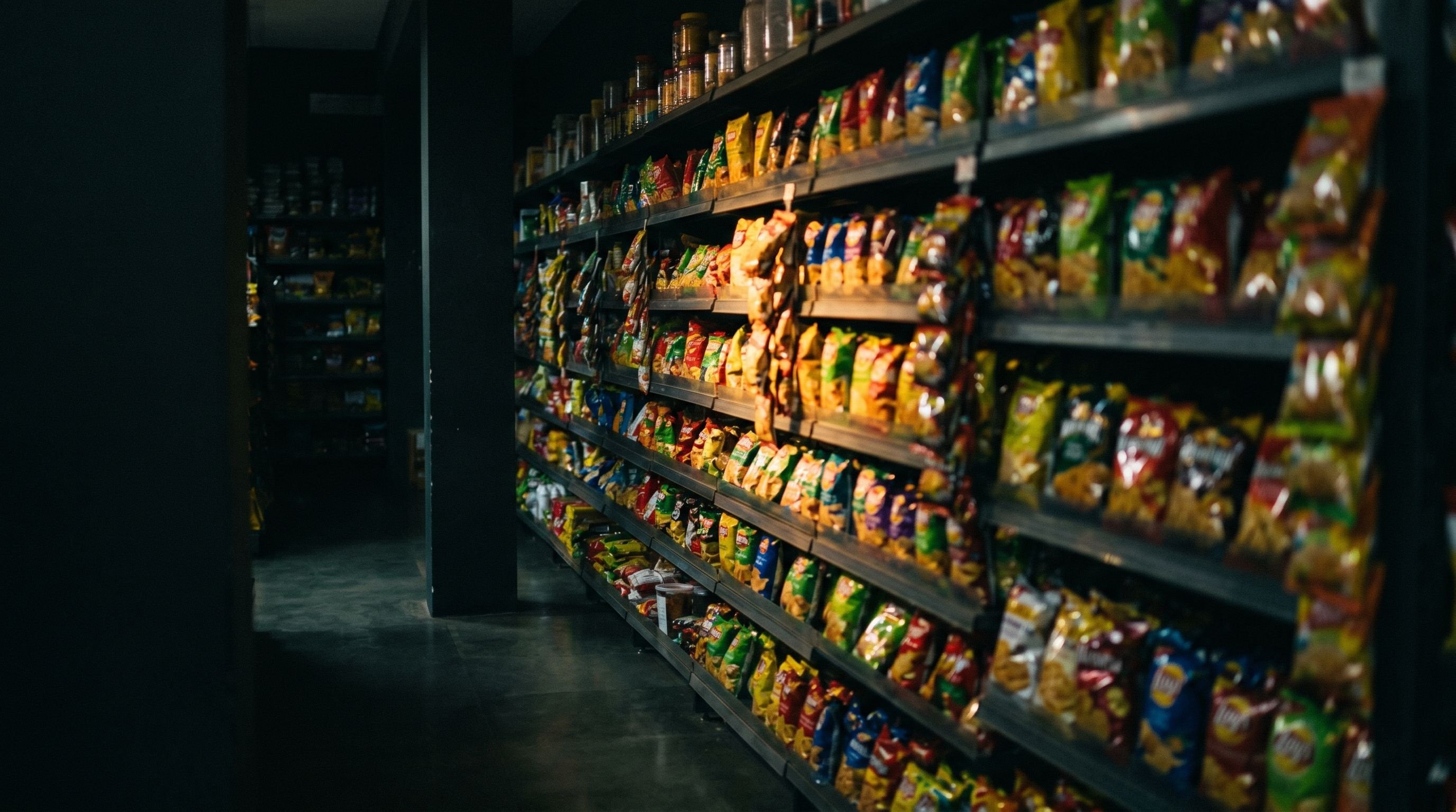
We photograph the actual retail environment — the gondola at the relevant modern-trade store, the first-page grid on Blinkit or Zepto — and map the visual language of the category: colour ownership, typography register, hierarchy conventions, where the brand name usually lives. Too Yumm, for instance, built immediate shelf standout partly by breaking the red-dominant colour convention every incumbent was using. That move requires knowing the convention first. We ran exactly this audit for Solvio, mapping the crowded Amazon category grid before a single label decision — and for Waffangle, whose pack had to work on a delivery thumbnail and a café counter alike.
Audience research here is behavioural, not aspirational. A shopper gives an FMCG pack only a few seconds of attention before deciding, so we want to know what they scan for and what cue triggers pick-up. That sets the hierarchy for everything that follows.
step 3: naming and brand architecture lock
If the product name, variant naming, or sub-brand structure is still in flux, do not start designing. This sounds obvious. It is ignored constantly.
A name change after concepts are built is not a find-and-replace. It changes character count, which changes type size, which changes hierarchy, which can cascade into layout restructuring across the whole face. A brand-architecture decision — is this a line under a master brand, or a standalone brand? — determines whether you need one design system or two.
We lock naming and architecture before concepts begin. For clients still deciding, we resolve it in a brand identity workshop. The hour spent here is a direct deduction from revision rounds later.
step 4: dieline and structure first
“The dieline decides the design — most studios start at concepts and pay for it in production.”
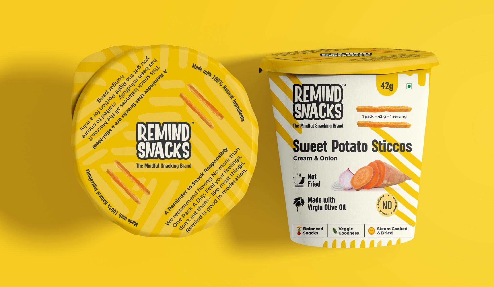
This is the step that separates studios that understand manufacturing from studios that only understand aesthetics. A dieline is the flat, unfolded template of the physical pack — every panel, fold, bleed, and safe zone. It is determined by the box structure, the filling method, the substrate, and the printer's technical specs.
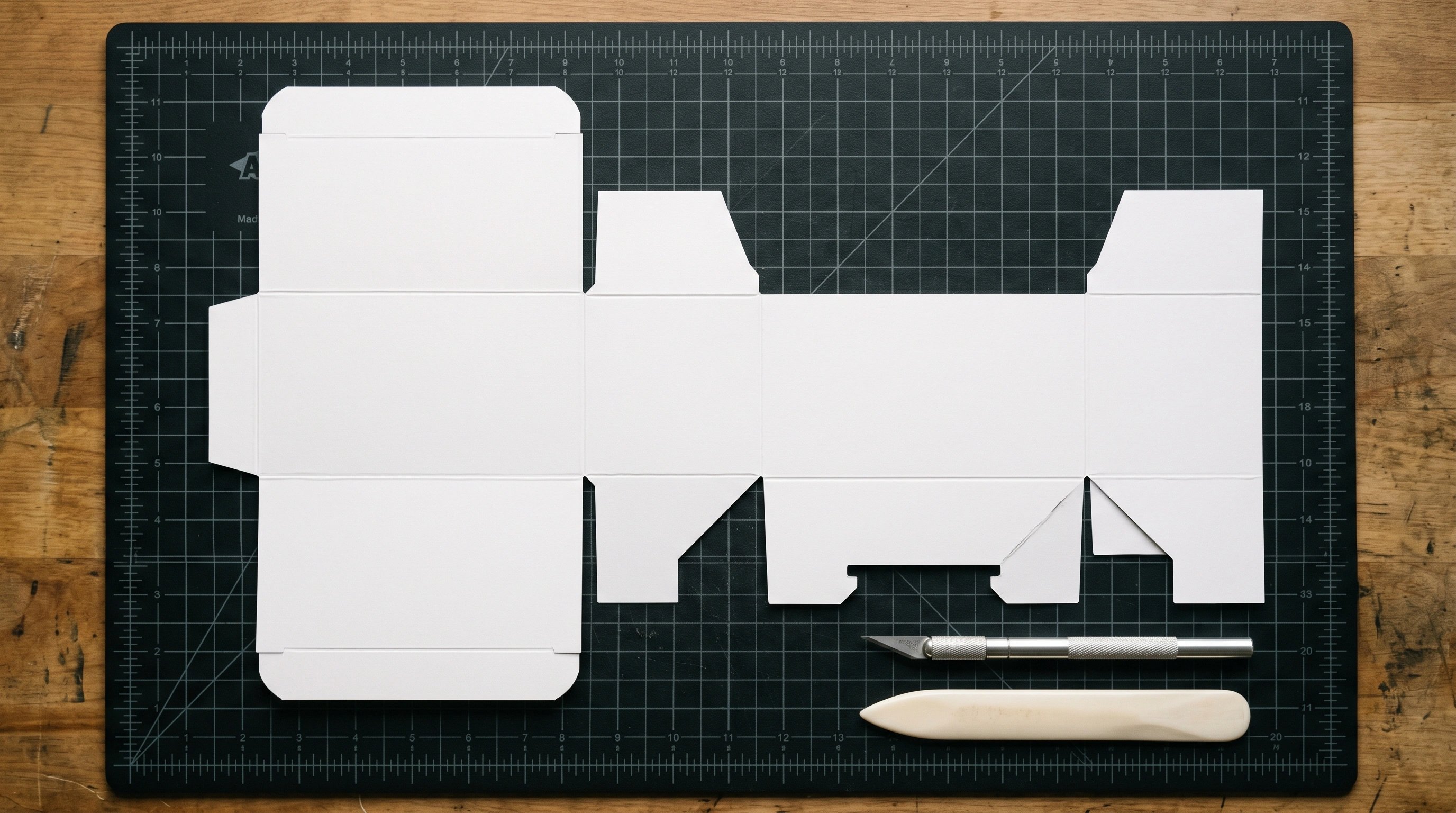
We build or validate the dieline before any concept work. The reason is mechanical: a design conceived on an incorrect or absent dieline will have its proportions, hierarchy, and sometimes its core idea compromised once it is wrapped onto the real structure. Paper Boat's distinctive pouch is a useful example — the structure itself carries meaning, and that meaning was designed with the structure, not retrofitted onto it.
We also resolve substrate and finish in principle here: paper stock, lamination, special finishes. These set what the design can and cannot do — a matte laminate reads colour differently from gloss, and some techniques are not viable below certain run quantities.
step 5: concept routes, not 20 variations
We present two or three concept routes, each a genuinely distinct design strategy. Not colour variations of one idea. Not the same layout in three typefaces. Distinct structural approaches to how the pack communicates.
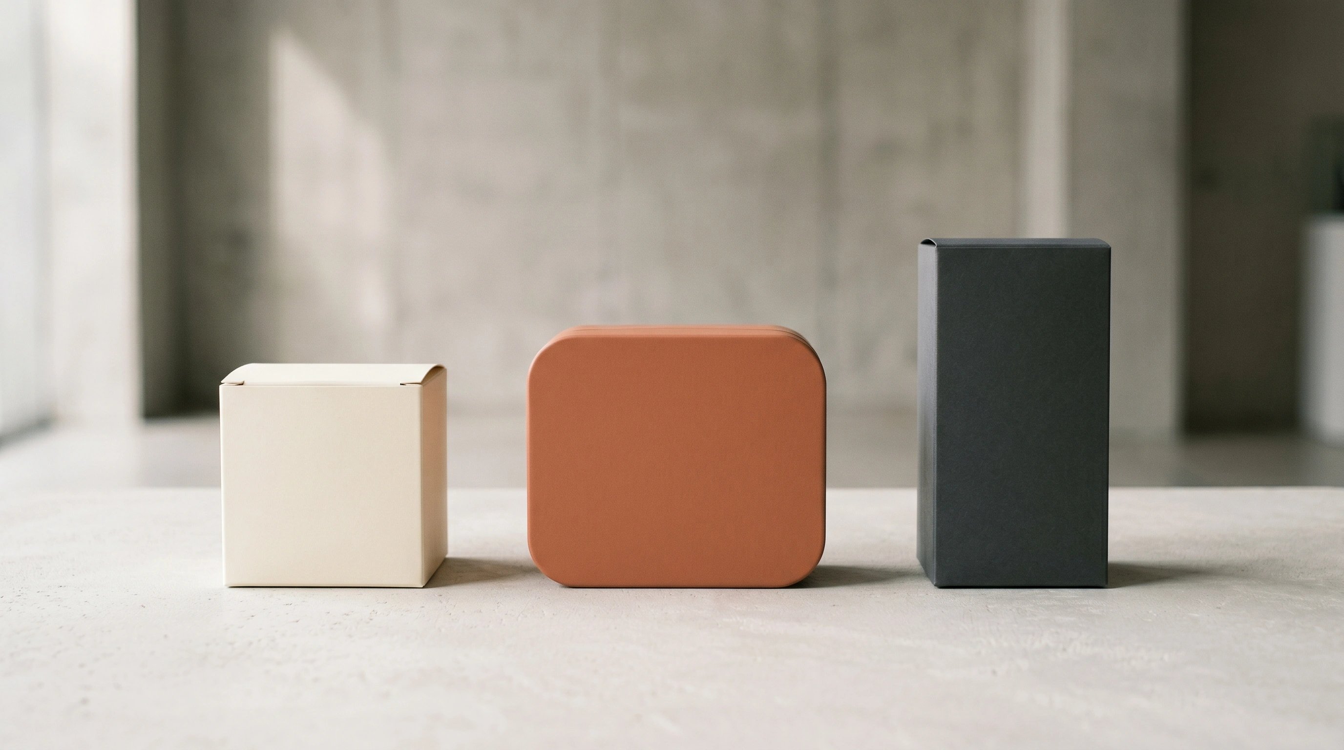
Each route is shown on the actual dieline, in the actual retail context photographed in step 2. Clients see the pack as it will be seen — not as a studio-lit hero image. This narrows the decision considerably. Most of the 'I'm not sure' feedback in packaging comes from evaluating designs in a vacuum.
Twenty variations is a symptom of a studio that has not done steps 1 to 4. When the brief, the audience insight, and the structural constraints are genuinely resolved, the direction space narrows. Our work shows the results of that narrowing — decisive design across categories.
step 6: refinement, and killing your darlings
One route is selected. Then the real design work begins. Refinement is not decoration — it is the systematic resolution of hierarchy, legibility at size, colour consistency across substrates, and the hundred small decisions that determine whether a pack holds up at ten centimetres and at ten metres.
This is where timelines compress dangerously. Clients approve a concept at 70% resolution and push for production. The remaining 30% is not cosmetic — it is type refinement at small sizes, colour specification in CMYK and Pantone, image retouching, and the secondary panels that were placeholder in the concept.
We run a simulated shelf view and a small-size legibility check before pre-press as standard. Amul's label consistency across a range of that scale is not an accident — it is the result of a disciplined refinement process applied to a locked system.
step 7: compliance and pre-press
For food and beverage products in India, the design must satisfy FSSAI labelling requirements before it goes to press. This is not a brief review. It is a mandatory legal check covering nutritional information, allergen declarations, net weight, batch and expiry format, and the FSSAI logo and symbol placement.
We have a dedicated post on the 2026 FSSAI label rules — refer to that for current specifics. What we will say here is that compliance belongs at step 7, not after printing. A non-compliant pack cannot legally be sold. We have seen products go to print with compliance errors and face a full reprint; the cost is rarely under ₹2 lakh for a mid-volume run.
Pre-press covers everything the printer needs: press-ready PDFs, embedded or outlined fonts, correct colour profiles, proof of bleed and safe zones, and a technical spec sheet. Our services include a full pre-press package on every packaging project.
step 8: production and QC
A press check is when someone from the studio or the client is physically present at the printer for the first production run. Not every project needs one, but every high-stakes launch — new brand introductions, premium-positioned products, packs with special finishes — should have one.
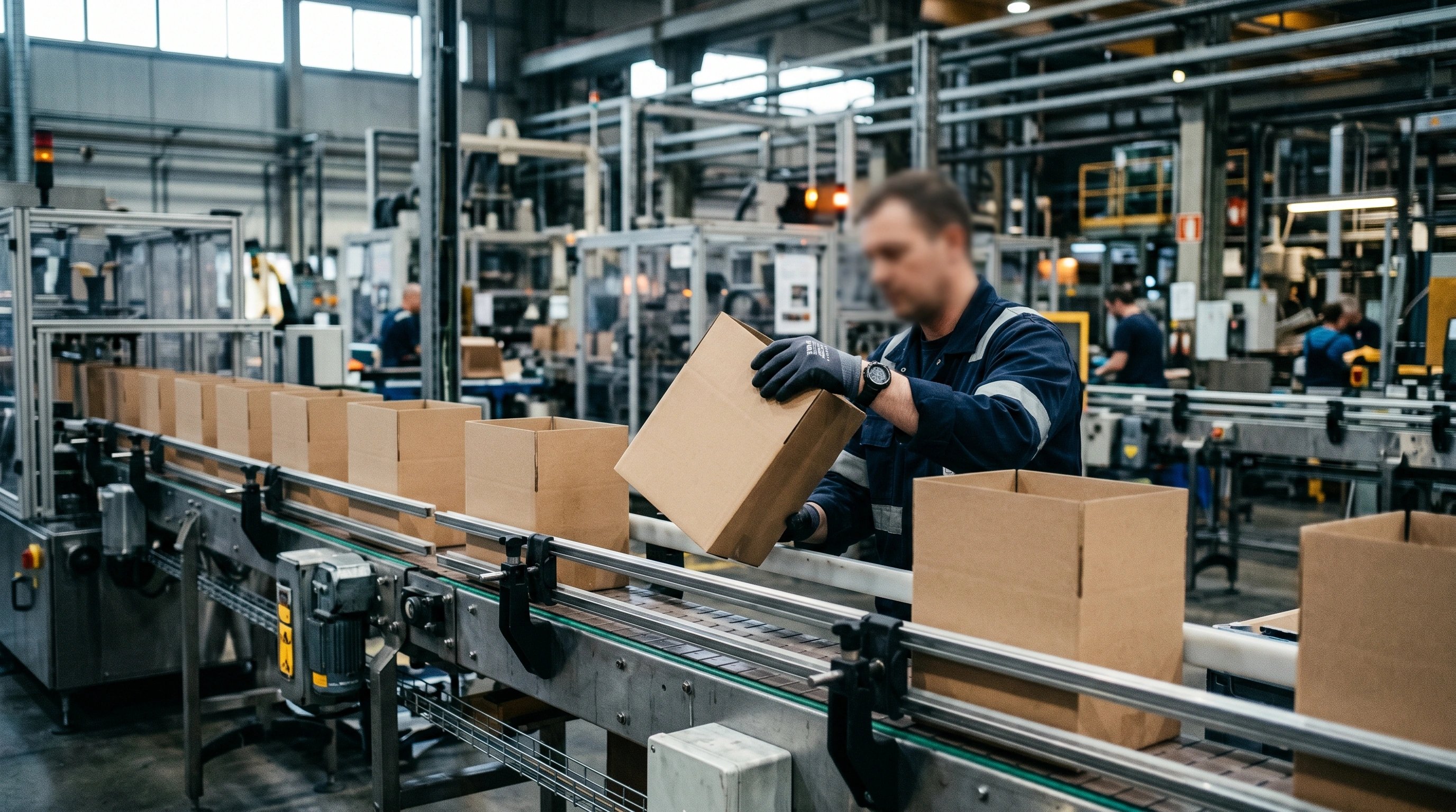
What you are checking: colour against approved proofs, registration accuracy, finish quality, and structural issues that only appear when the pack is assembled at volume. Substrate inconsistencies, dot gain, and lamination bubbles are caught at a press check and nowhere else.
We attend press checks for qualifying projects and provide a first-run QC report. The goal is to catch and correct before the full run is committed. A brand whose packaging promise is core to product trust cannot absorb a run of visually inconsistent packs at launch.
quick answers
how long does the packaging design process take?
For a straightforward single-SKU FMCG product, expect six to ten weeks from brief to press-ready files. Complex ranges, new brand builds, or projects needing structural development run twelve to sixteen weeks. Compliance review and pre-press add time that cannot be safely compressed.
what does packaging design cost in india?
Studio rates range from around ₹80,000 for a single-SKU rebrand with a freelancer to ₹8–15 lakh for a full brand-and-packaging system at a specialist studio. The variable is almost always how much of the process above is actually included. A quote that skips dieline work, compliance review, and pre-press is not cheaper — it is incomplete.
can i skip the dieline step if i already have a box structure?
You can use an existing dieline, but it must still be validated against your printer's current specs and your fill/close method before concepts begin. An inherited dieline that has not been checked is still an unknown. We validate every dieline we work from, regardless of its source.
what is the difference between packaging design and label design?
Label design is a subset — it covers the printed panel applied to a pre-made container (bottle, jar, pouch). Packaging design includes structural decisions about the container itself, the dieline, and sometimes the unboxing experience. Both require the same compliance rigour for food products in India.
The eight steps are what the process looks like when it is run without shortcuts. Some projects compress stages legitimately — a label refresh on a stable brand can skip steps 3 and 4. But the sequence exists for a reason. The brands that build packaging that lasts have almost always done the work in this order.

got a project in mind?
we turn thinking like this into brands that actually ship. tell us what you’re working on.