contents
The Lay's rebrand — unveiled in October 2025, the biggest design overhaul in the brand's roughly 100-year history — was built on a single uncomfortable data point: 42% of consumers did not realise Lay's chips are made from real potatoes. That is not a branding opportunity. It is a product-perception failure. And it is exactly the kind of problem a rebrand is actually meant to fix.
the insight that started it: 42% didn't know it was potatoes
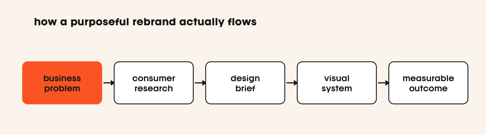
PepsiCo's in-house Design & Innovation team did not begin with a mood board. They began with a business problem, reported by Fortune: nearly half of Lay's buyers — people who eat the product regularly — had no idea they were eating something made from actual potatoes. That is category-level confusion, not a packaging-aesthetic problem.
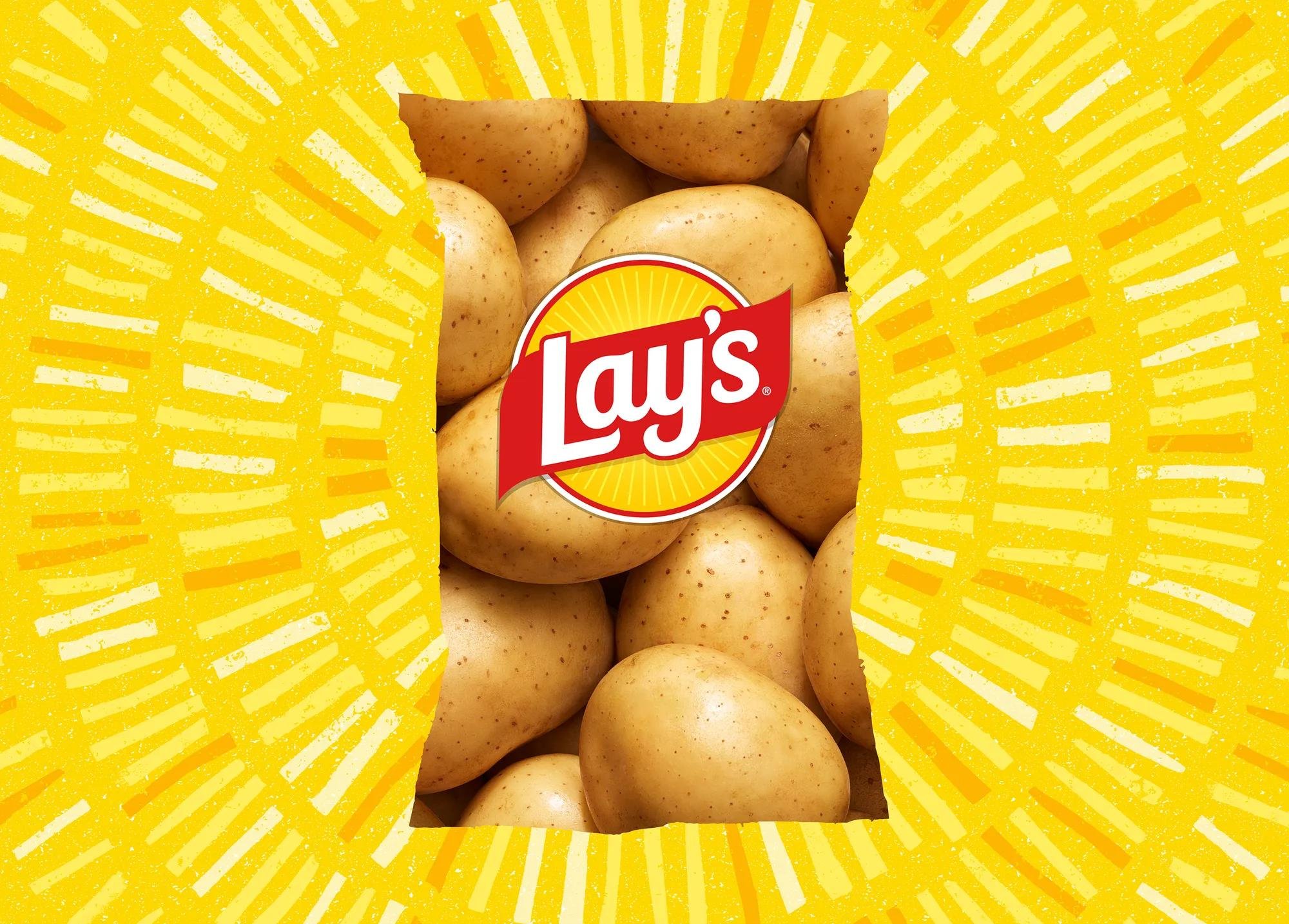
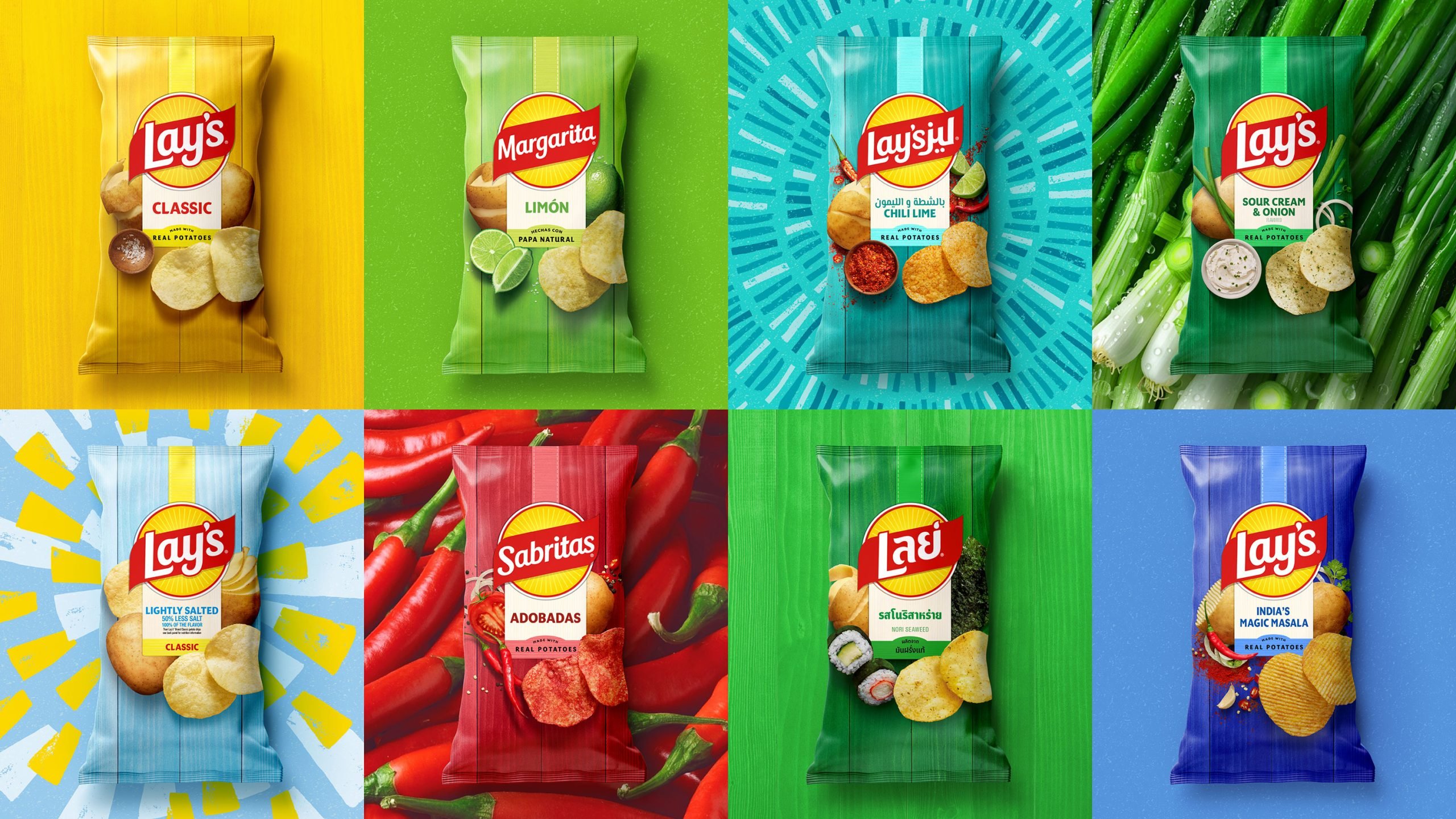
The rebrand's entire logic flows from that number. Once you know the insight, every design decision reads as a direct answer to it. The new bag carries photography of real potatoes. The pack states 'Made with real potatoes'. A sun-like logo motif reinforces warmth and naturalness. None of it is arbitrary.
This is what brand identity work actually is — not decoration applied to a product, but the system that accurately represents what the product is. When the system drifts far enough from the product reality, you get a 42% confusion rate.
what actually changed, and what they kept
The new system replaces the previous illustrative approach with real-potato photography on the pack. The logo is refreshed into a sun-like mark — warmer, rounder, more expressive of the farm-origin story. The palette stays in Lay's characteristic yellow territory; they were not trying to become a different brand, they were trying to become a *clearer* one.
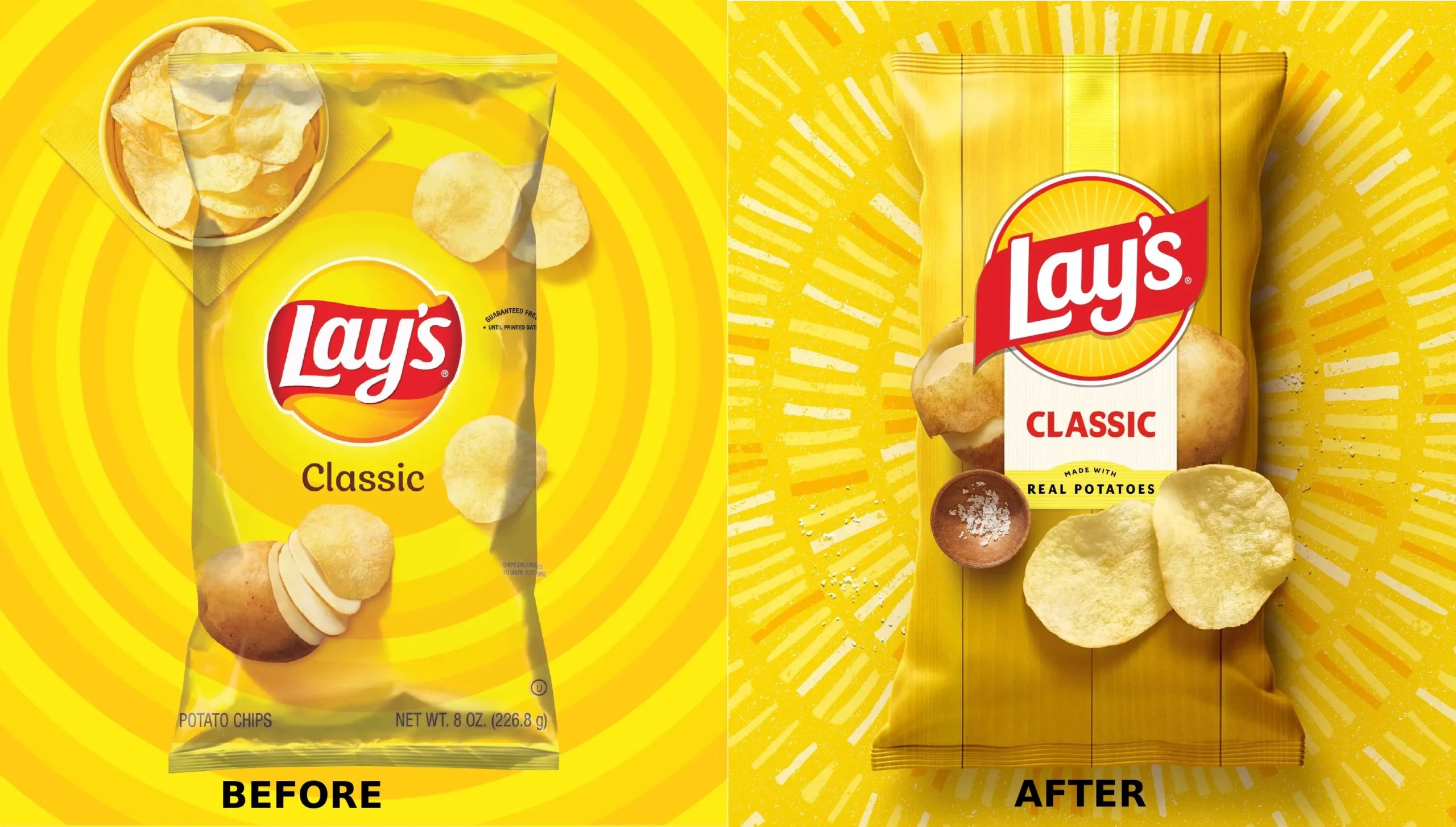
Crucially, PepsiCo also removed artificial flavours and colours from core products as part of the same programme. The packaging change and the product change happened together. That alignment matters: if you redesign the bag to communicate naturalness and the ingredient list still reads like a chemistry exam, consumers eventually notice the contradiction.
The work won three 2026 Communicator Awards of Excellence, recognised in May 2026. Awards do not validate commercial success, but they confirm the craft was executed to a high standard, not just briefed well.
why designers loved it and some shoppers didn't
The design community's reception was broadly positive. The reasons are not hard to see: the system is coherent, the hierarchy is clean, and you can read the brief through the finished work — one of the marks of well-executed packaging.
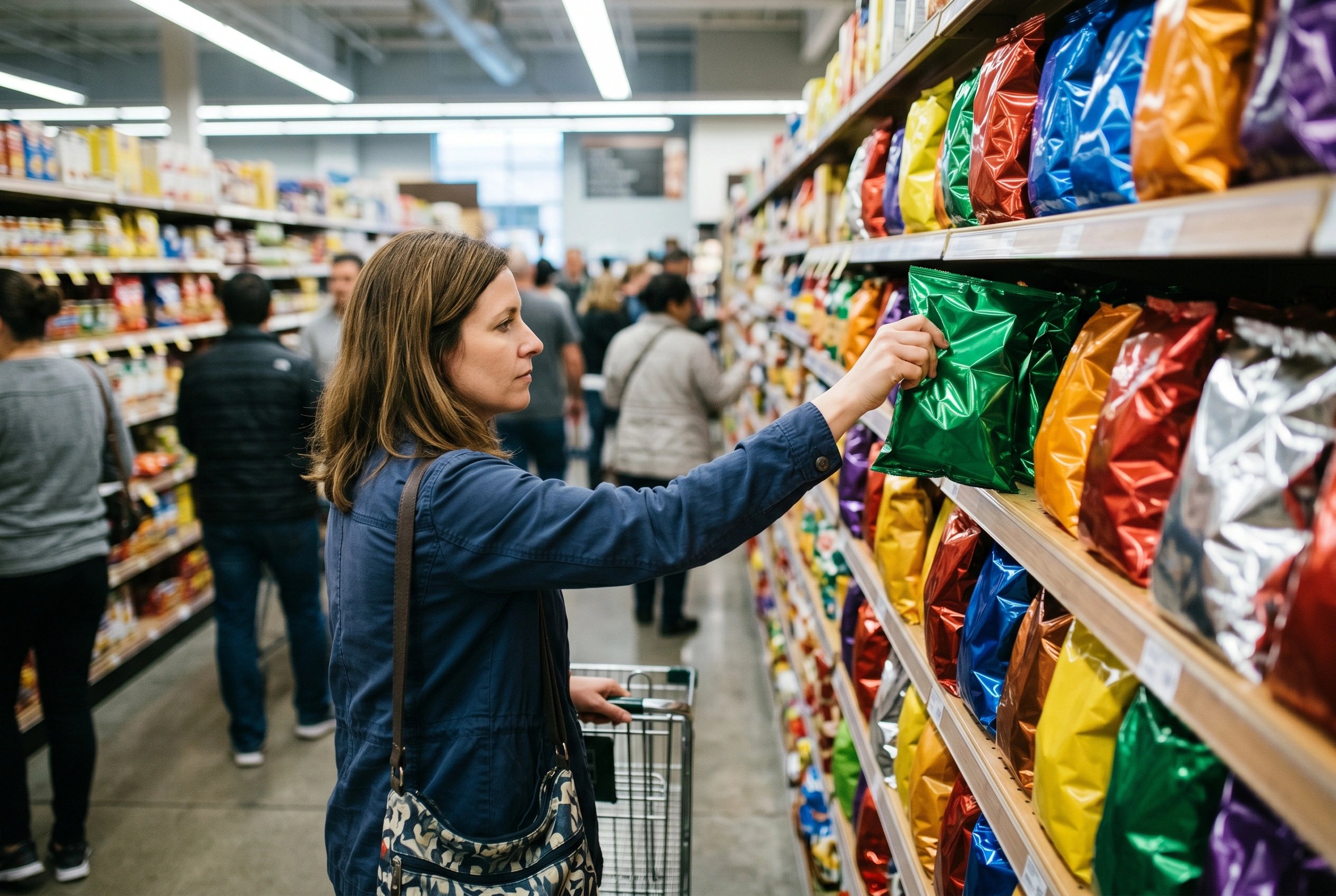
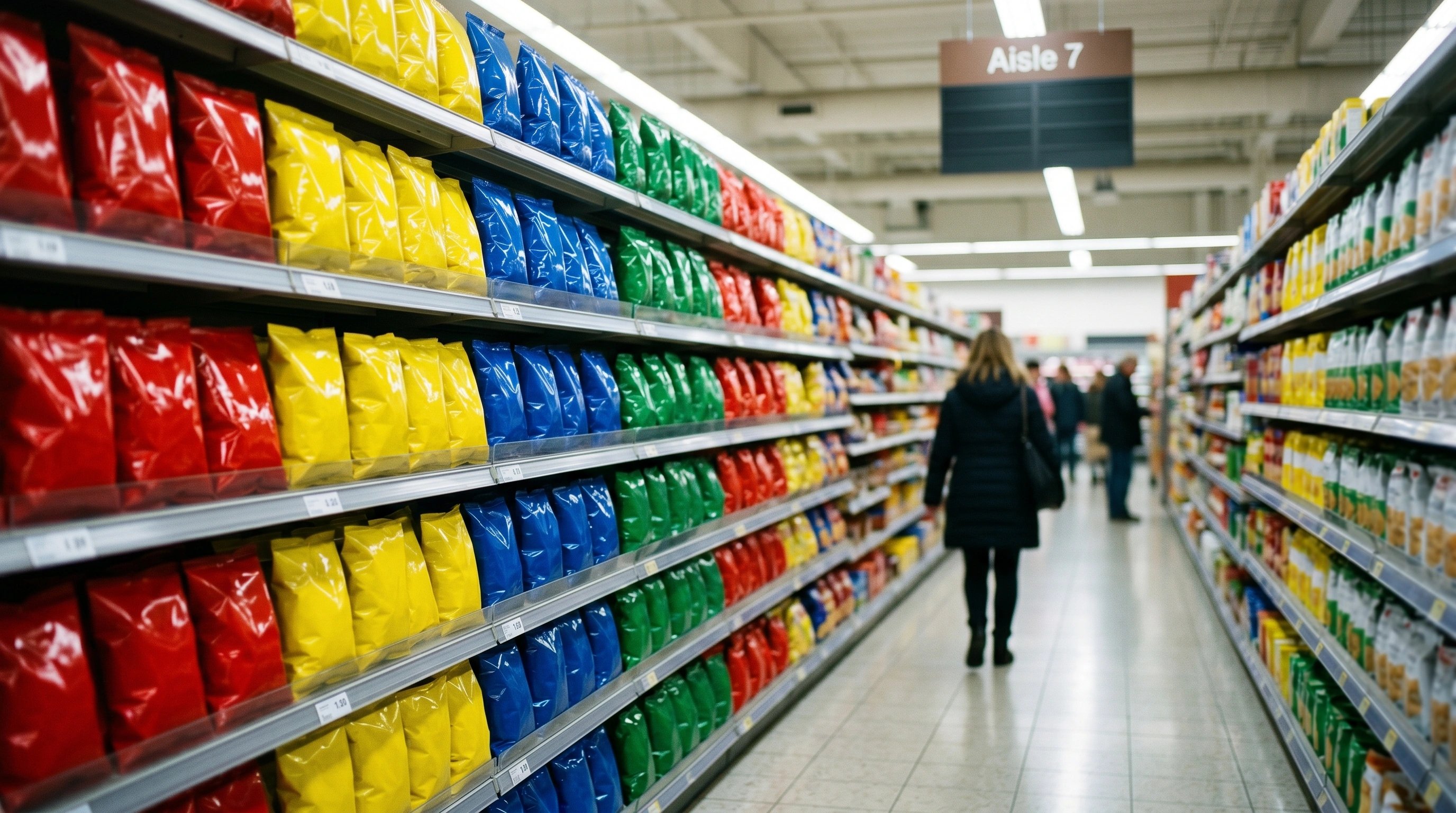
Shopper response split along a familiar fault line. Long-time buyers said they missed the older look. This is not ingratitude — it is a predictable response to any significant change in a product that functions partly as a habit. Crisps are eaten in the same place, at the same time, by the same person, week after week. The pack is part of the ritual.
That loyalist friction does not mean the rebrand was wrong. It means the business made a deliberate trade: accept short-term discomfort from existing buyers in exchange for long-term clarity for the much larger pool of people who were underinformed. The 42% number made that trade quantifiable.
“A rebrand that doesn't fix a business problem is just expensive boredom.”
the real lesson: rebrand for a reason, not a refresh
The Lay's case is instructive precisely because the reason was so specific. Not 'our brand feels dated' or 'we want to feel more premium'. It was: nearly half our buyers hold a false belief about our product, and that belief may be capping our growth. Translate that into a design brief and you have direction. Leave it vague and you get a cosmetic refresh.
Most rebrands fail because they are launched for internal reasons (a new CMO, a bored board, a competitor's rebrand causing panic) rather than external ones. PepsiCo's team did the opposite: started with consumer research, found a real perception gap, then designed a system to close it. We run rebrands the same way — our Zion Health rebrand started from the business reason, not a mood board.
The rollout is global, which means the refreshed packaging reaches Indian shelves too. For Indian founders watching this, the principle applies at a ₹10 crore brand just as cleanly as at a global FMCG giant. The size of the business does not change what makes a rebrand worth doing.
when you should not do what lay's did
Lay's had something most brands considering a rebrand do not: a specific, measurable perception problem backed by research. If you do not have that, you are not ready to rebrand. You are ready to do research.
A full system overhaul — new logo, new pack architecture, new photography, product reformulation — requires alignment across design, marketing, supply chain, and legal. The cost is not just fees. It is the operational weight of switching every touchpoint at once. For a ₹5–50 lakh brand, that overhead can absorb resources better spent on distribution or product quality.
There are also categories where visual familiarity is a safety signal — pharmaceutical packaging being the obvious one, but FMCG staples share the dynamic. There, a quieter evolution (refining typography, updating photography, modernising colour) often delivers the perceptual shift without triggering loyalist backlash.
The discipline is in the diagnosis. Our services start there — not with a visual direction, but with the business question the design has to answer. Lay's got that order right. Most rebrand briefs we see get it backwards.
quick answers
why did lay's rebrand in 2025?
Research found roughly 42% of consumers did not know Lay's chips are made from real potatoes. The redesign — real-potato photography on the pack and a 'Made with real potatoes' line — was built directly to close that perception gap.
what changed in the lay's redesign?
A sun-like logo motif, real-potato photography on packaging, and the line 'Made with real potatoes'. PepsiCo also removed artificial flavours and colours from core products as part of the same programme. The core yellow brand colour remains.
did the lay's redesign win any awards?
Yes — it won three 2026 Communicator Awards of Excellence, announced in May 2026. The work was executed by PepsiCo's in-house Design & Innovation team.
how do i know if my brand needs a rebrand?
Start with a specific, measurable business problem — a perception gap, a category mismatch, an audience you are failing to reach. If you cannot name the problem in one sentence, you are not ready to rebrand. You are ready to do research.
“A logo is a signature, not a personality. The work is in what the packaging communicates before anyone reads a word.”


got a project in mind?
we turn thinking like this into brands that actually ship. tell us what you’re working on.