a bakery built to glow — in purple, of all colours
about the client
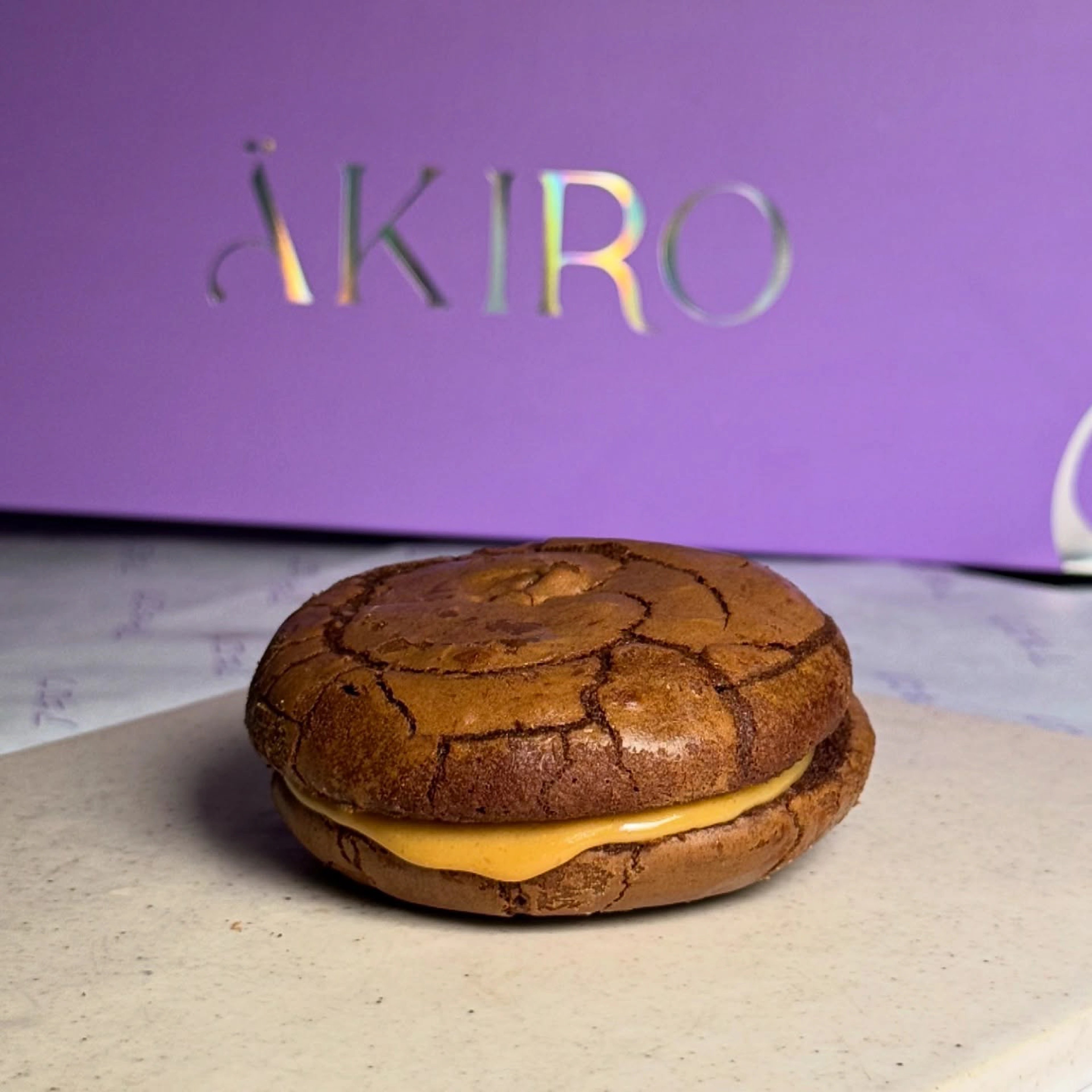
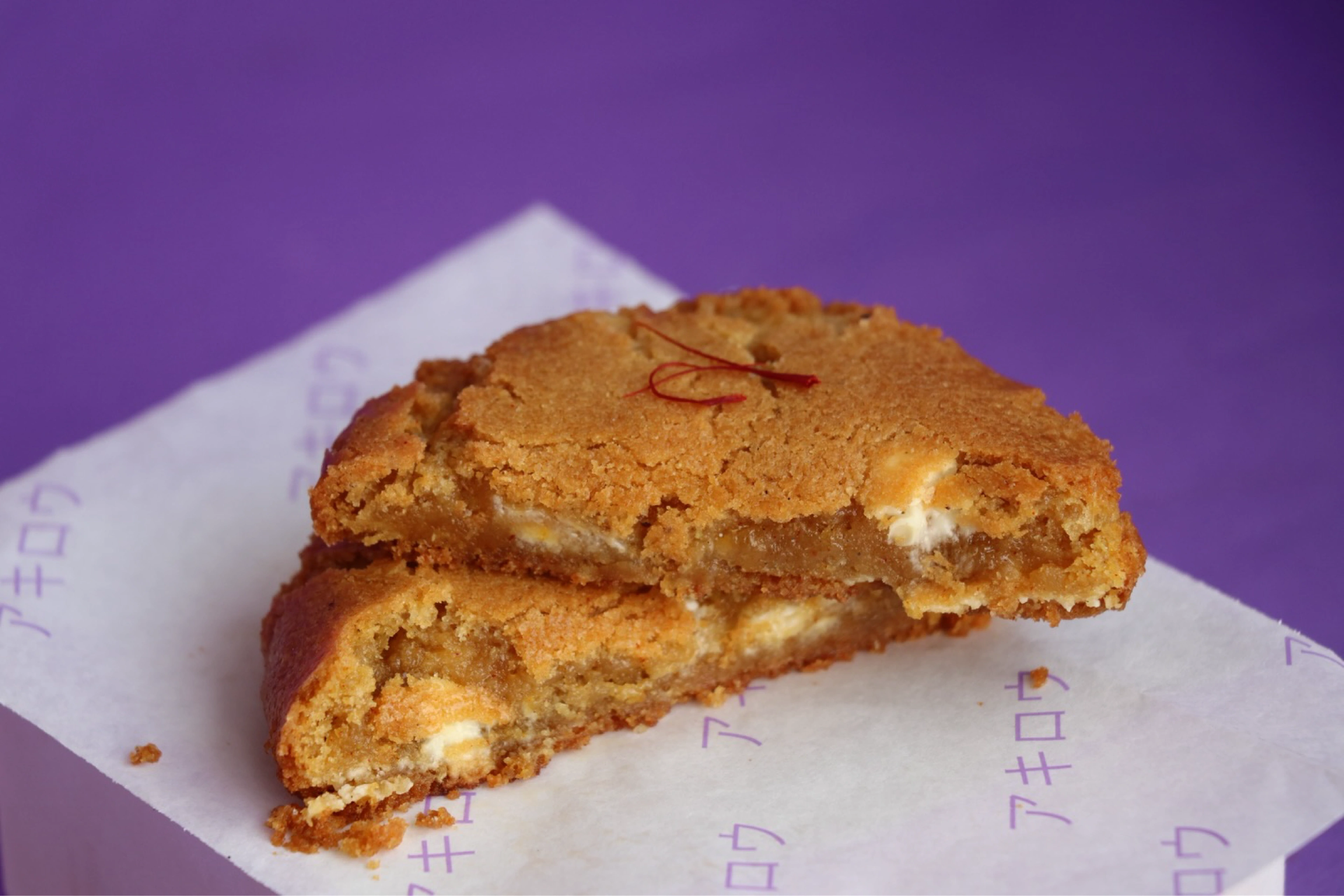
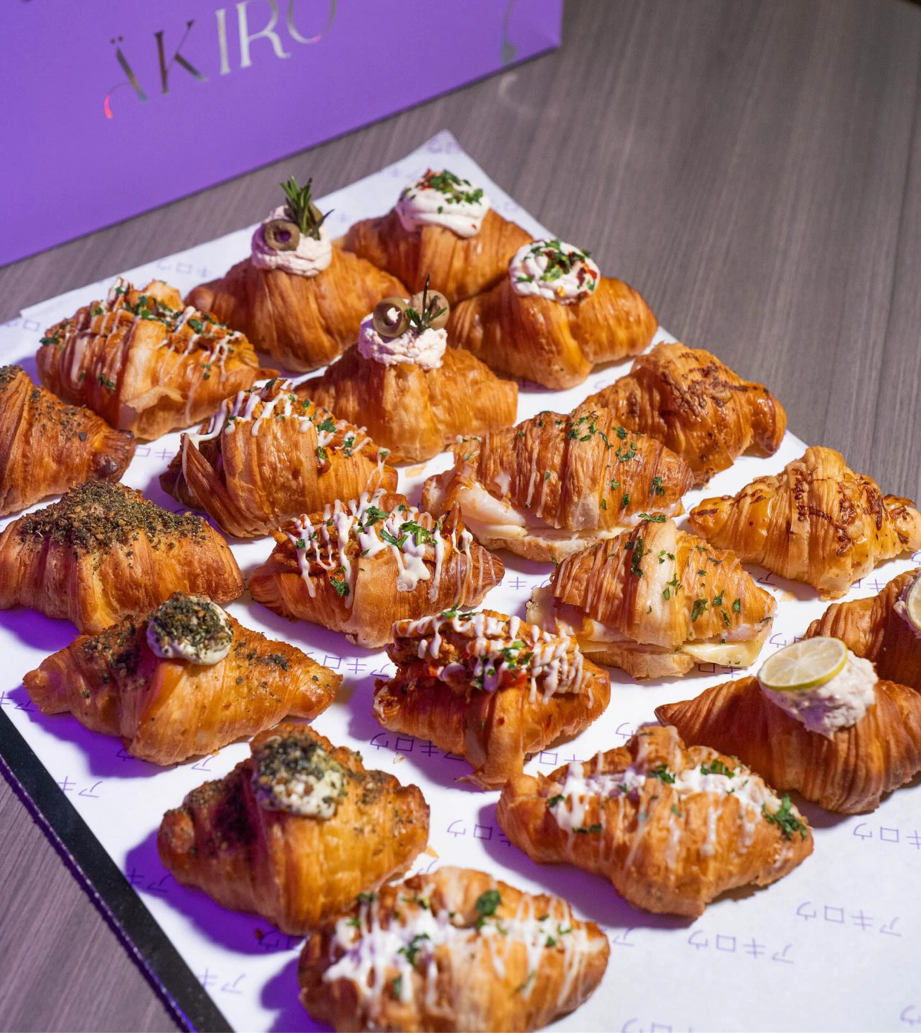
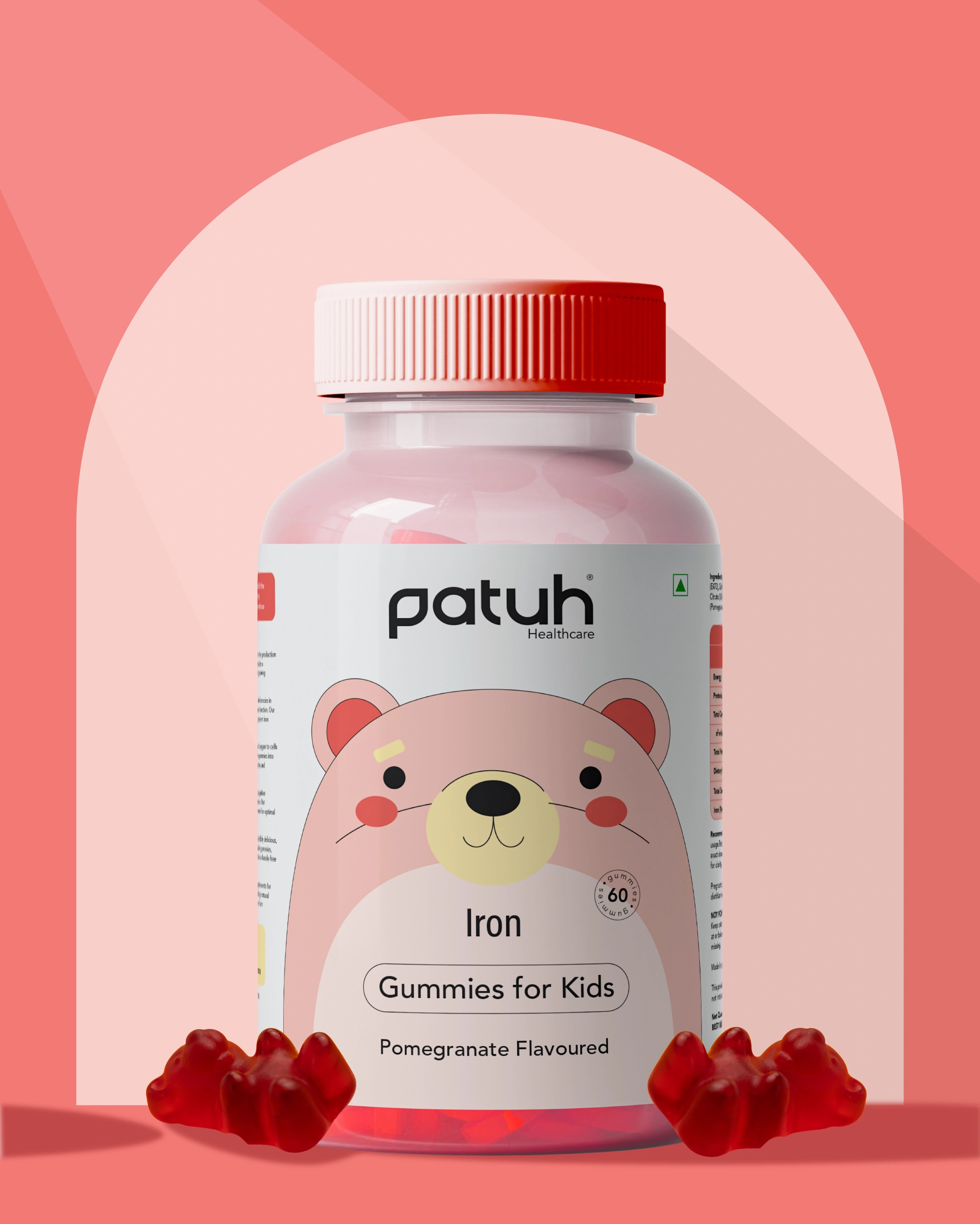
Akiro (ÄKIRO) is a Japanese-themed bakery and café concept built on bright colour, warmth, and community. The menu runs from pastries and breads to coffee, each carrying a quiet Japanese-inspired twist. The name nods to brightness and glow — the founder wanted a bakery that felt happy, colourful, and memorable. Beyond the counter, Akiro carries a learning-led mission, giving students hands-on baking and real workplace experience.
the challenge
Japanese-inspired is a crowded, cliché-prone space, and Akiro refused to look like everyone else's idea of it. The brief was layered — bright colour, happiness, quality baking, community, family values, and a student-learning mission all had to live inside one coherent system. And it had to hold up across real touchpoints — cups, pastry boxes, wrapping paper, product photography, social — while still reading premium and ownable.
our solution
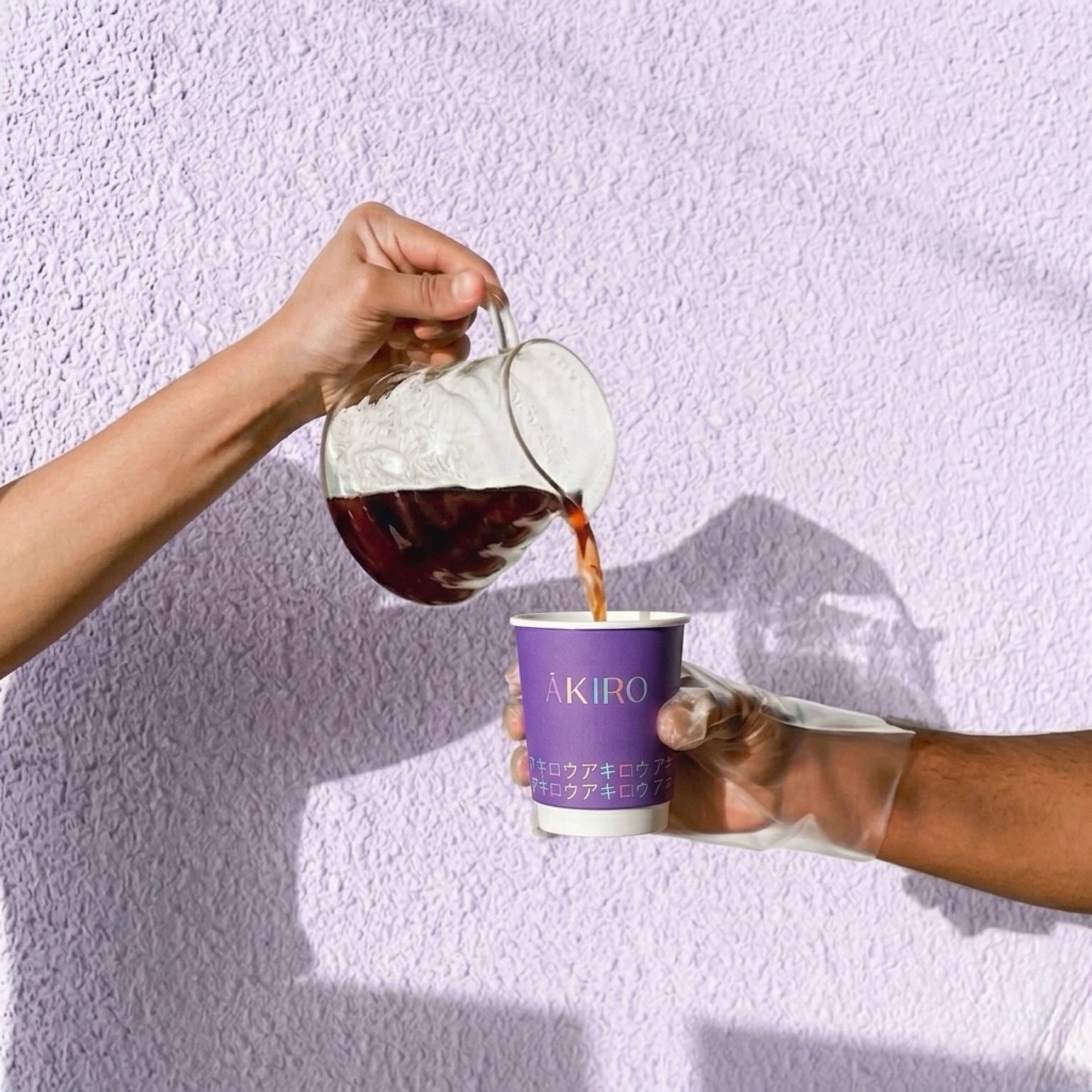
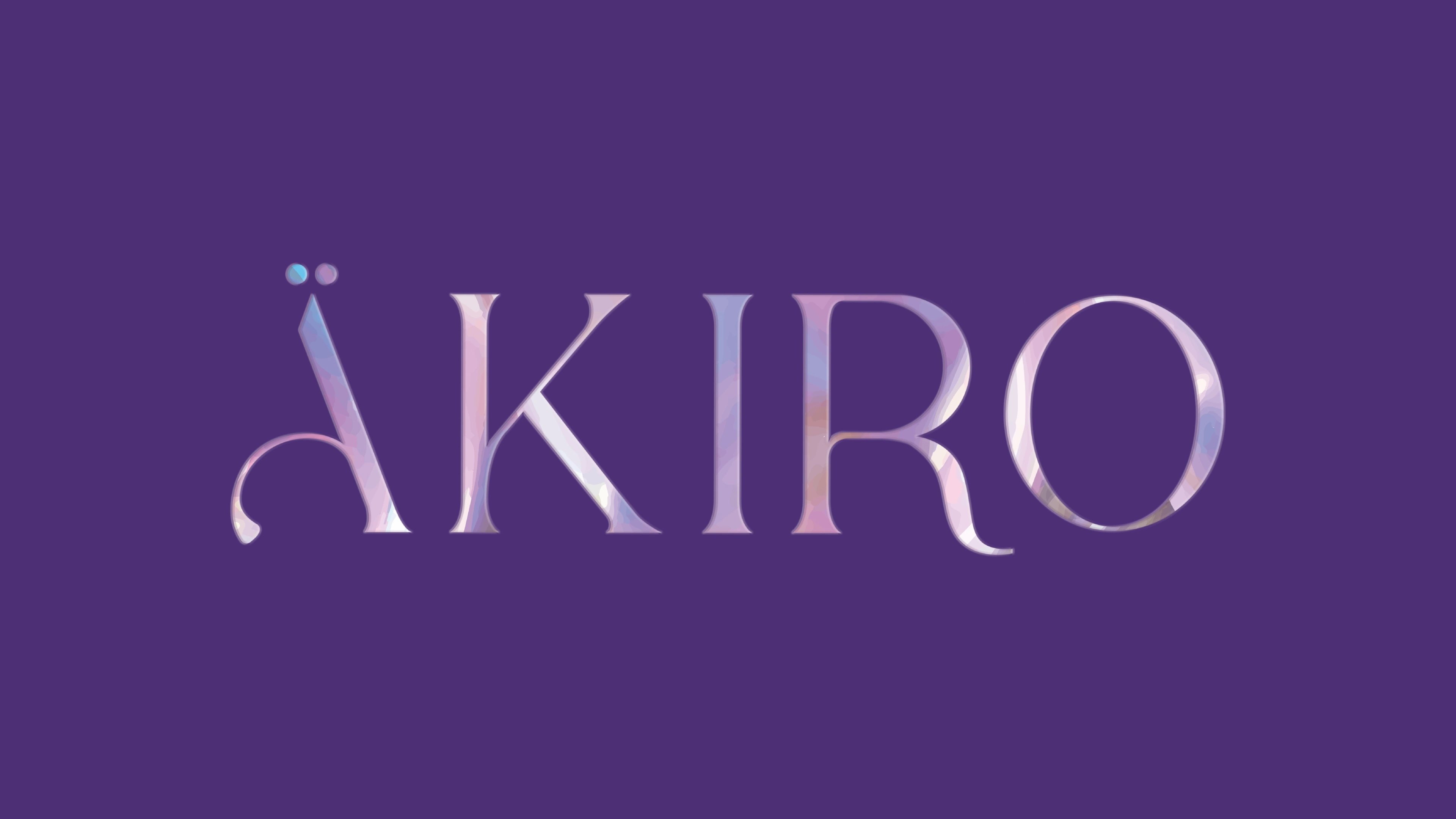
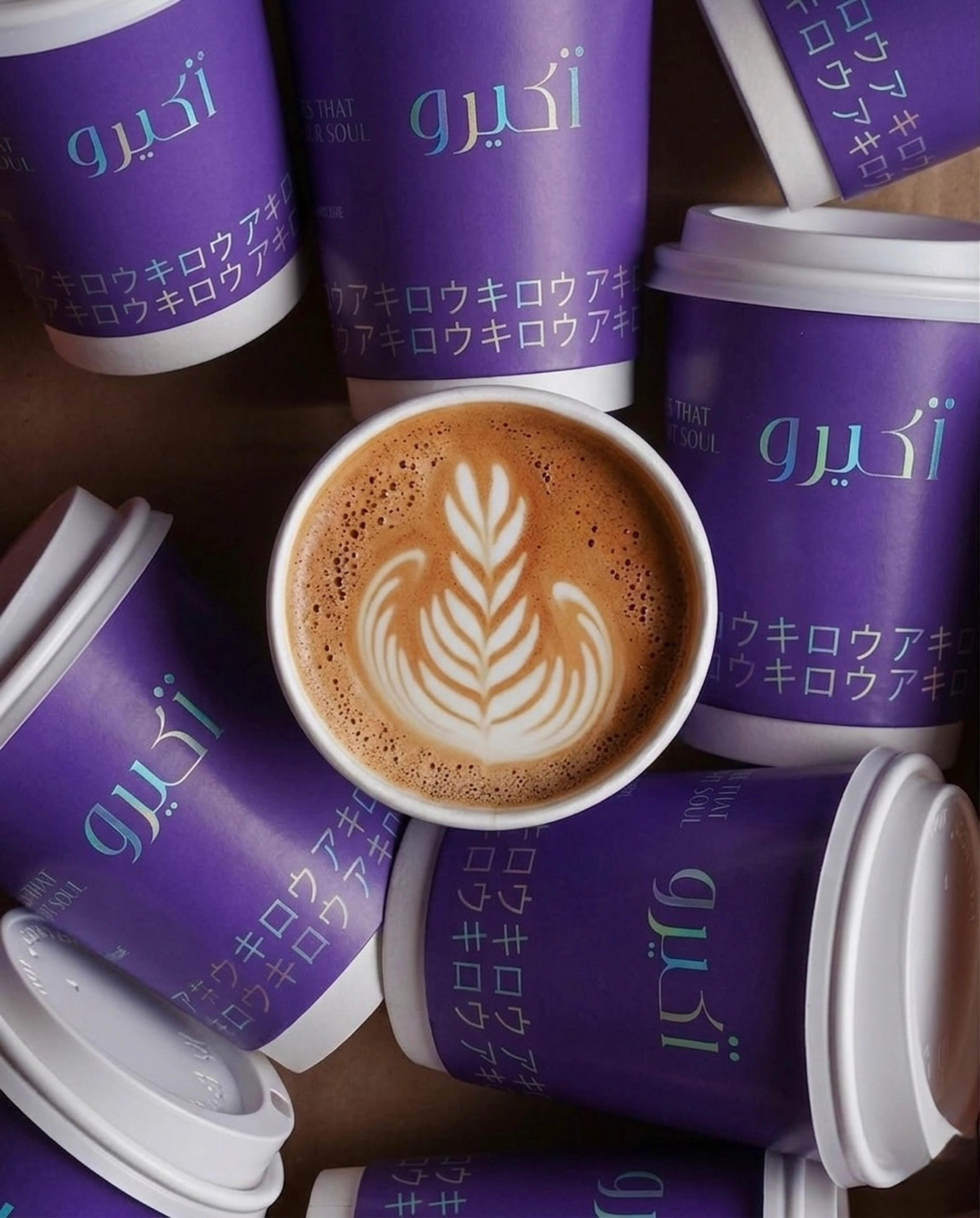
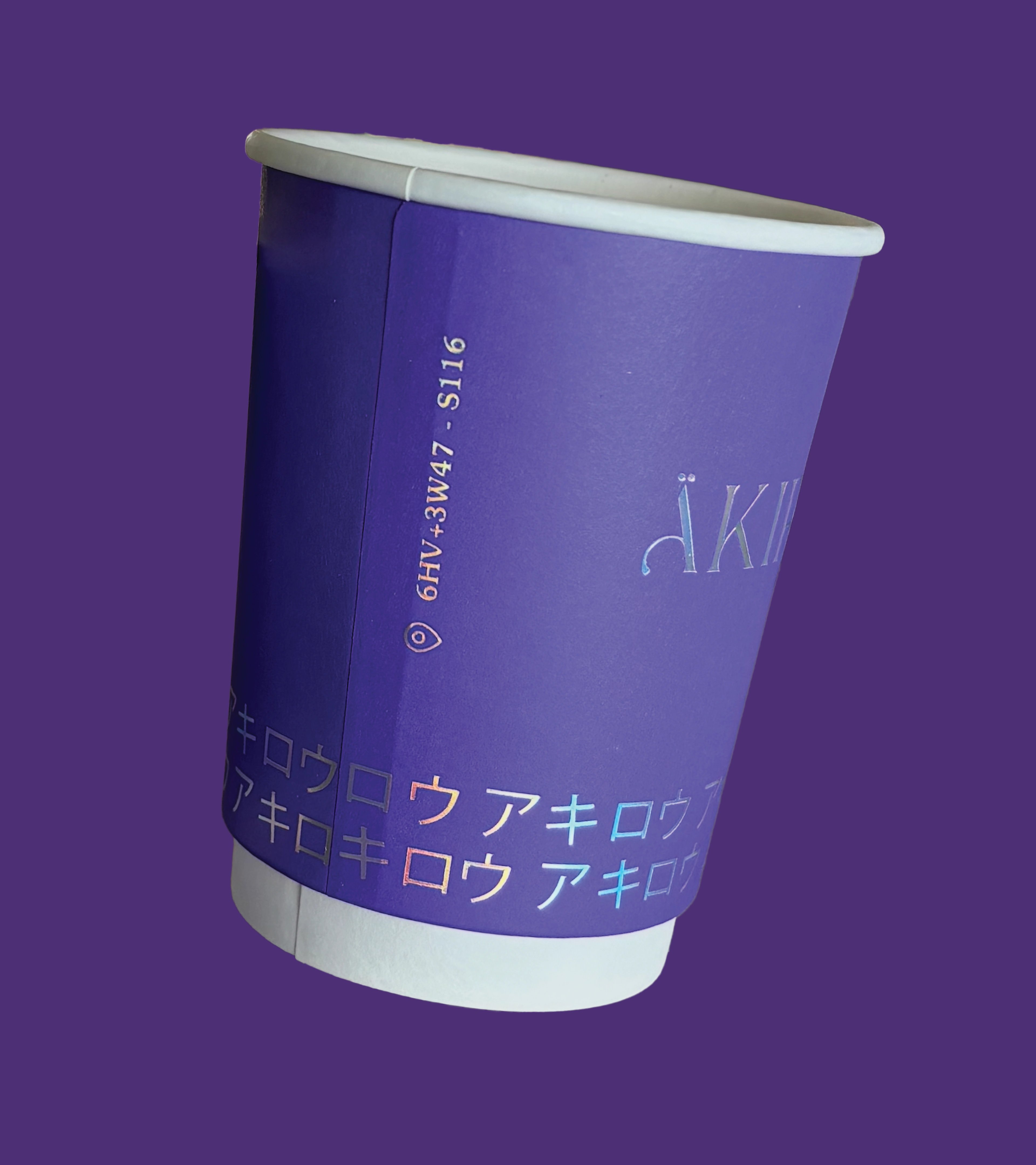
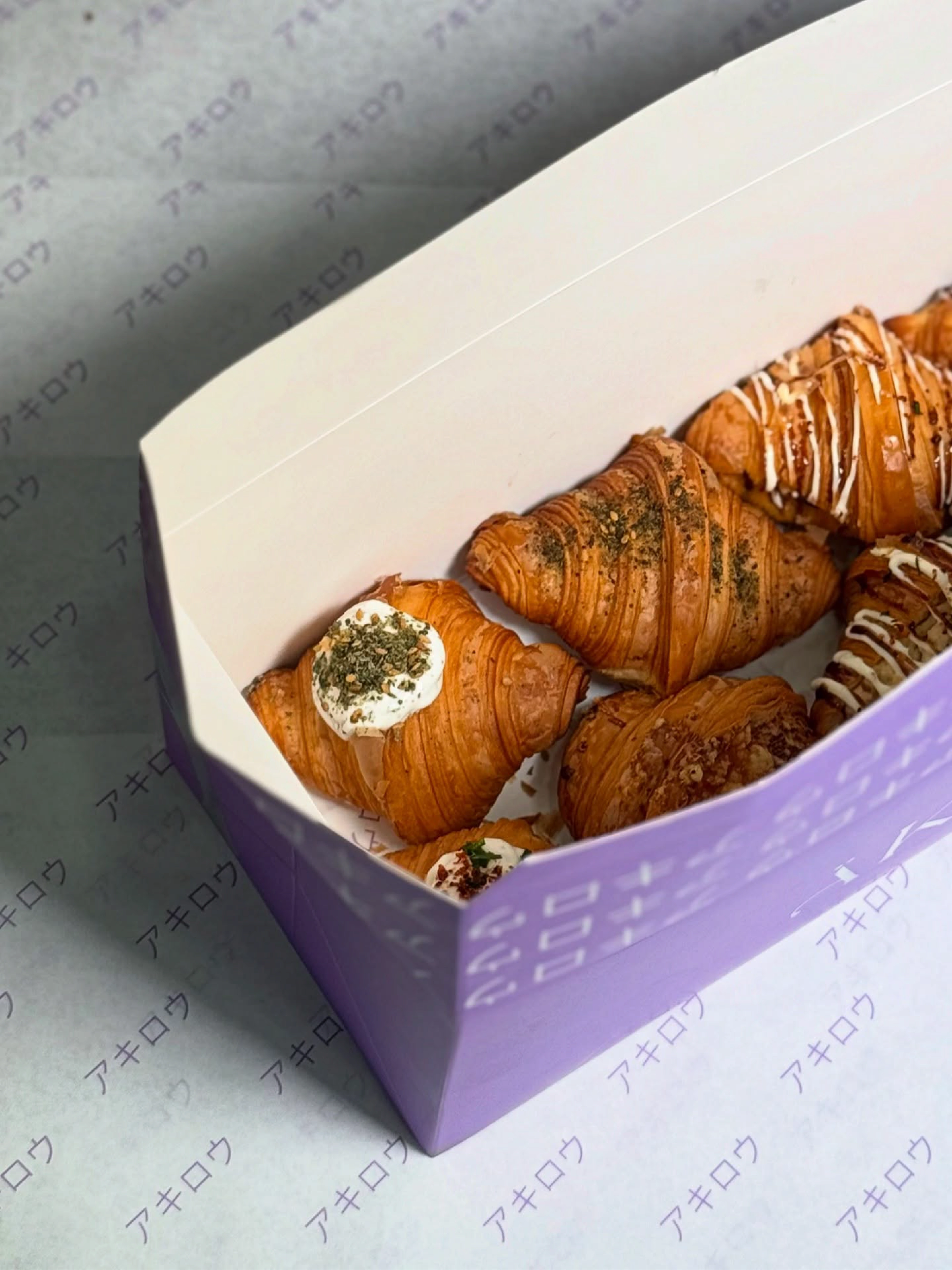
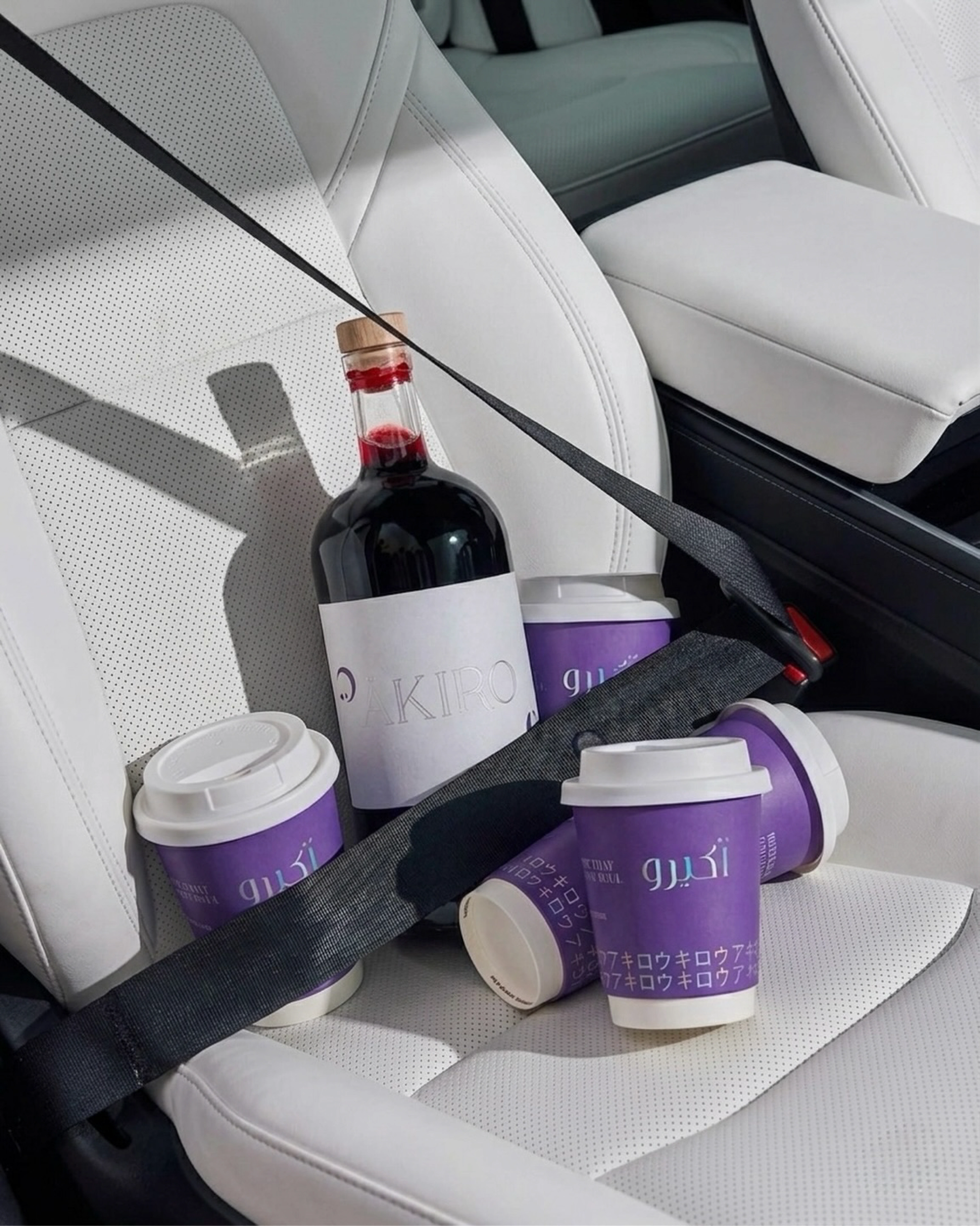
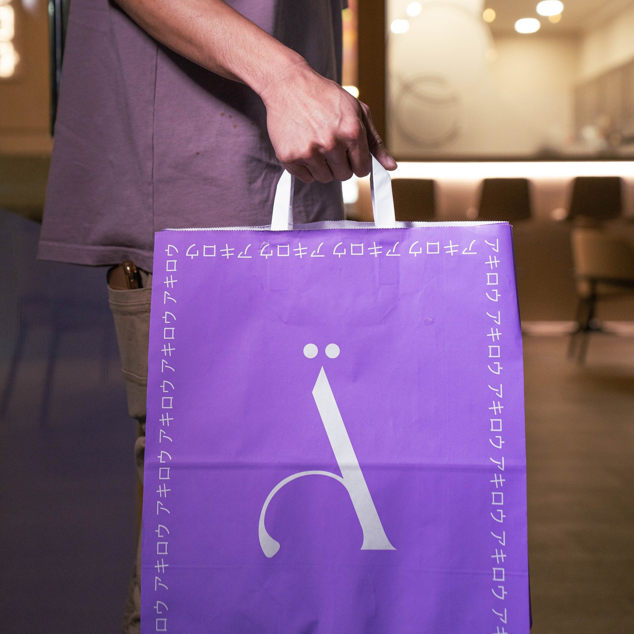
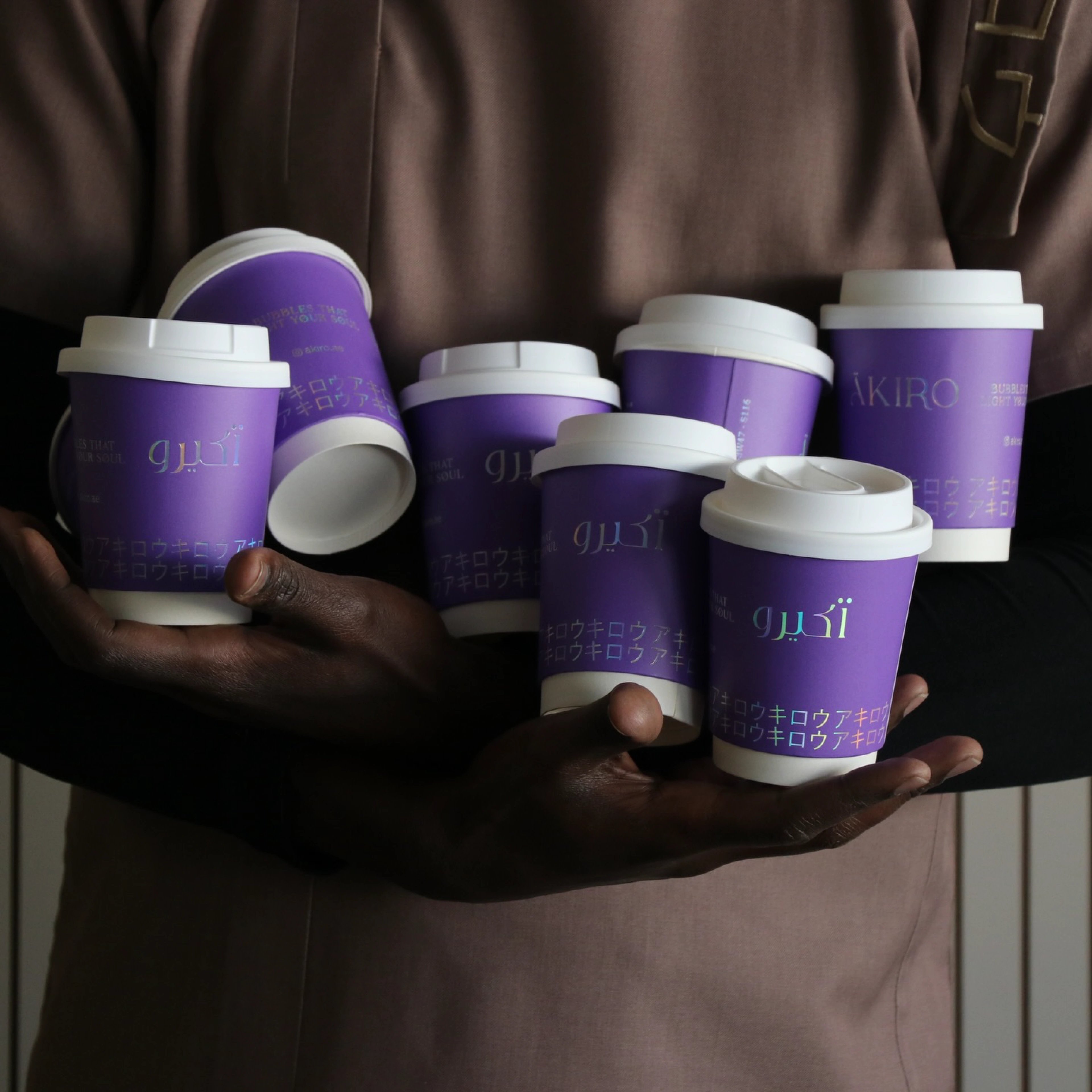
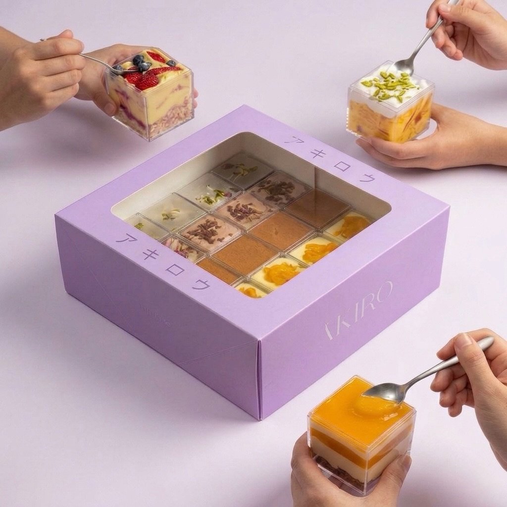
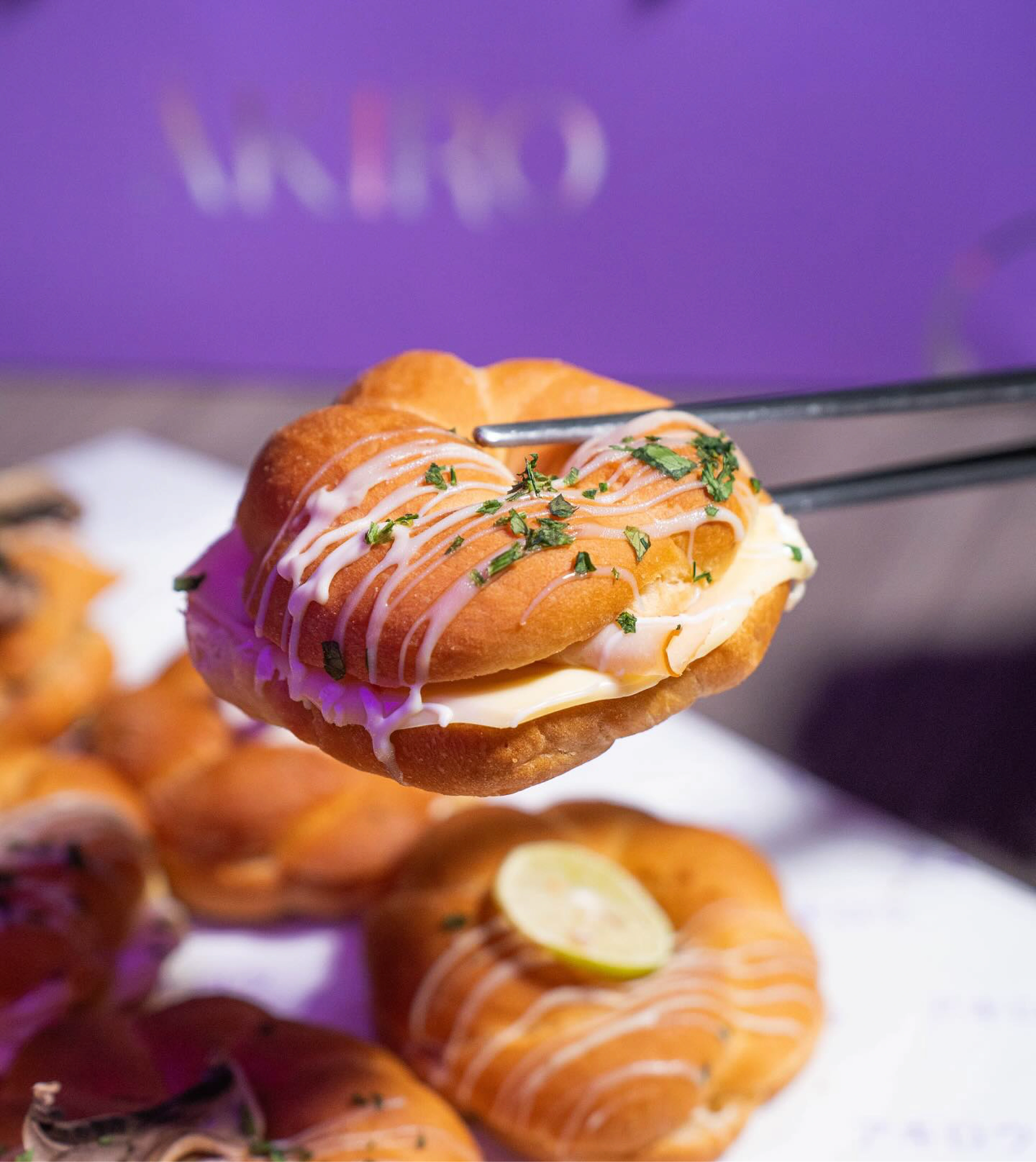
We built a luminous, purple-led world — soft pastel accents, iridescent finishes, and a high-contrast wordmark that feels bakery-elegant, not generic. The accented 'Ä' became a standalone mark, portable enough to live on packaging, patterns, and the smallest applications. Glossy, holographic treatments give the system its glow, tying every surface back to the meaning of the name. Arabic lettering and Japanese-inspired character patterns layer in cultural depth without leaning on obvious stereotypes — so cups, boxes, and wrap all speak one premium, photo-ready language.


bubbles that light up your soul
a glow you can hold
The purple packaging does the heavy lifting — on cups, pastry boxes, and branded wrap, every product moment now arrives with presence. The holographic glow keeps the brand feeling premium and unmistakably itself, while the warmth of a community bakery stays intact. It photographs beautifully, which is half the battle for a café living on social. Akiro walked in with a simple Japanese-themed idea and walked out with a full café world — its own colour, texture, and packaging language, and the kind of recall most bakeries never earn.
the impact
but wait, there’s more
Zion Health
earth-rooted identity system for a clay-based wellness brand

RooView
smart viewfinder accessory brand for solo content creators
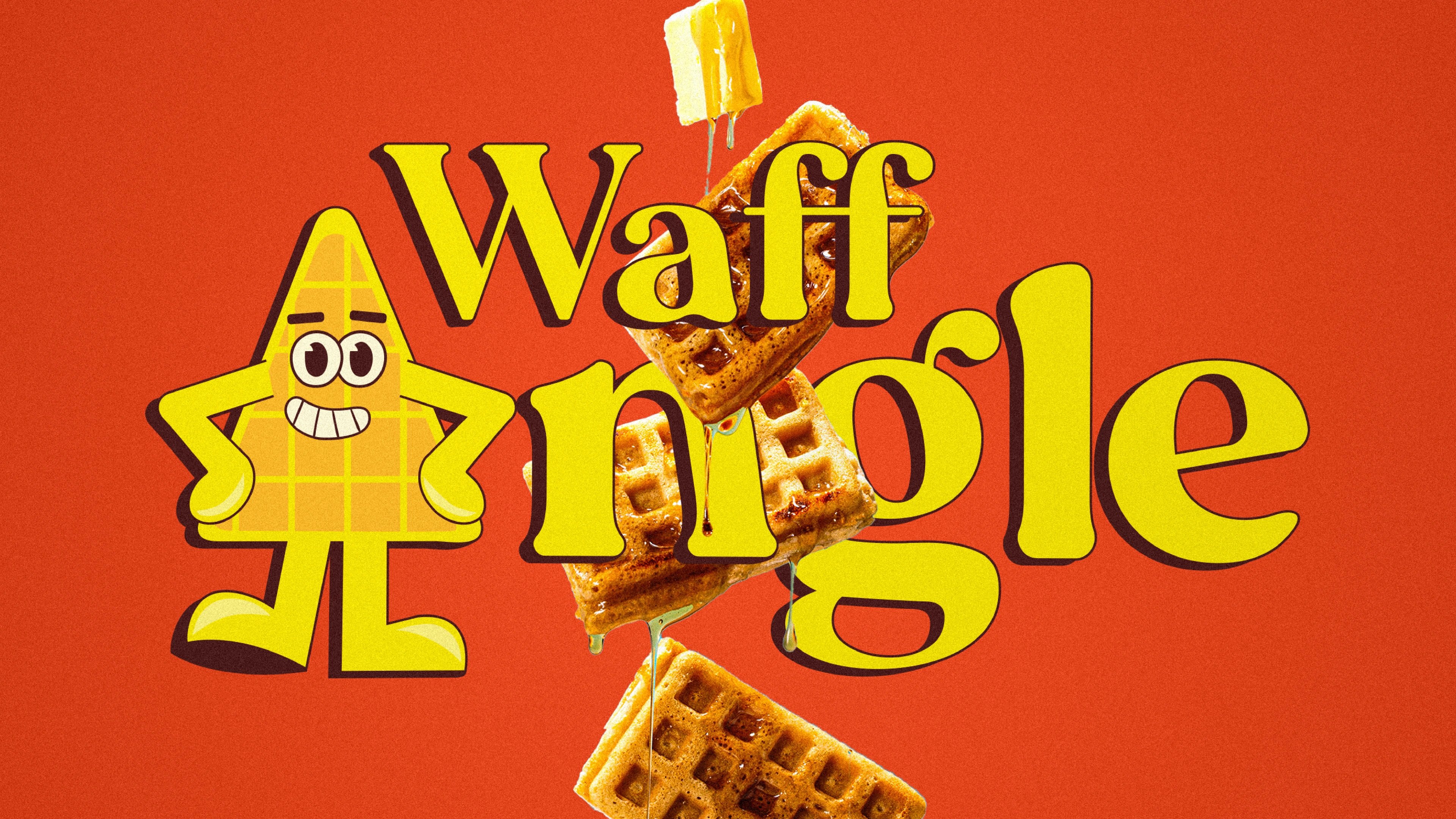
Waffangle
mascot-led identity and packaging for a bengaluru waffle brand
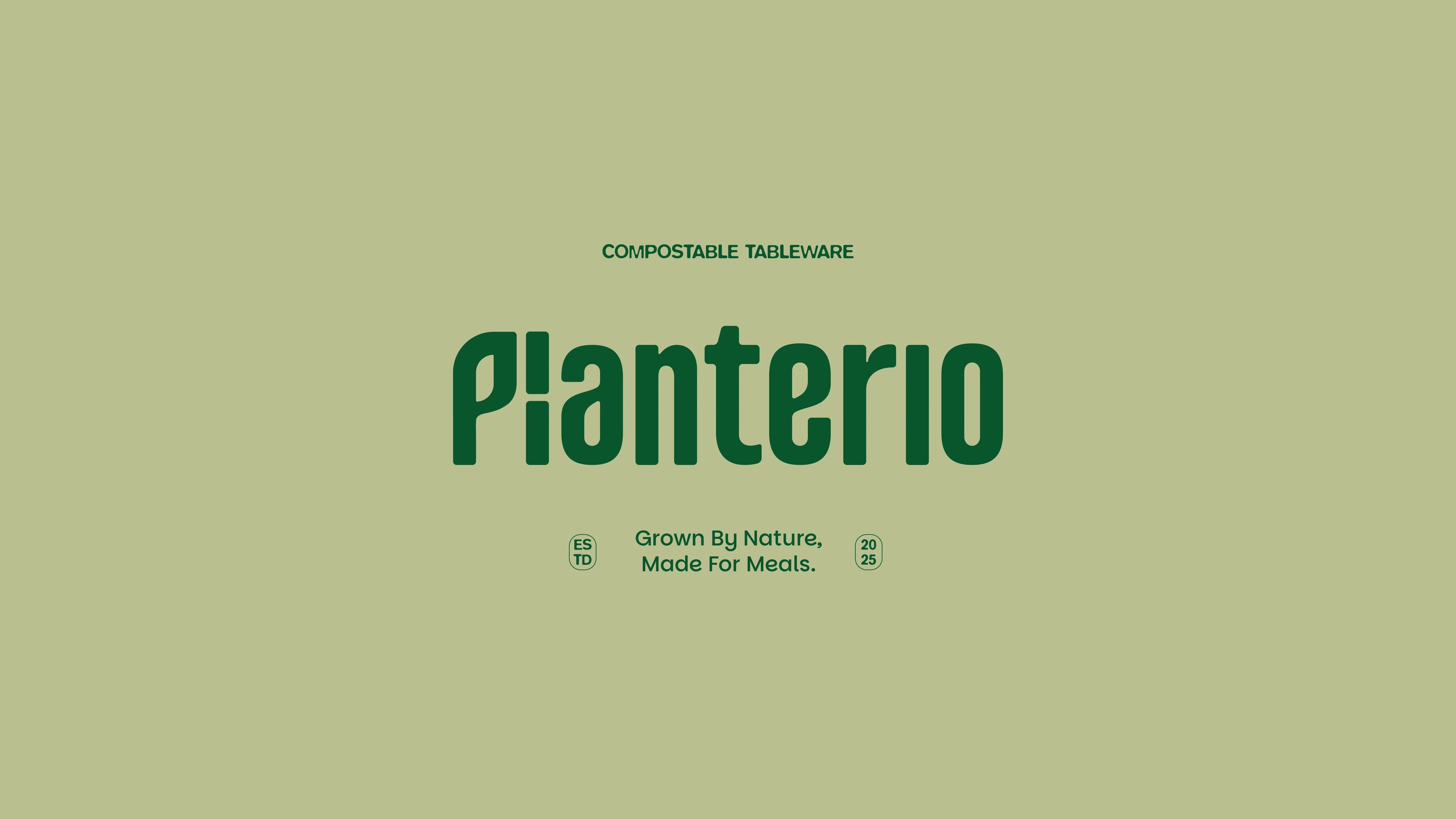
Planterio
identity for a plant-based tableware brand
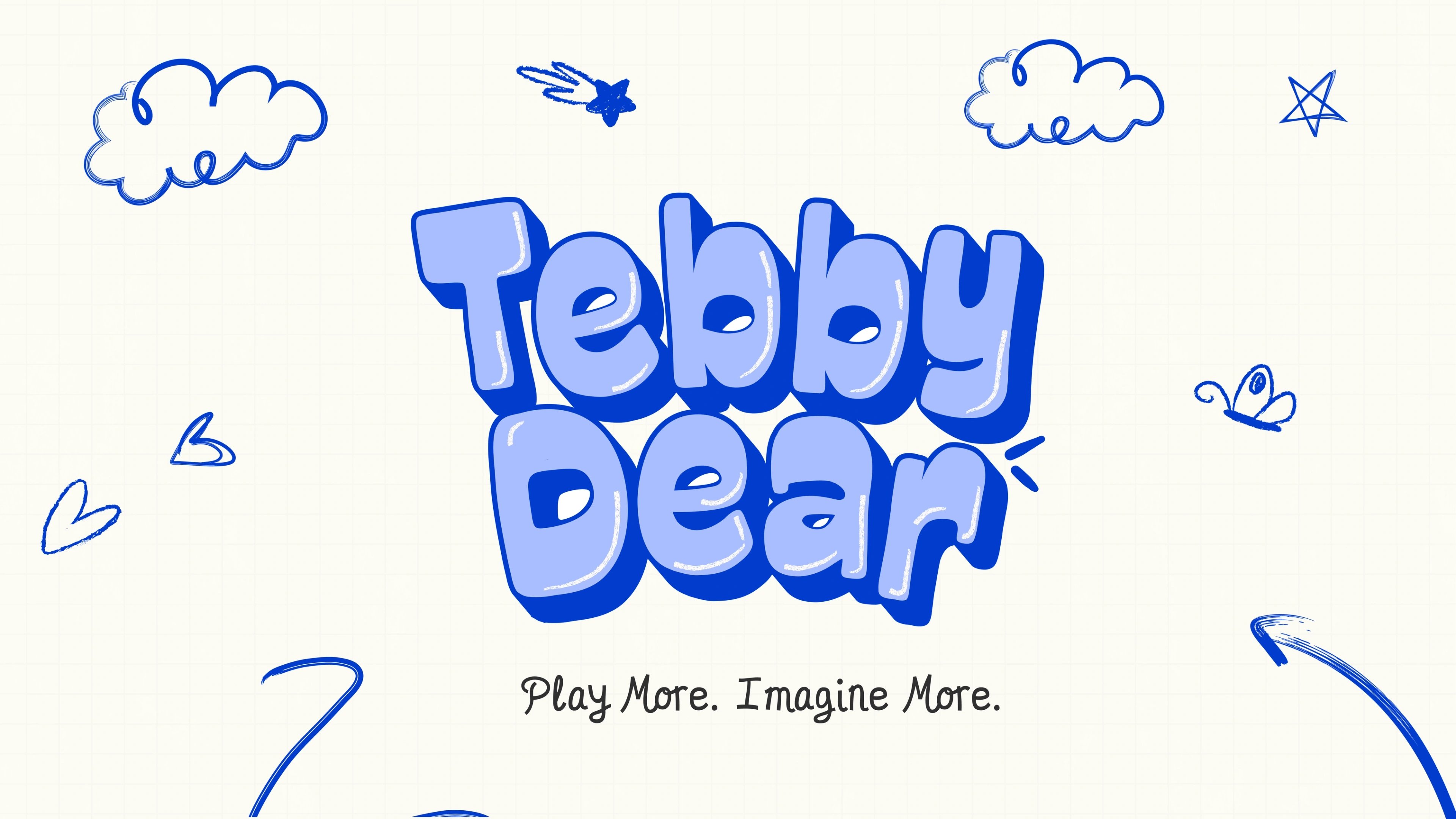
Tebby Dear
playful packaging for a US kids' toy brand

ready tobegin?
tell us what you’re building. we read every message, reply within two working days, and only take on projects we know we can ship well.