Heavenence Organica
calm doesn't need to shout to sell.
about the client
Heavenence Organica is a natural-living brand built on calm — naturally crafted incense and home fragrance today, with perfume and a wider wellness range already on the way. It sits where Indian ritual heritage, organic ingredients and modern home wellness meet, made for people who want their everyday spaces and rituals calmer and more intentional. The ambition was never a single product line — it's a house meant to grow across categories.
the challenge
The job wasn't to dress one range; it was to build a brand that could carry a growing catalogue. Heavenence needed an identity rooted in tradition without going old-fashioned, organic without going clinical, and elastic enough to hold incense now and perfume, home and whatever launches next — every product reading as one family, premium but never precious, in an aisle that usually swings between too religious and too medicinal.
our solution
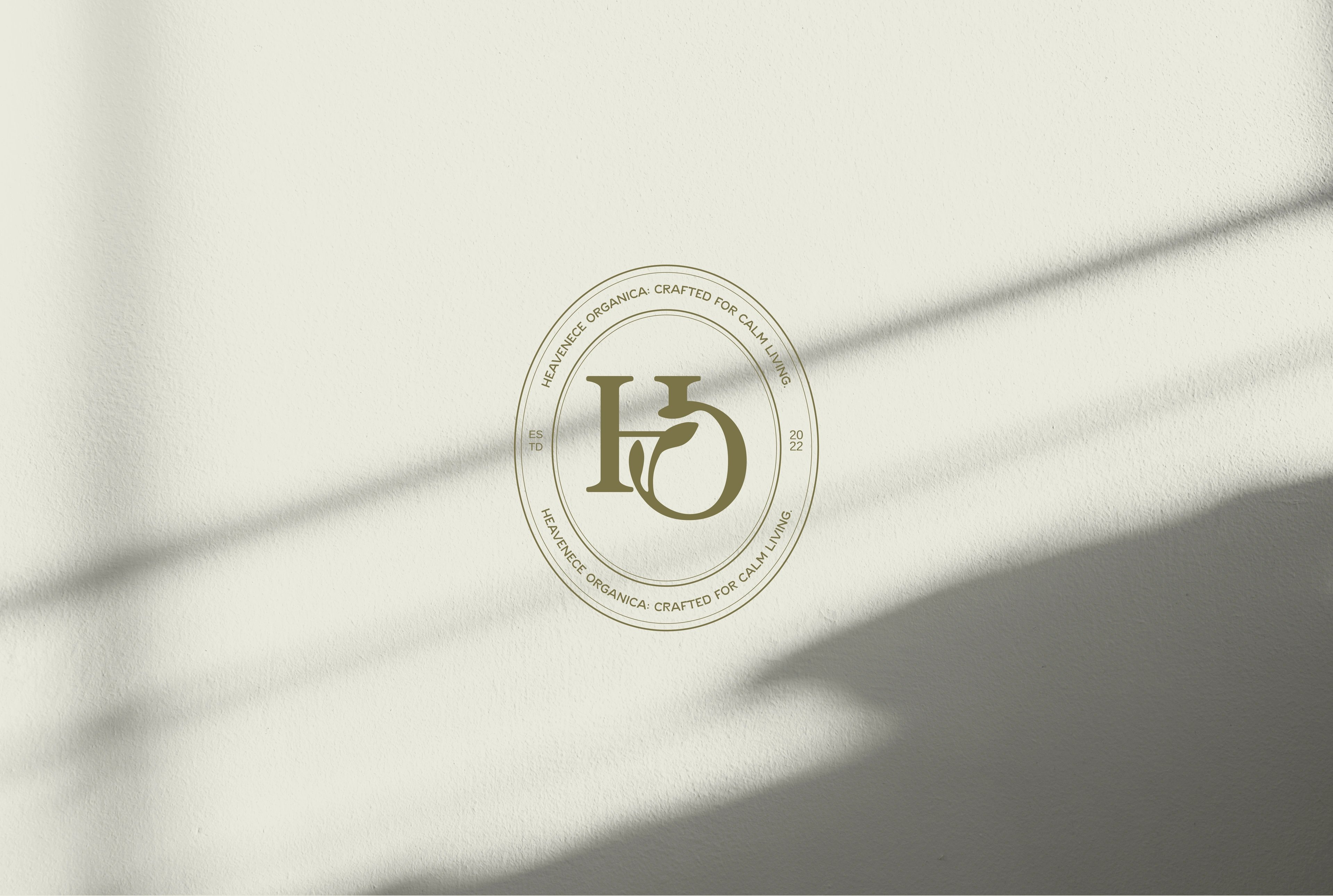
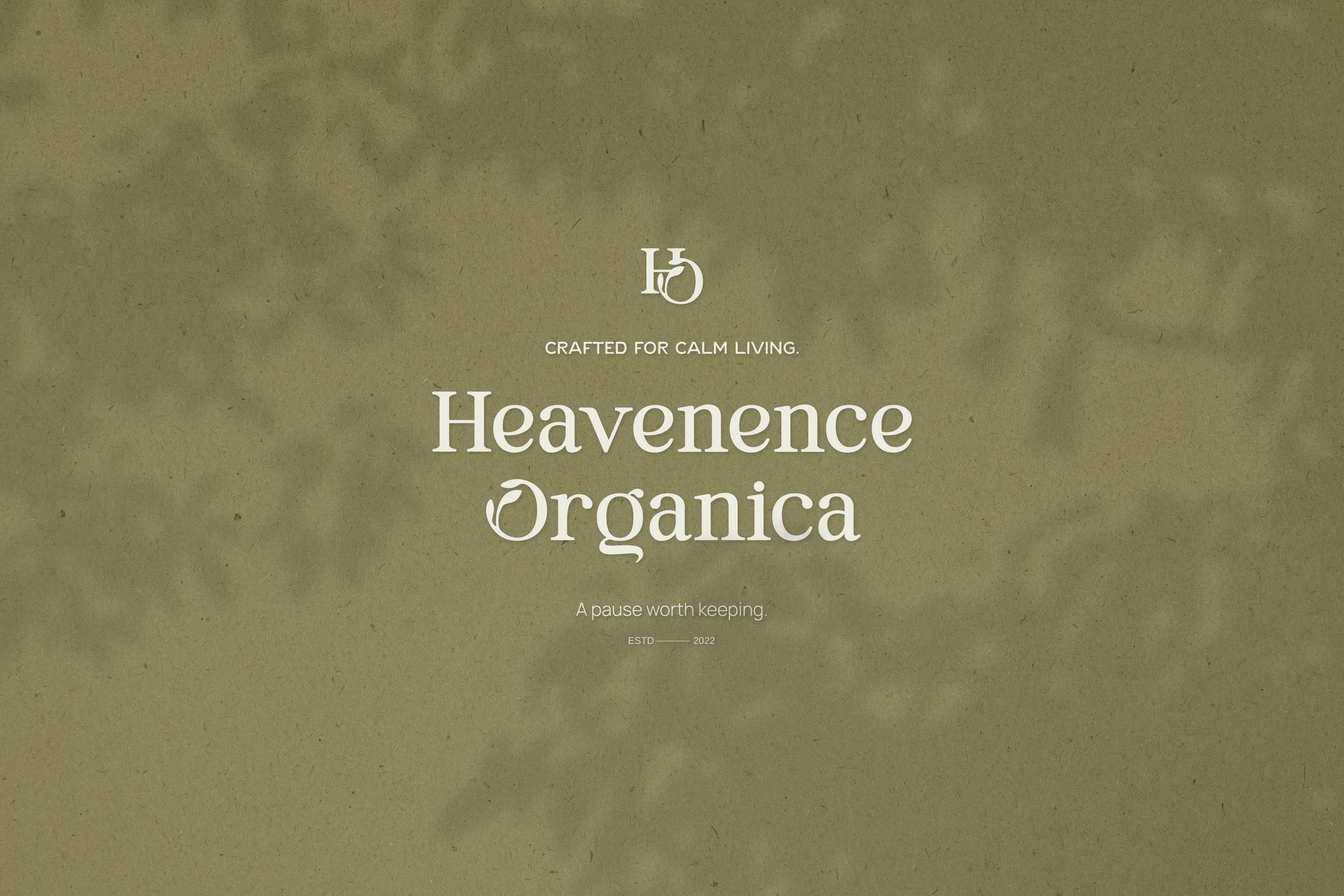
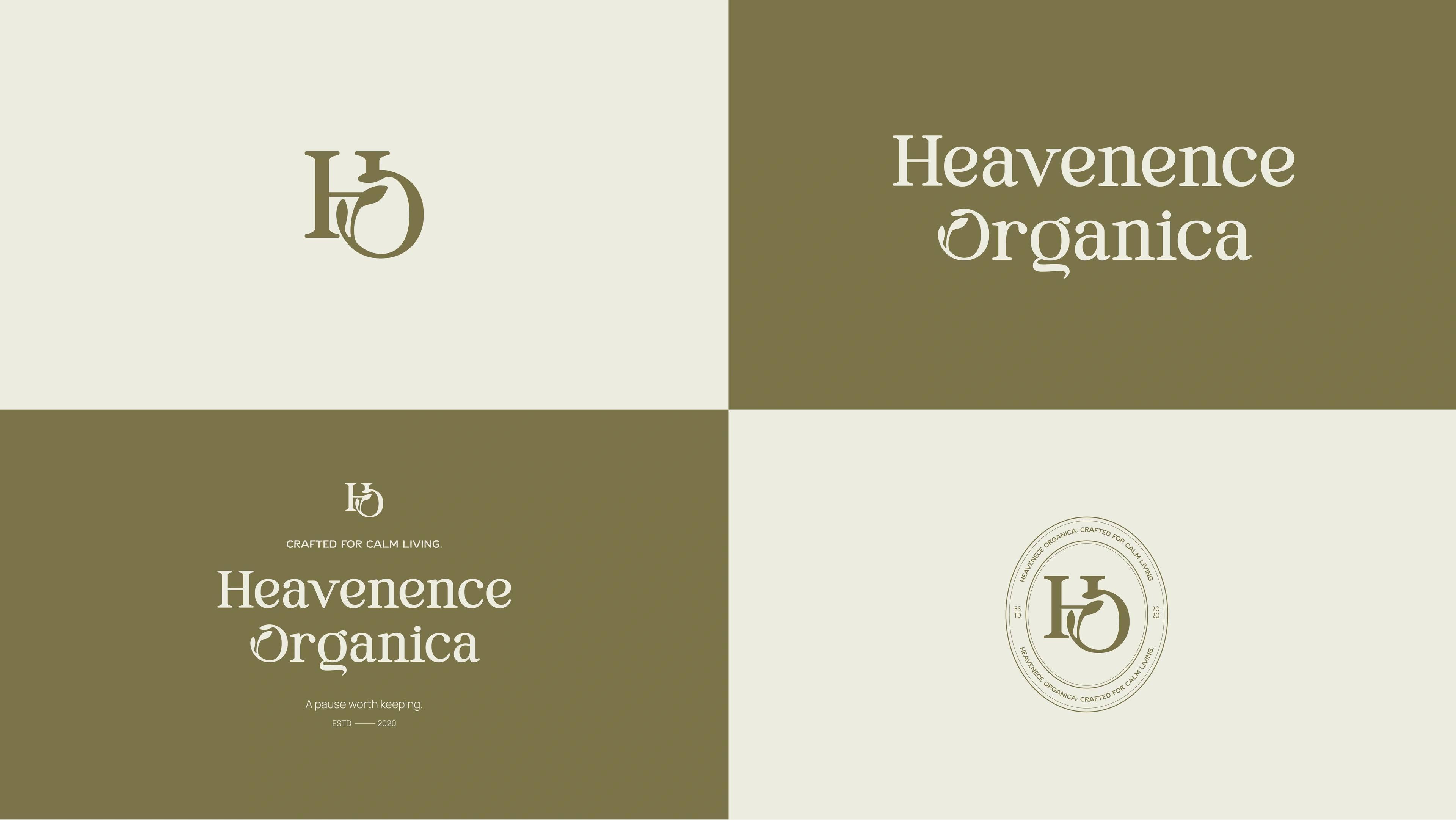
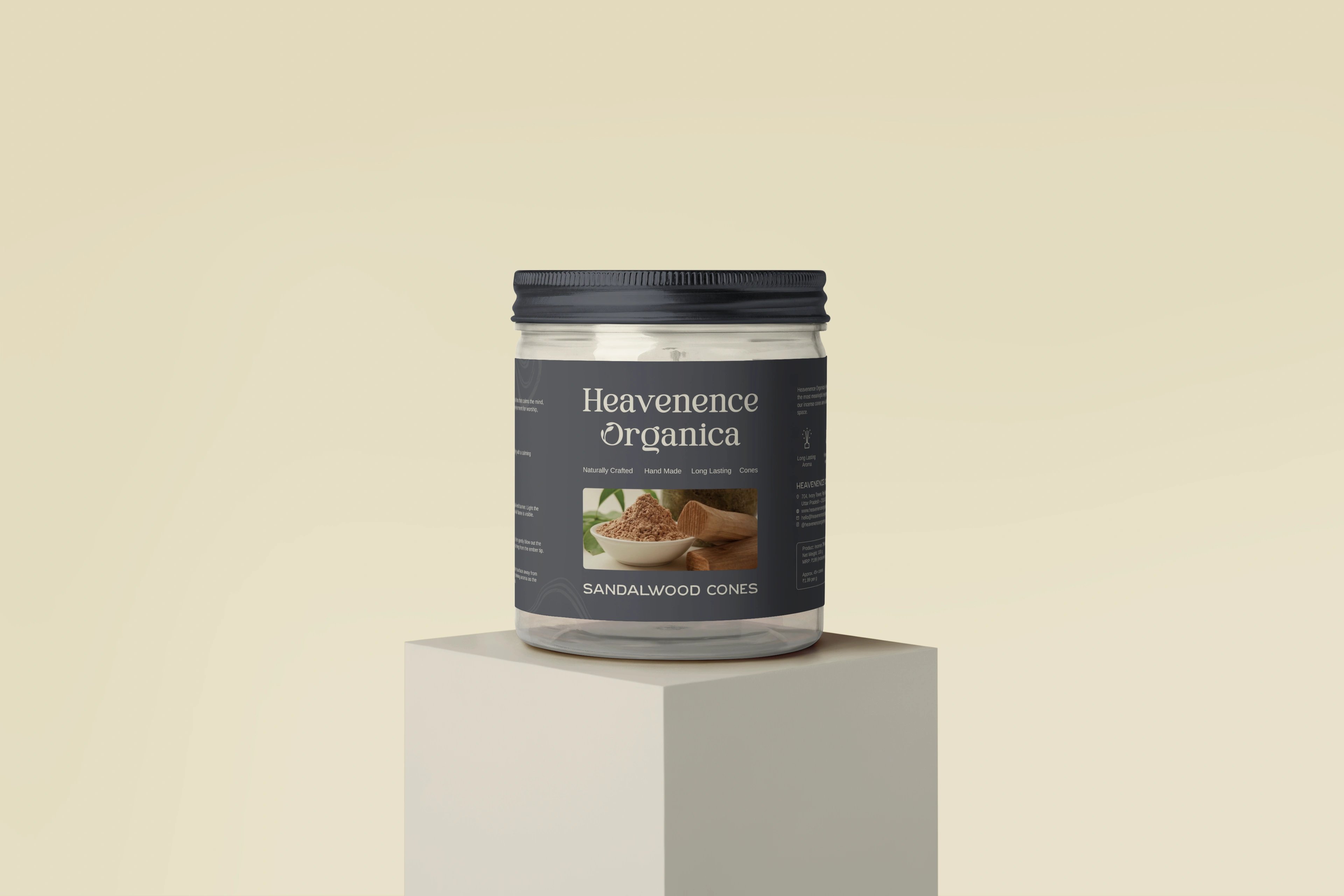
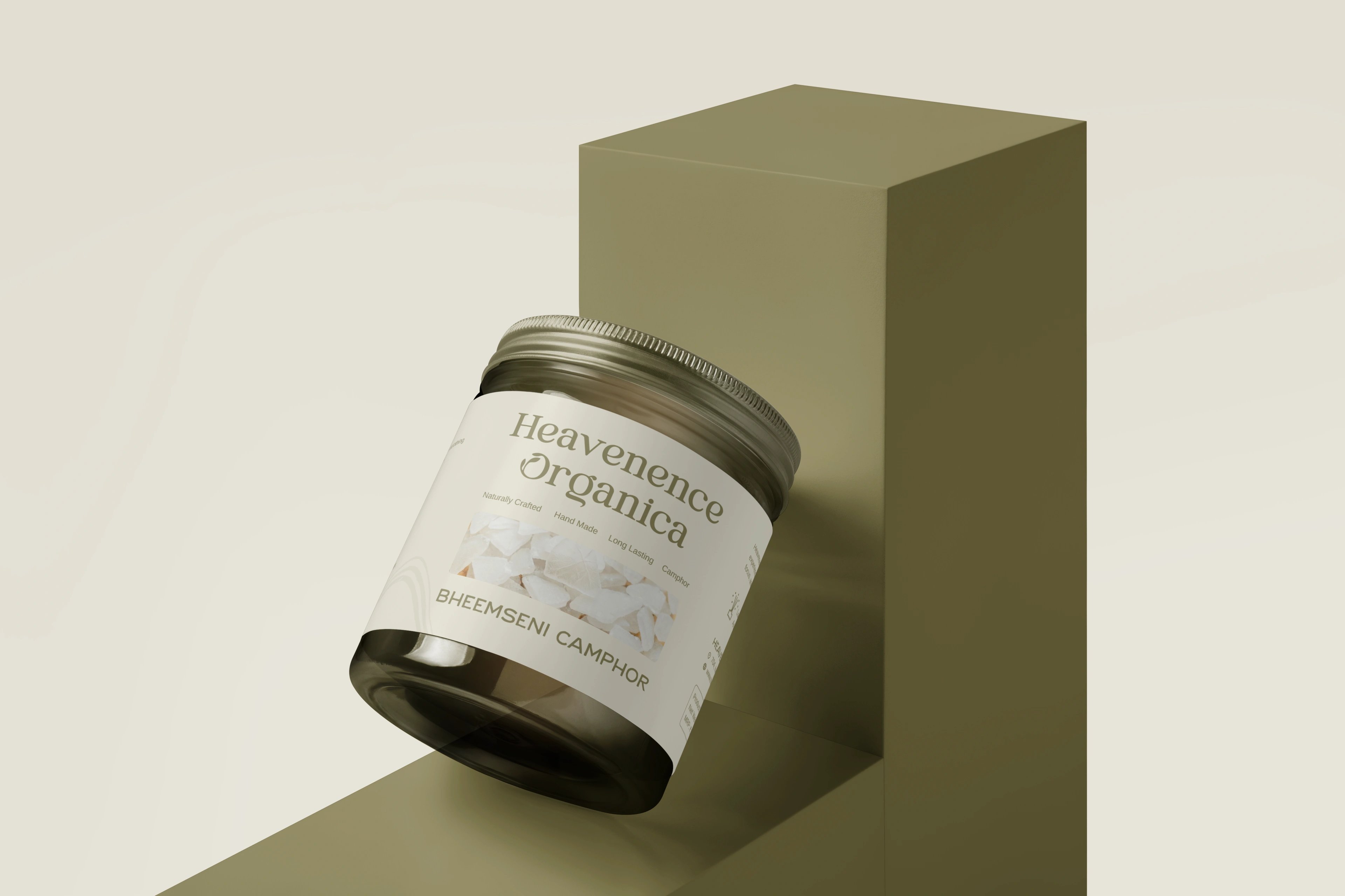
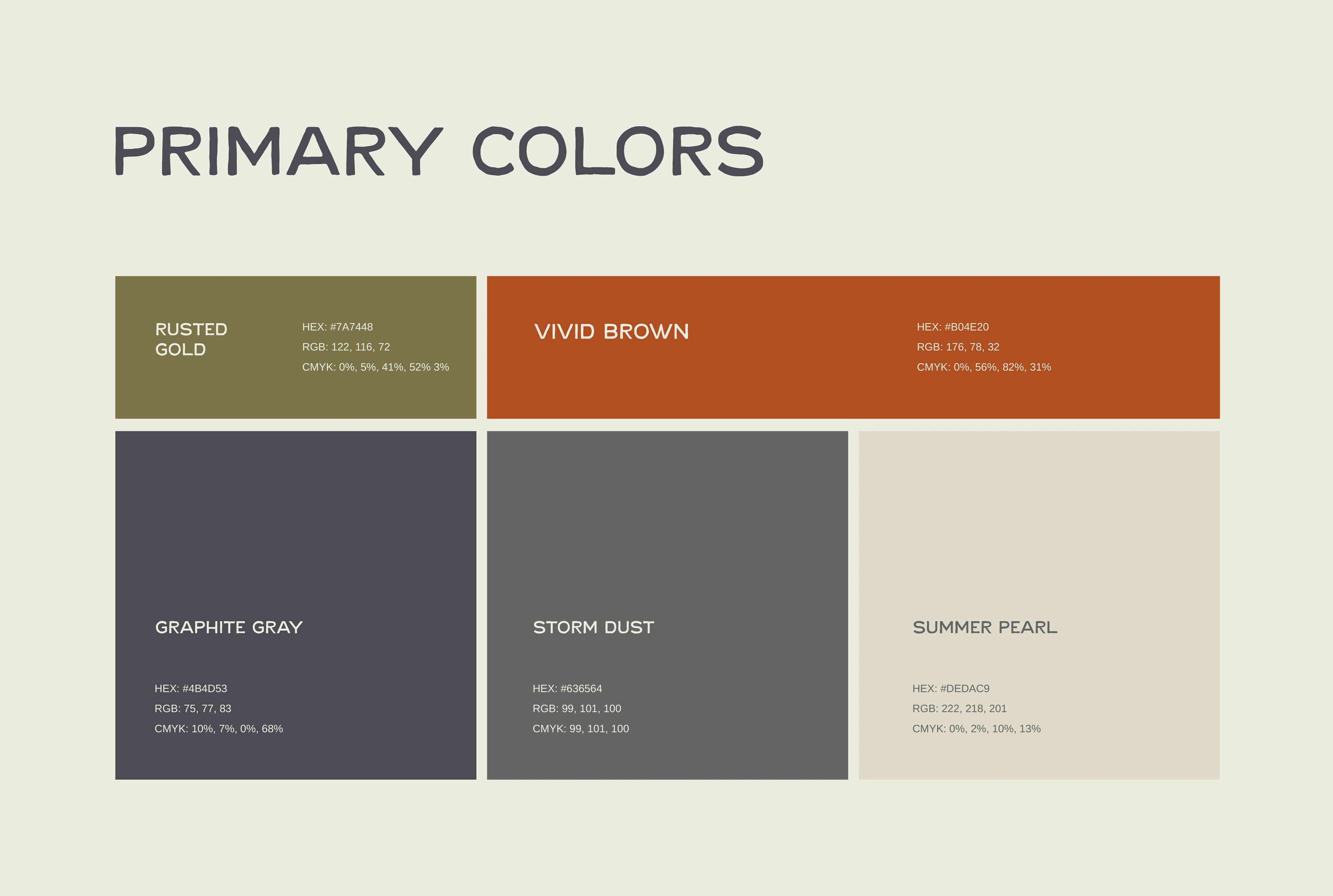
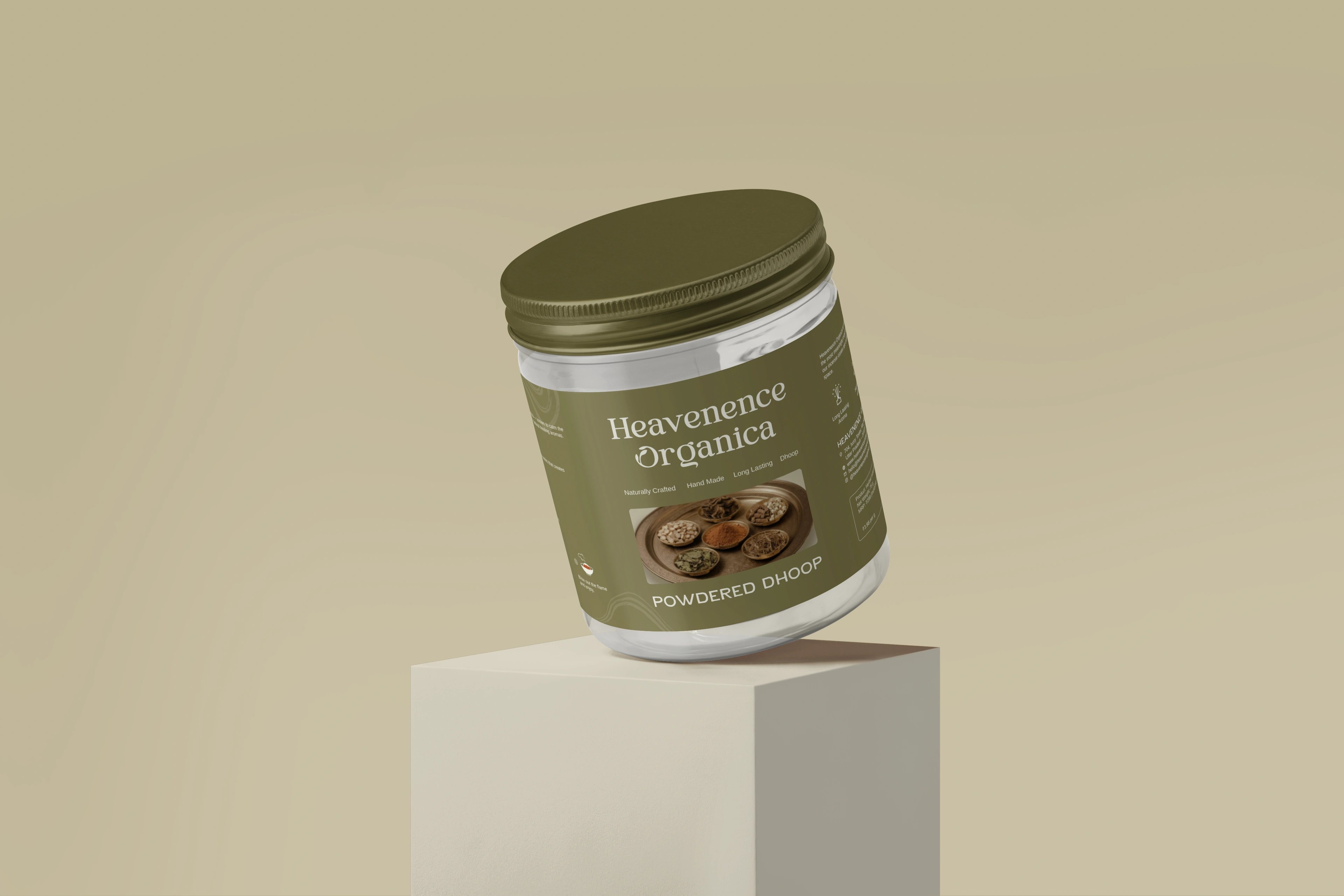
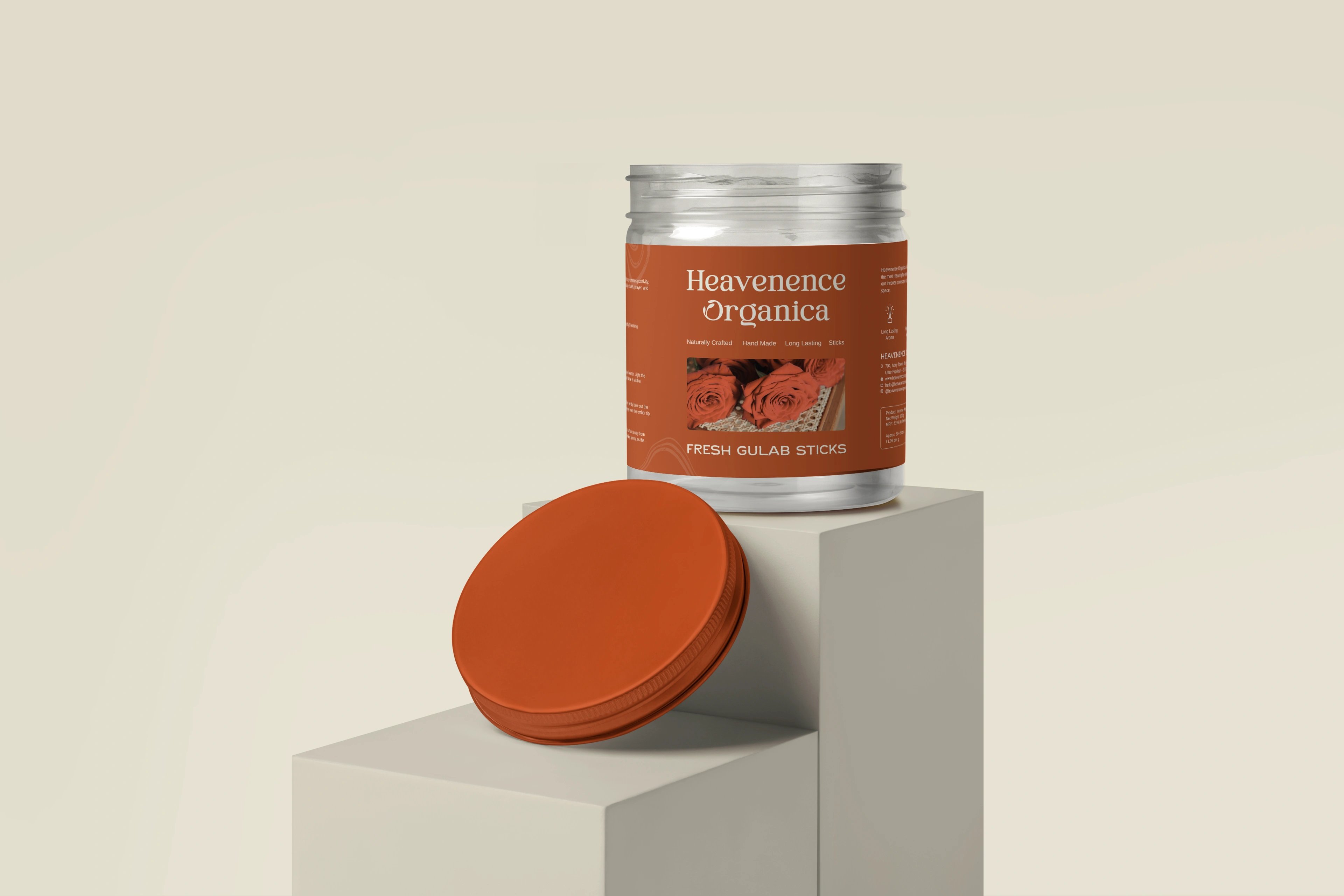
We built a brand system, not a one-off pack. A refined serif wordmark carries the heritage weight; an HO monogram fuses the initials with a leaf for nature and calm; a stamp-seal lends ritual trust without religious overtones. Beneath them sits a modular packaging structure and an earthy, colour-coded palette that any new product can slot into and still belong — so a future perfume or fragrance line extends the brand instead of restarting it. The launch incense range is just the system's first outing: one shared structure, separated by colour, finished with wave-line illustration, ingredient photography and quiet type.
restraint did the heavy lifting.
The brief asked for premium without pretension, rooted without being dated — and, quietly, for room to grow. So we designed the identity as a system that scales: a serif wordmark for heritage, the leaf-fused HO monogram for organic calm, the stamp-seal for ritual trust, and a colour-coded packaging structure built to absorb new products without losing the family resemblance. The incense here is simply the first thing it dressed — the real deliverable is a brand that can keep dressing the next one, perfume to home fragrance, and still feel like one calm, intentional whole.
but wait, there’s more


ready tobegin?
tell us what you’re building. we read every message, reply within two working days, and only take on projects we know we can ship well.