
fifty years of family baking, finally given a brand to match.
about the client
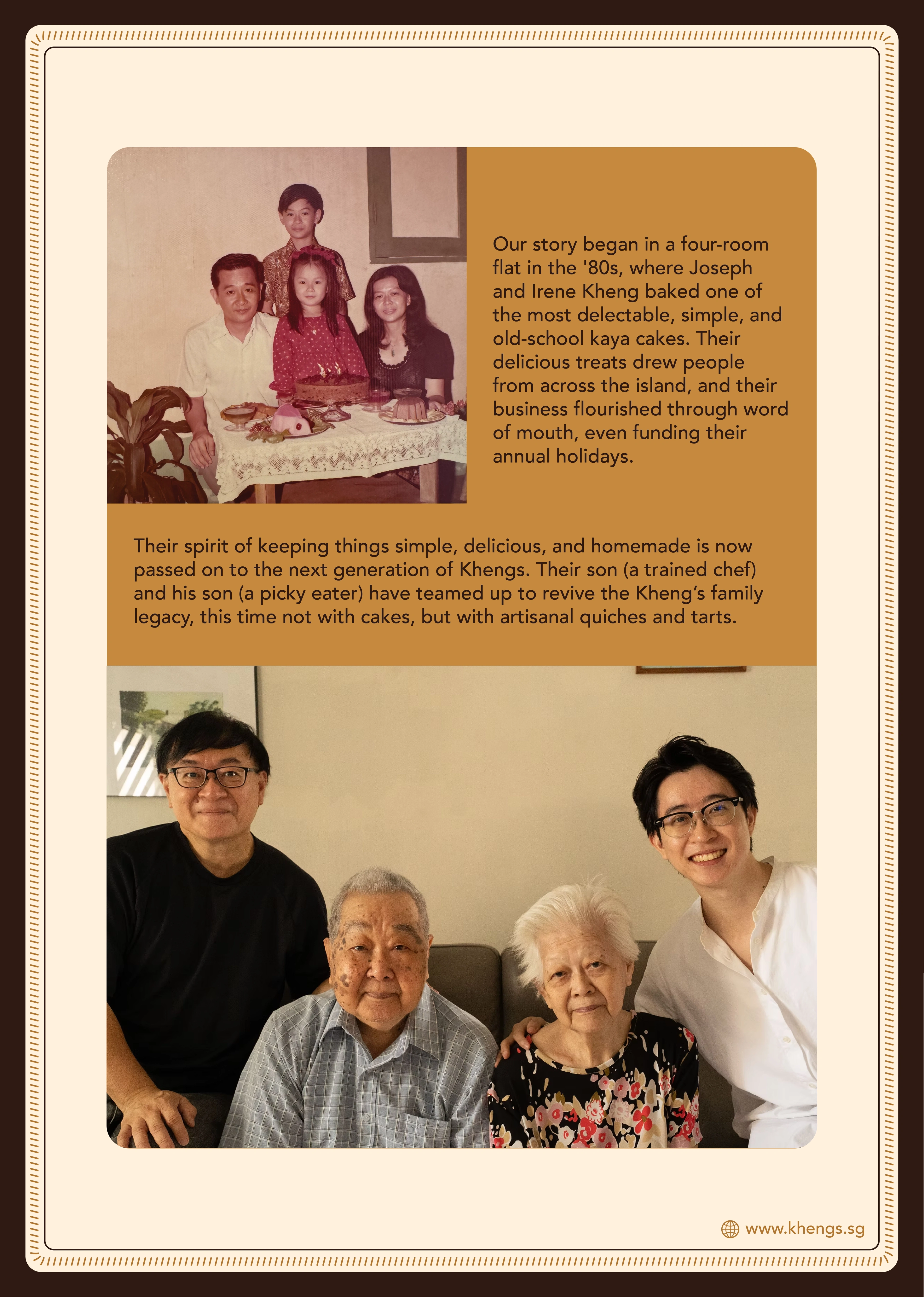
Kheng's is a Singapore family food brand built around artisanal quiches and tarts. It began in 1974 with Joseph and Irene Kheng baking old-school cakes, and is carried forward today by chef Chris Kheng and his son Cameron. Two generations on, the homemade spirit is still the point — only now it runs through a tightly curated menu of quiches, tarts and slow-made bakes.
the challenge
Kheng's had the food, the family story and the quality — but no brand world to hold them together. It risked reading like just another home-baking business instead of an established, artisanal name. The identity had to carry heritage, old-school trust and homemade warmth while staying polished enough for menus, social, ordering and a wider business.
our solution
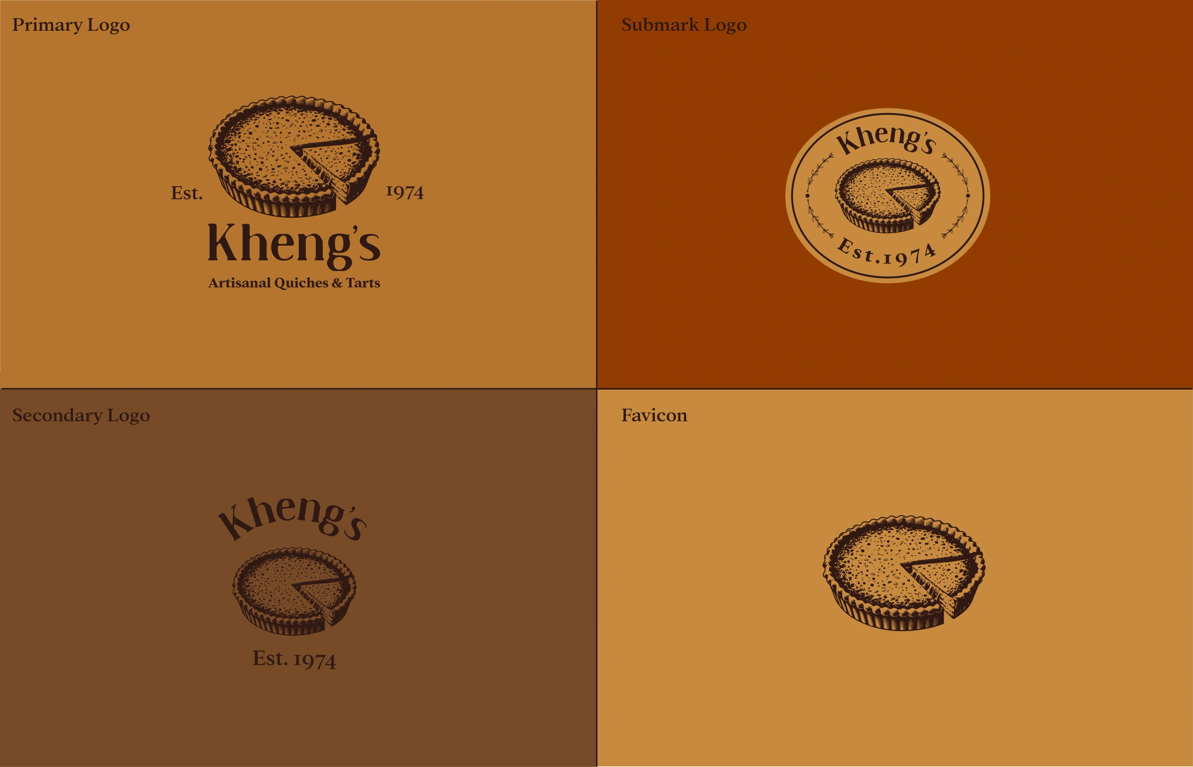
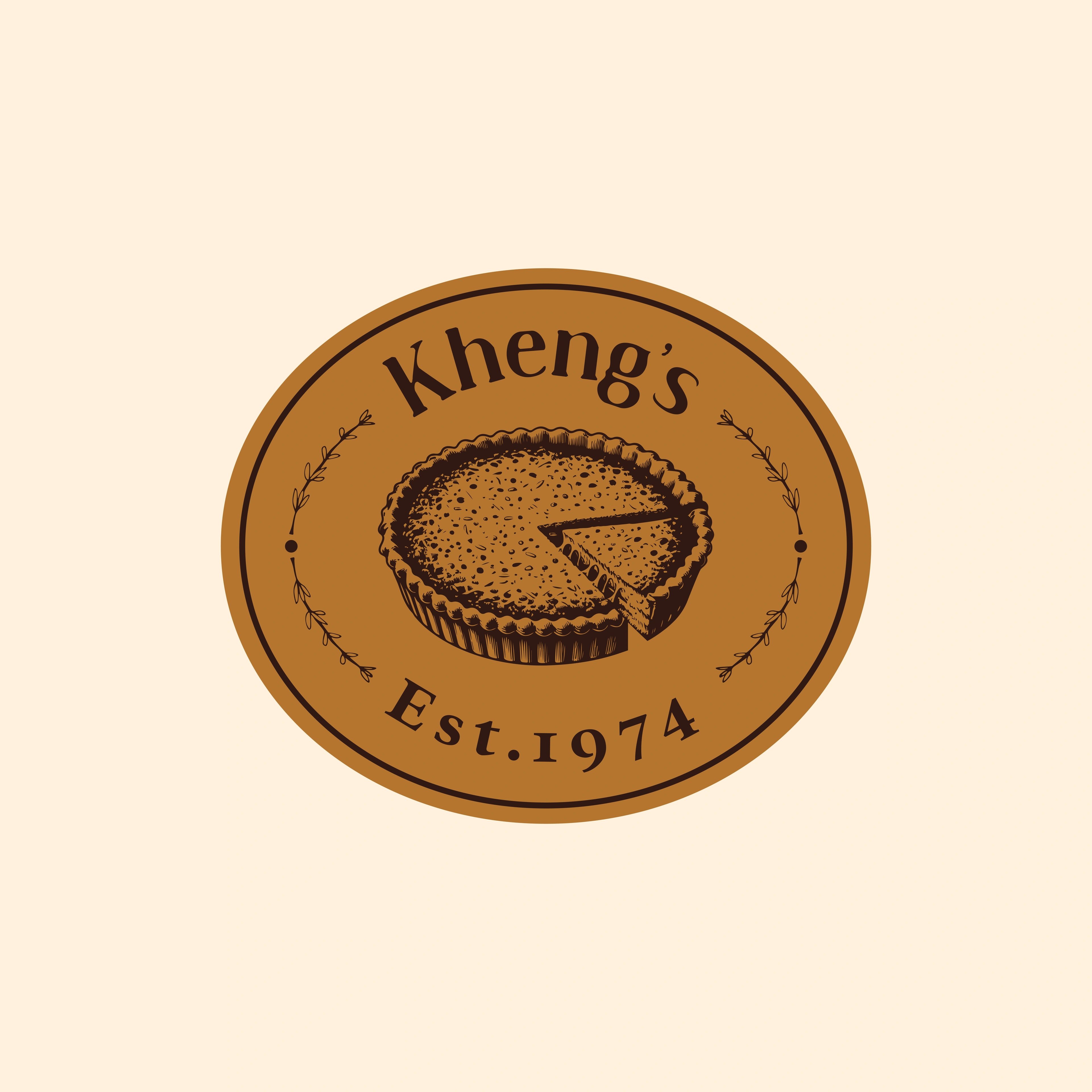
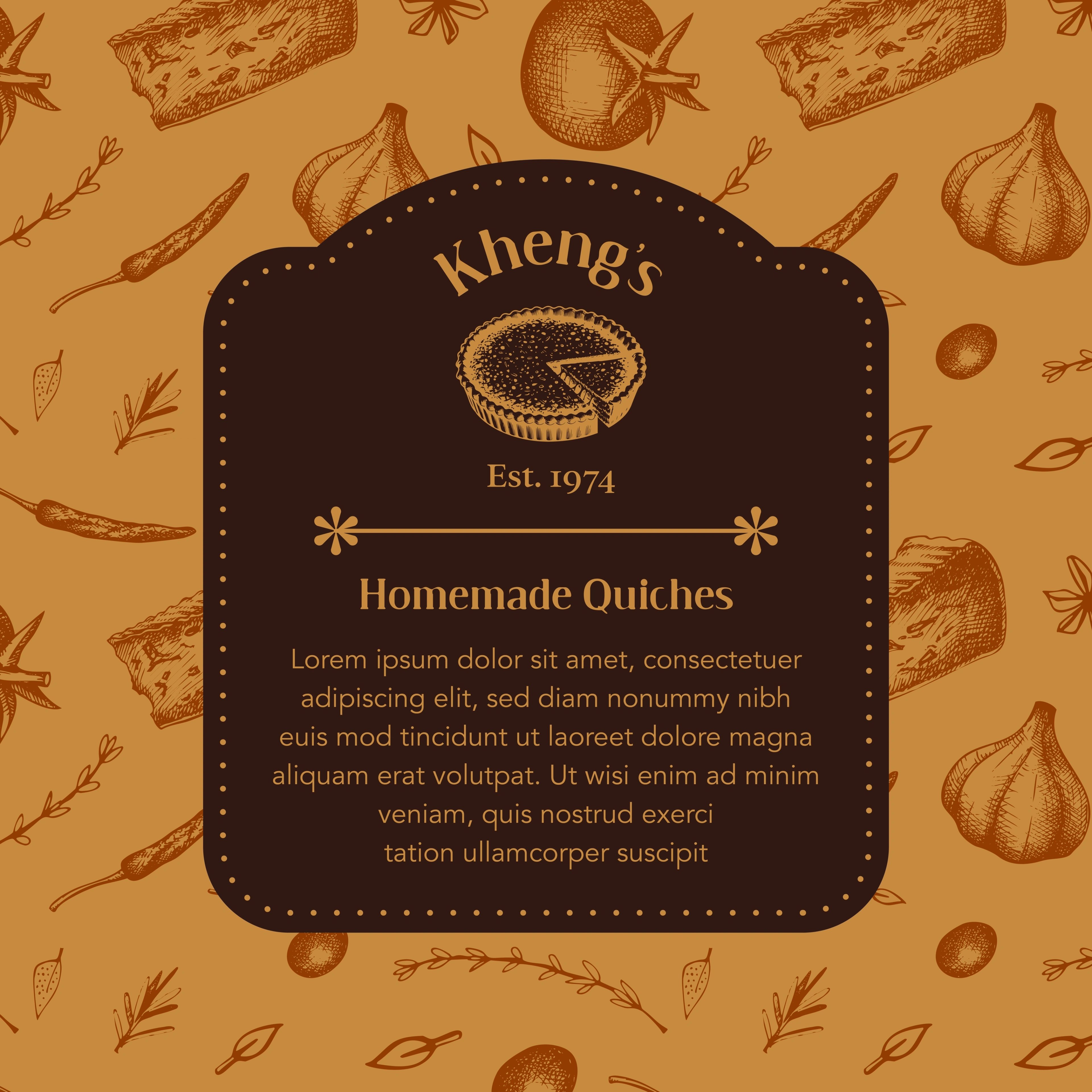
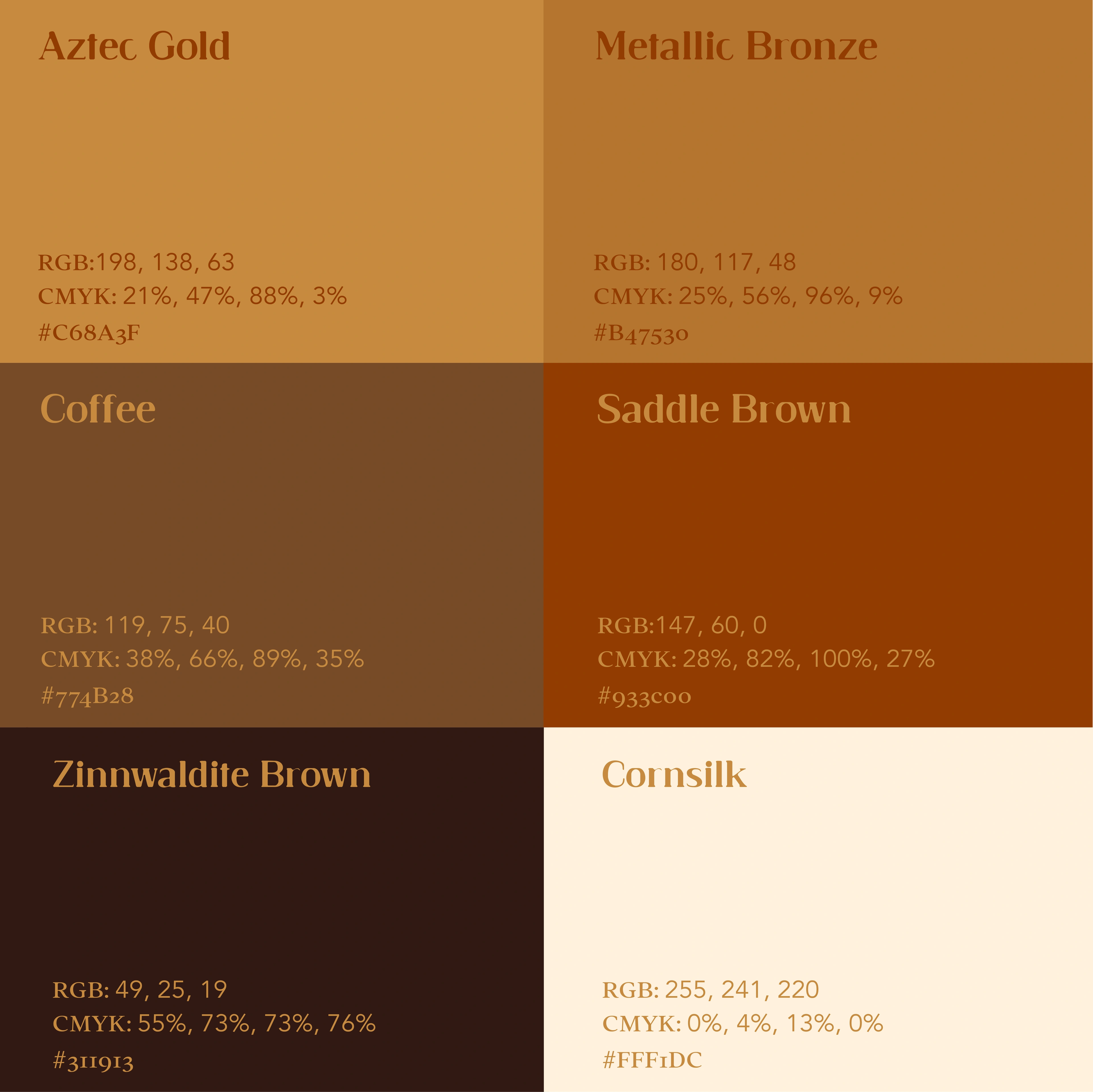
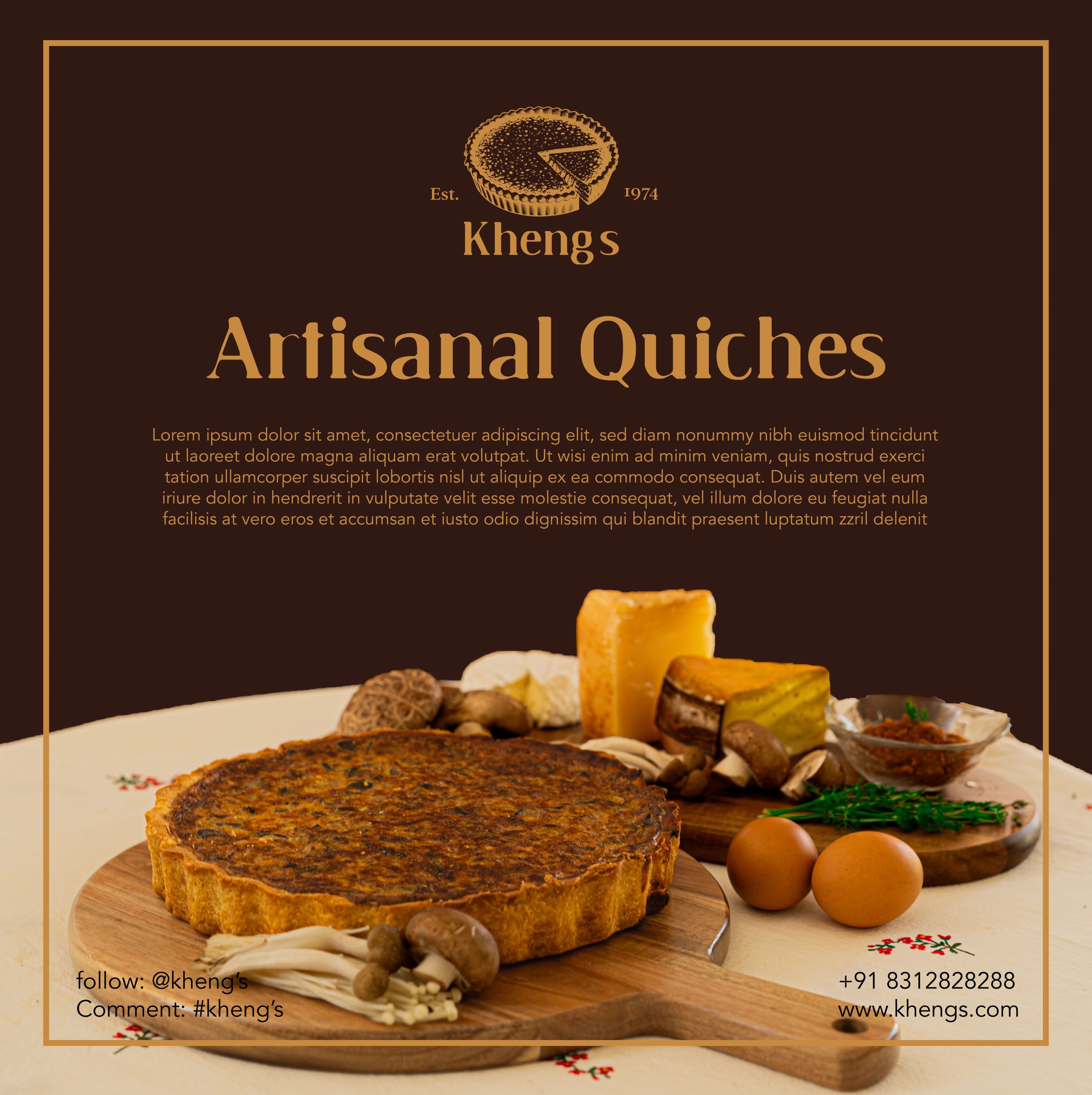
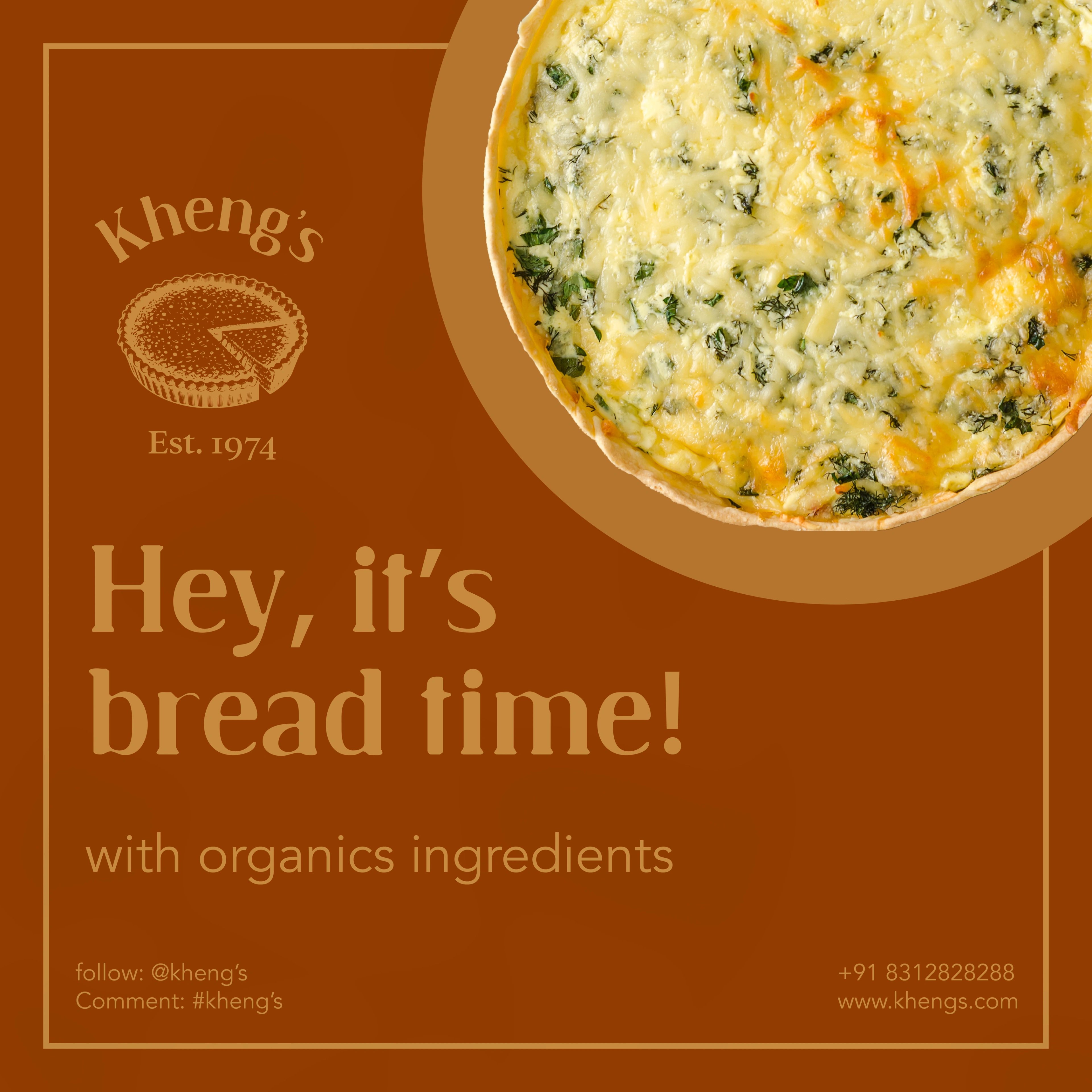
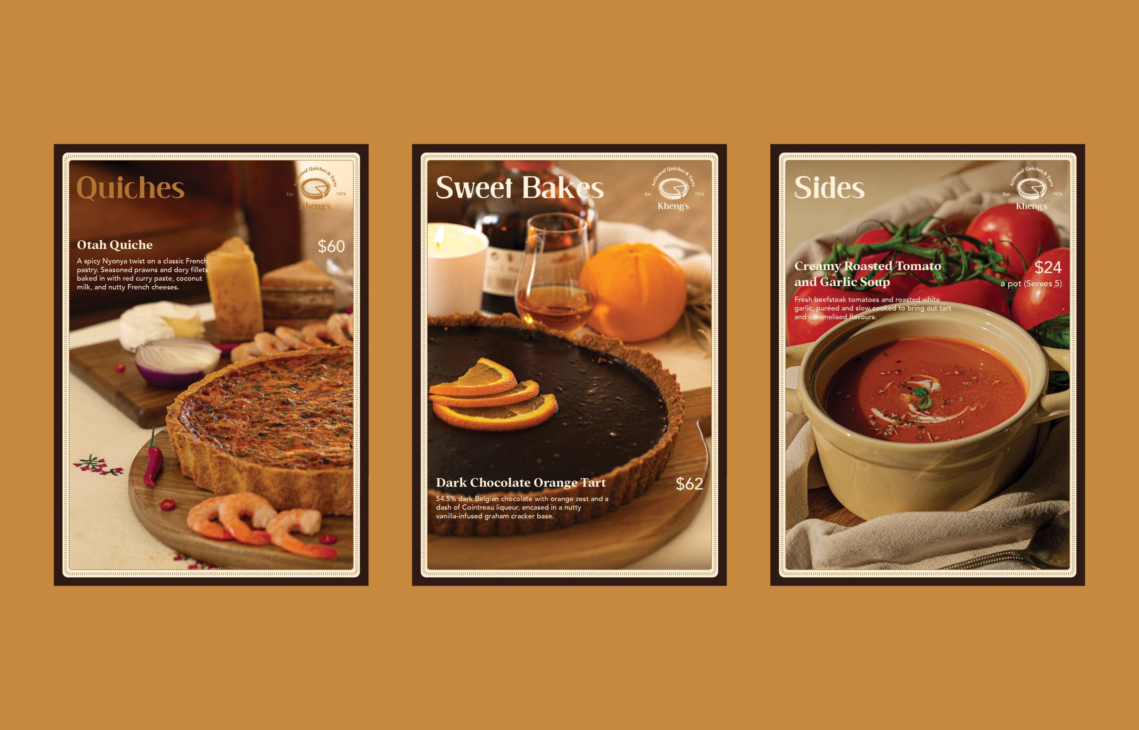
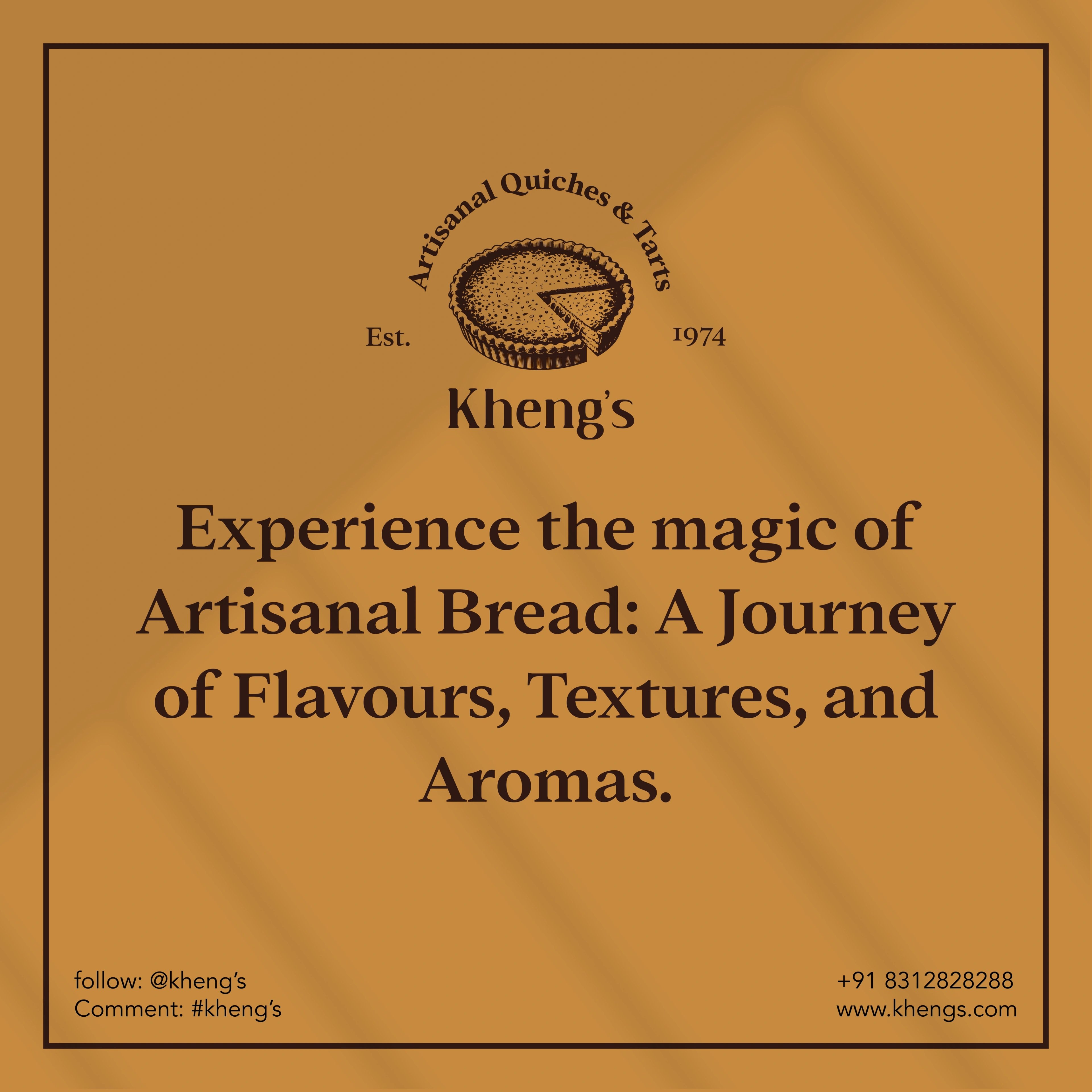
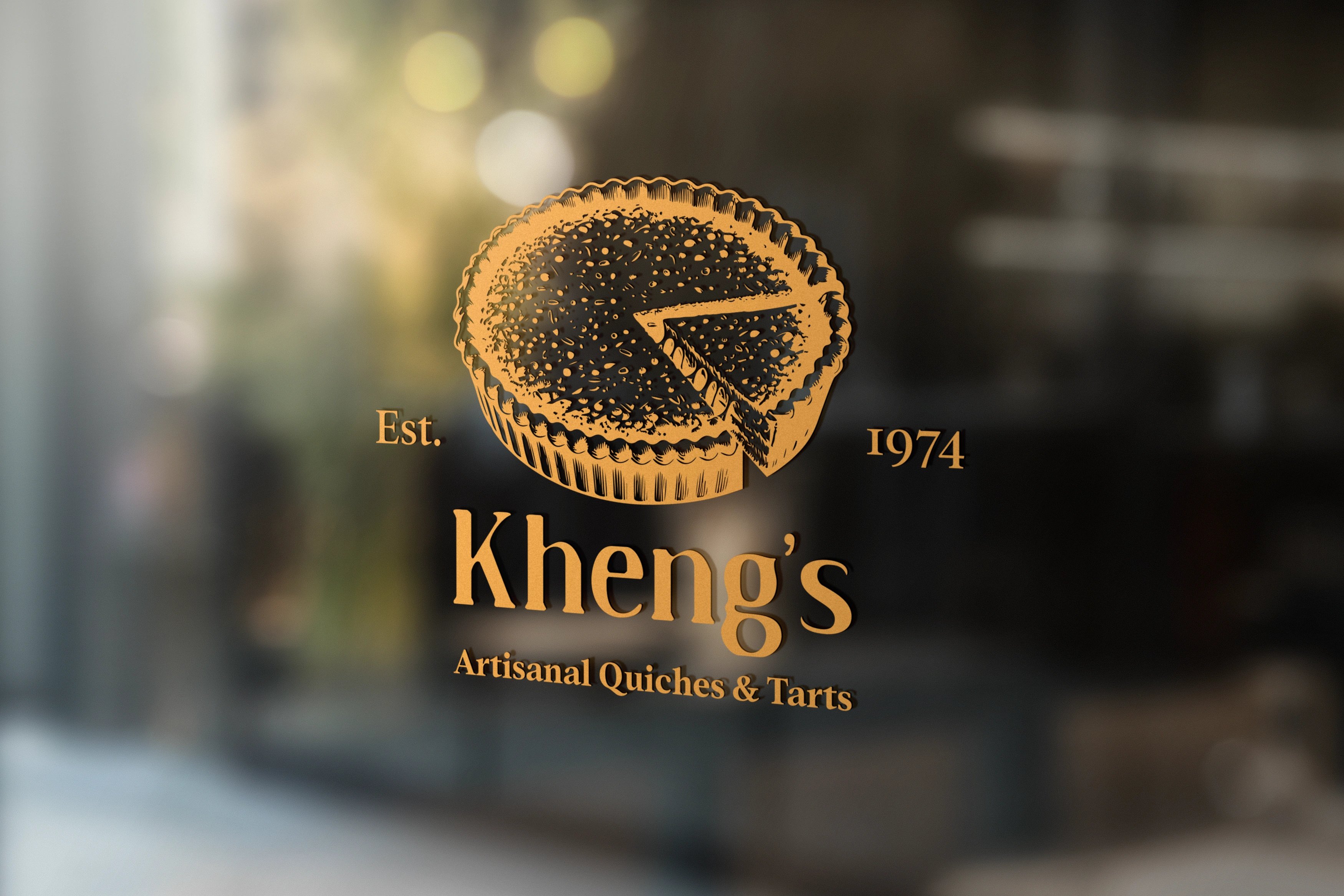
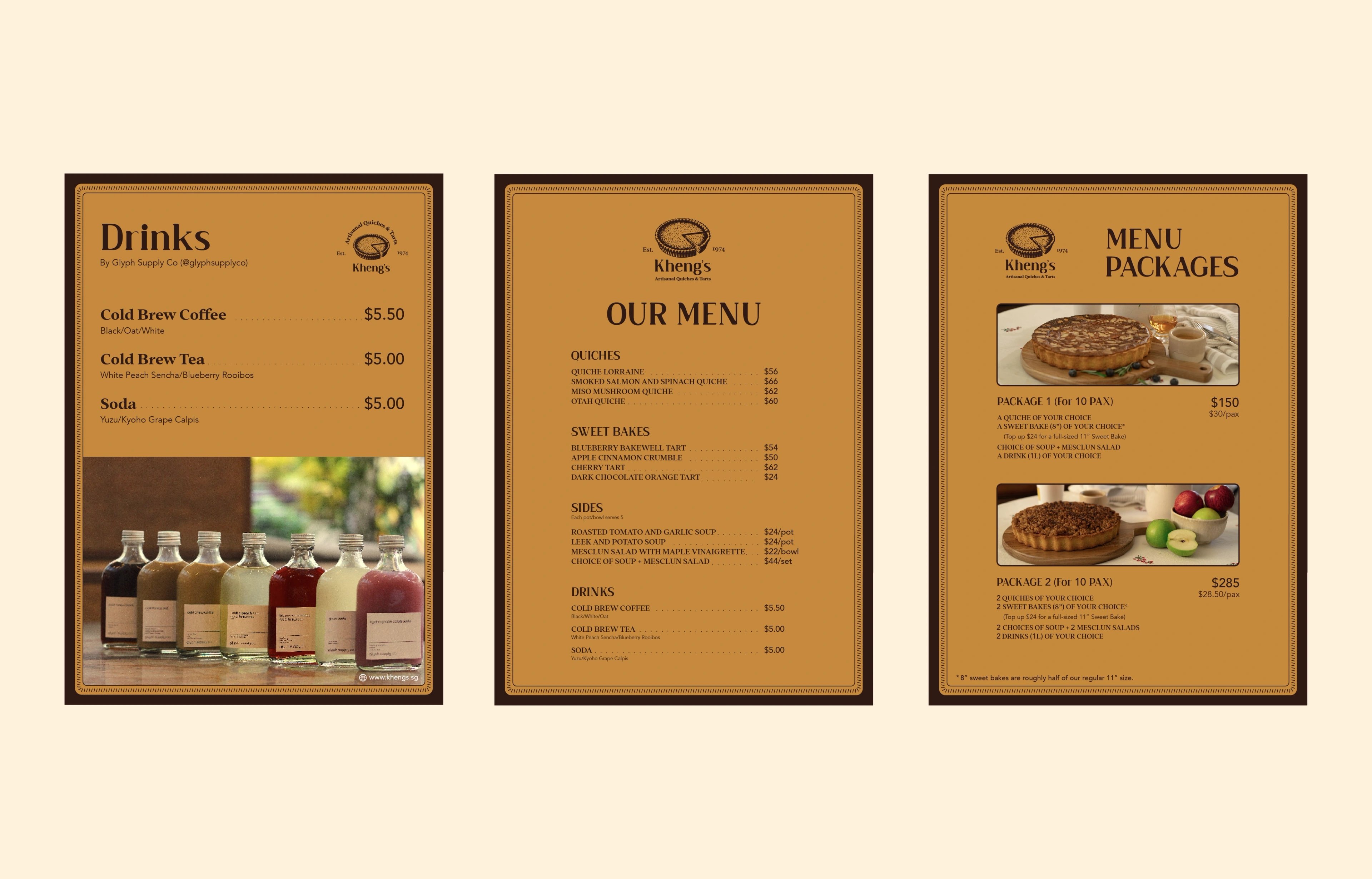
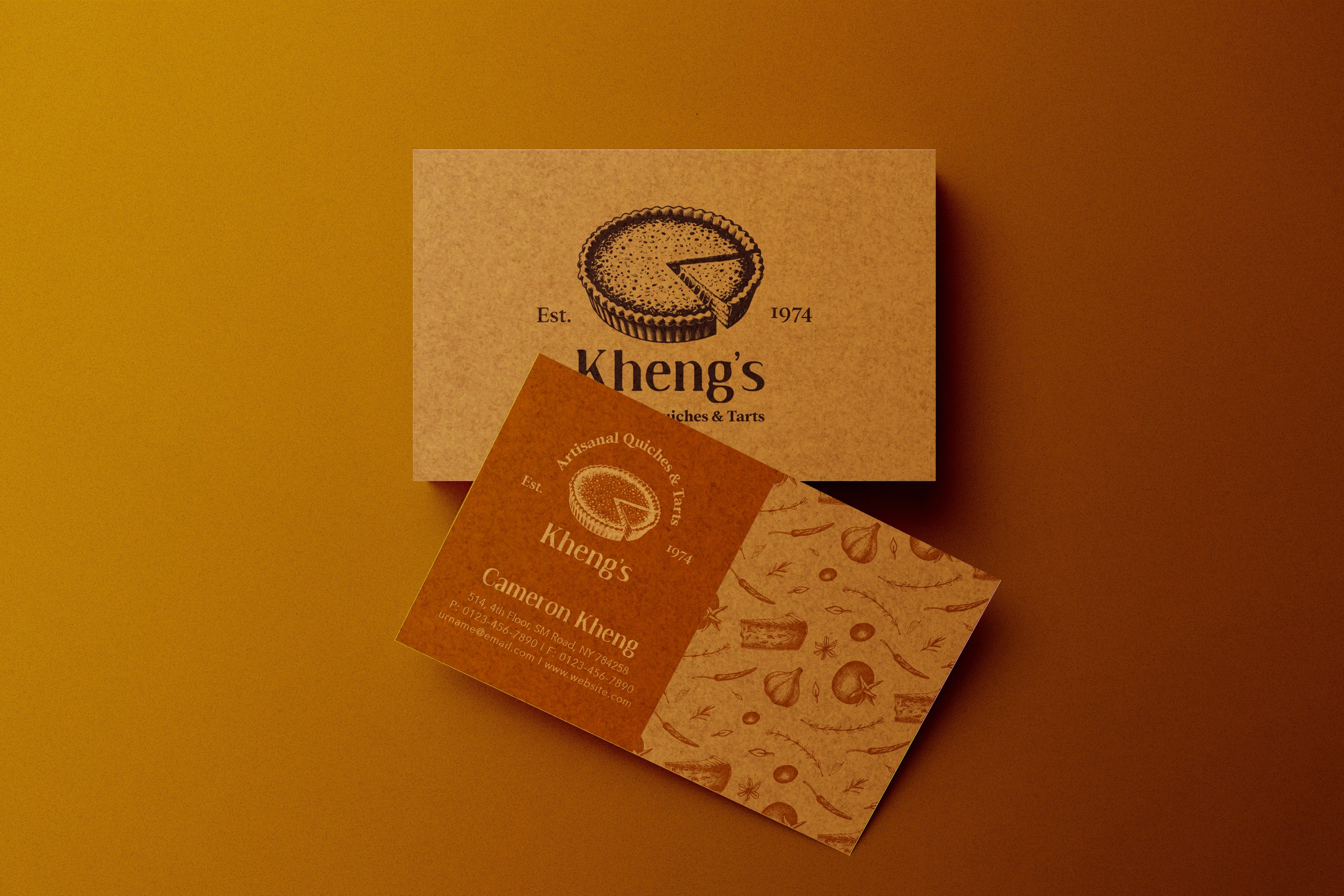
We built the identity around a handmade, old-world food language — crusty, warm, passed down rather than manufactured. A detailed, hand-drawn quiche sits at the centre of the mark, rendered like a stamp from an old family bakery, paired with a warm vintage serif and the descriptor 'Artisanal Quiches & Tarts.' An earthy palette of gold, coffee, saddle brown, cream and chocolate pulls from baked crusts and old recipe books, while rustic, warm-lit food photography keeps every touchpoint feeling homemade and generous.
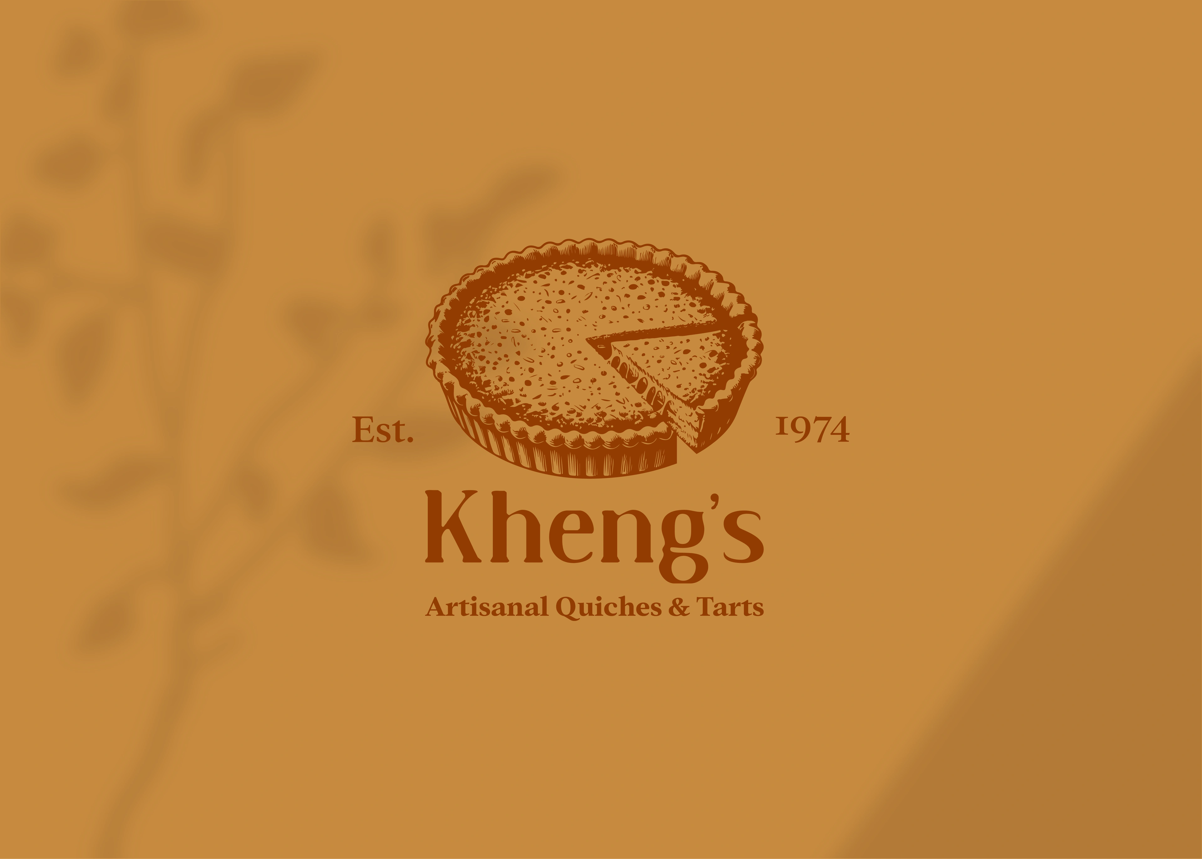
fifty years, served warm
The story starts in 1974, with two people baking simple cakes their family loved. We wanted the brand to feel like a continuation of that, not a reinvention — so we leaned into archival bakery cues: engraved detailing, tactile borders, menus that read like old recipe cards. The new system gave Kheng's the depth to move from home-led orders into a credible artisanal brand, ready for menus, social, website ordering and larger catering moments. It now feels like a name with history and taste — a family legacy people can buy into, not just a menu.
but wait, there’s more

RooView
smart viewfinder accessory brand for solo content creators
Waffangle
mascot-led identity and packaging for a bengaluru waffle brand
The Great Bellingrath Harvest
festival identity for a historic alabama garden estate
Planterio
identity for a plant-based tableware brand
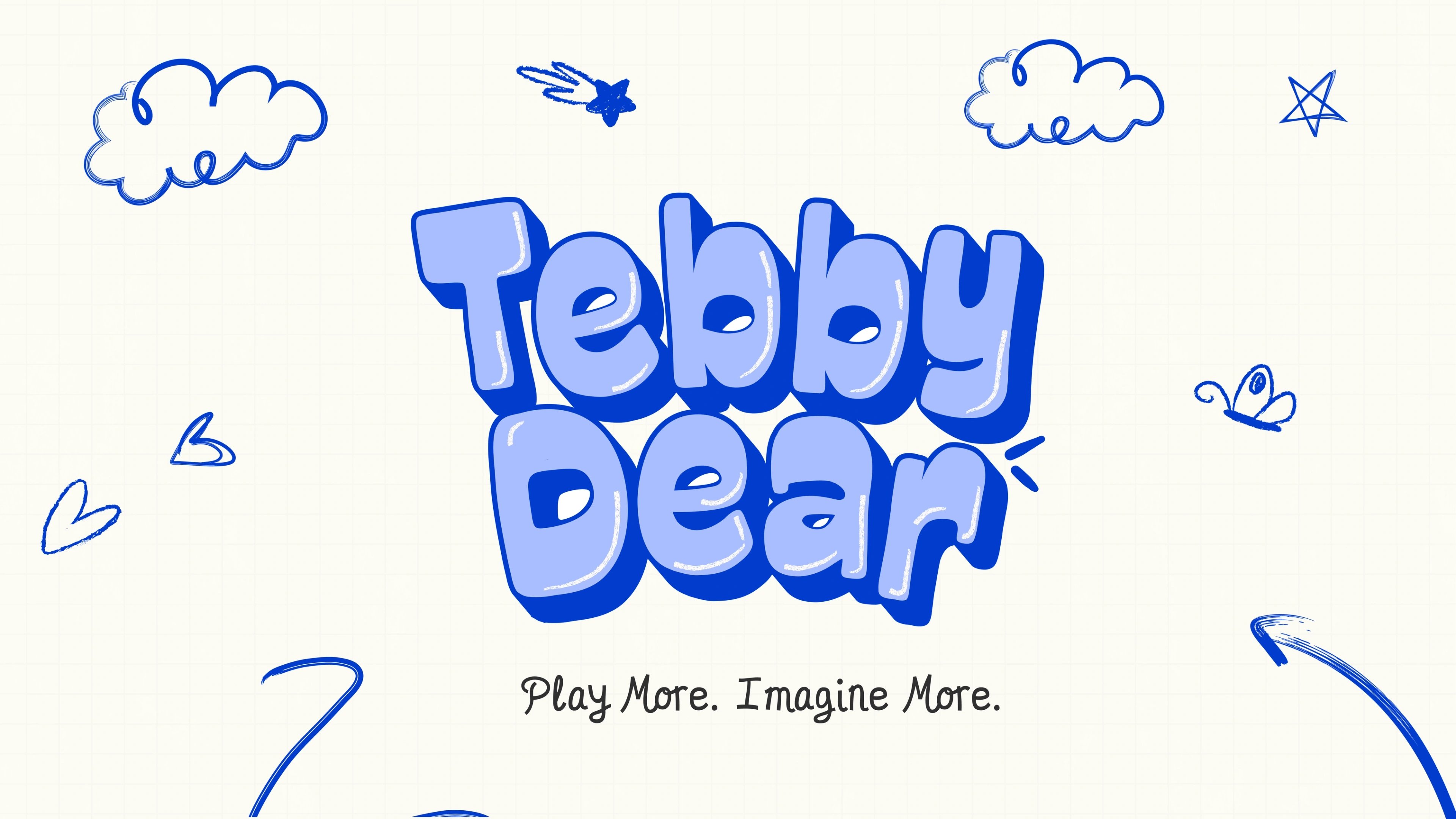
Tebby Dear
playful packaging for a US kids' toy brand

ready tobegin?
tell us what you’re building. we read every message, reply within two working days, and only take on projects we know we can ship well.