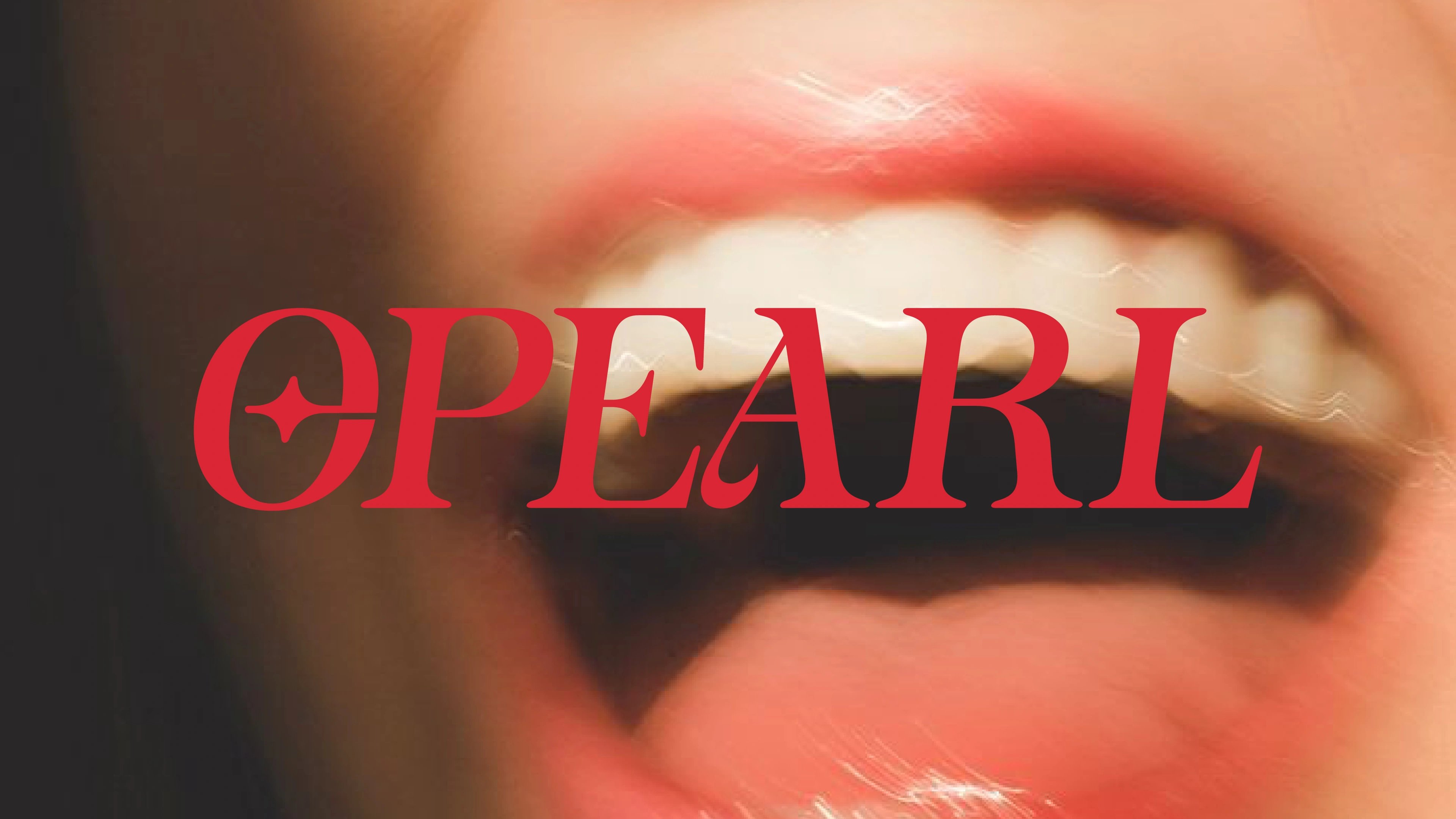
we made teeth-whitening look like beauty, not dentistry.
about the client
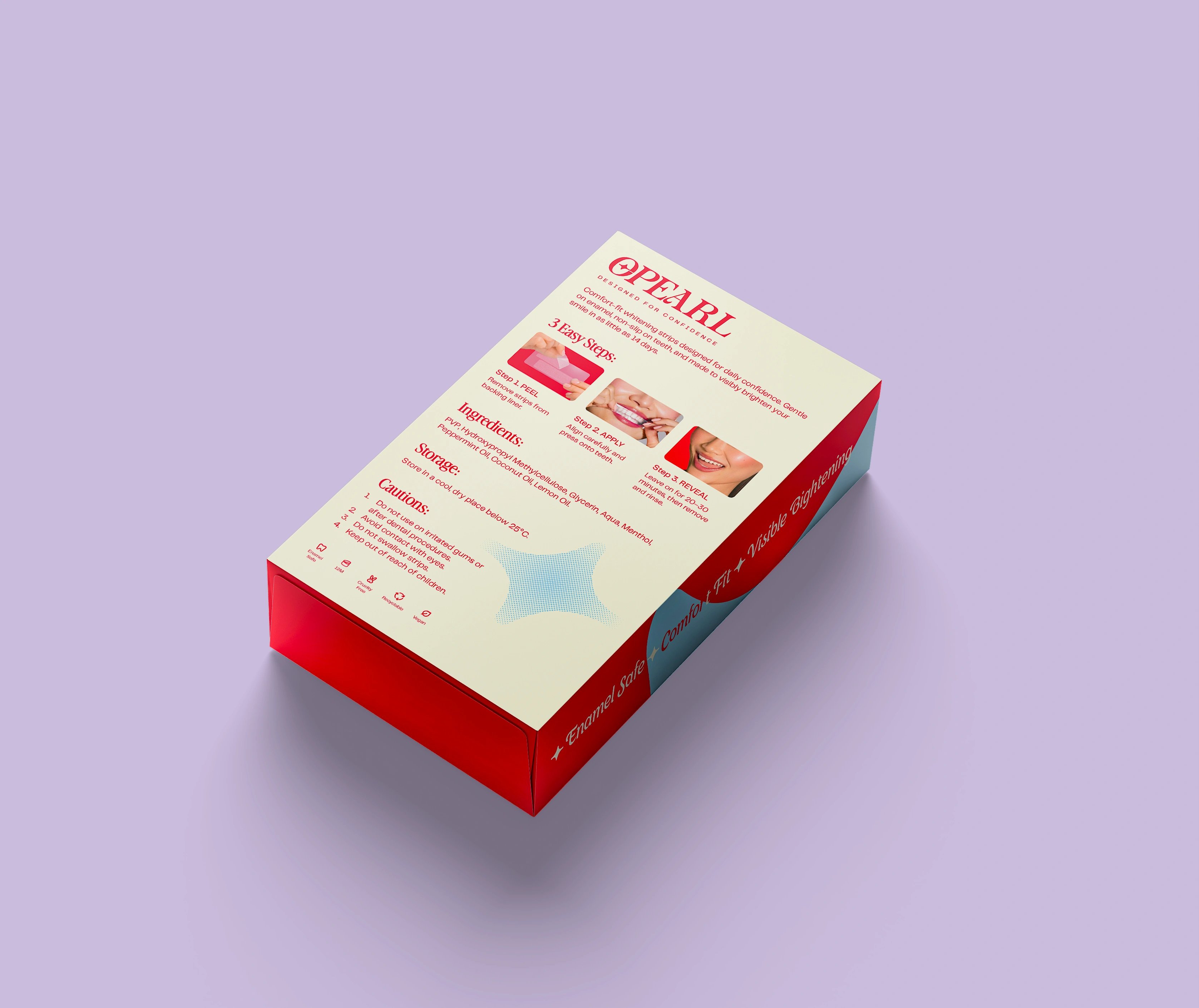
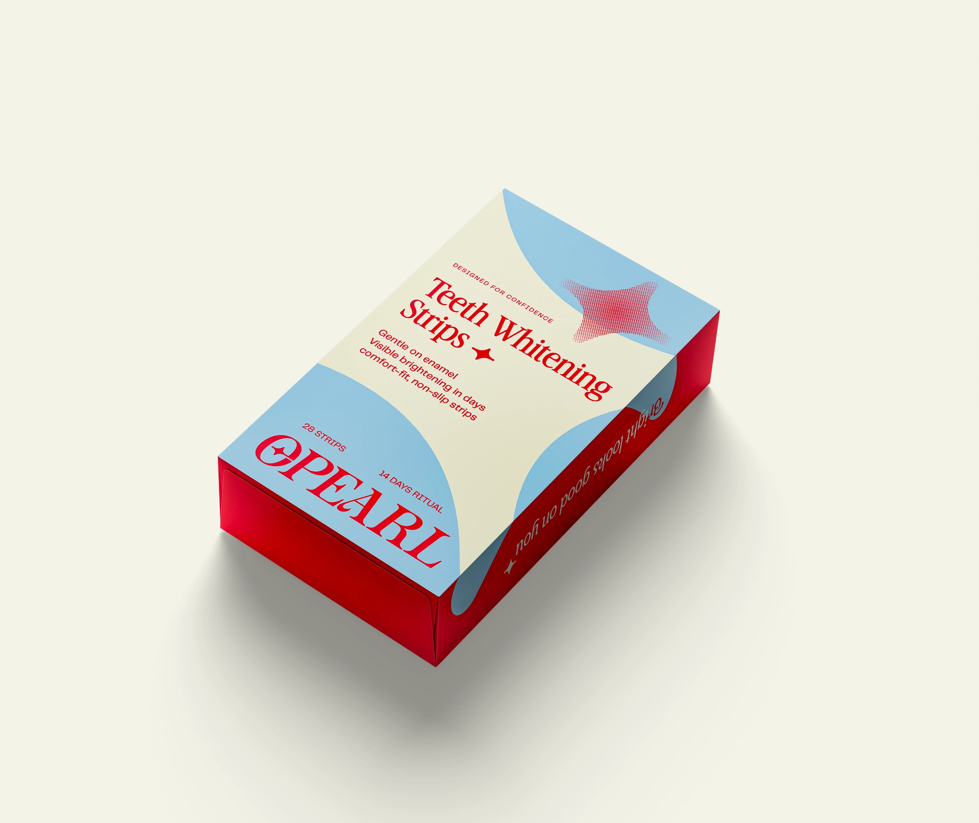
OPEARL is a smile-care brand from Zenith Global Solutions LLC, founded by Siddhaarth Gupta, launching with teeth-whitening strips. It sits where oral care meets beauty and self-care — built around confidence and radiance rather than hygiene. It sells digital-first, through Amazon and its own channels.
the challenge
Oral care defaults to clinical: white coats, mint-and-mirror packaging, function over feeling. OPEARL needed to escape that language entirely and make whitening feel desirable, premium and a little vain — for a design-aware audience that buys on a screen, not off a pharmacy shelf.
our solution
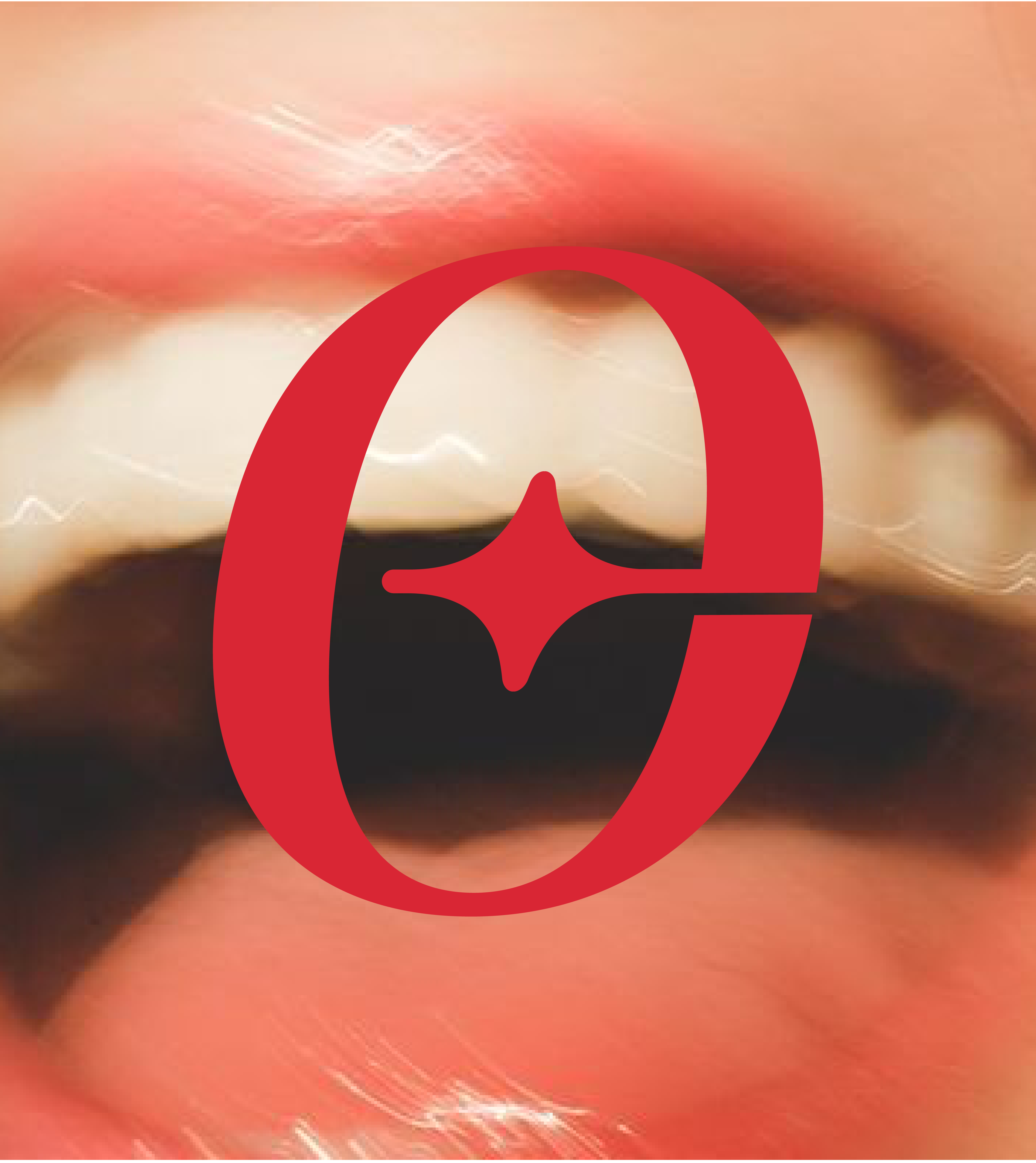
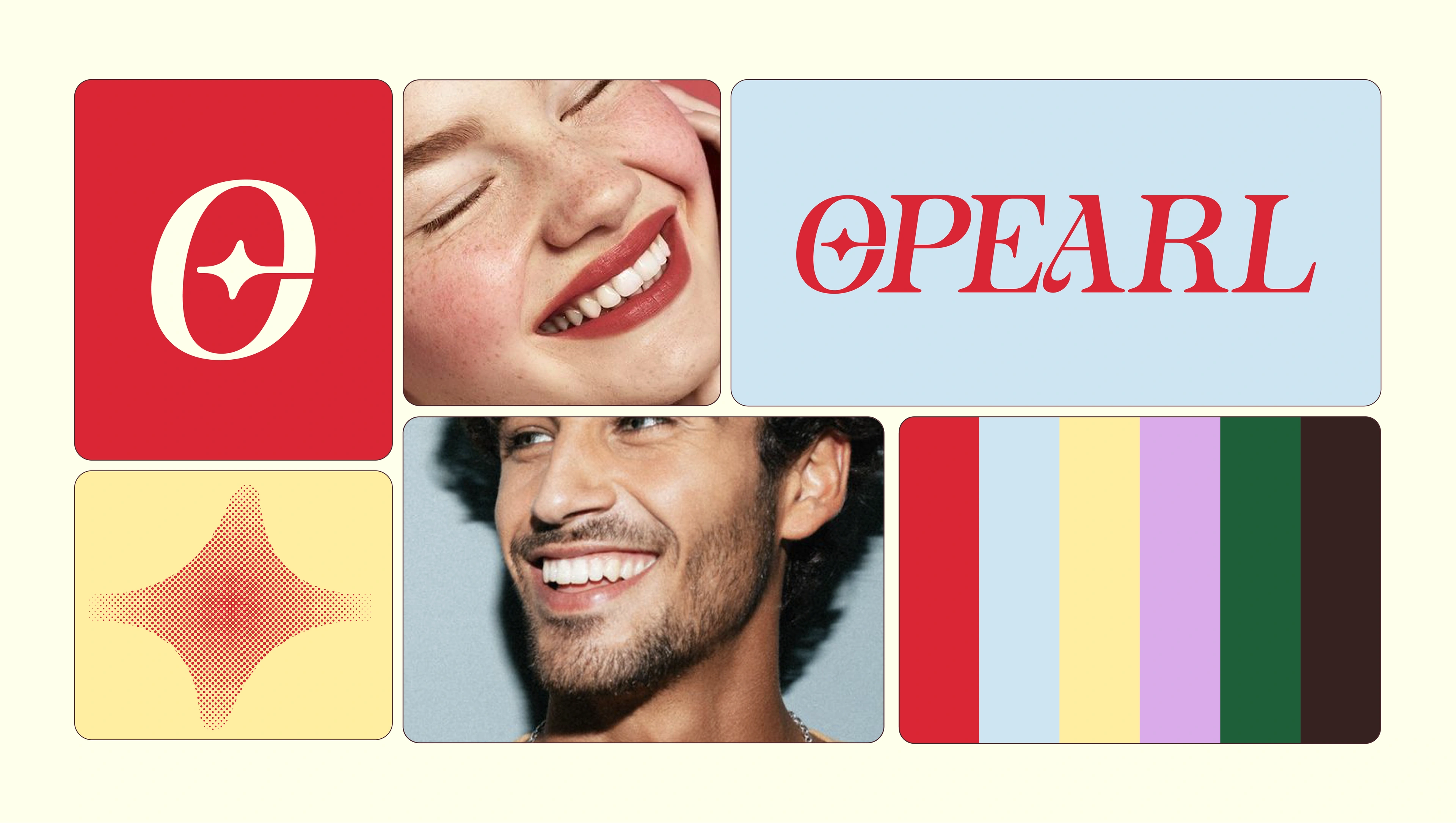
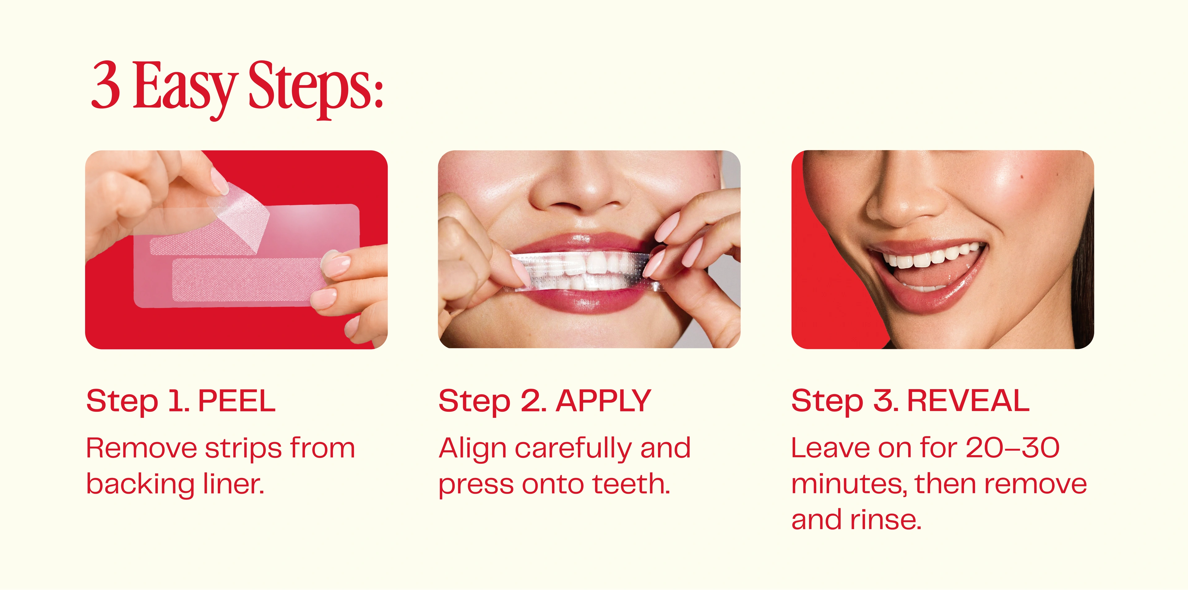
We built OPEARL as a beauty brand that happens to whiten teeth. The wordmark carries the premium weight, and a star set inside the 'O' became the signature cue for shine and confidence. Halftone textures lend a retro-print character while bold, high-contrast colour pulls the whole system toward cosmetics, not dentistry — and it holds up across packaging, Amazon listings, social and collateral.


the smile became the statement.
The brief was a single instruction: don't make it look like a dental brand. So we threw out the clinical vocabulary and rebuilt the positioning around beauty, confidence and radiance. The wordmark leads, with the star-in-'O' logomark giving every touchpoint its signature moment, and halftone textures adding retro-print energy without nostalgia. The result reads as premium beauty on a screen, survives the scrutiny of an Amazon listing, and has the range to stretch across future products without coming apart.

but wait, there’s more

Zion Health
earth-rooted identity system for a clay-based wellness brand

RooView
smart viewfinder accessory brand for solo content creators
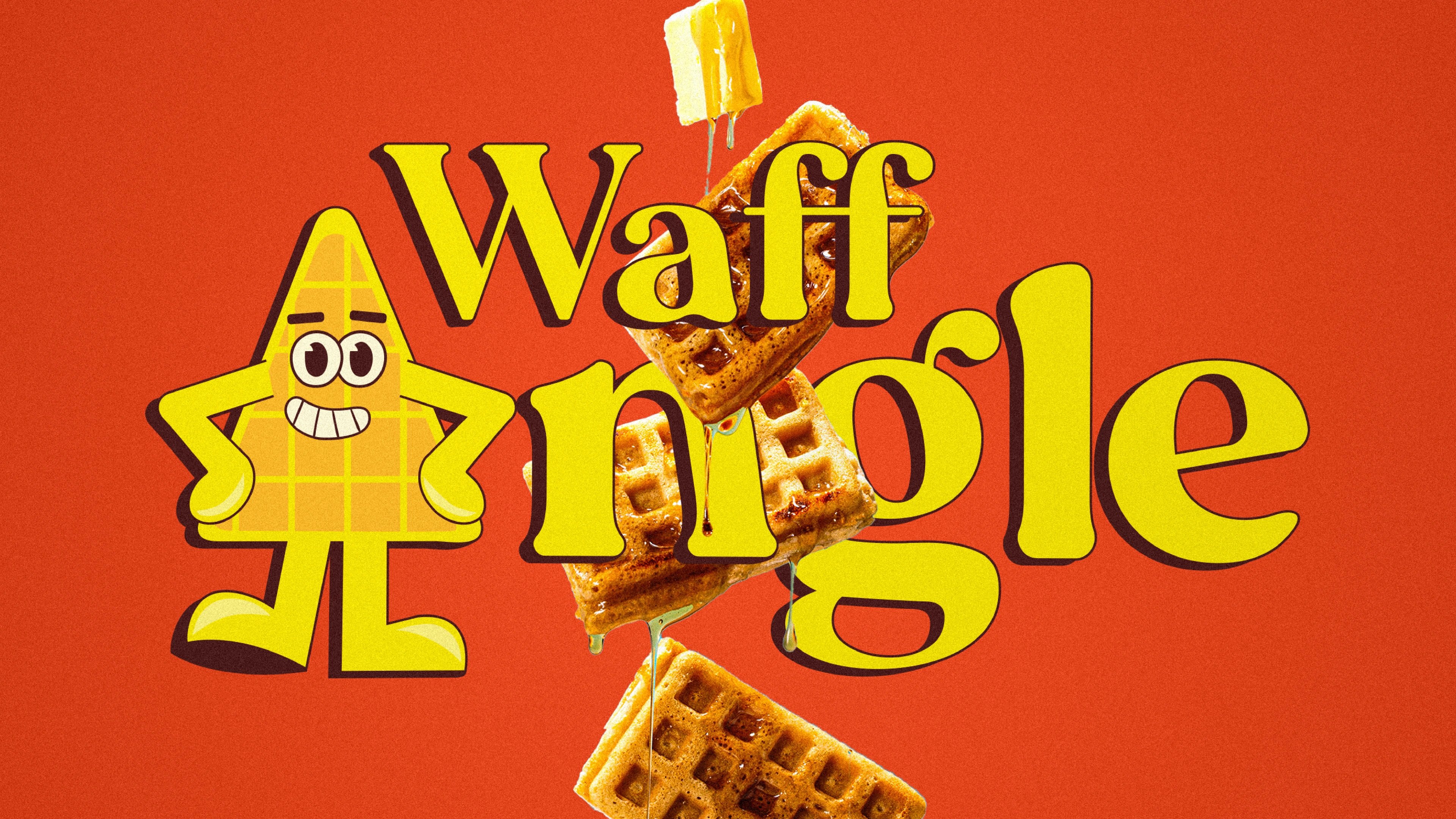
Waffangle
mascot-led identity and packaging for a bengaluru waffle brand
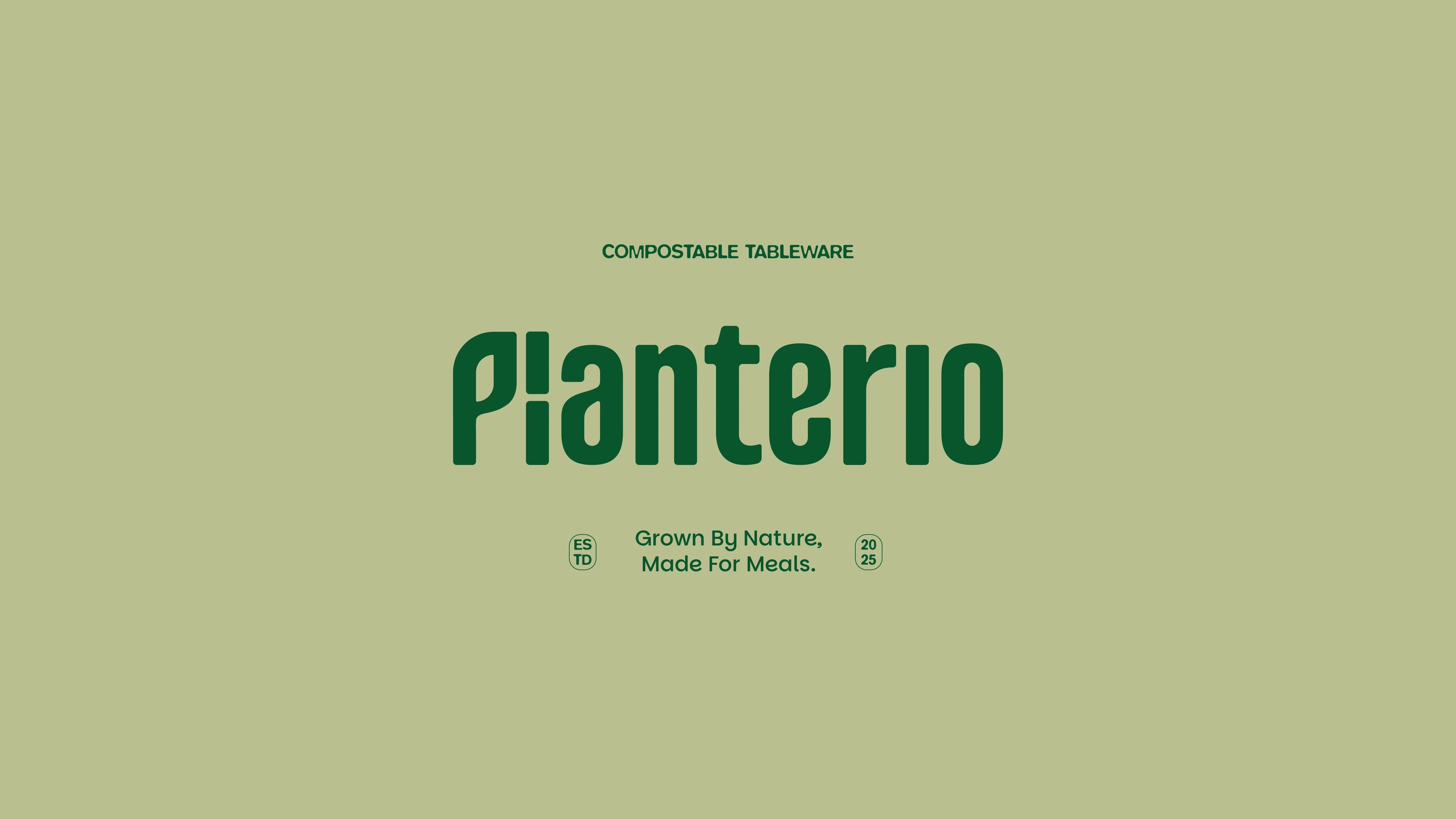
Planterio
identity for a plant-based tableware brand
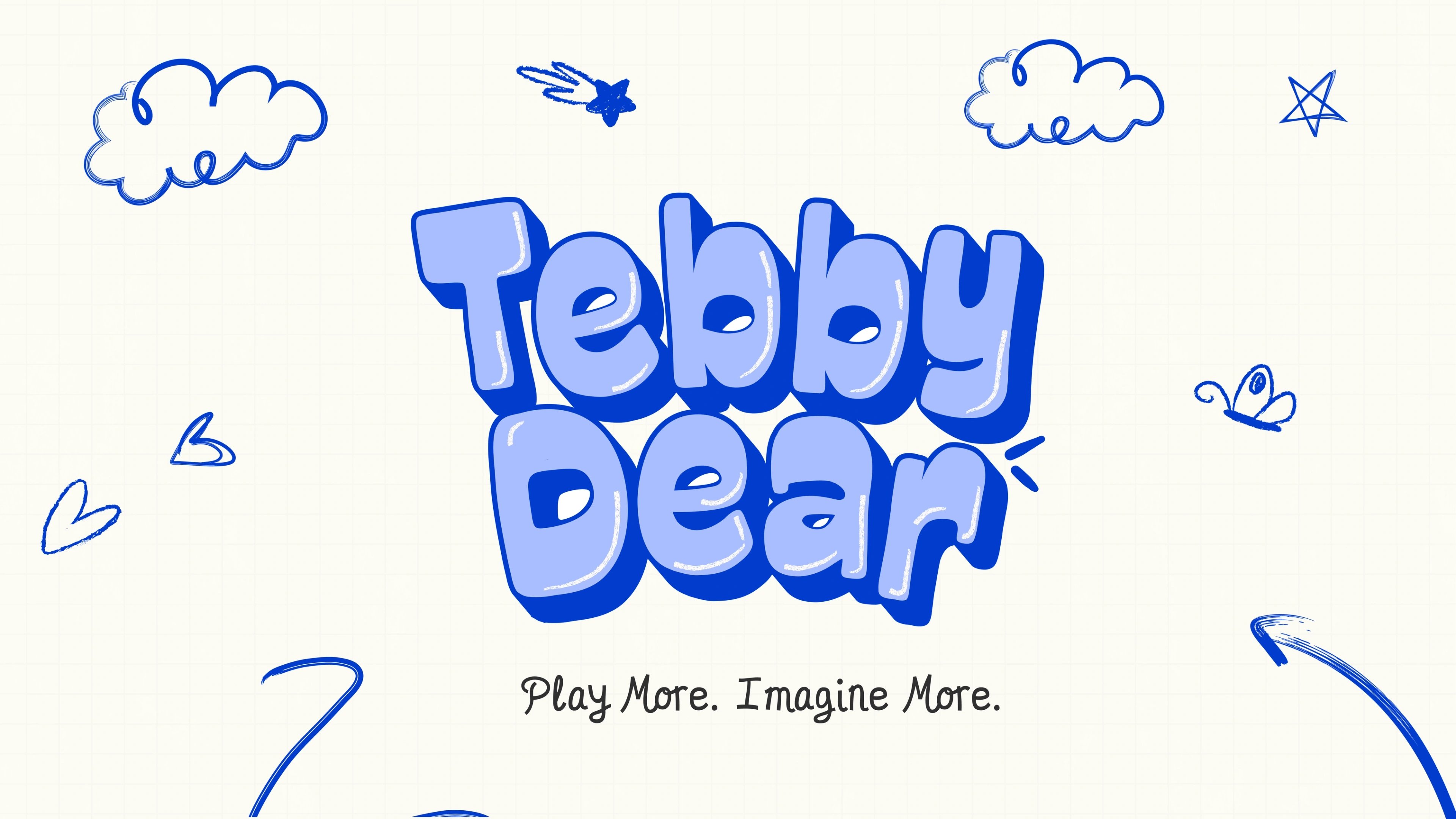
Tebby Dear
playful packaging for a US kids' toy brand

ready tobegin?
tell us what you’re building. we read every message, reply within two working days, and only take on projects we know we can ship well.