Sawa Sawa Beach House
a beach house that finally reads four-star
about the client
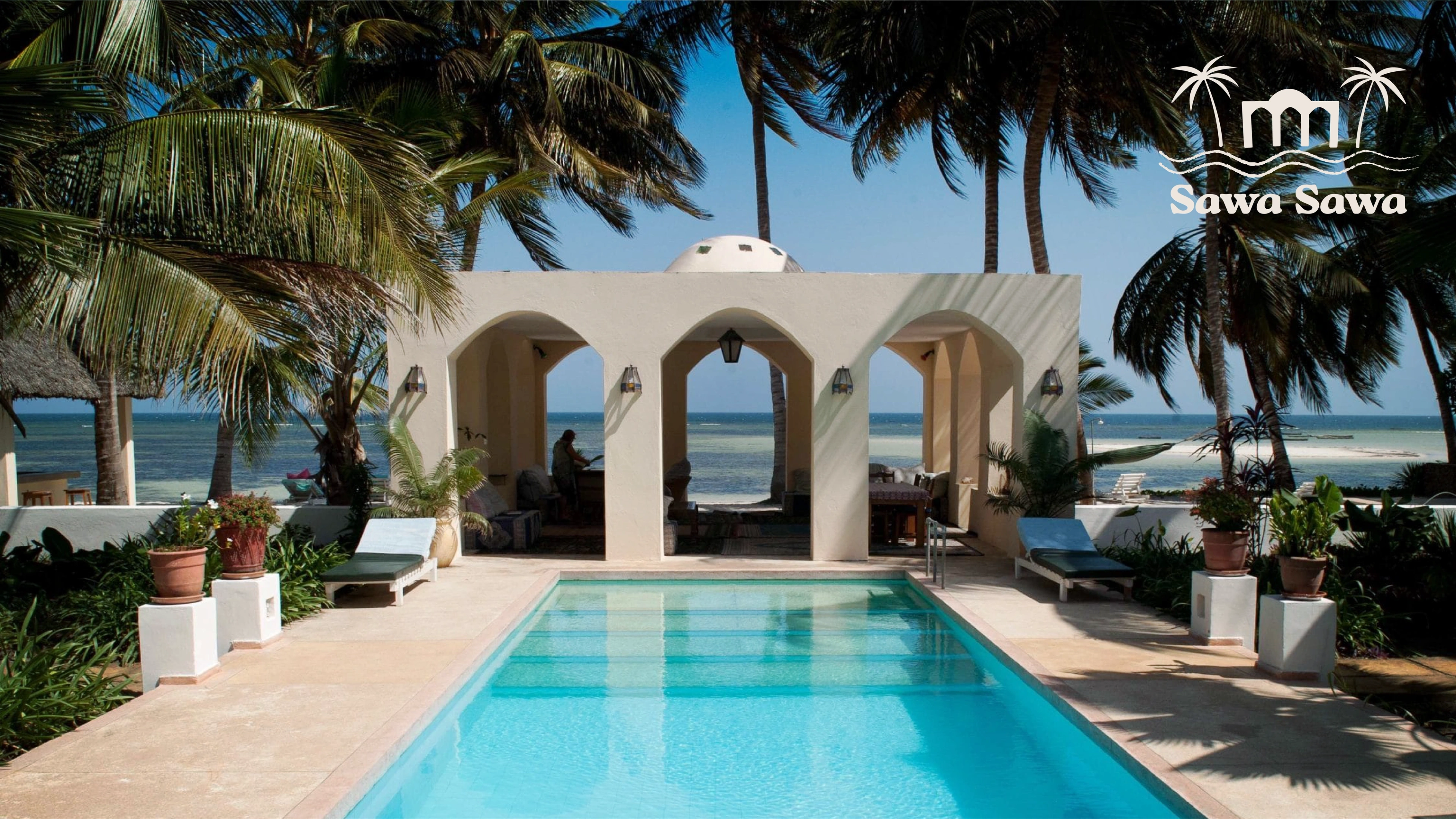
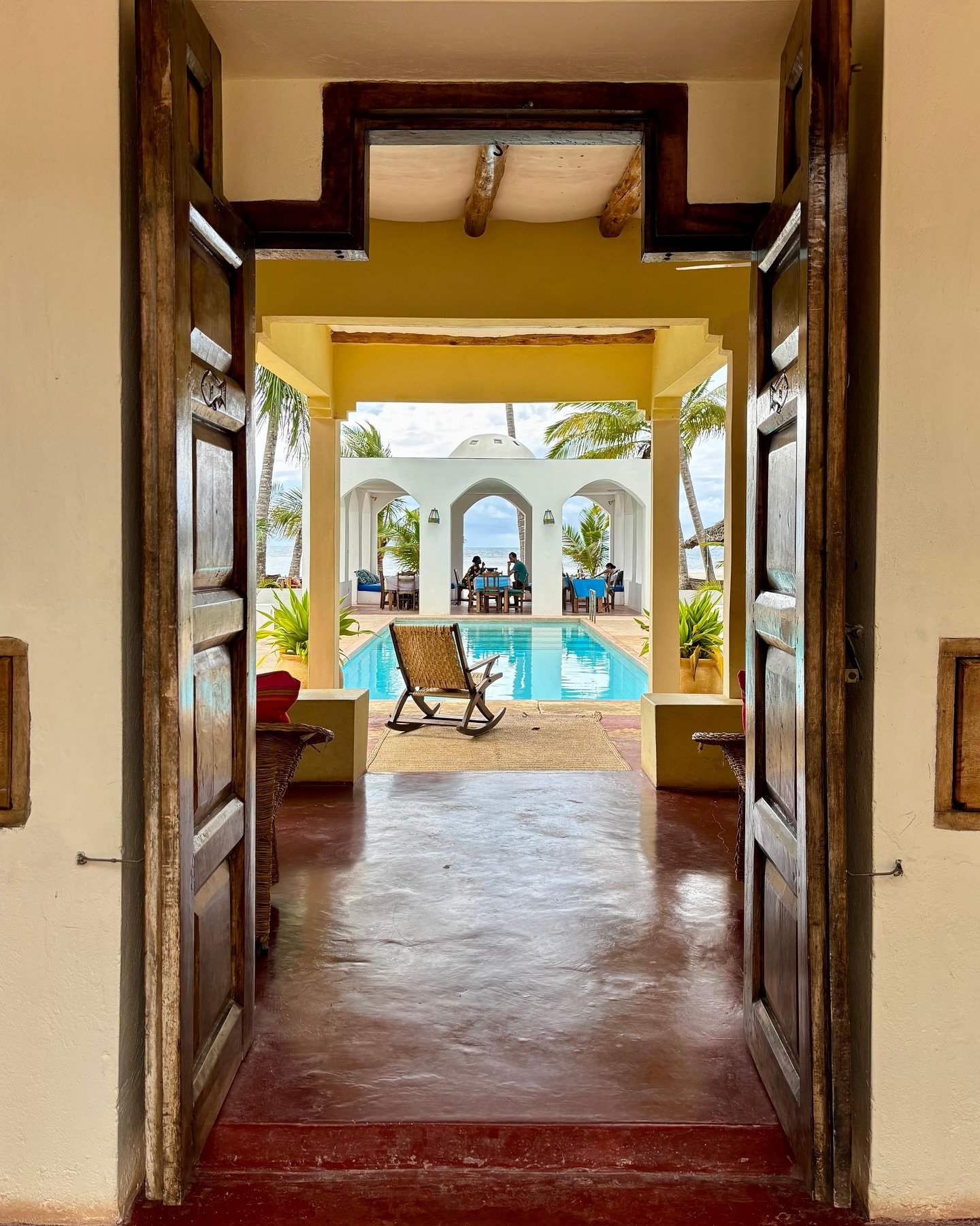
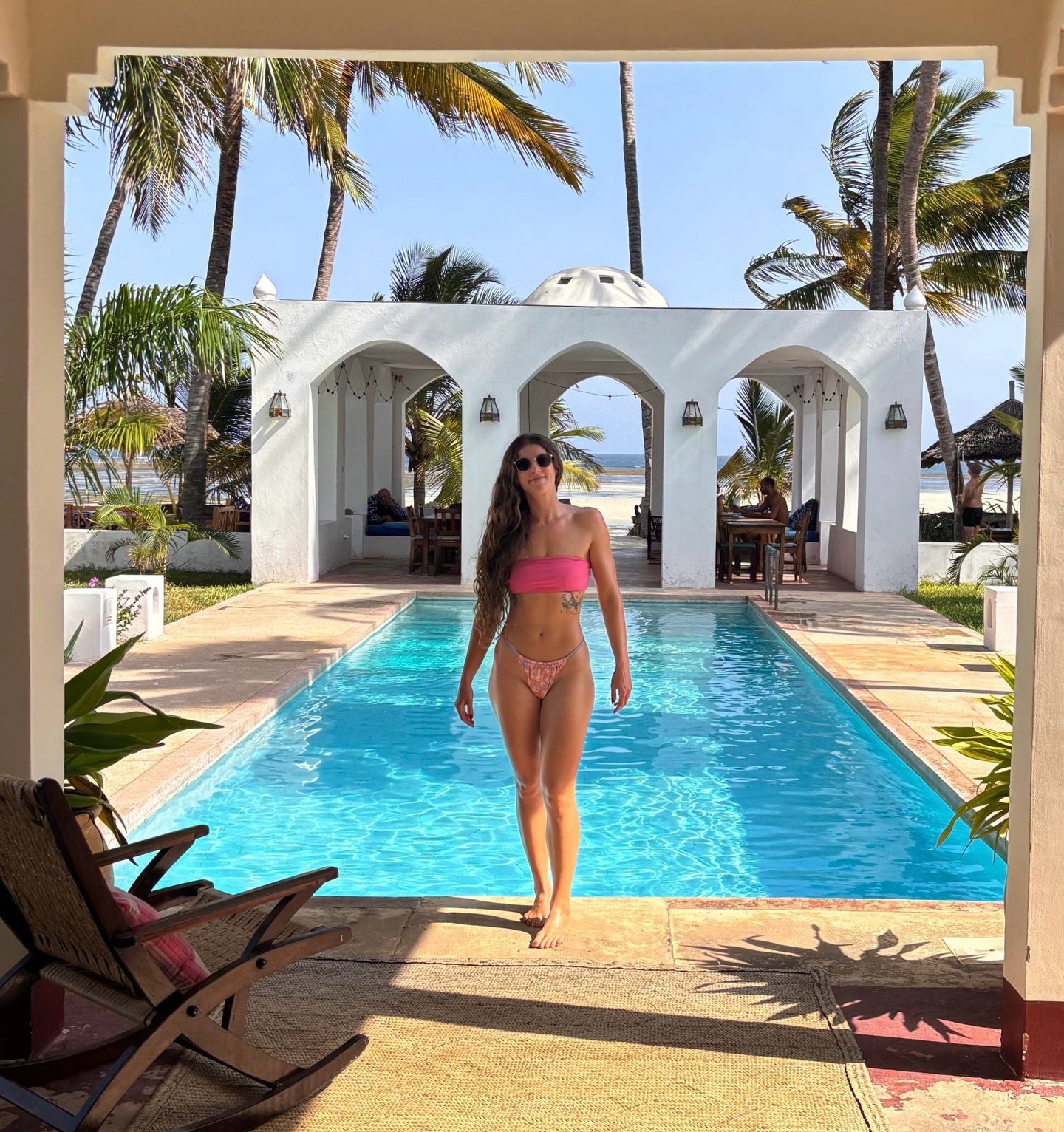
Sawa Sawa Beach House is a boutique beachfront retreat and four-star hotel in Msambweni, on Kenya's south coast. Led by founder Ivo, it carries the intimacy of a private beach house with the polish of a professional hospitality destination. Swahili hospitality, oceanfront calm, and a warm coastal lifestyle shape every part of the guest experience.
the challenge
Sawa Sawa already had the location and the warmth; what it lacked was a brand that felt as complete and four-star-ready as the stay itself. The property risked reading as a small boutique stop rather than a polished destination. Identity, signage, print, menu, website, and booking journey all needed to pull in one direction, so guests felt the same coastal calm before arrival, during the stay, and after they left.
our solution
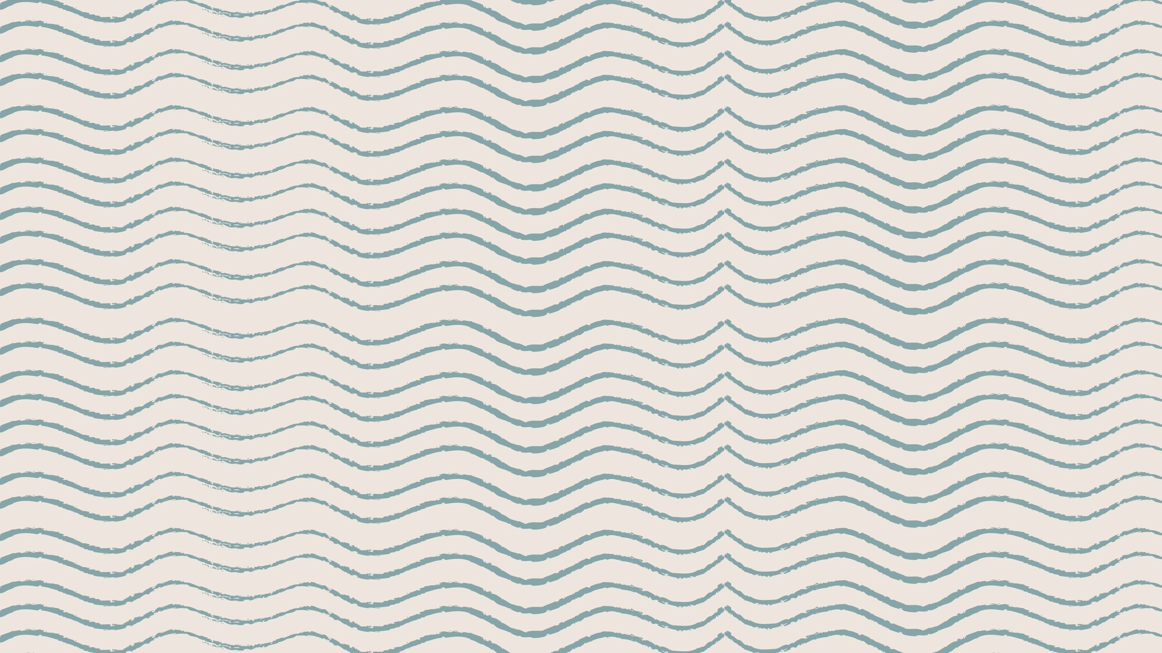
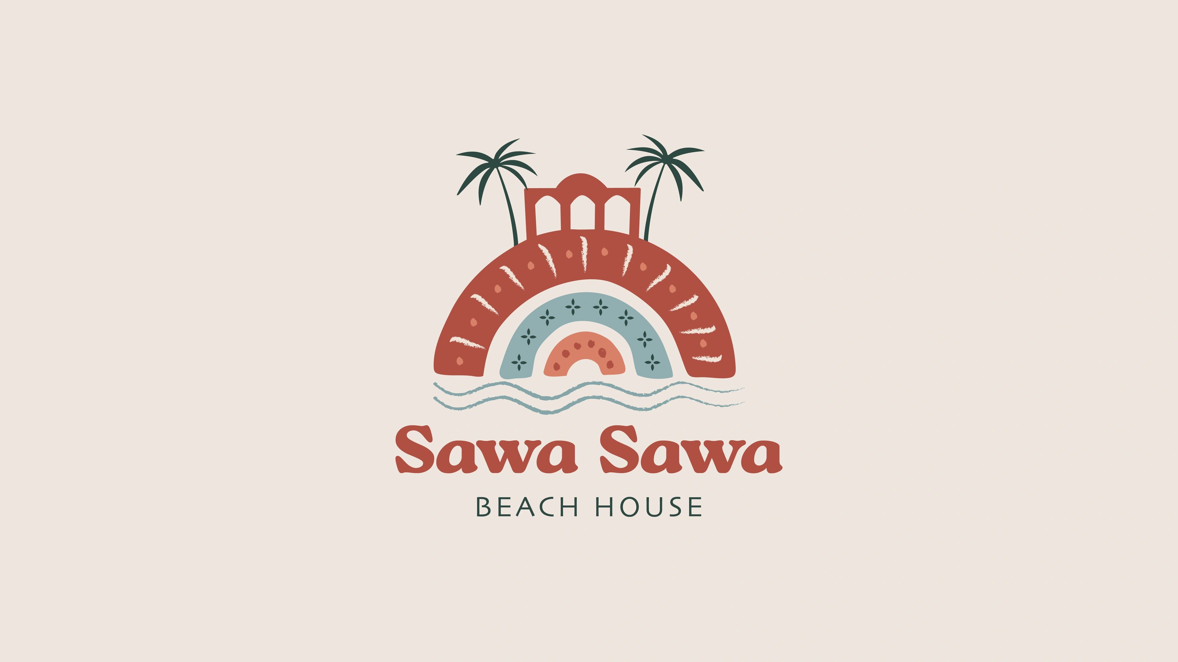
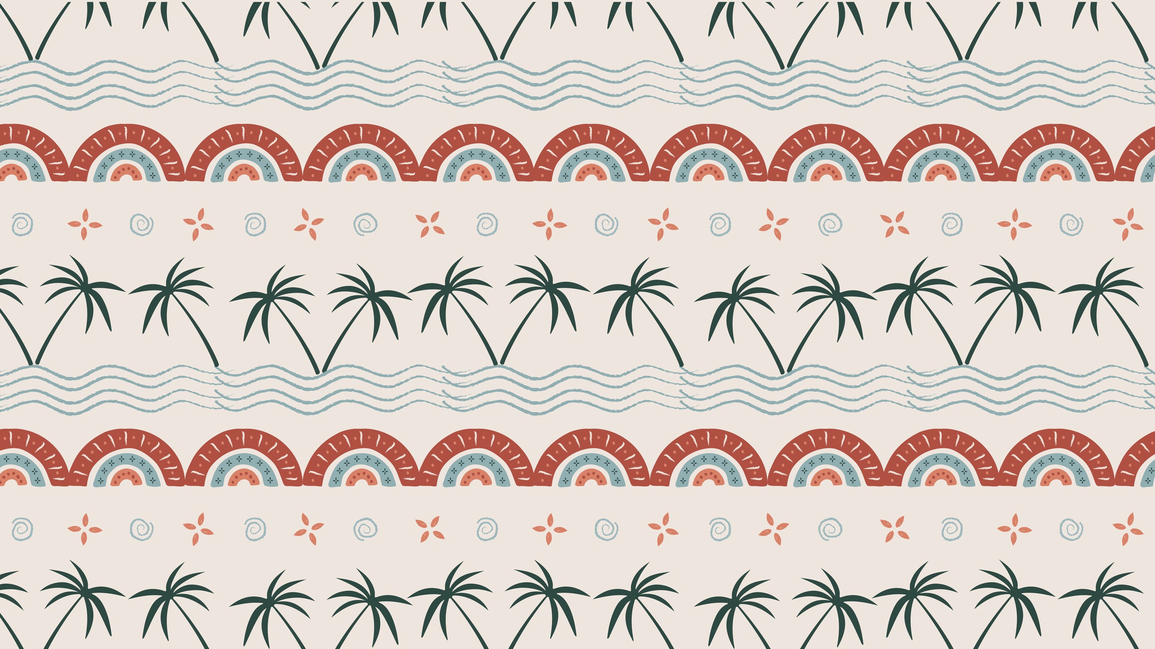
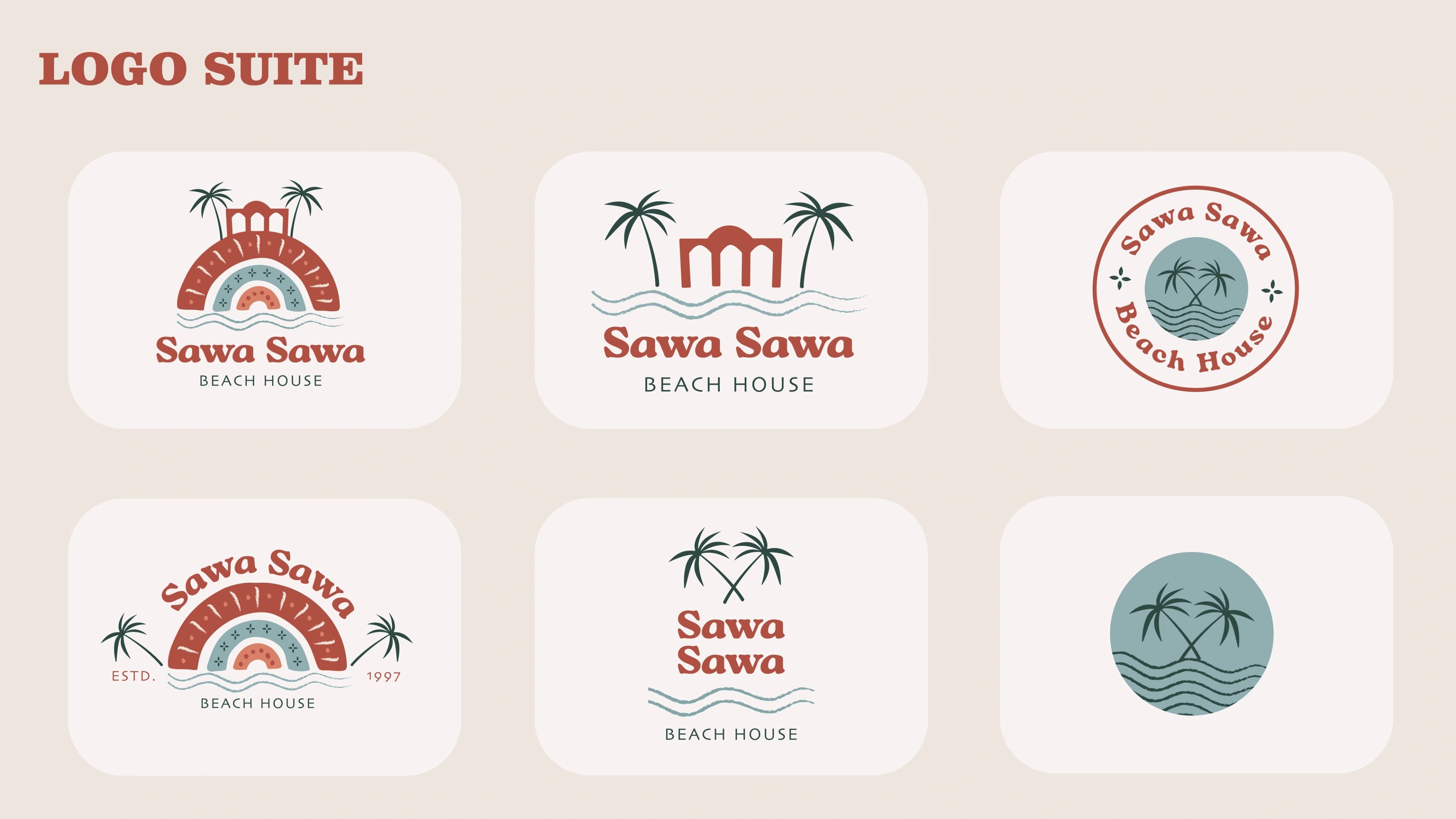
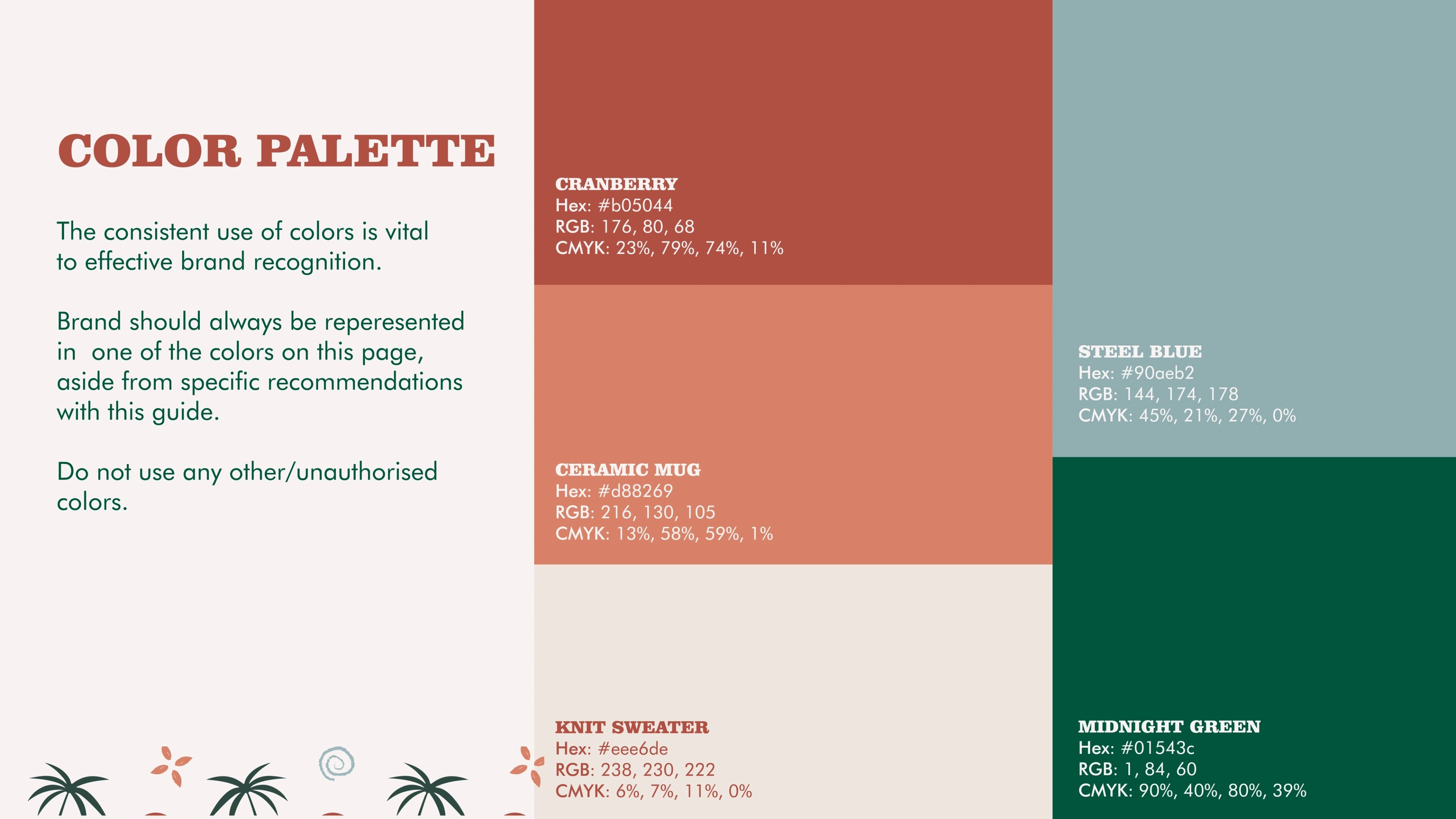
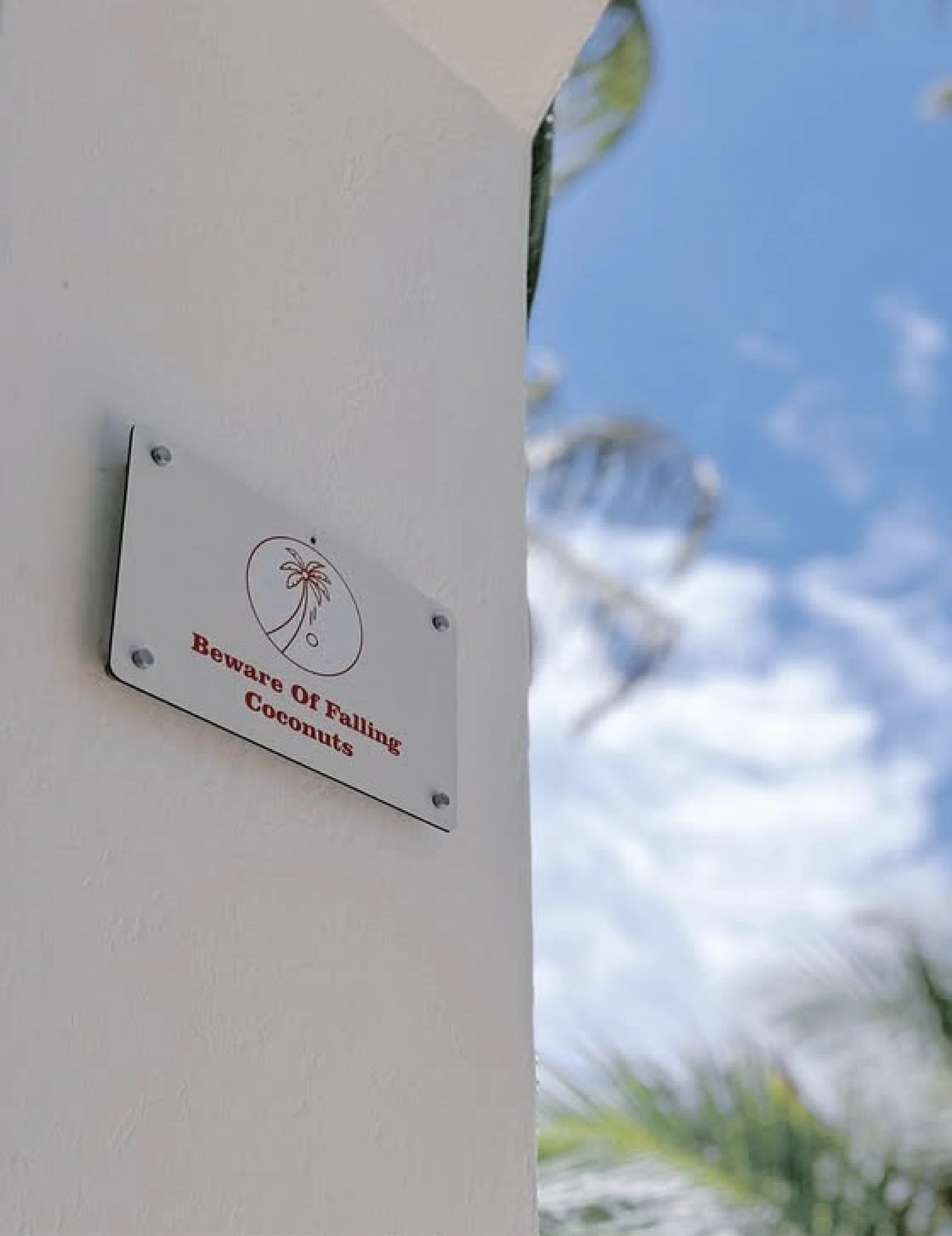
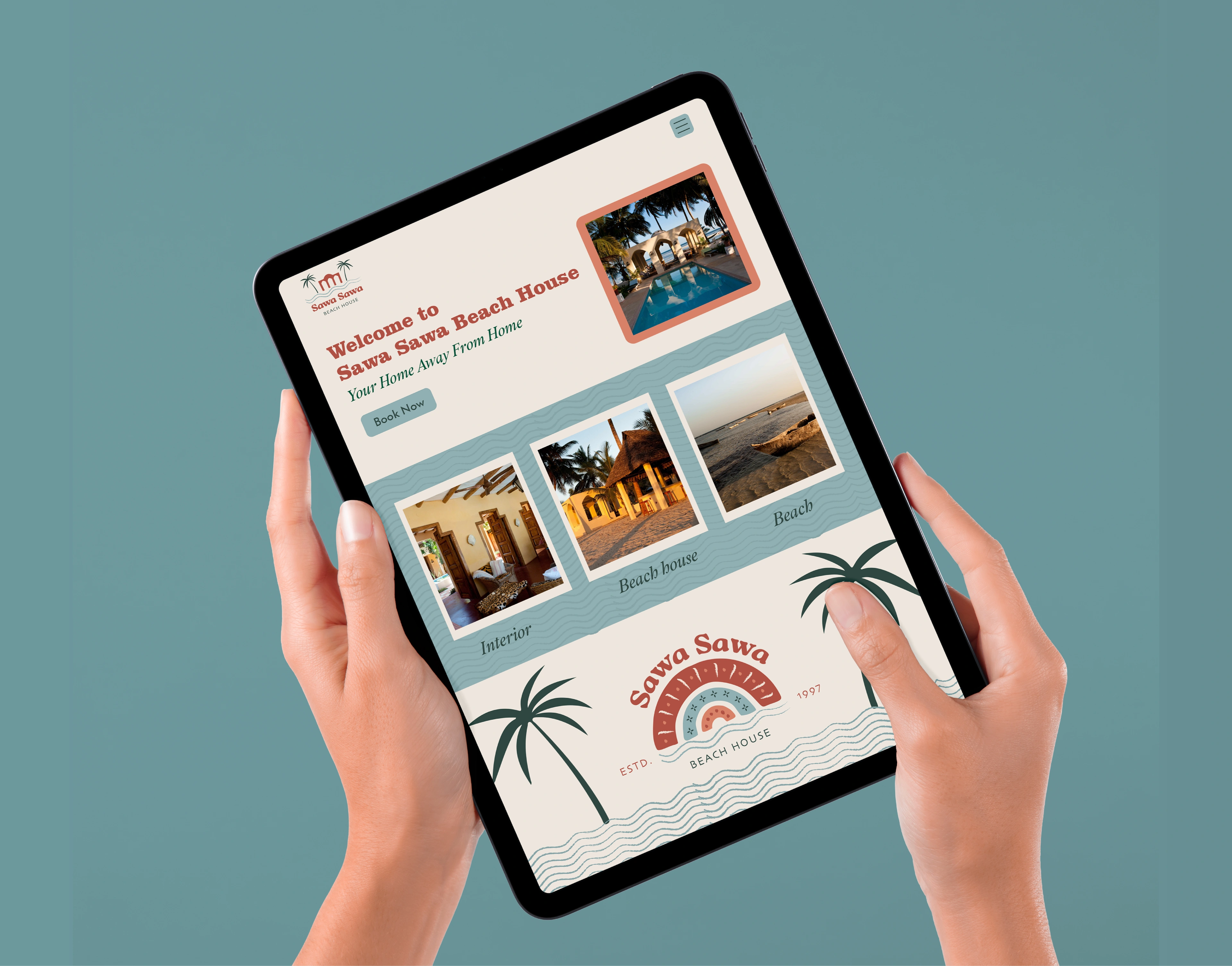
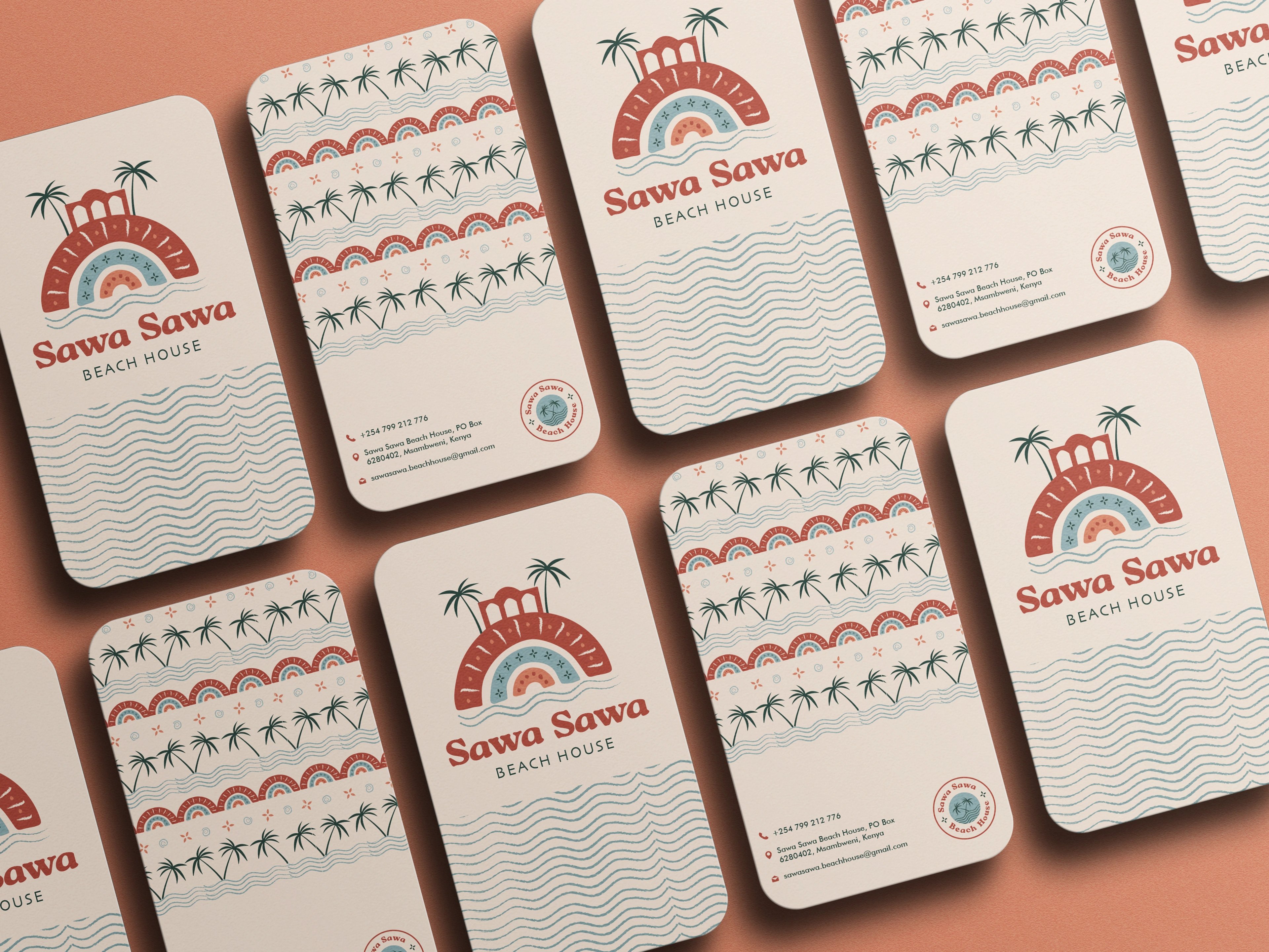
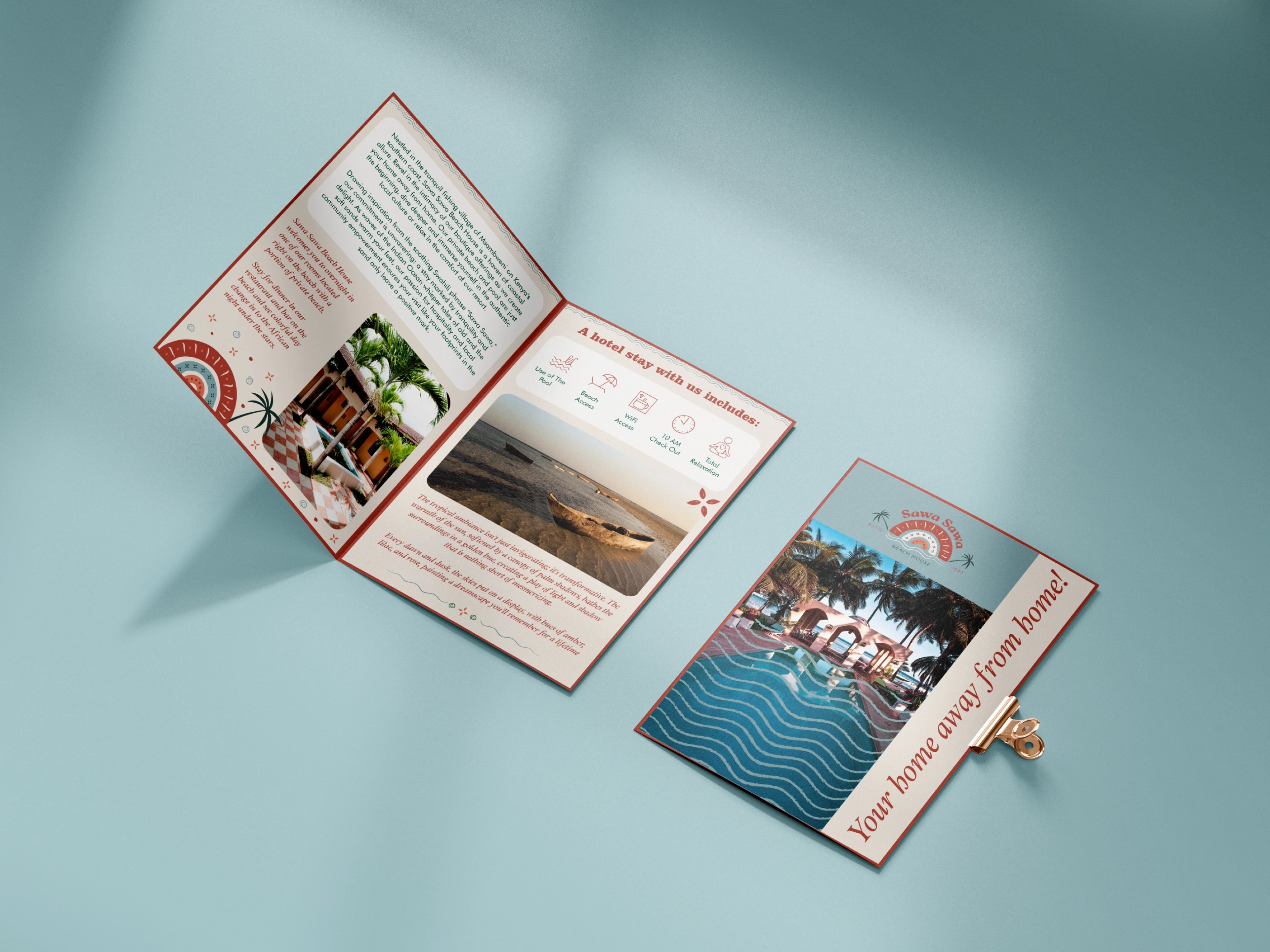
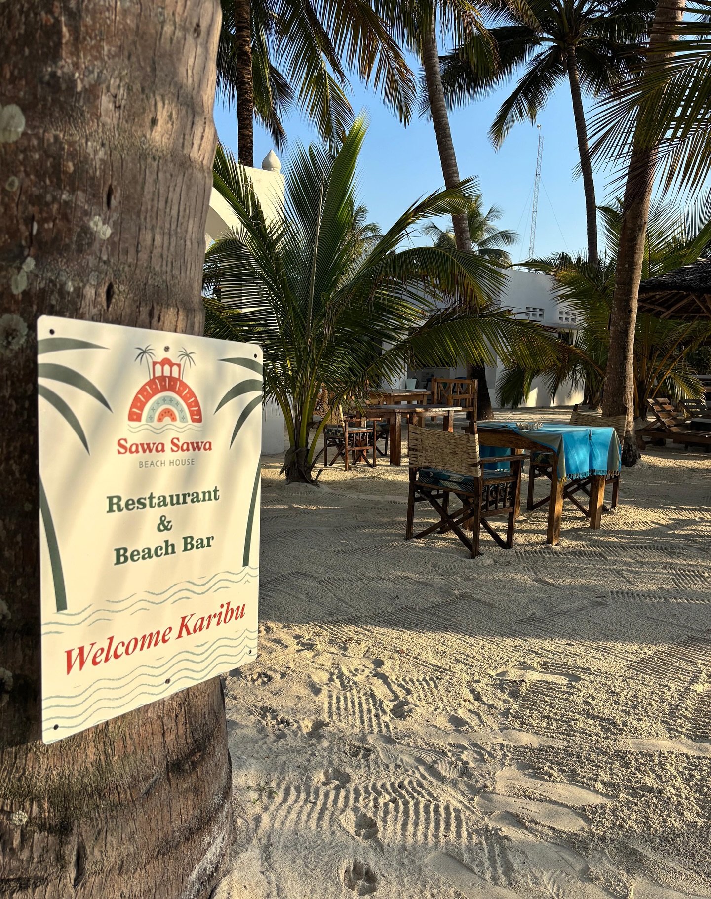
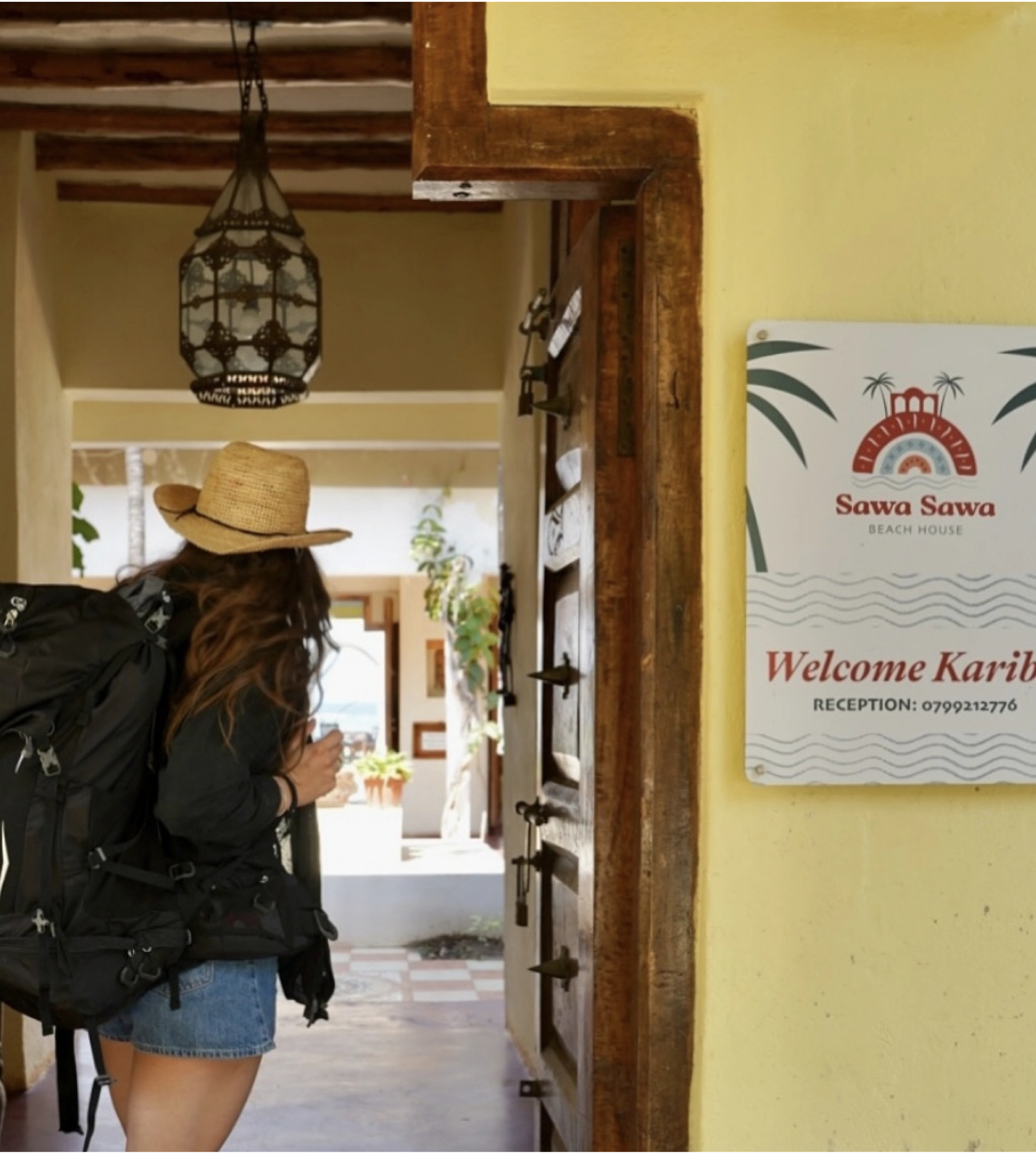
We drew the mark straight from the property's most recognisable feature — its arched architecture — and simplified it into a coastal emblem of arches, palms, waves, and spiral details with an African-boho hand. The palette echoes the surroundings: cranberry for African soil, steel blue for the ocean, midnight green for the palms. A custom display type keeps it warm and classic while staying distinctive, and the system extends across signage, stationery, stickers, menu, and a redrawn website so discovery and booking feel as calm as the place itself.
a coastal escape, redefined
a brand that arrives before the guest does
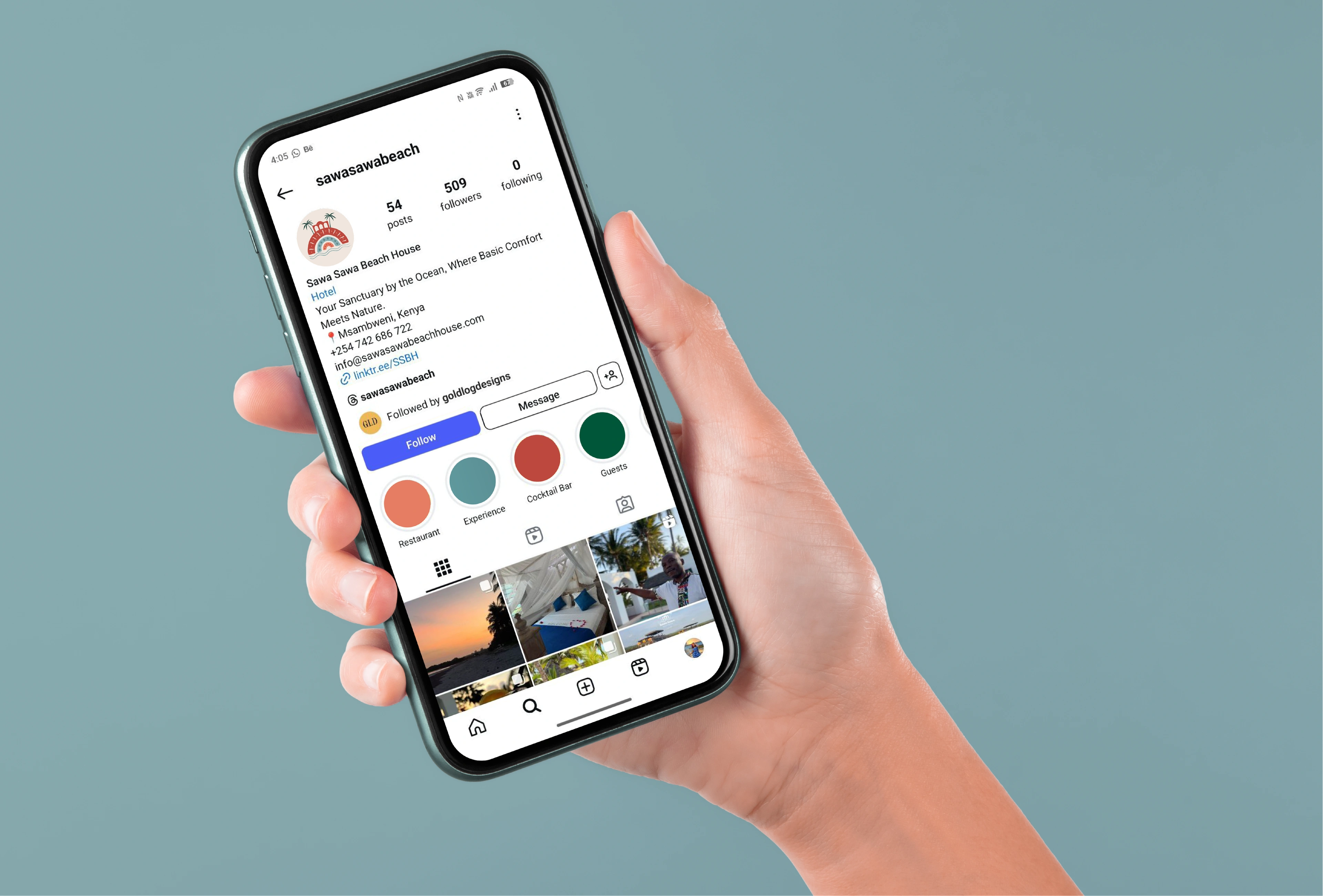
Every touchpoint was rebuilt to tell one coastal story. The arch motif, the hand-drawn palms and waves, and the earthy palette carry from the entrance signage to the menu to the booking screen, so the property reads as one considered place rather than a collection of parts. The result feels grander and more established without losing the relaxed soul that made guests love it. Ivo's verdict: a beach house that now looks — and books — like the four-star destination it always was.
the result
but wait, there’s more
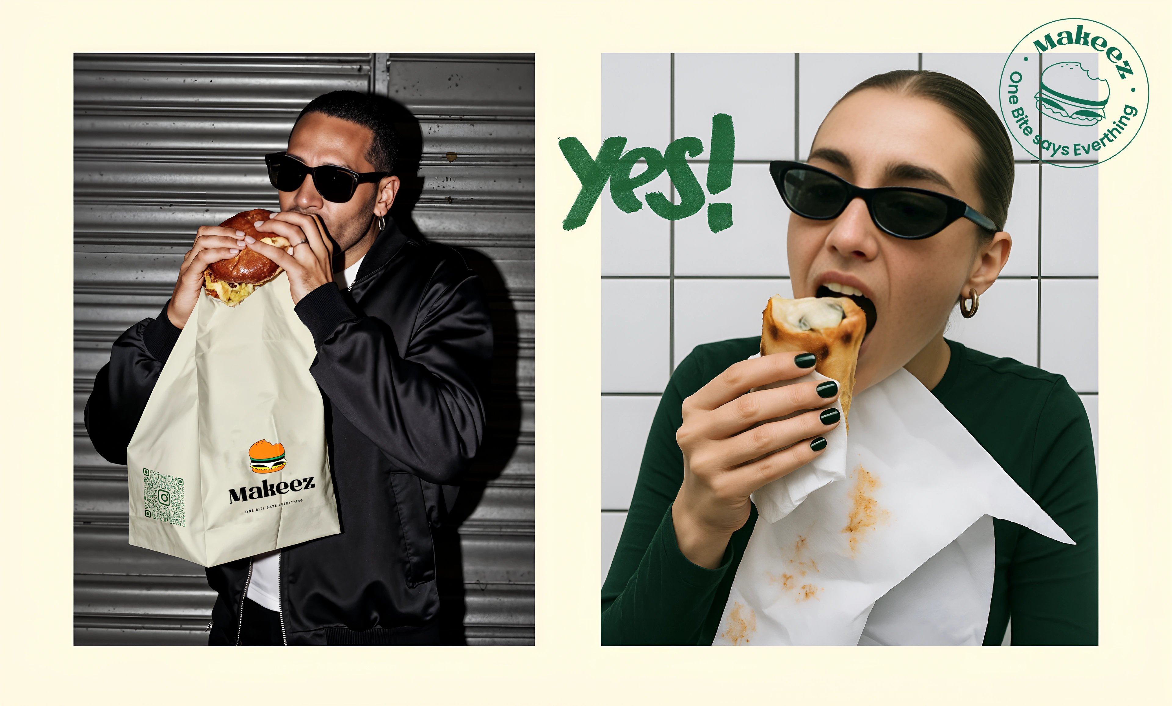
Karaoke Kubo
a retro-pop identity for a private karaoke night out
Washify
trust-led identity for a doorstep car-wash subscription
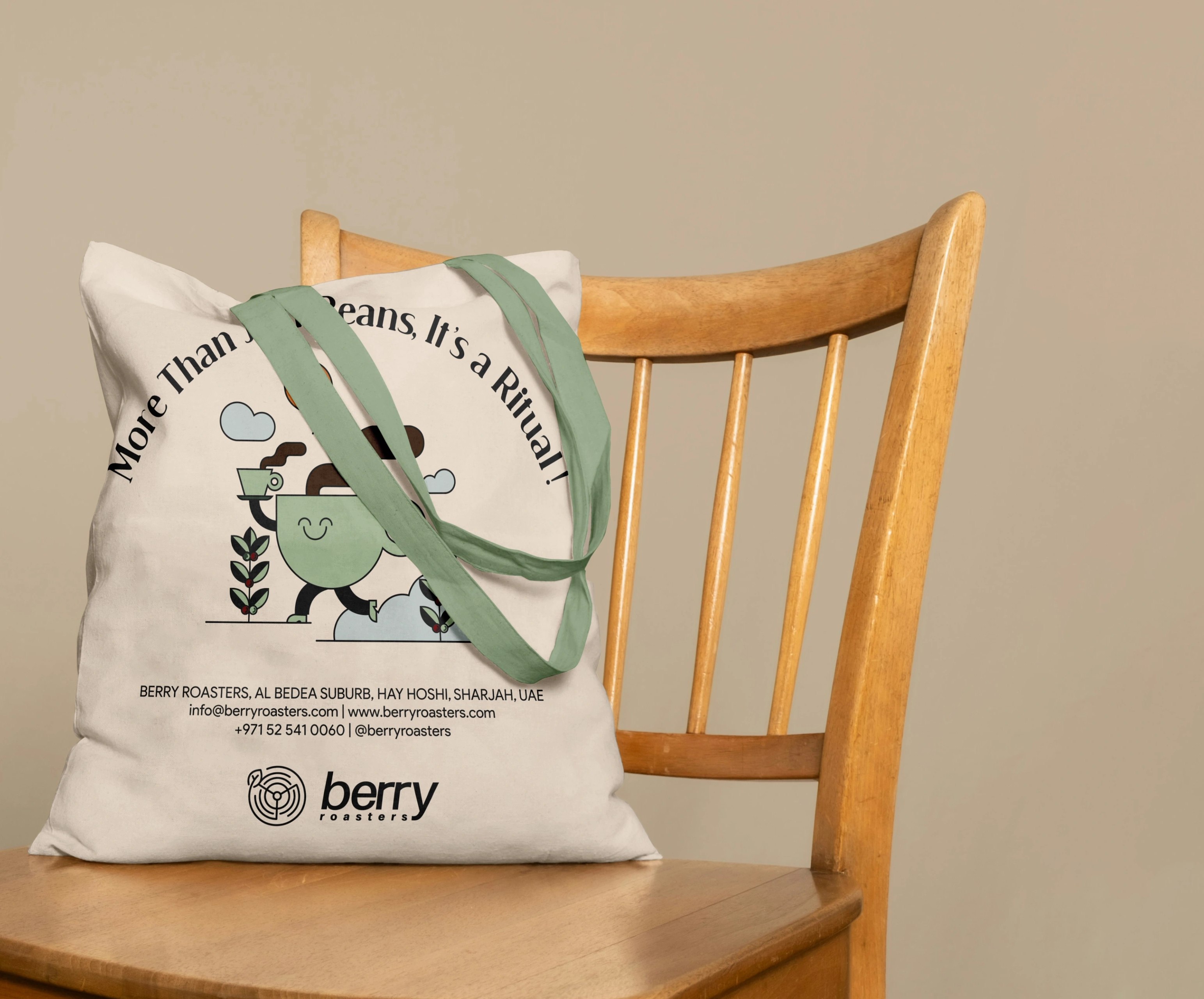
Berry Roasters — World of Coffee
an illustrated farm-to-cup identity for world of coffee dubai
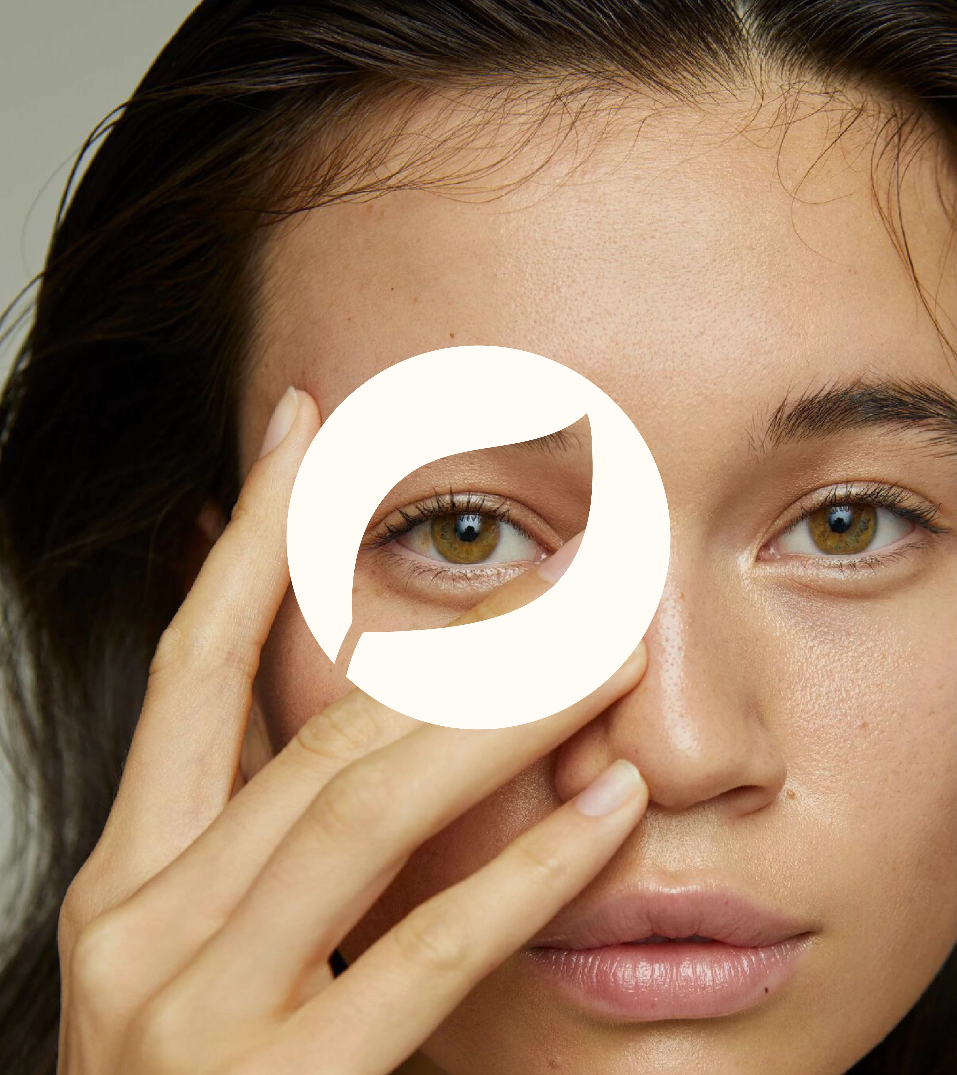
Zion Health
earth-rooted identity system for a clay-based wellness brand
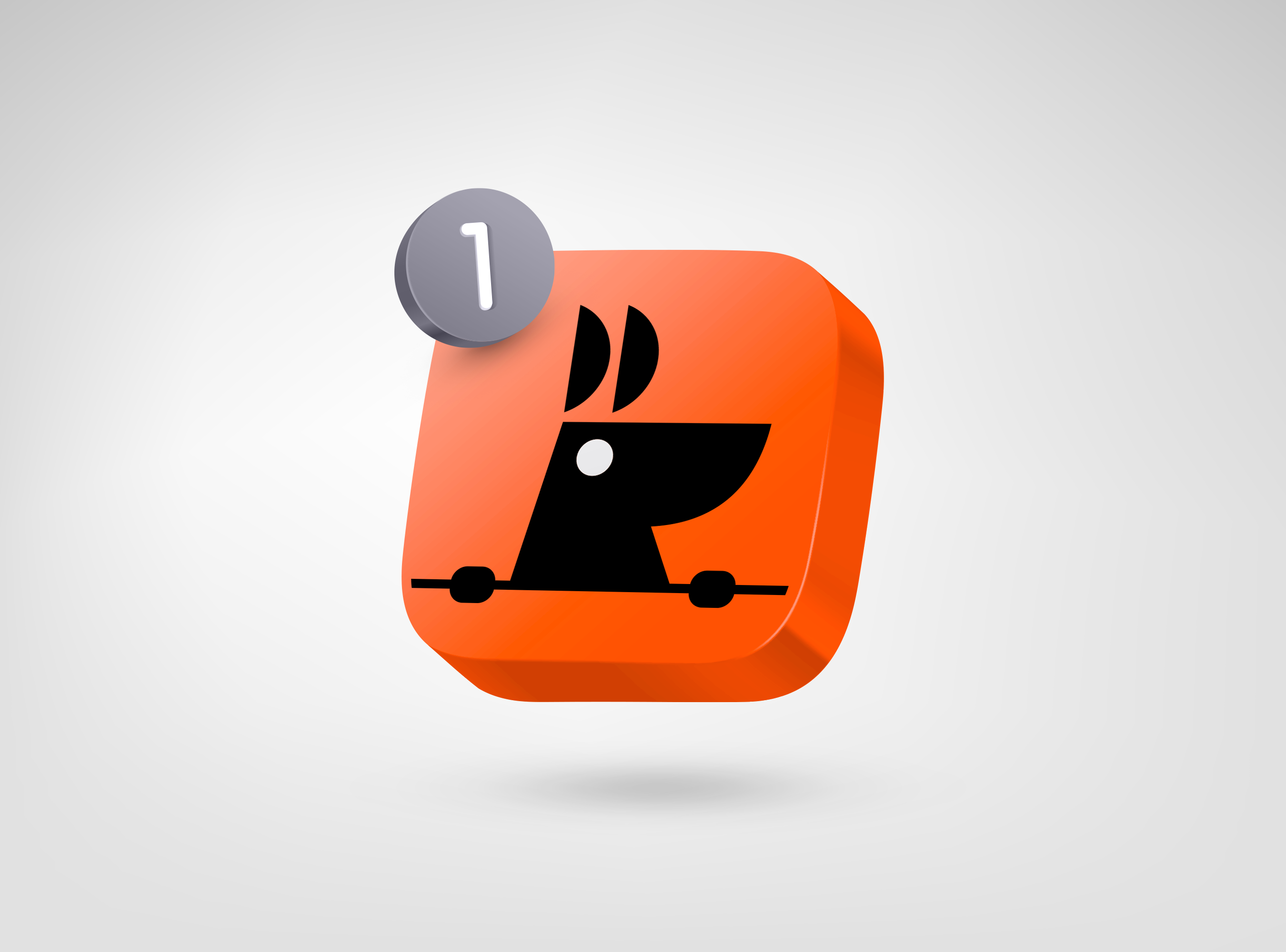
RooView
smart viewfinder accessory brand for solo content creators

ready tobegin?
tell us what you’re building. we read every message, reply within two working days, and only take on projects we know we can ship well.