even after it dries, a flower is still a flower.
about the client
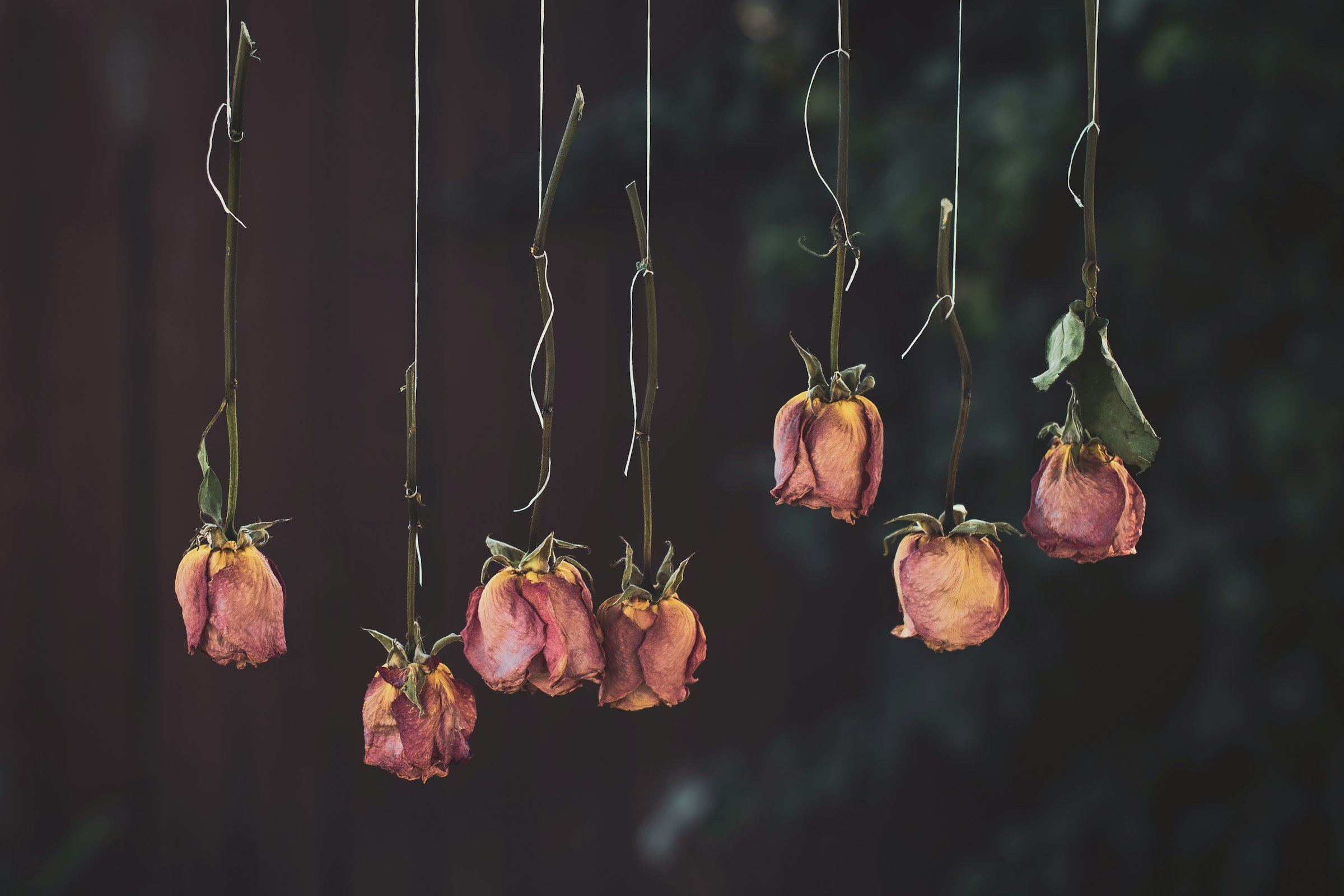
Stillflower is a curatorial, scent-led studio built around preserving what's usually overlooked — dried flowers, potpourri, preserved botanicals and tactile home goods, reframed as intentional and quietly luxurious. The name carries the whole idea: even dried, a flower is still a flower. Based in Austin, Texas, it lives where art, fragrance, floral design and storytelling meet.
the challenge
Potpourri and dried flowers carry a dusty, dated reputation, while modern home-fragrance brands lean too minimal, too wellness-coded, or too mass-market. Stillflower had to shift the category from 'dead flowers' to 'preserved beauty' — making dried botanicals feel artful, collectible and modern without losing their softness. The system also had to stretch across fragrance, art objects, studio goods and future packaging, reading as a whole creative universe rather than one product line.
our solution
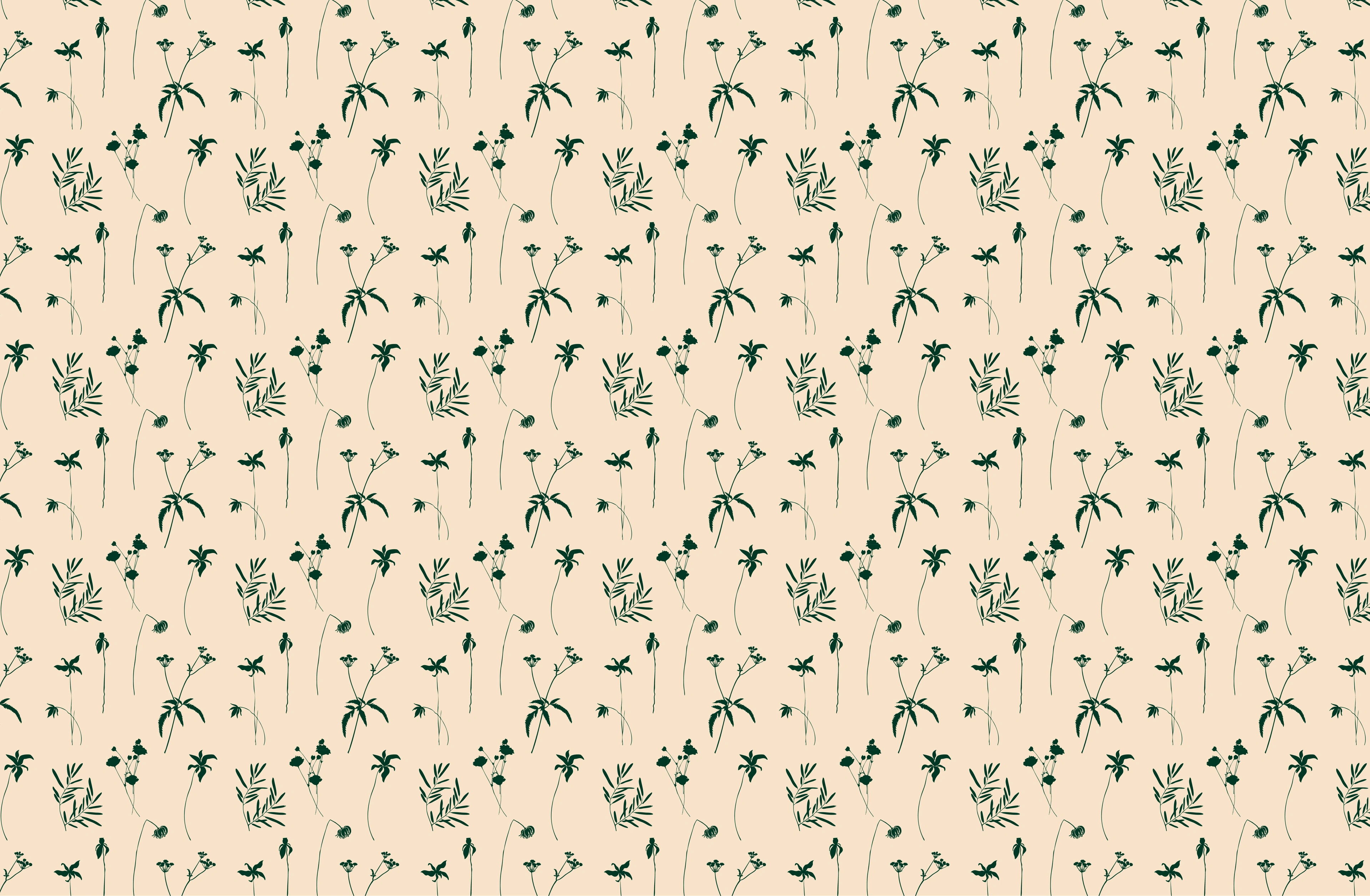
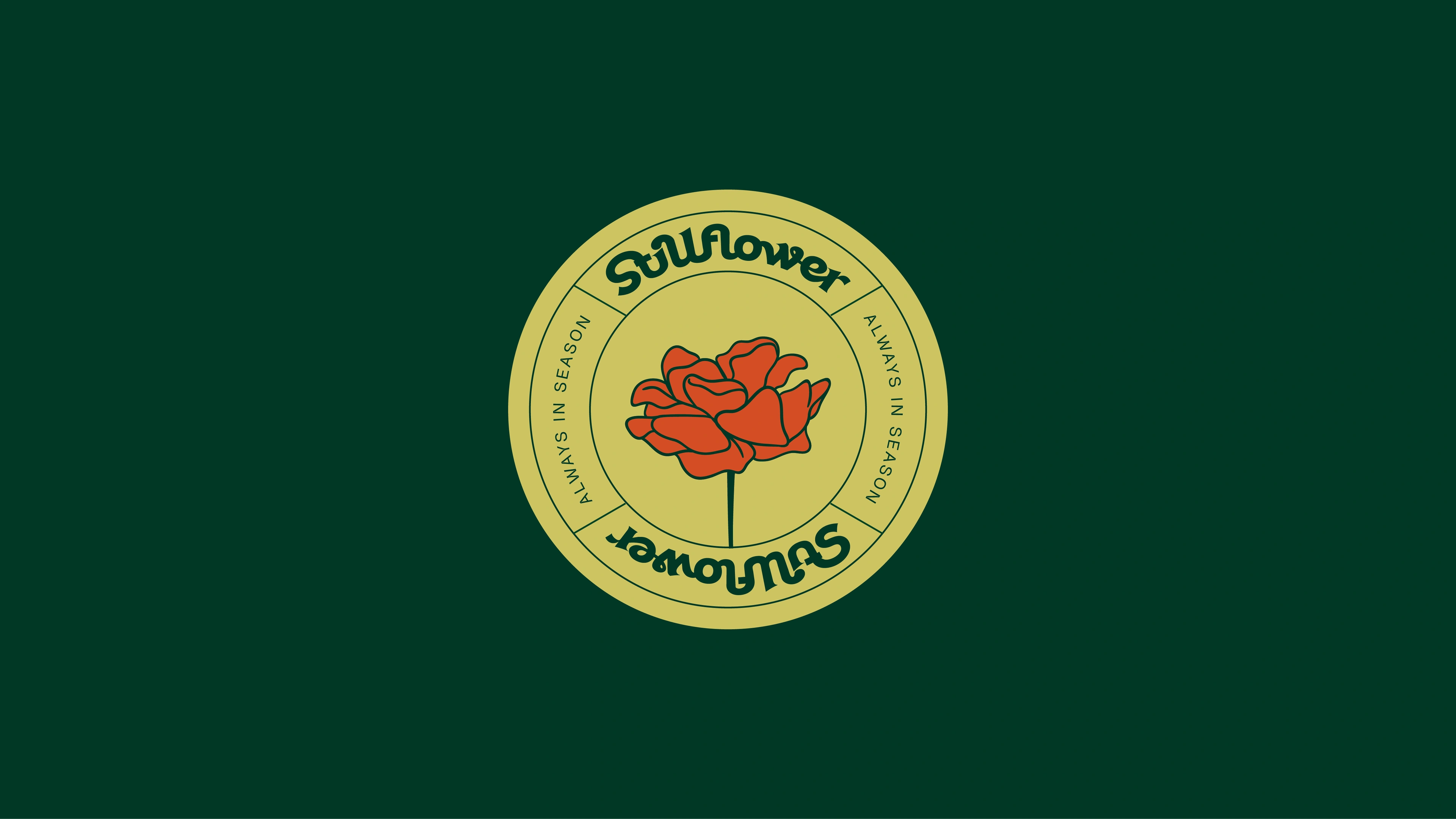
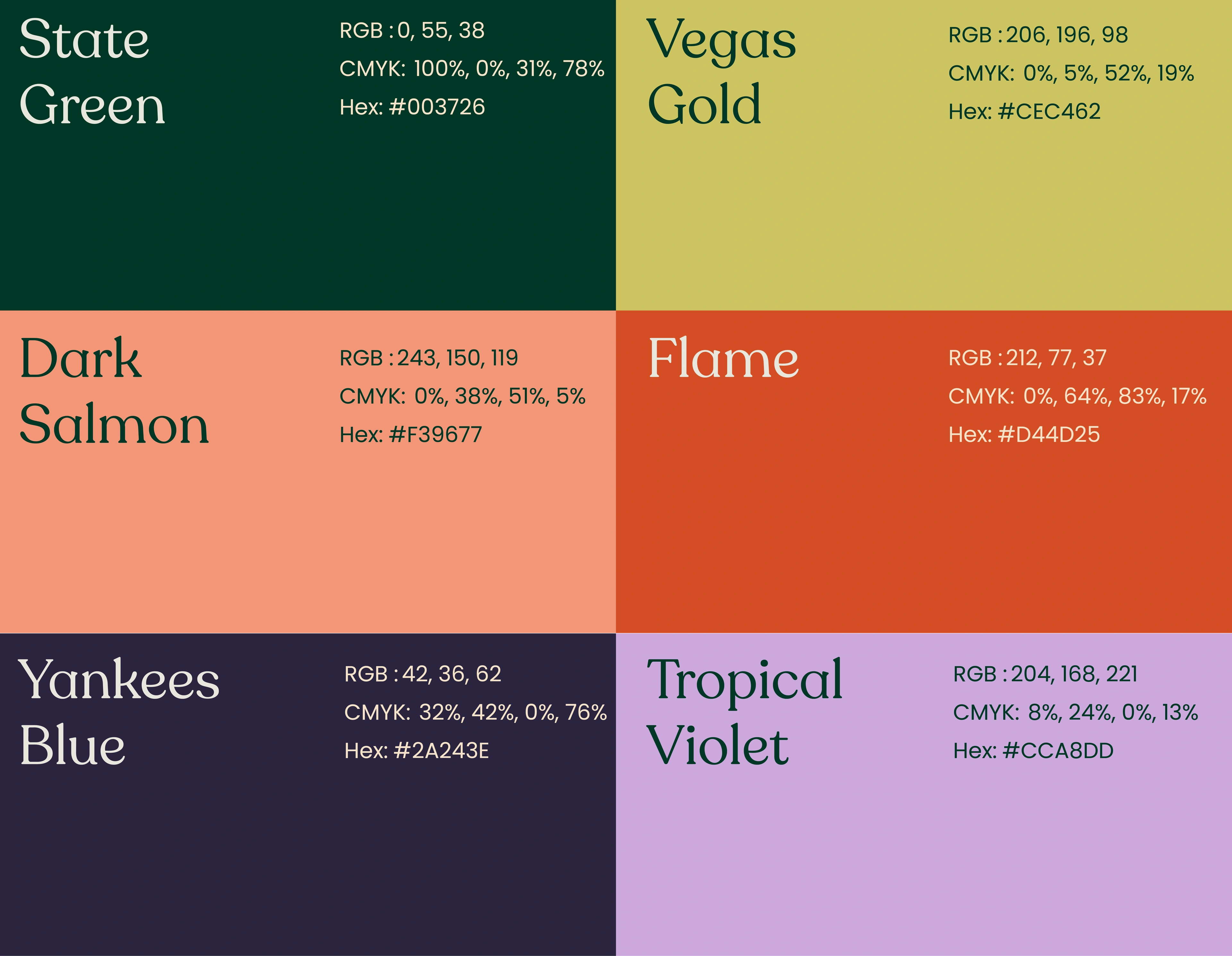
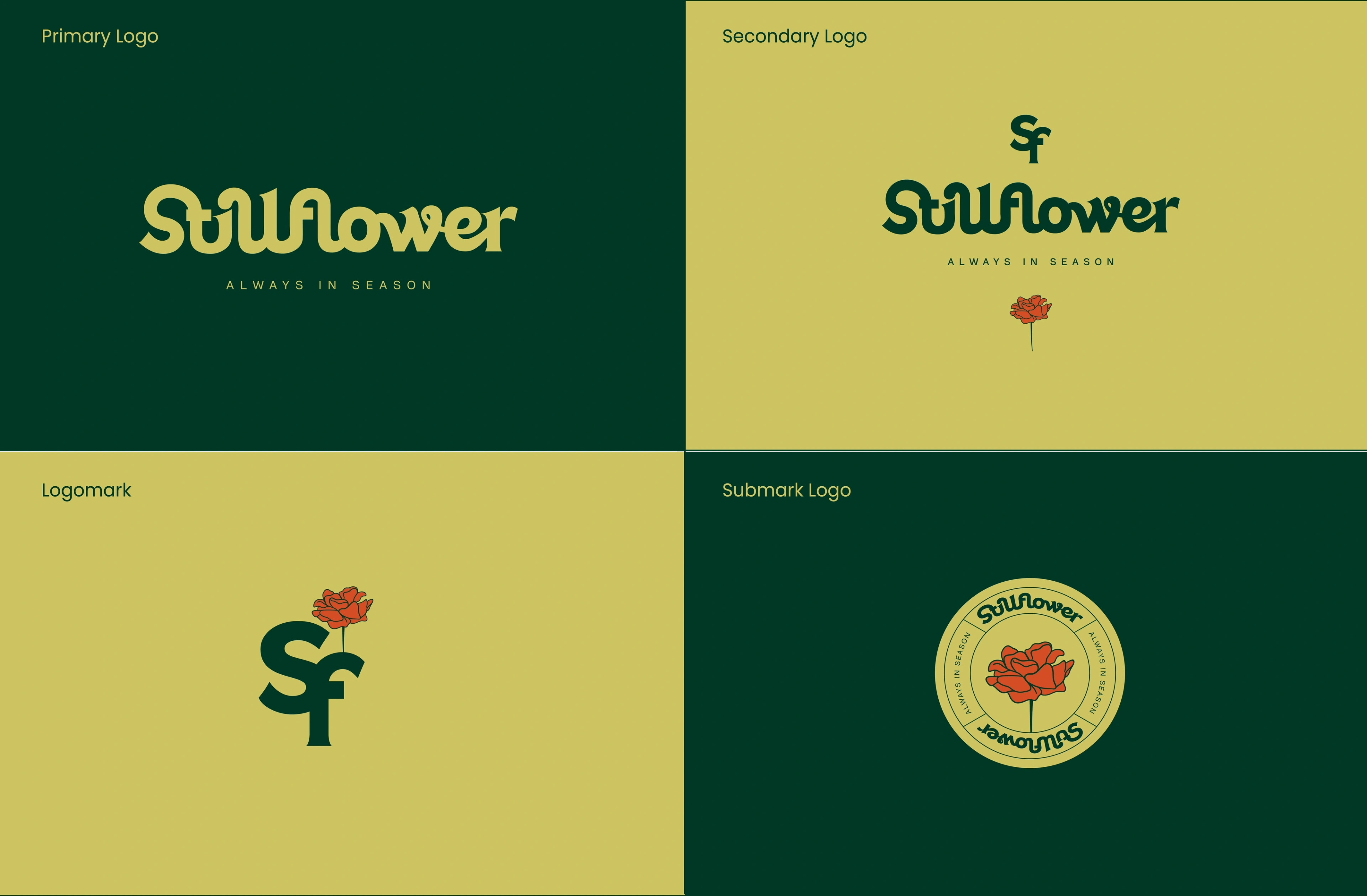
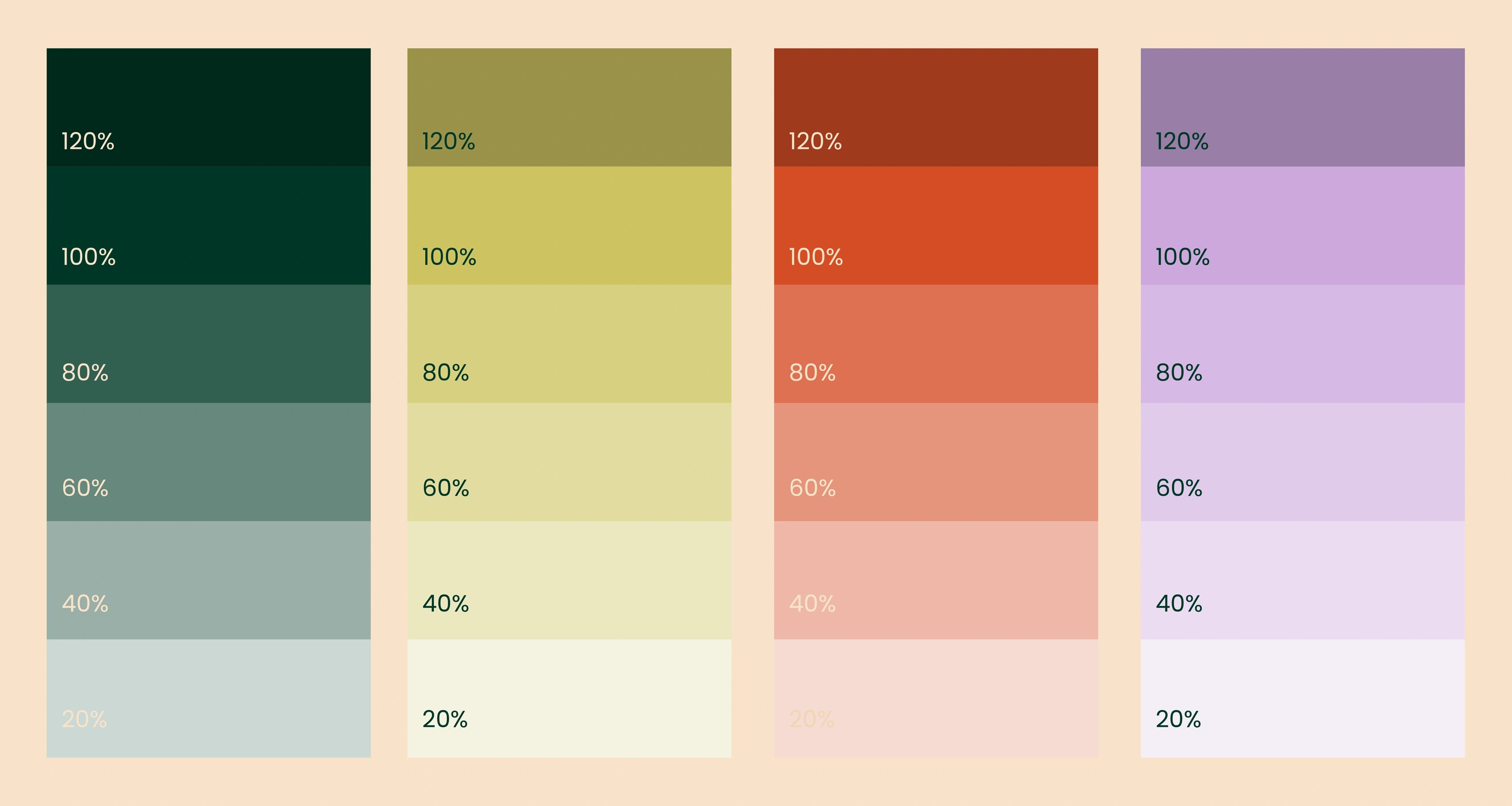
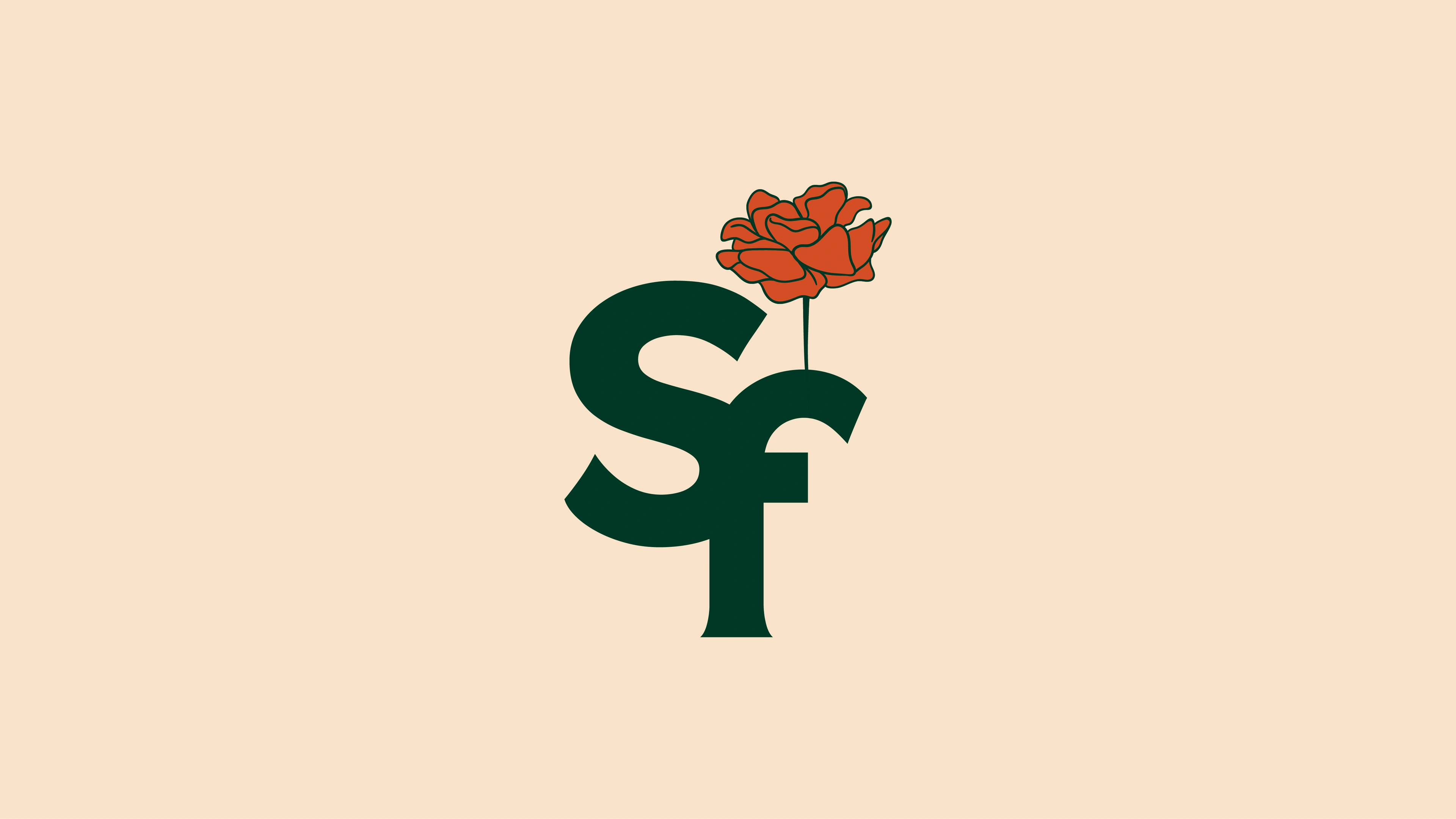
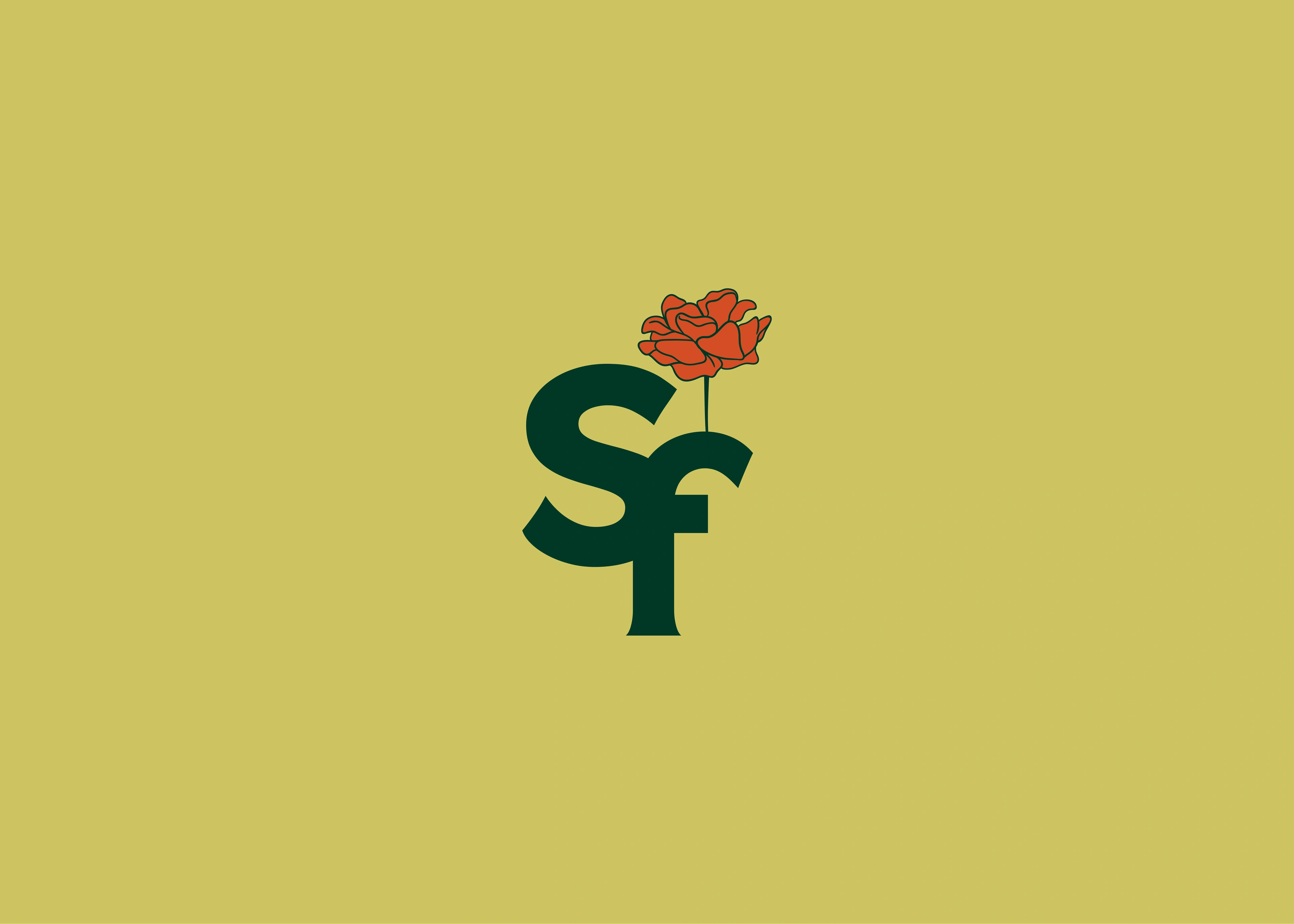
We built the brand on the tension between raw and refined. The wordmark is intentionally imperfect — soft, slightly irregular letterforms that bend like stems and settle like pressed petals, so it feels alive even in stillness. A preserved-bloom illustration anchors the identity, and the SF monogram grows a flower straight out of the letterform, keeping badges, seals and stickers tied to the wordmark. The palette — State Green grounding it, Vegas Gold for sun-faded age, Dark Salmon and Flame for dried petals, Yankees Blue and Tropical Violet for an unexpected, dreamy contrast — keeps it colourful but calm. Hand-drawn botanicals, circular badges and repeat floral patterns finish a world that feels tactile and collectible.
always in season
Instead of selling dried flowers as old-fashioned home fragrance, the brand reframes them as still flowers — preserved, intentional, always in season. That gives Stillflower a stronger emotional hook and a memorable name story, and the expressive wordmark, floral monogram and rich palette give it enough personality to stand out in a market full of neutral wellness brands. The result is a poetic, commercially expandable foundation for potpourri, sachets, scent objects, studio goods and art-led drops — built on the belief that even what's faded can still be worth keeping.
but wait, there’s more

ready tobegin?
tell us what you’re building. we read every message, reply within two working days, and only take on projects we know we can ship well.