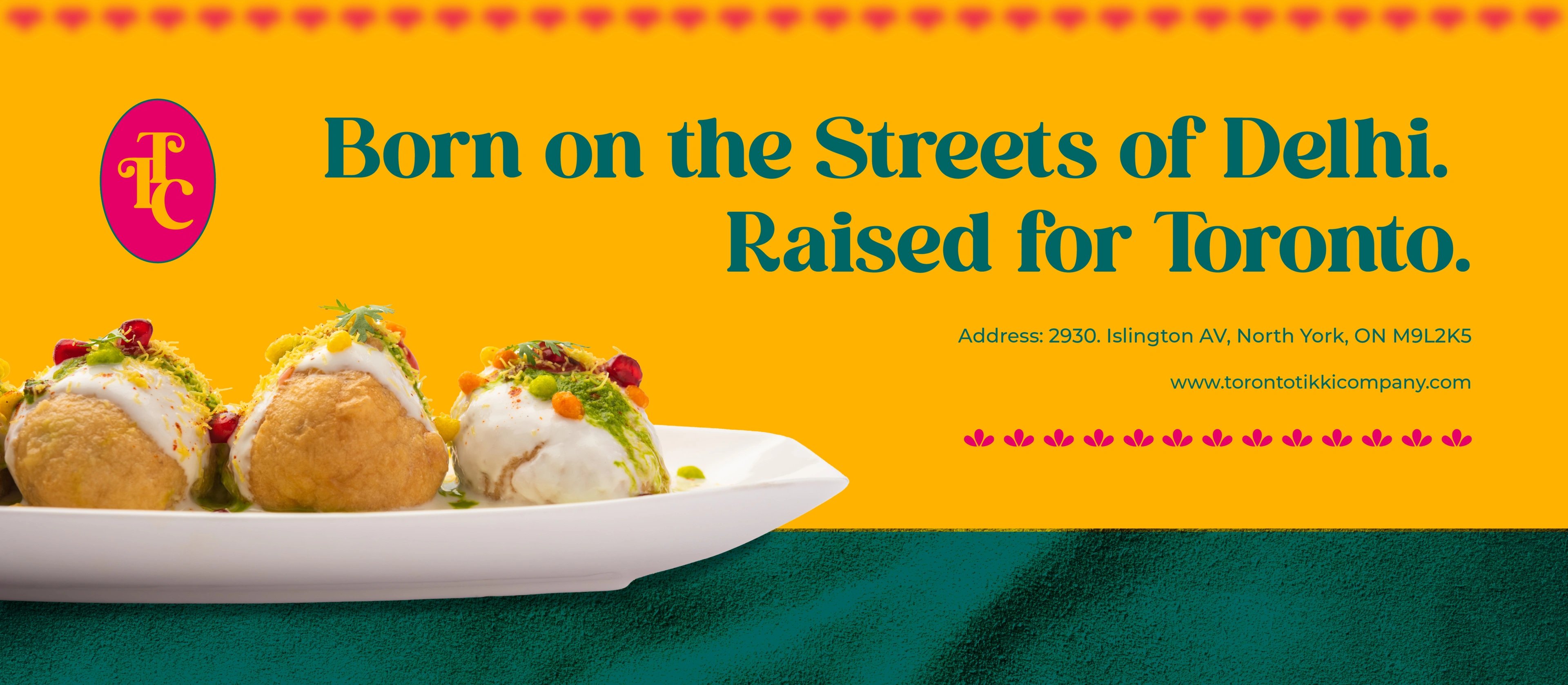
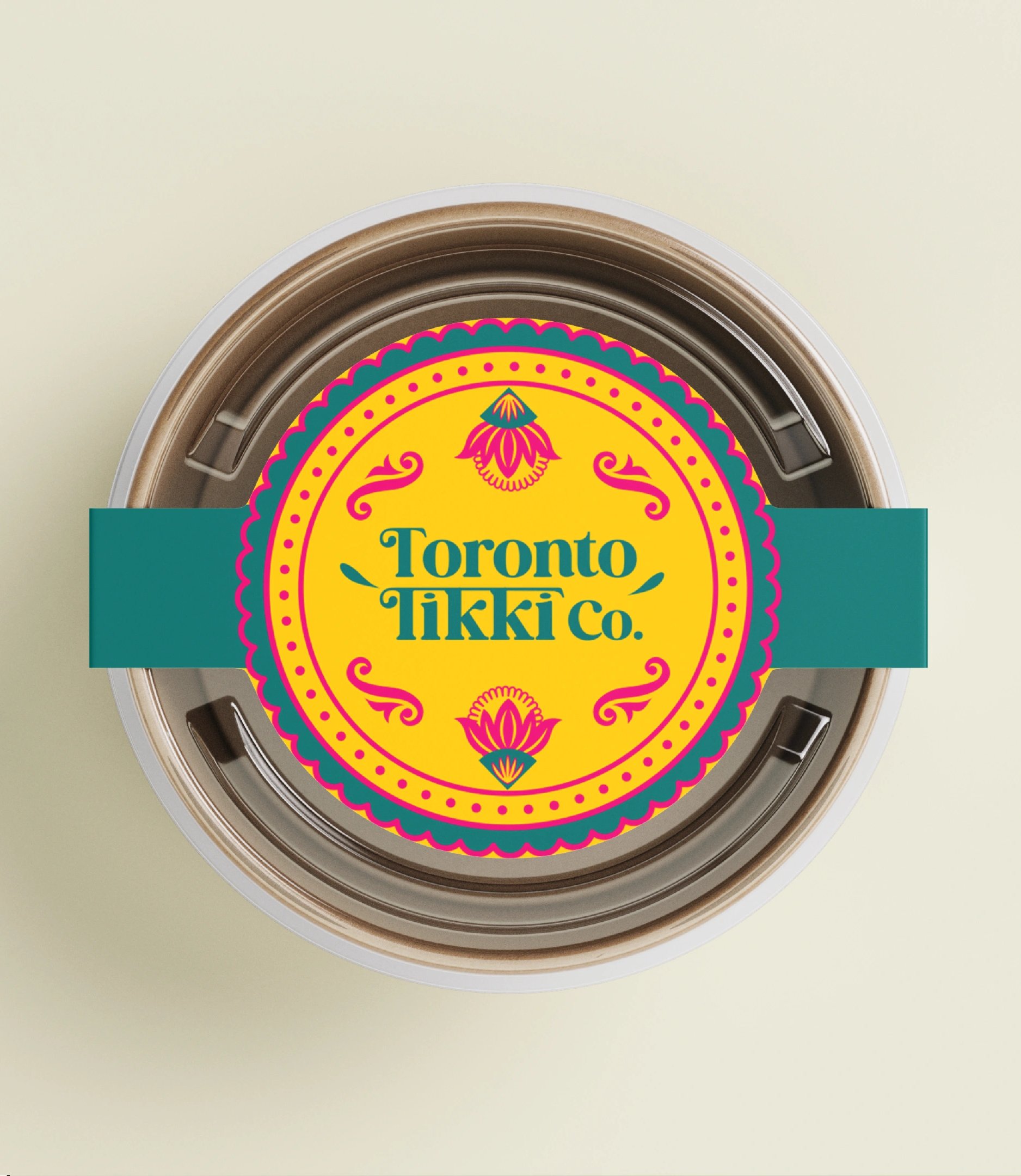
Toronto Tikki Co.
street food earned the grandeur it always deserved.
about the client
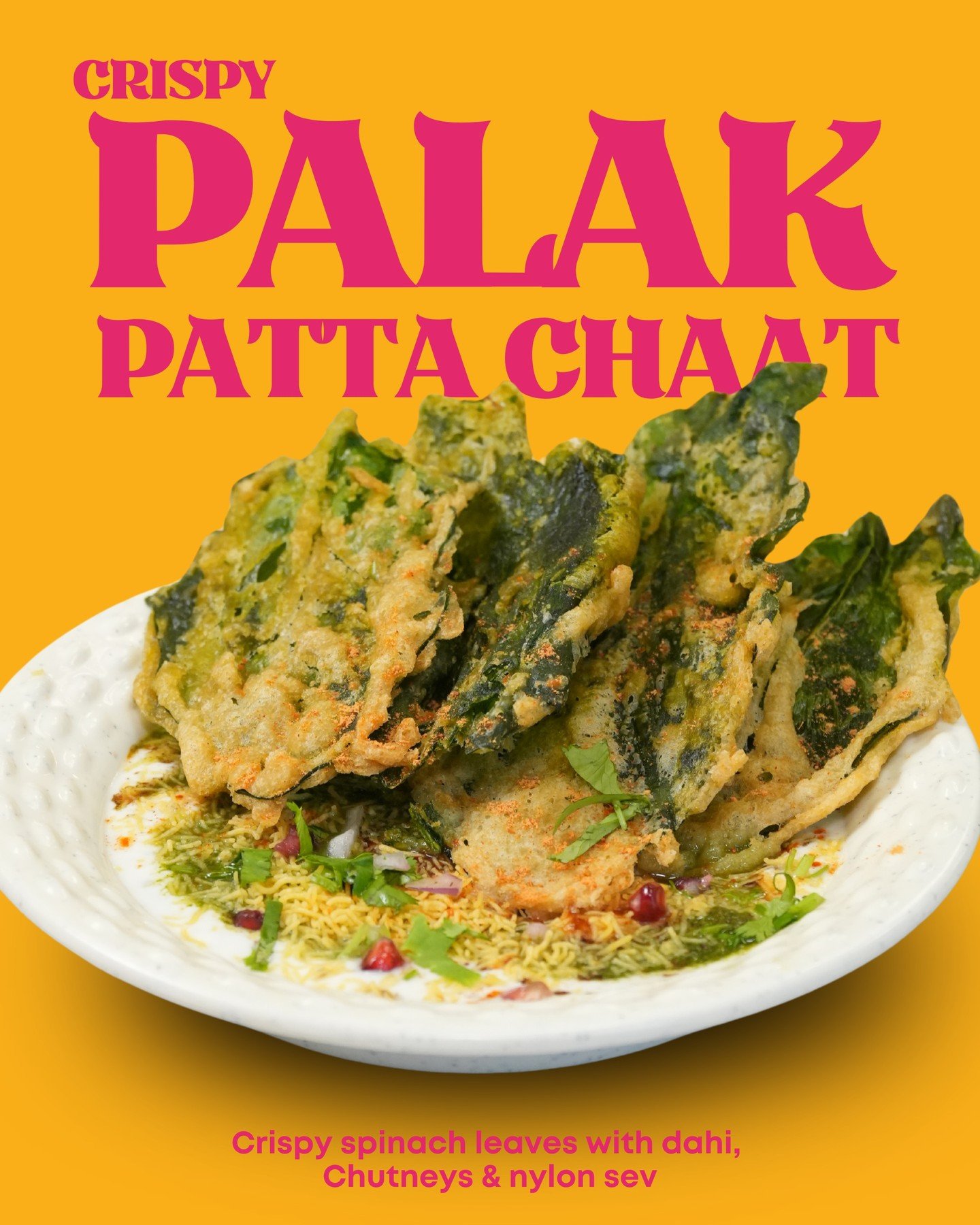
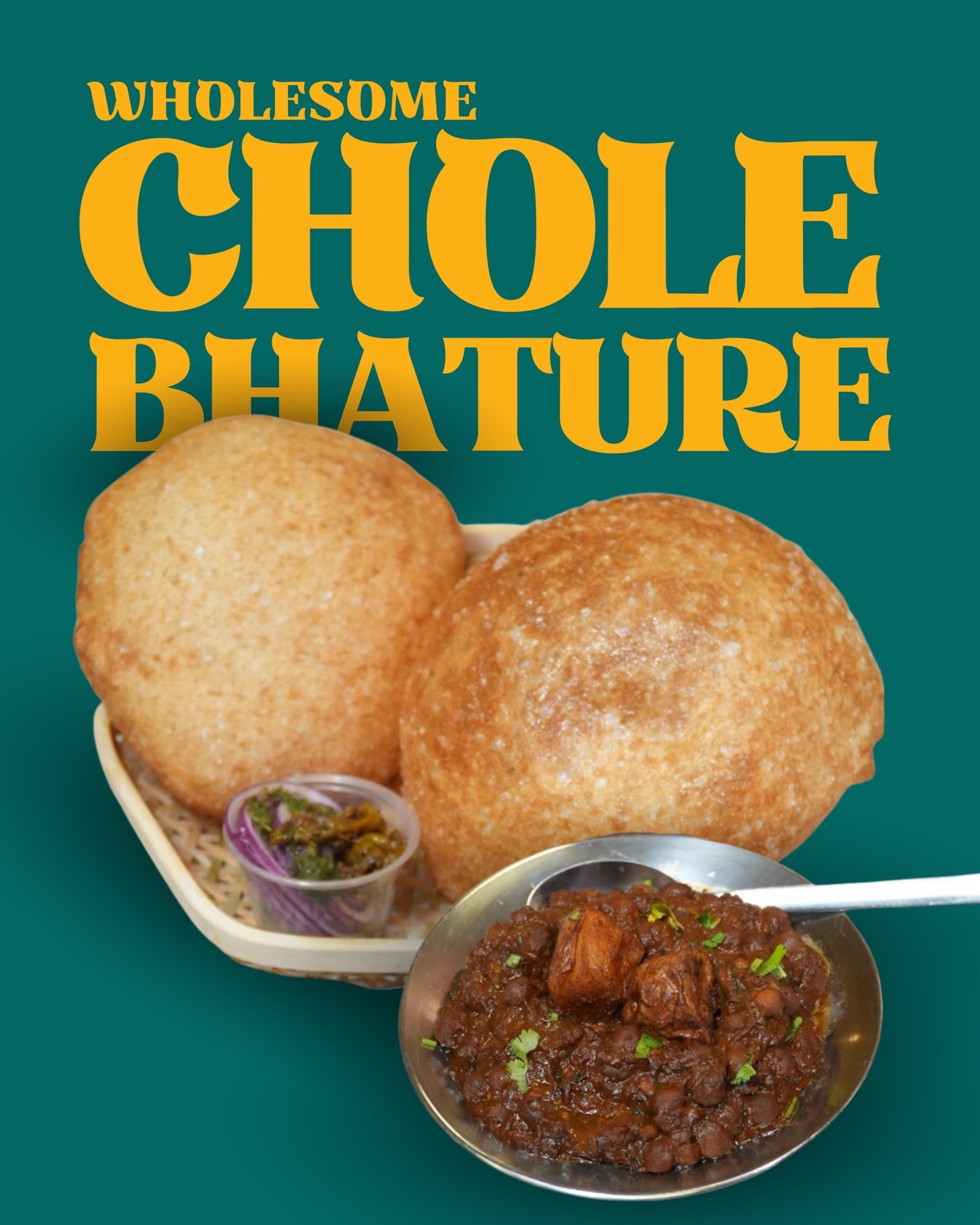
Toronto Tikki Co. is a 100% vegetarian chaat house serving Delhi-style street food cooked in pure desi ghee. Its founders moved from Delhi to Canada, couldn't find tikki that tasted like home, and flew back to study the craft across Chandni Chowk, Chawri Bazaar and GK for over a year before opening. They built TTC as a love letter to Delhi street food, crafted for Toronto.
the challenge
Street food carries centuries of culture, but in the diaspora it usually gets flattened into generic, apologetic branding. TTC had the product and the story — what it lacked was an identity with the depth of the craft, one that felt rooted and proud rather than nostalgic pastiche. It also had to land before the doors opened: the brand had to introduce an unknown name and make it feel like it had been on the street for years.
our solution
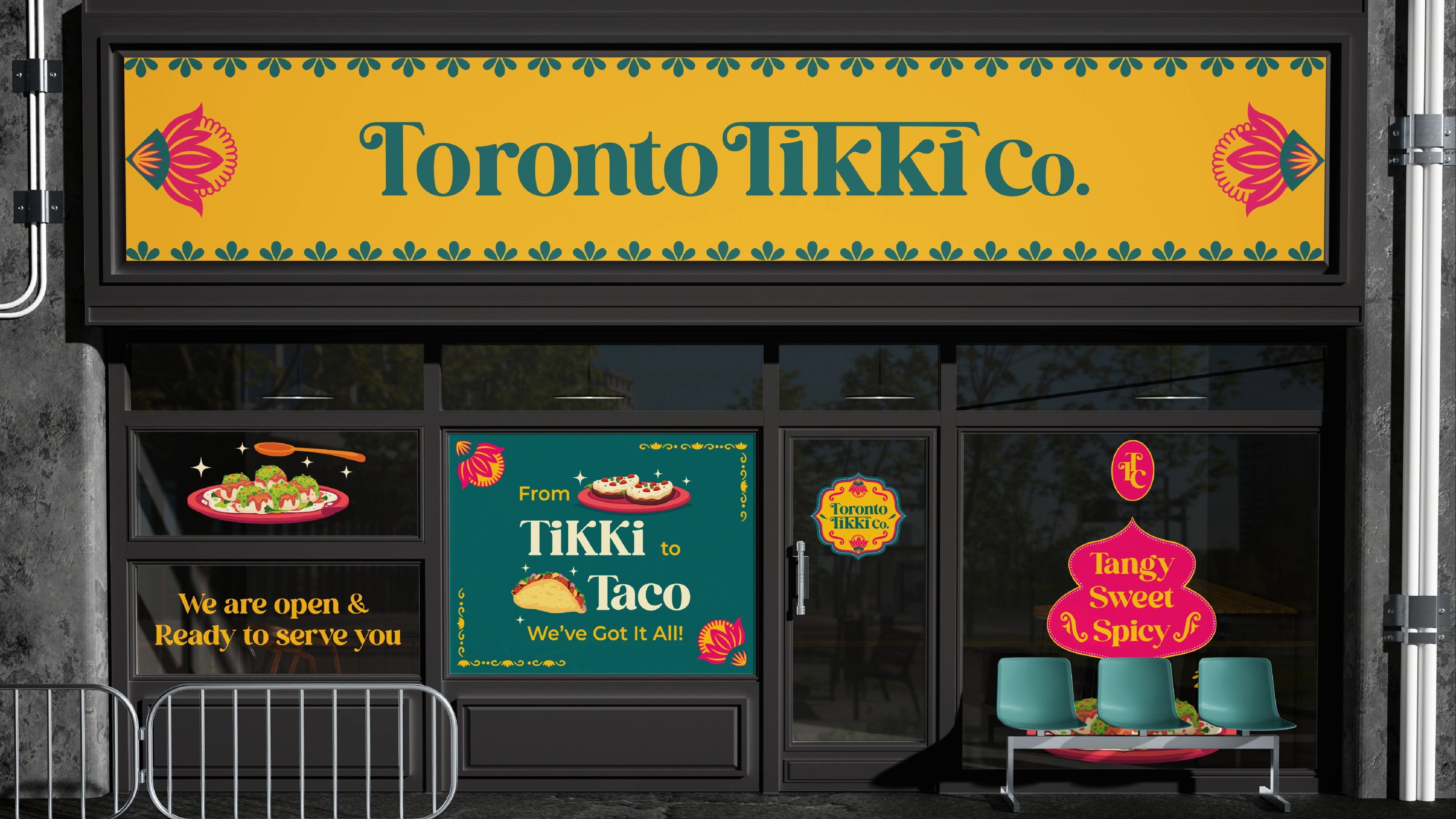
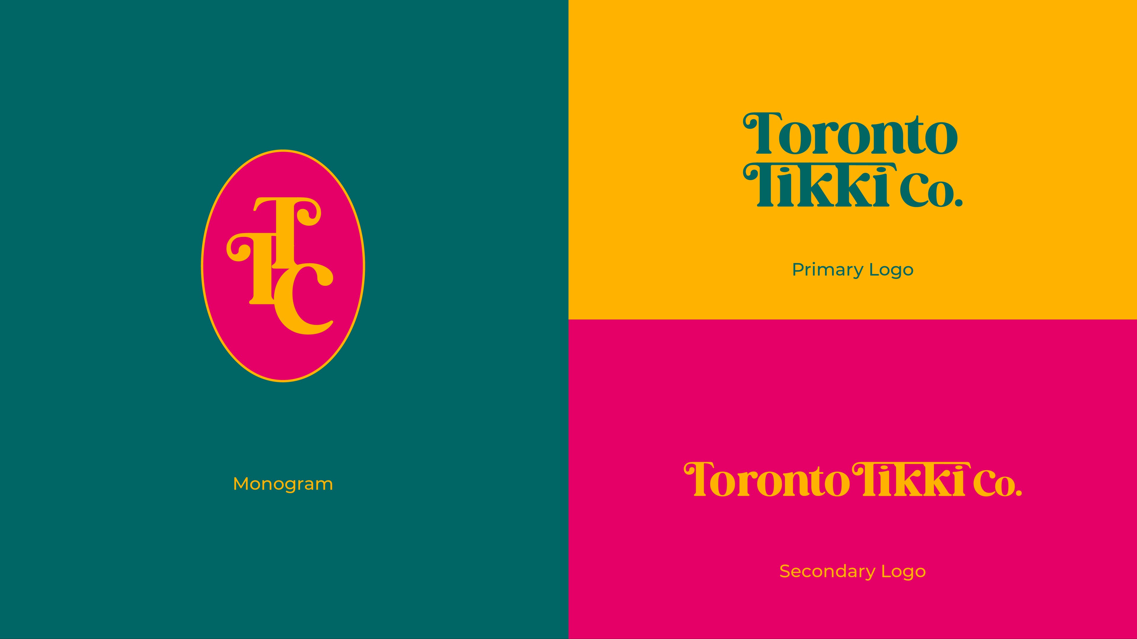
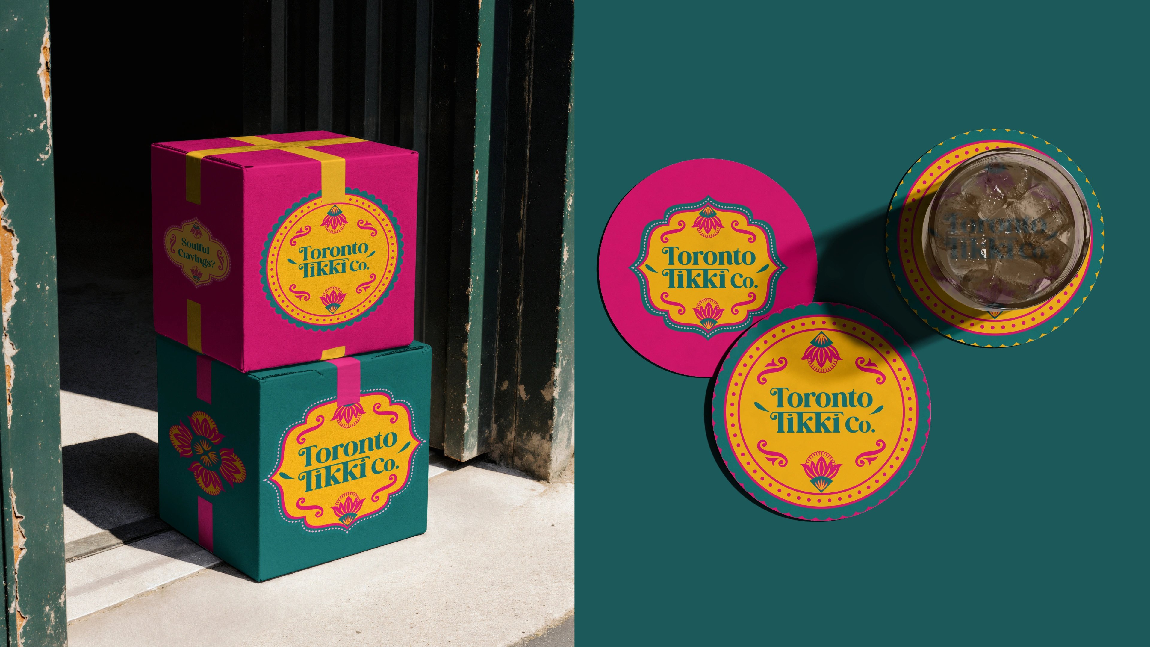
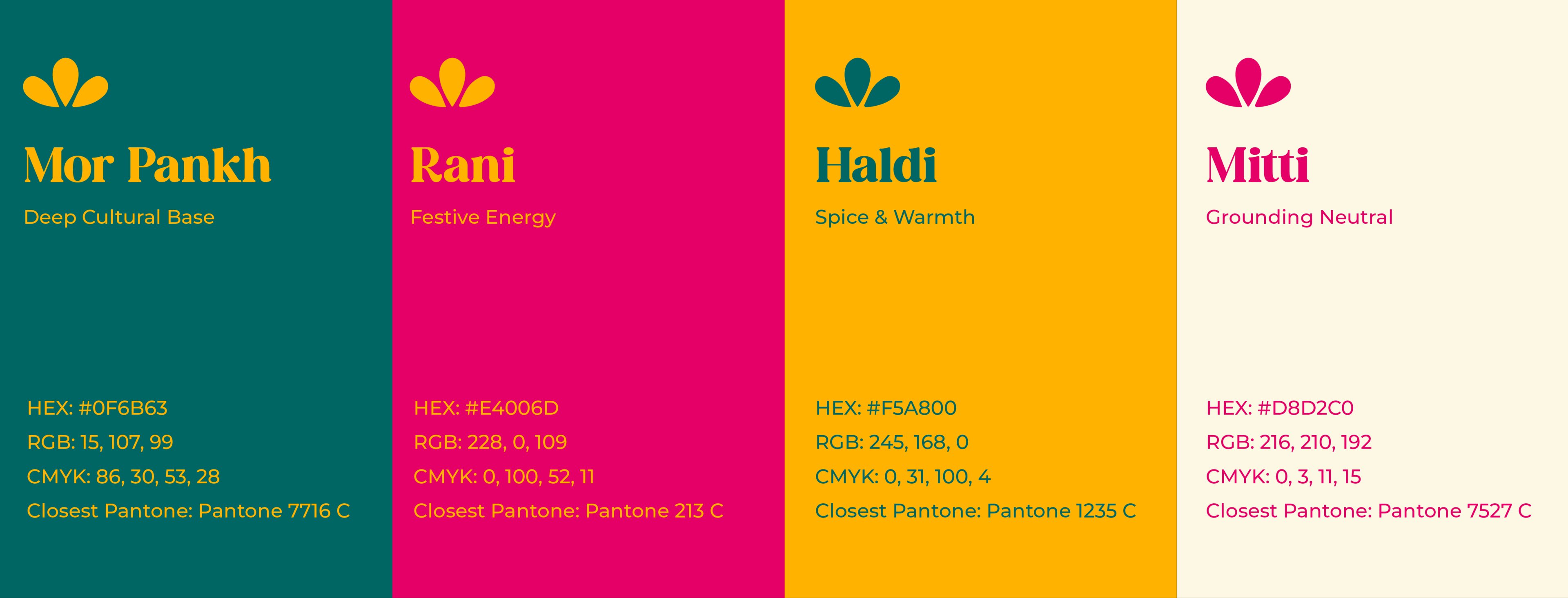
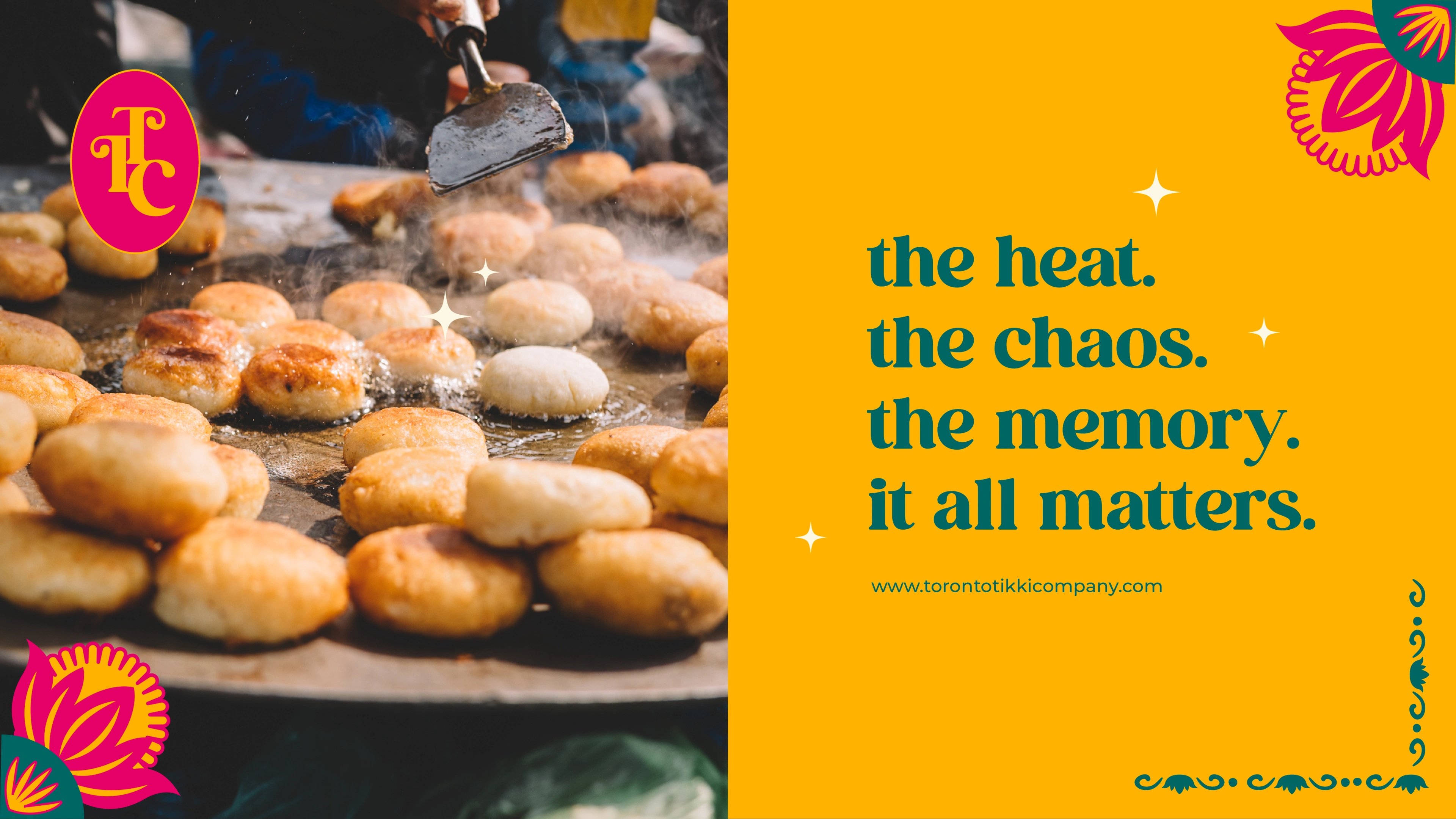
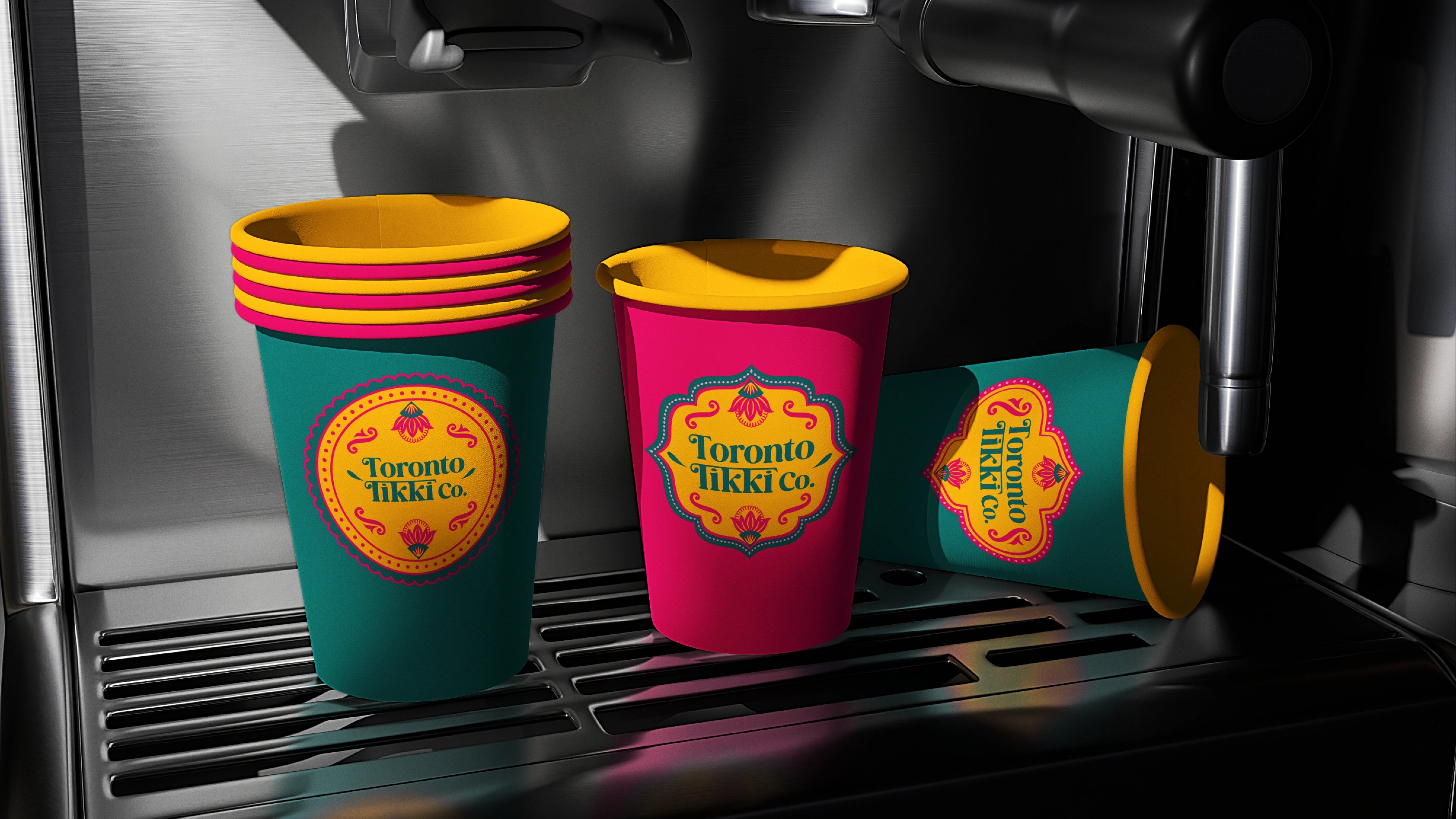
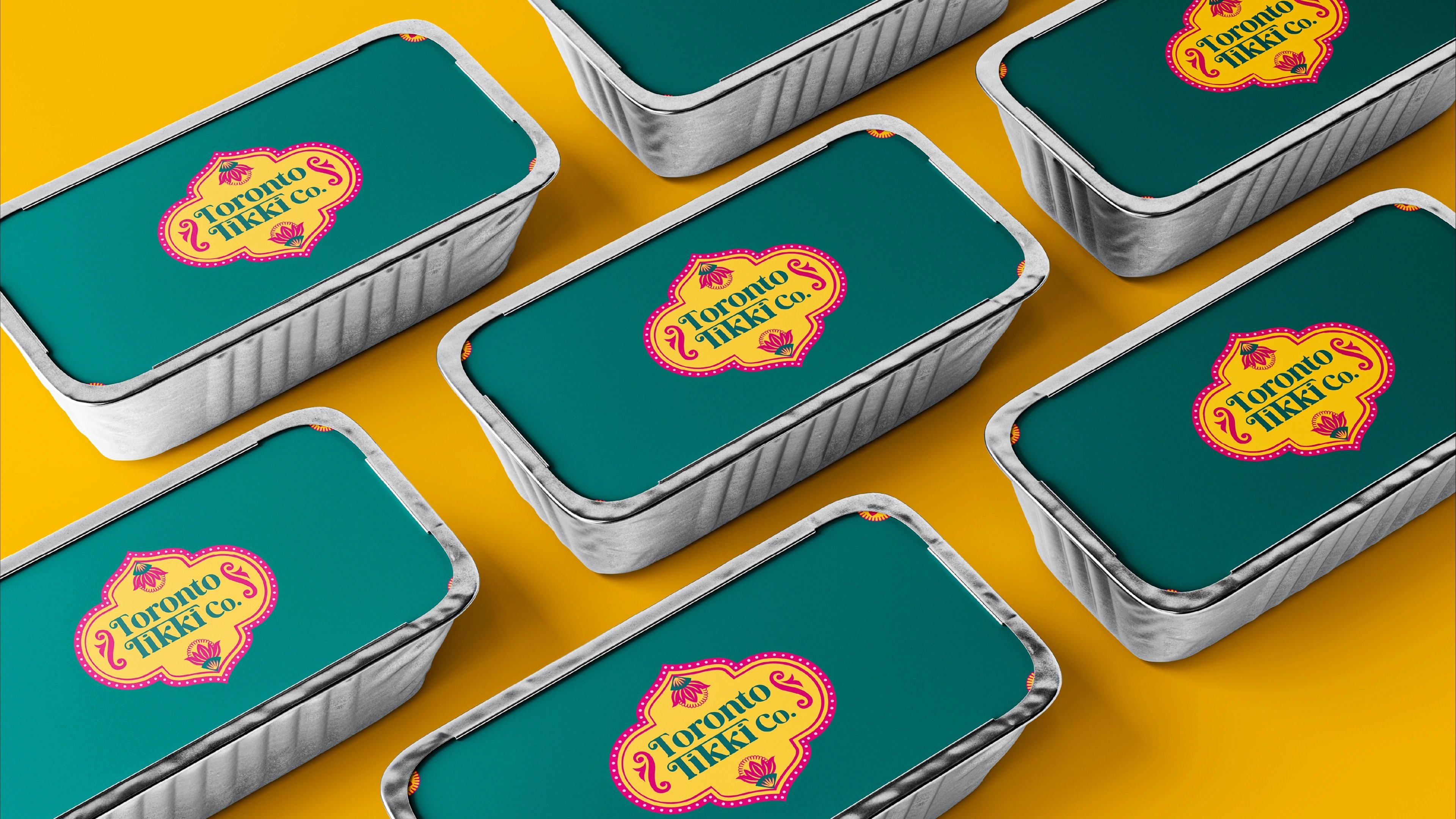
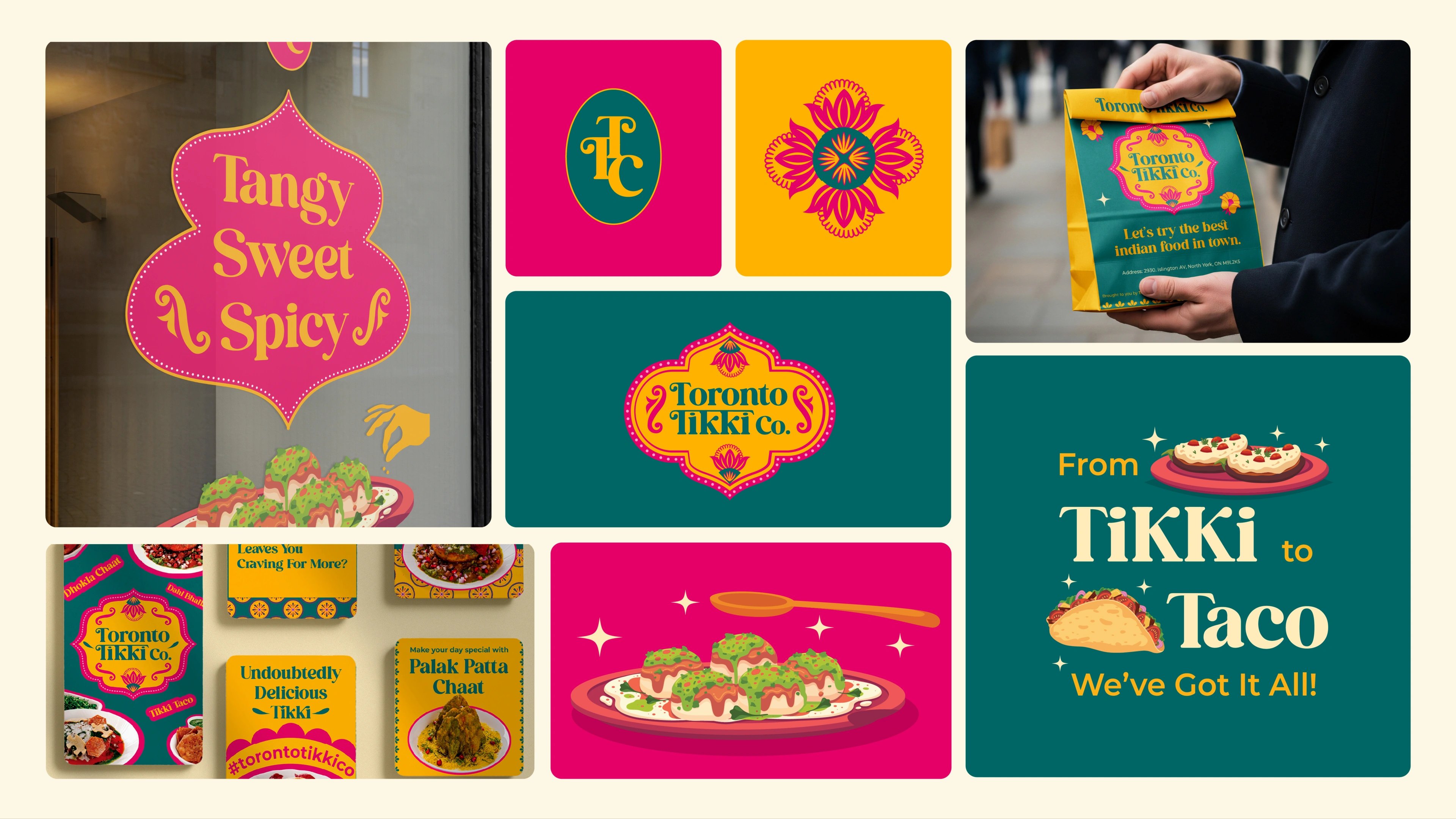
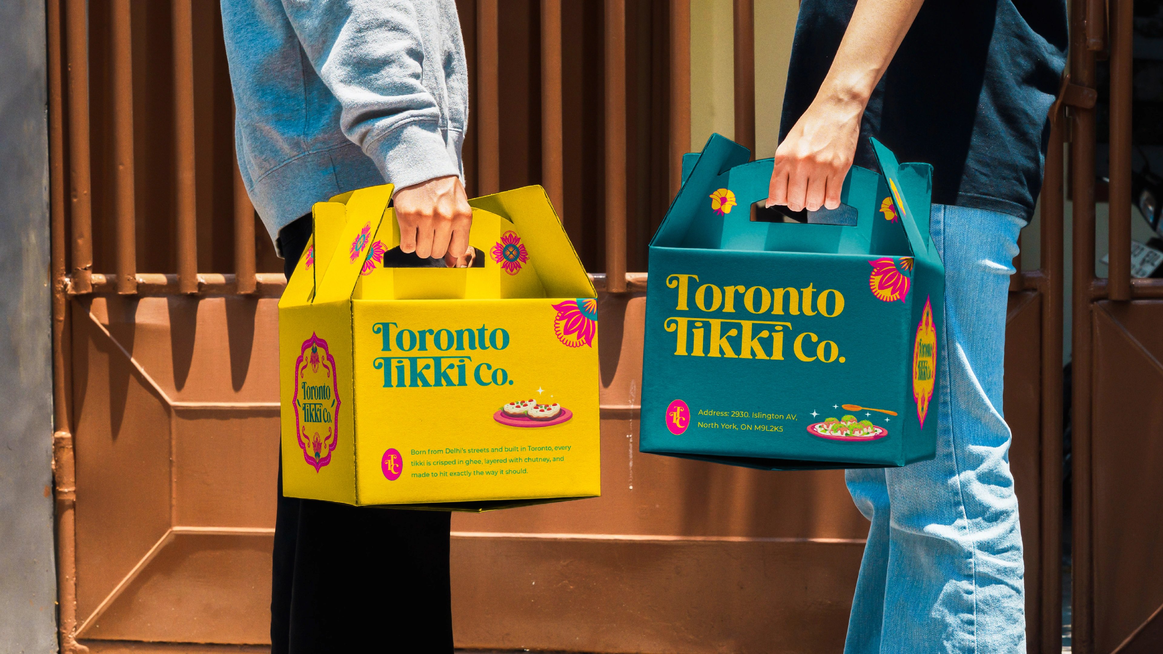
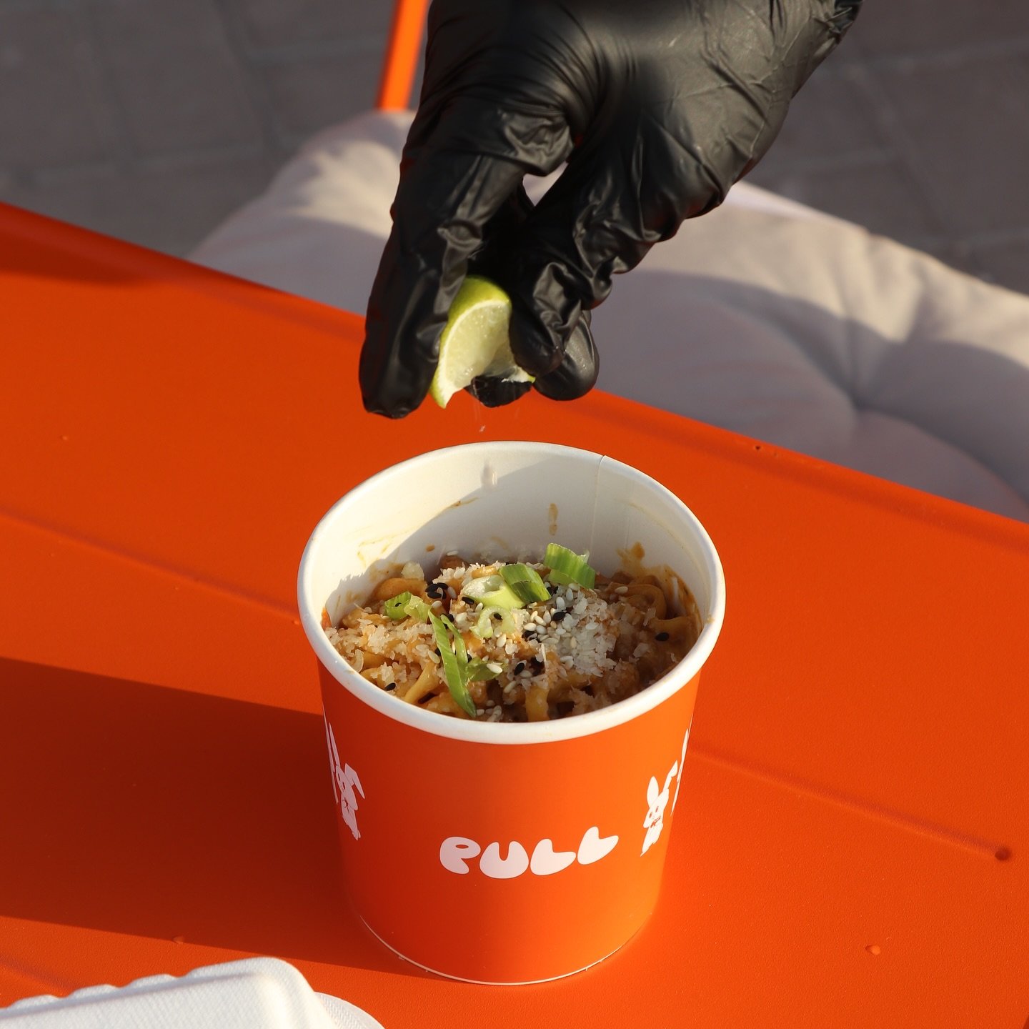
We built a system rooted in Indian visual heritage and applied it with contemporary discipline. The wordmark went bold and stately — a stylized vintage serif locked into a lotus-crest badge — to give an unproven restaurant instant legacy, backed by an interlocking TTC monogram for the tighter spaces. The palette came straight from Indian truck art: a loud, saturated set the studio named Mor Pankh, Rani, Haldi and Mitti — peacock, royalty, turmeric, earth. Carried across packaging, menu, signage and the in-space graphics, it holds the tension between traditional cues and a modern brand without tipping into kitsch.
toronto can't stop posting.
from chandni chowk to islington avenue.
We worked with the founders to distill what made the story worth telling — not a fusion concept or a reimagining, but a direct transplant of Delhi craft. The logo went serif and stately to anchor that intent; the palette borrowed truck art's fearless saturation; the system carried from packaging to the menu to the posters lining the ordering area and the street-facing windows. The space became part of the meal — in their Google reviews, customers don't just rate the food, they describe being carried back to Delhi, the vibe and the surroundings as much as the taste. The packaging did the same job outside the walls, photographed and posted by customers who treated it like a keepsake.
the result
but wait, there’s more
Berry Roasters — World of Coffee
an illustrated farm-to-cup identity for world of coffee dubai
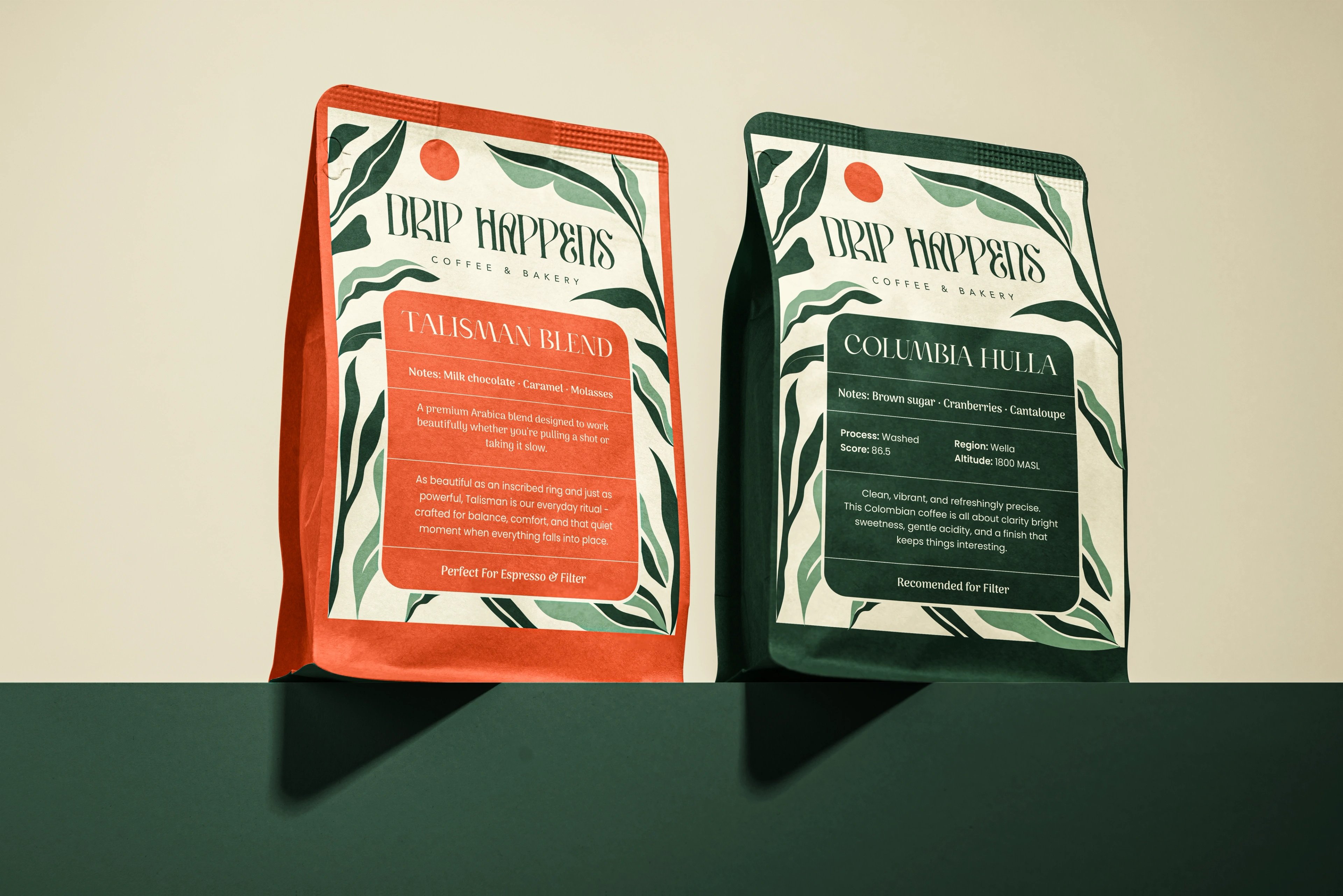
Drip Happens
a new cairo café built for the second visit.

Zion Health
earth-rooted identity system for a clay-based wellness brand

RooView
smart viewfinder accessory brand for solo content creators
Washify
trust-led identity for a doorstep car-wash subscription


ready tobegin?
tell us what you’re building. we read every message, reply within two working days, and only take on projects we know we can ship well.